


-
ResumeProductsAsked on January 22, 2020 at 3:29 PM
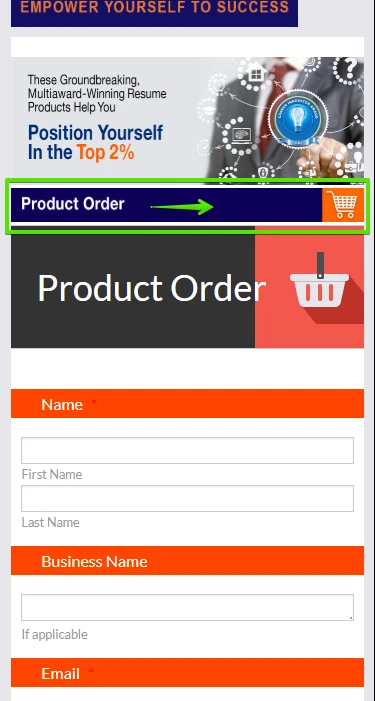
I can't find the answer to my Product Order bar question. I created and added the image (below) with one that has my brand colors, and someone mentioned I should do a particular thing, but it still shows up tiny on mobile and doesn't include the whole image on tablet. It should look like this and size correctly:

If that can't be done, we need to replace the black and red bar with my image. What to do?
-
VincentJayReplied on January 22, 2020 at 3:32 PM
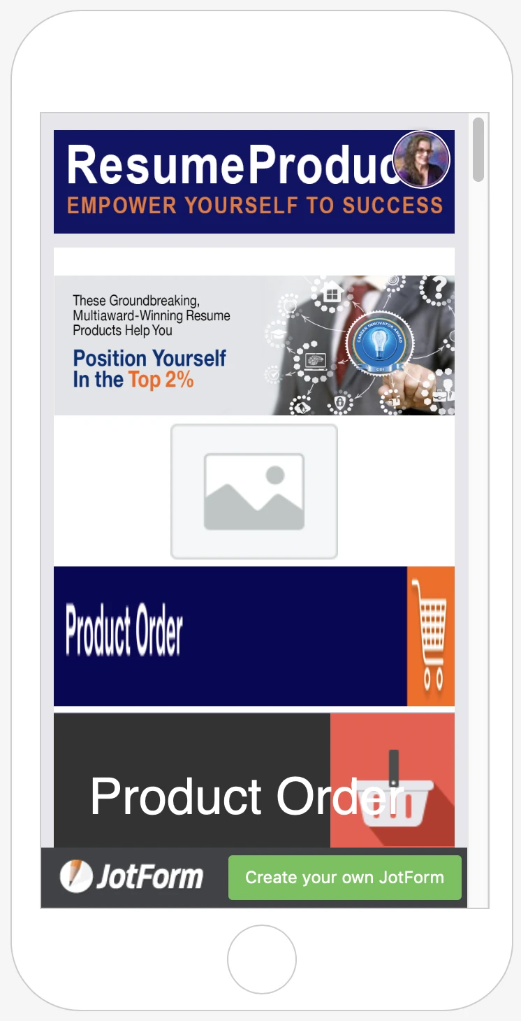
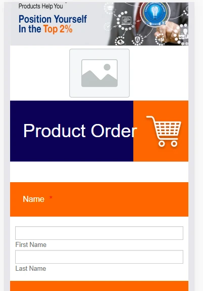
I checked your form and view it using a Mobile Device and here's what it looks like:
Are you referring to that image or the image below it? It looks okay on a Mobile device.
Could you please share a screenshot of the issue so we can check it further? Also, is the form embedded on a website?
-
ResumeProductsReplied on January 23, 2020 at 1:34 PM
As I said, it's too small on mobile. I want it to be bigger like the original Product Order. And as I also mentioned, it doesn't fully show up on tablet. Please read my questions more carefully before answering them, I keep getting responses like this and I have to finish this form today!
-
VincentJayReplied on January 23, 2020 at 2:57 PM
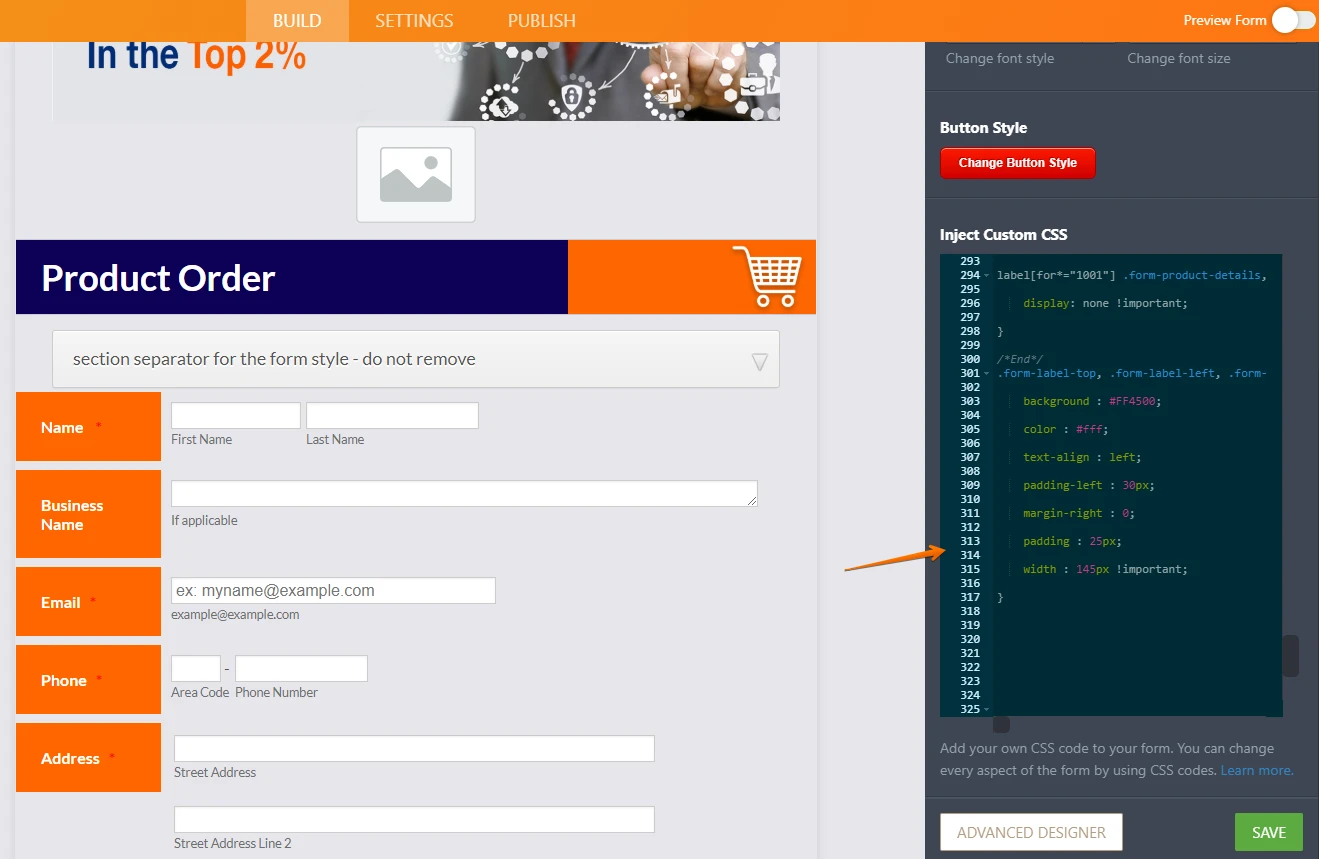
To increase the height, please add this custom CSS code to your form:
img.form-image {
height: 100px !important;
}
To add custom CSS code to your form, please follow this guide:
https://www.jotform.com/help/117-How-to-Inject-Custom-CSS-Codes
-
ResumeProductsReplied on January 23, 2020 at 4:49 PM
Looks terrible all stretched out when adding the code. I want it to look exactly like the original "Product Order" bar, with the updated shopping cart. Is there a code used for that one or can you just change the black to blue and the basket to the shopping cart?
Also, I've been trying to upload the updated image below, but it keeps coming up "server error."

-
VincentJayReplied on January 23, 2020 at 6:01 PM
Please keep in mind that the two are different.

You might need to insert the Image to the Header field instead of using the Image field as your Header Image.
Please keep in mind that your image will look different depending on the user view (mobile, tablet, or computer)

Do you have any image that is mobile responsive?
-
ResumeProductsReplied on January 23, 2020 at 6:04 PM
Not all images are JPEGs. How does one make them responsive? If replacing the image works, that would certainly be an easy solution. I tried to upload the new image but I haven't been able to upload any of late. Can I go in and delete some images I'm not using (I tried different ones till they fit)?

-
Kevin Support Team LeadReplied on January 23, 2020 at 9:13 PM
What happens is that the image will fit the screen, if you notice on your screenshot the image is well proportioned according to the screen:

Now note that if the image itself is increased in size this will not be displayed on the full screen of the form and the user would need to scroll to view the entire image. Also, note that if your purpose is to increase the size or icons inside the image you would need to edit the image itself on your editor.
Also, it's possible to delete the uploaded files on an image element, here is a screenshot about where to find this:

Let us know if you have questions.
-
ResumeProductsReplied on January 25, 2020 at 2:40 PM
What are you not getting? I want it to look like the original Product Order section that is much larger and responsive. Look at your own screen shot and see the difference. :/ I'm so late with getting this form done!
-
John Support Team LeadReplied on January 25, 2020 at 4:00 PM
We can use this custom CSS code in the form:
@media screen and (max-width: 480px){
div#cid_59 > img {
height: 100px;
width:400px;
}
}
However, as my colleague has mentioned, this will make the to be stretched/out-of-proportioned. You need to upload an image with the exact same size/dimensions as that of a mobile phone's screen (maximum 480px width). You'll be needing a photo editor to do that.
-
ResumeProductsReplied on January 25, 2020 at 6:22 PM
Okay, so this is not working with my added image. Can you just change the original Product Order rectangle to the blue then instead?
-
David JotForm Support ManagerReplied on January 25, 2020 at 9:44 PM
Hi, I managed to change the header by modifying this code:

So, it would look like this in desktop:

And it would look like this in mobile:

Here is my clone version: https://form.jotform.com/200248424415952
If that is what you want, please confirm that you allow us to simply replace the whole injected CSS code of your form with the CSS code of my clone version.
-
ResumeProductsReplied on January 26, 2020 at 1:32 PM
That's perfect! Please do so. :)
-
VincentJayReplied on January 26, 2020 at 2:41 PM
I checked your form and you remove the image. You can clone the form of my colleague by following this guide: How-to-Clone-an-Existing-Form-from-a-URL
Here's the cloned form: https://form.jotform.com/200248424415952
If you want us to add it to your form, you have two identical forms, could you please let us know which form link you want us to edit? To find the form link, please follow this guide: Where-to-Find-My-Form-URL
We'll wait for your reply. Thank you.
-
ResumeProductsReplied on January 26, 2020 at 2:57 PM
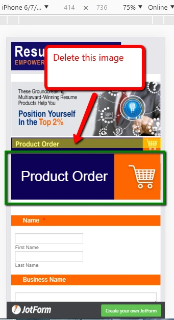
I thought you were replacing the current "Product Order" image that's why I deleted it. I was able to add it back in, so if you can fix it now that would be great.
I wasn't aware I had 2 forms, I'm only working on one. Here's the URL so you can fix it:
https://www.jotform.com/build/200164161802139
I think maybe when I was in preview mode and was trying out buttons, I hit the "Save for Later." I didn't think it would do anything, so I don't need that one at all.
-
David JotForm Support ManagerReplied on January 26, 2020 at 3:31 PM
Hi, I have added the code in your form, you may remove the image, result:
And your form looks the same: https://www.jotform.com/form/200164161802139

-
ResumeProductsReplied on January 26, 2020 at 3:43 PM
Much better, but the Mobile preview doesn't come up like you show it above. Why is that?

Also, my whole form looks different now when in Build mode. The left orange boxes are all one line now instead of boxes; the address section is spaced out; and the whole Product section is an old version (tho they are working on coding for that area so it might not matter). It looks more correct in Preview mode though. What happened?
-
jonathanReplied on January 26, 2020 at 4:48 PM
We apologize for any inconvenience caused. I was able to see the issue when I checked on your form using mobile device browser.
I found that there is a typo mistake on one line in the custom CSS codes injected.
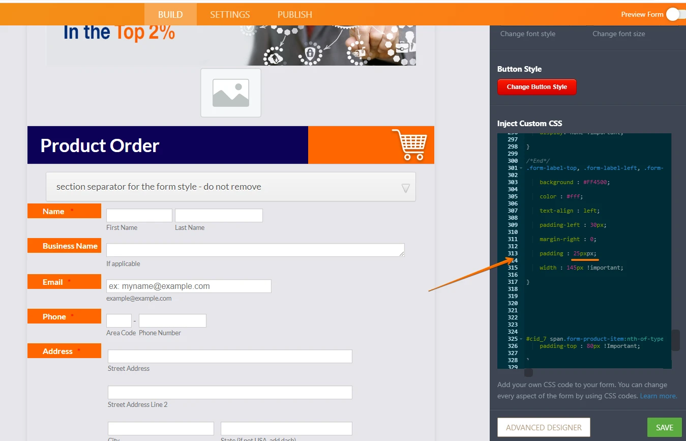
Please remove or correct the px to correct the codes. It should fix the issue.
Please let us know if issue persist.
-
ResumeProductsReplied on January 26, 2020 at 5:53 PM
I don't know what you mean, can you just fix it please?
-
jonathanReplied on January 26, 2020 at 7:14 PM
I fixed it on your form.

You can test/check again on your mobile browser.
It is working properly on my test.

Let us know if issue persist.
-
ResumeProductsReplied on January 26, 2020 at 7:39 PM
Nope, it still looks the same.
-
John Support Team LeadReplied on January 27, 2020 at 12:10 AM
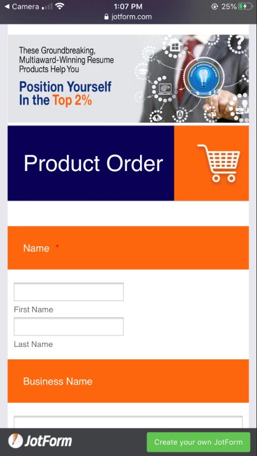
May we know if you already tried accessing the form using an actual mobile phone. Here's how it looks on my end:
-
ResumeProductsReplied on January 27, 2020 at 12:46 PM
So I copy and pasted the URL from the Preview mode and opened it on my phone. It looks a lot better, only the "r" in "Order" is running into the orange box.
-
VincentJayReplied on January 27, 2020 at 2:00 PM
Please add this custom CSS code to your form:
@media screen and (max-width: 640px)
.form-header-group .form-header {
font-size: 100% !important;
}
Guide: https://www.jotform.com/help/117-How-to-Inject-Custom-CSS-Codes
If the issue still persists, please provide us the mobile device you're using and what resolution settings you have on the computer you're using.
-
ResumeProductsReplied on January 27, 2020 at 2:20 PM
It's the same. I'm using an iPhone. All of my images I create in Photoshop at 300dpi. If you can fix it, that would be great; otherwise, I guess I'll live with it that way.
-
VincentJayReplied on January 27, 2020 at 4:23 PM
Please check my cloned form and see if the issue still persists:
https://form.jotform.com/200265926922961
Open the form to all your devices and let us know if that's what you're looking for.
-
ResumeProductsReplied on January 28, 2020 at 1:04 PM
Okay, it's an awful lot smaller now but that's fine. Thank you.
-
VincentJayReplied on January 28, 2020 at 2:07 PM
I see. If that is okay with you, we can apply it to your form.
We'll wait for your response. Thank you.
- Templates
- Integrations
- INTEGRATIONS
- See 100+ integrations
- FEATURED INTEGRATIONS
 PayPal
- Slack
- Google Sheets
- Mailchimp
- Zoom
- Dropbox
- Google Calendar
- Hubspot
- Salesforce
- See more Integrations
- Products
- PRODUCTS
- Form Builder
- Jotform Enterprise
- Jotform Apps
- Store Builder
- Jotform Tables
- Jotform Inbox
- Jotform Mobile App
- Jotform Approvals
- Report Builder
- Smart PDF Forms
- PDF Editor
- Jotform Sign
- Jotform for Salesforce Discover Now
- Support


