Jotform’s Dropdown element lets you present a list of options in a compact, organized menu. Users can click the dropdown field to select a single option from the list, making it ideal for forms with multiple choices while keeping the form clean and easy to navigate. It’s commonly used for selecting items such as countries, departments, categories, or predefined answers without taking up too much space on the form.
Here are a few ways to use it:
- Selecting a country or region in registration and contact forms.
- Choosing a department or service in customer support request forms.
- Picking a product category in order and inventory forms.
- Selecting appointment times or available schedules in booking forms.
- Choosing survey answers such as satisfaction levels, ratings, or preferences.
Pro Tip
The Dropdown element is available in both Classic and Card Forms. You can check out our guide on When to Use Card Forms to learn more.
Adding the Dropdown Element
Whether you’re creating a new form or updating an existing one, you can add the Dropdown element in a few easy steps. Here’s how to do it:
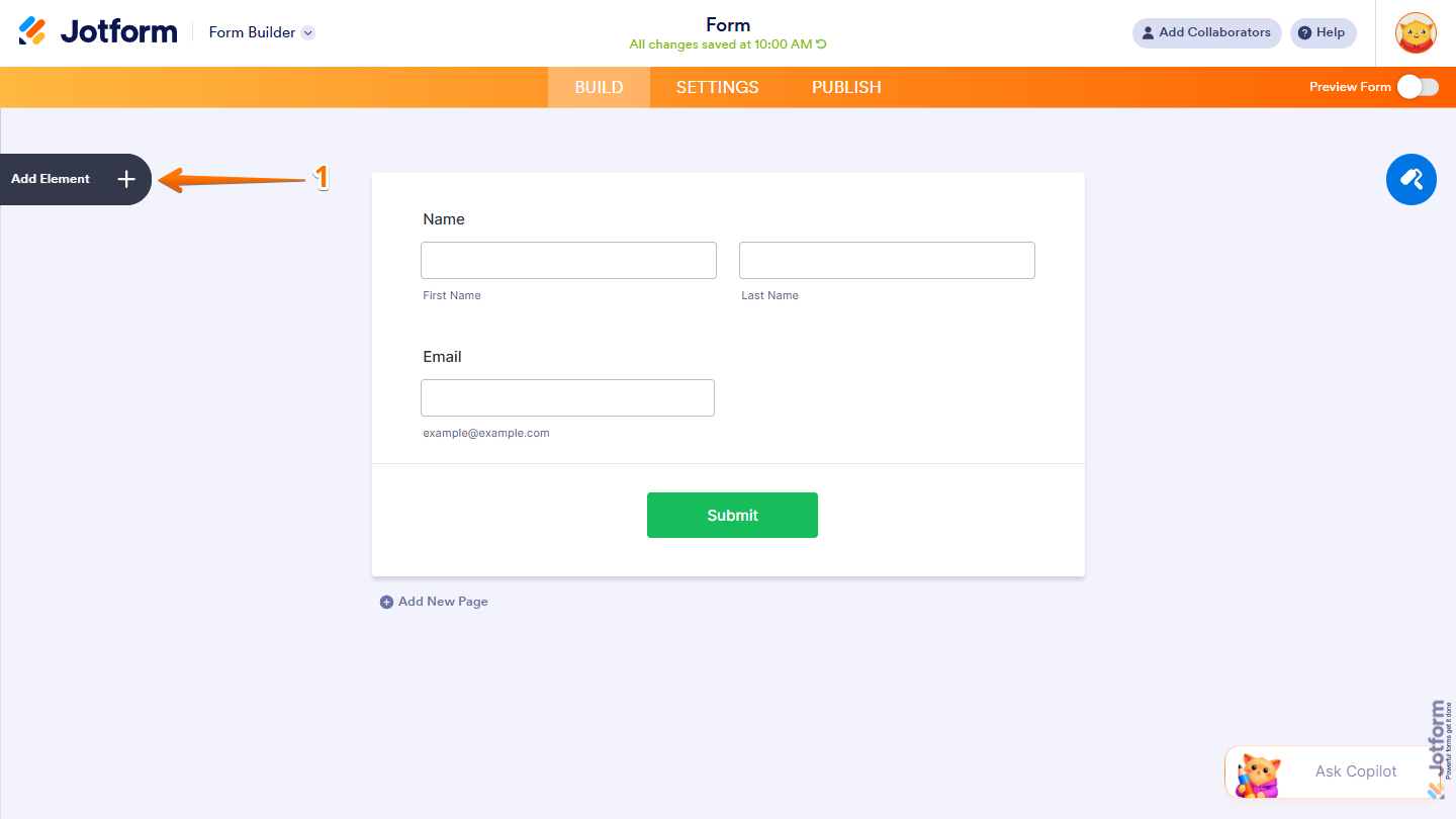
- In Form Builder, click on Add Element on the left side of the page.
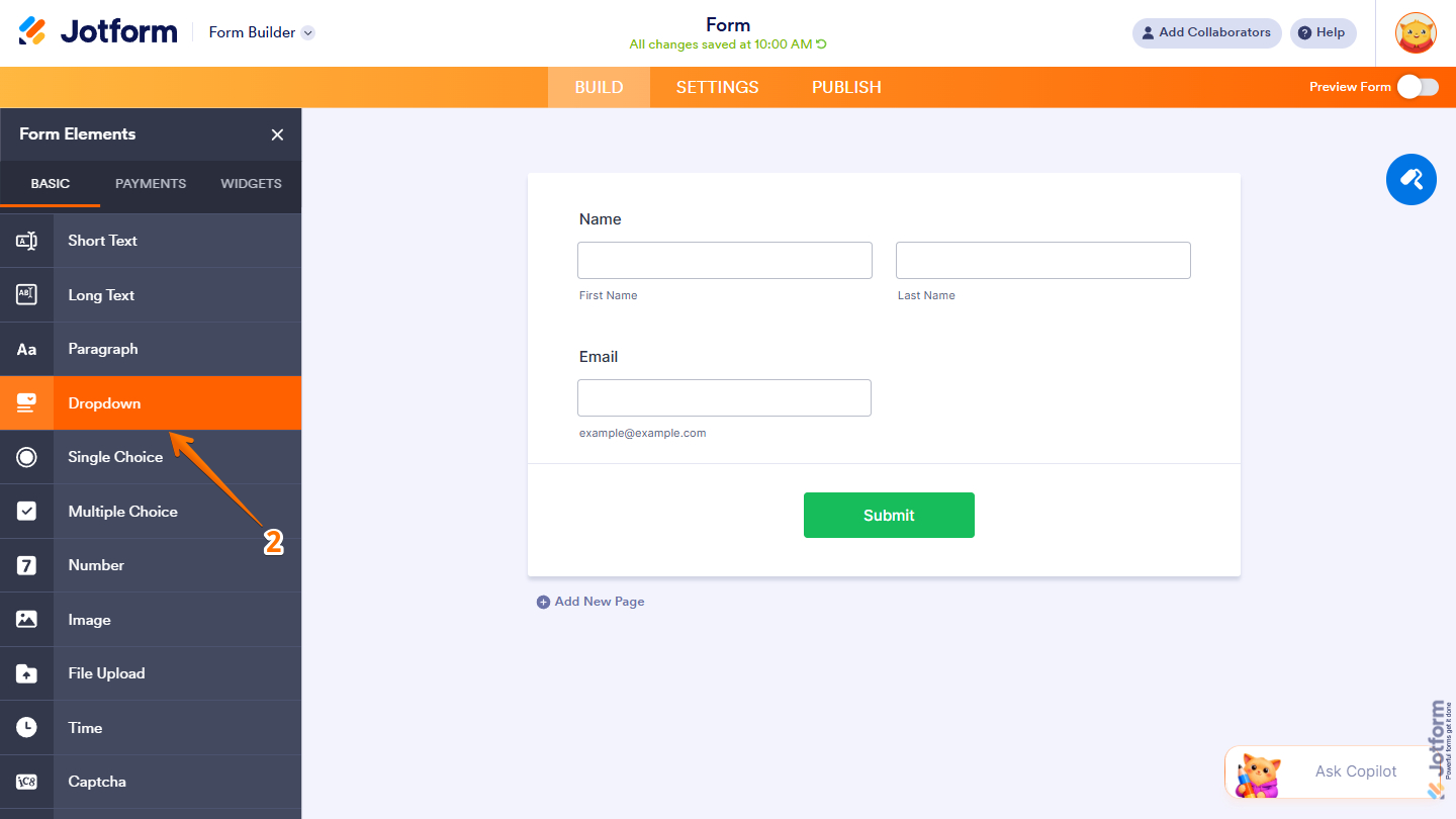
- Then, in the Form Elements menu, under the Basic tab, scroll down and then click on Dropdown. Or drag and drop it to where you want it on your form.
Once you’ve added the Dropdown element to your form, you can adjust how it appears and how the options work through the following tabs:
Configuring the General Tab
The General tab of the Dropdown element properties lets you customize the labels, including their alignment and overall display settings. It only takes a minute to set up—here’s how:
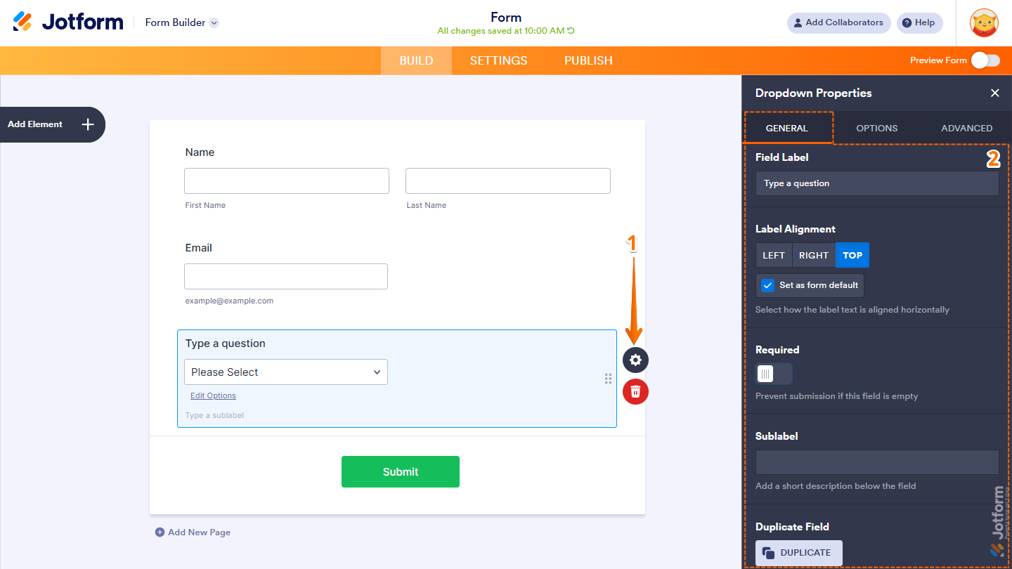
- In Form Builder, while your Dropdown element is selected on your form, click on the Gear icon.
- Then, in the Dropdown Properties menu that opens on the right side of the page, under the General tab, set up these things:
- Field Label — Enter the text that will appear as the label for the field.
- Label Alignment — Choose whether the label appears on the Left, Right, or Top of the field.
- Set as Form Default — Enable this option to apply the selected label alignment as the default for all form fields.
- Required — Turn on this option to make the field mandatory and prevent form submission when left empty.
- Sublabel — Add a short description or instruction that appears below the field.
- Duplicate Field — Creates a copy of the field, including all its current settings and configurations.
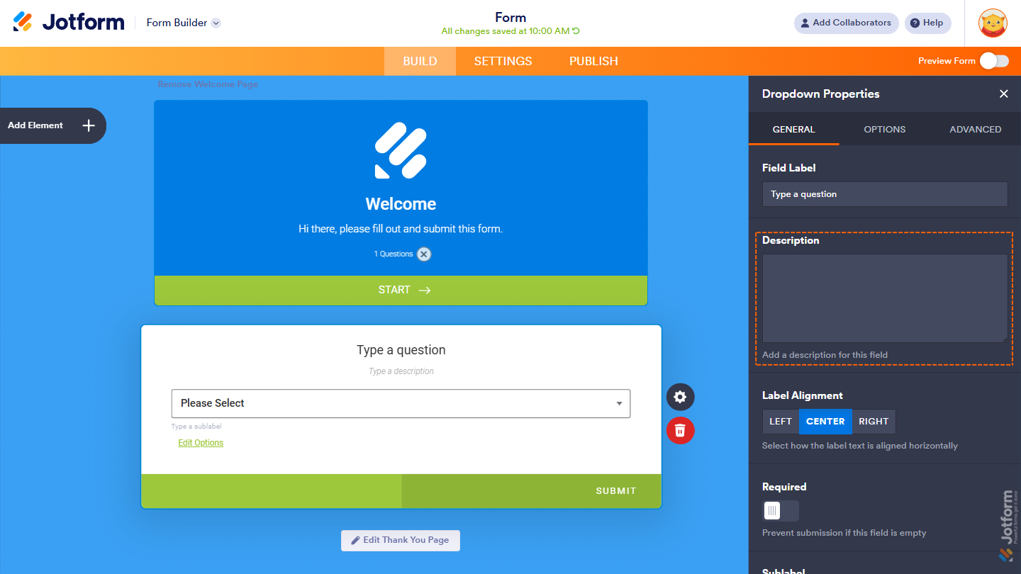
In Card Forms, you can enter text in the Description property to add context or instructions that appear below your field label.
Note
Label Alignment in Card Form is applied globally to all fields. Individual fields cannot have separate label alignment settings.
That’s it. You’ve configured the General tab properties of the Dropdown element on your form.
Setting Up the Options Tab
The Options tab lets you manage the items displayed in the Dropdown element, including how they are added, organized, and shown on the form. Here’s what to do next:
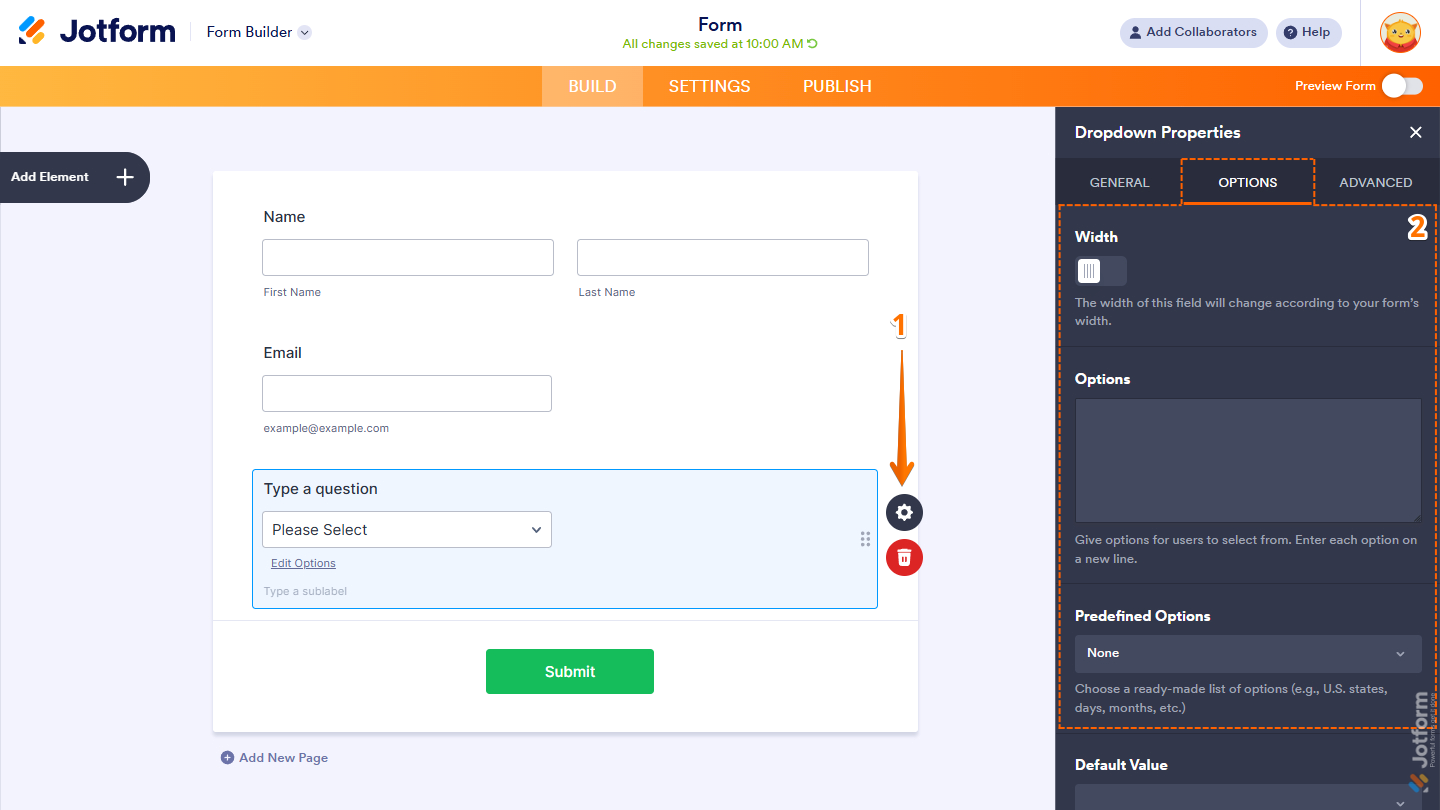
- In Form Builder, while your Dropdown element is selected on your form, click on the Gear icon.
- Then, in the Dropdown Properties menu that opens on the right side of the page, under the Options tab, configure these things:
- Width — Enable this option to set a fixed width for the Dropdown element. Leave it disabled to keep the field responsive across different devices and screen sizes.
- Options — Add the choices users can select from. Enter each option on a separate line.
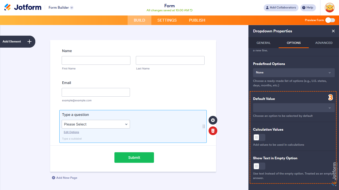
- Predefined Options — Select from ready-made option lists, such as countries, months, days, U.S. states, and more.
Pro Tip
In both Classic and Card Layouts, you can quickly add or edit choices by clicking the Edit Options link located at the bottom of the Dropdown element.
- Next, scroll down to the bottom and then continue setting up these options:
- Default Value — Select an option that is automatically selected when the form loads.
- Calculation Values — Assign custom values to options for use in form calculations and conditions.
- Show Text in Empty Option — Display custom placeholder text instead of a blank option while still treating it as an empty response.
Notes
- The Calculation Values option is useful for forms with simple product listings or pricing selections. You can assign values to each dropdown option and use them to automatically calculate totals based on the user’s selection. Check out our guide on How to Assign Calculation Values to learn more.
- The Width option is not available in Card Forms, as Card Forms automatically adjust field sizes for responsive layouts.
That’s it! You’ve successfully set up the Options tab of the Dropdown element, including how the options are added, displayed, and used within your form.
Managing the Advanced Tab
The Advanced tab of the Dropdown element lets you control how users interact with the available choices, along with additional display and behavior settings for the field. Here’s how to get going:
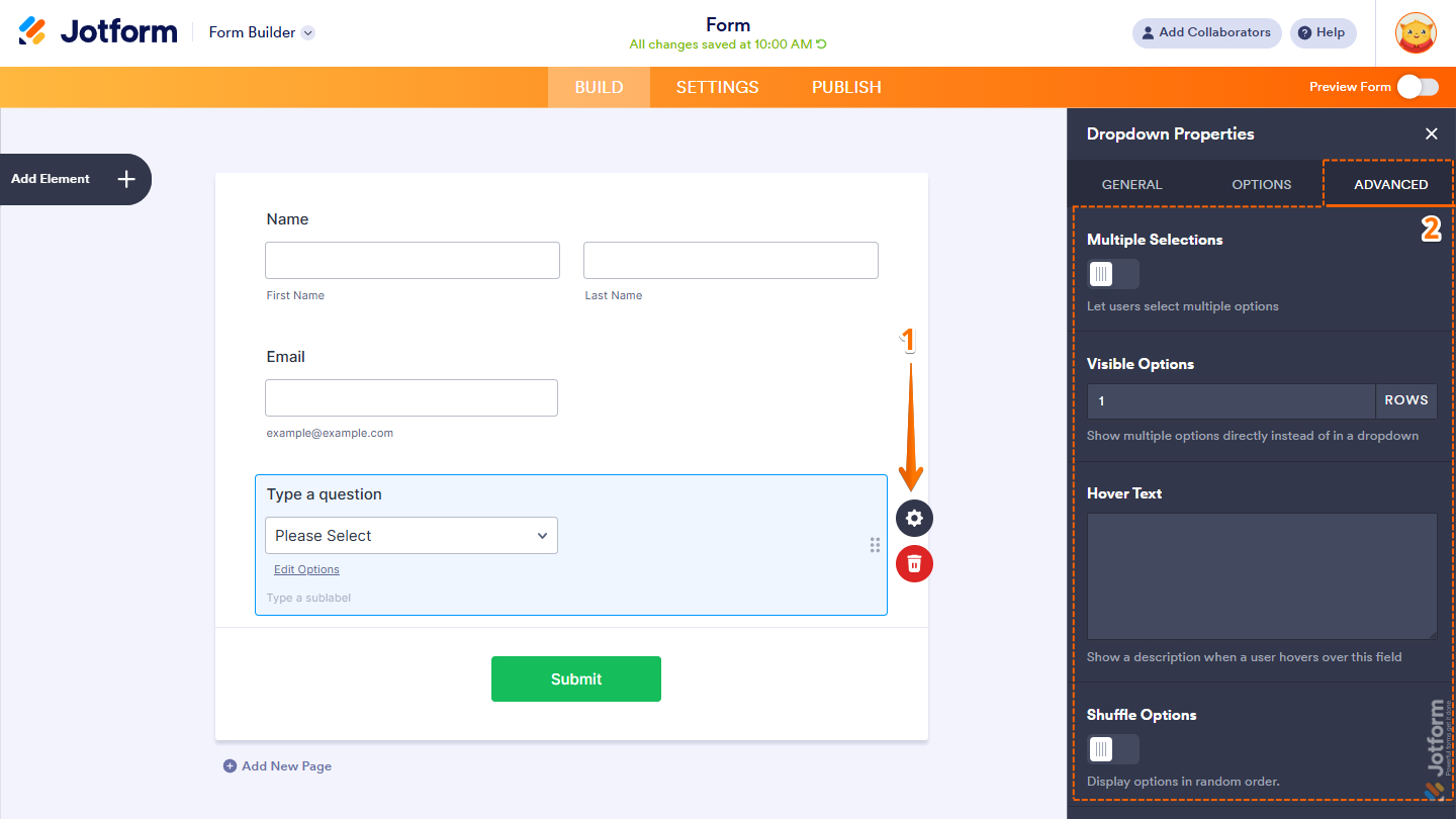
- In Form Builder, while your Dropdown element is selected on your form, click on the Gear icon.
- Then, in the Dropdown Properties menu that opens on the right side of the page, under the Advanced tab, set up these things:
- Multiple Selections — Allow users to choose more than one option from the Dropdown element.
- Visible Options — Display multiple options directly in the field rather than in a dropdown menu.
- Hover Text — Show additional information or a short description when users hover over the field.
- Shuffle Options — Randomize the order of the options each time the form is loaded.
Note
The Visible Options and Hover Text settings are not available in Card Forms.
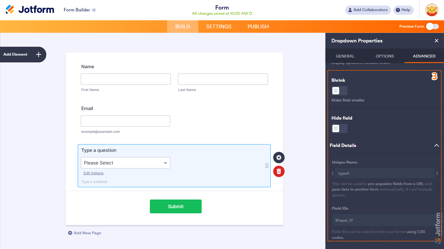
- Next, scroll down to the bottom and optionally complete these options:
- Shrink — Reduce the field’s size to use less space on the form layout. Check out our guide on Setting Up Form Columns to learn more. You’ll only find this property in Classic Forms.
- Hide Field — Keep the field hidden from users, which is useful for storing admin-only or internal data.
- Field Details — Click on this section to expand it and view, copy, or update your Dropdown field’s Unique Name, which is used to reference it in integrations, calculations, and other advanced form features. Check out our guide on How to Find Field IDs and Unique Names to learn more.
Note
The Shrink option is also not available in Card Forms.
That’s it! You now have the Dropdown element set up on your form. Users can now select and submit their preferred option from the dropdown list, helping keep your form clean, organized, and easy to complete.

Send Comment: