The Number element lets you collect numeric input from users in a clean and organized format. It’s ideal for gathering values such as quantities, prices, percentages, ratings, ages, measurements, and other number-based data. You can customize the field with placeholders, default values, validation rules, and limits to ensure users enter accurate information. The Number element also works seamlessly with calculations, formulas, and conditional logic, making it useful for order forms, surveys, registrations, and more.
Here are a few ways to use it:
- Collect quantities for product orders or inventory requests.
- Gather age, weight, height, or other measurable information in registration forms.
- Accept payment amounts, budgets, or donation values.
- Record ratings, scores, or survey scales using numeric input.
- Capture attendance counts, ticket numbers, or participant totals for events.
Pro Tip
The Number element is available in both Classic and Card Forms. You can check out our guide on When to Use Card Forms to learn more.
Adding the Number Element
Whether you’re creating a new form or updating an existing one, you can add the Number element in a few easy steps. Here’s how to do it:
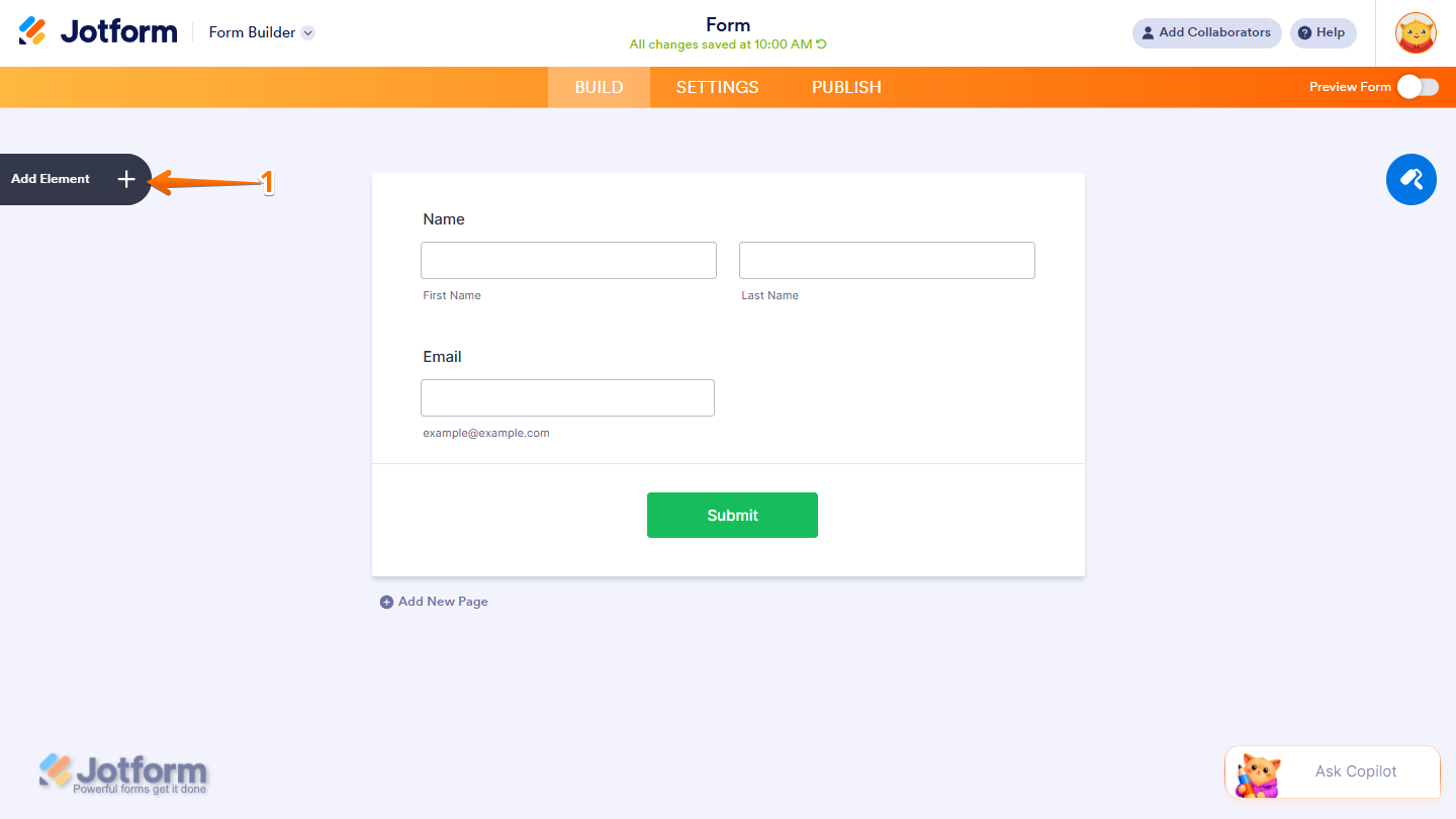
- In Form Builder, click on Add Element on the left side of the page.
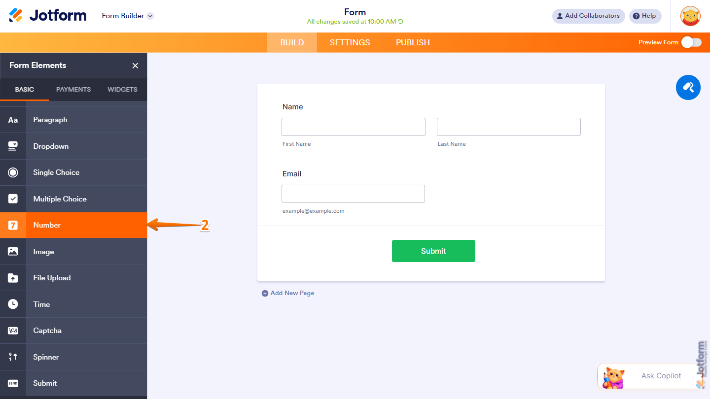
- Then, in the Form Elements menu, under the Basic tab, scroll down and then click on Number. Or just drag and drop it to where you want it on your form.
Once you’ve added the Number element to your form, you can adjust how it appears and how the field works through the following tabs:
- General
- Options
- Advanced
Configuring the General Tab
The General tab of the Number element properties lets you customize the labels, including their alignment and overall display settings. It only takes a minute to set up—here’s how:
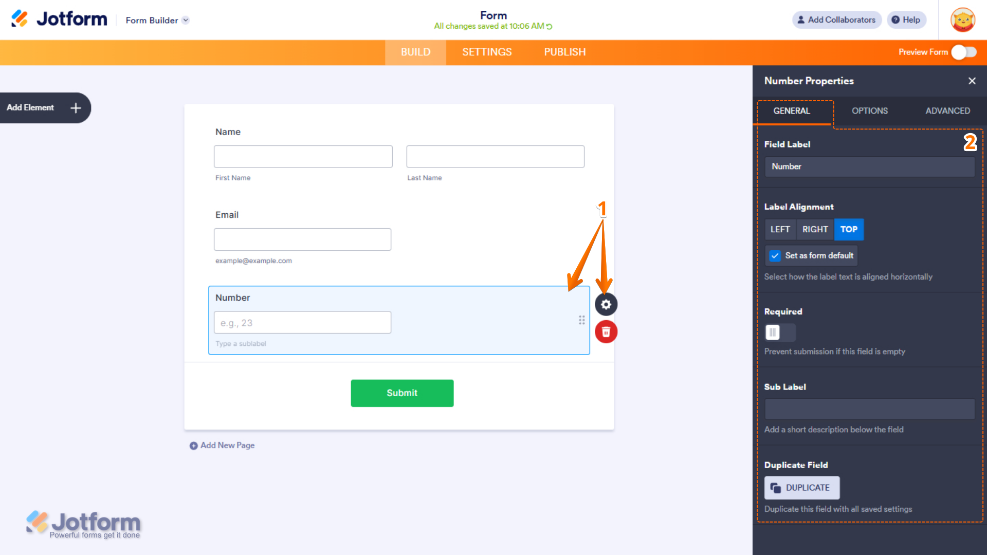
- In Form Builder, while your Number element is selected on your form, click on the Gear icon.
- Then, in the Number Properties menu that opens on the right side of the page, under the General tab, set up these things:
- Field Label — Enter the text that will appear as the label for the field.
- Label Alignment — Choose whether the label appears on the Left, Right, or Top of the field.
- Set as Form Default — Enable this option to apply the selected label alignment as the default for all form fields.
- Required — Turn on this option to make the field mandatory and prevent form submission when left empty.
- Sub Label — Add a short description or instruction below the field to provide users with additional information.
- Duplicate Field — Creates a copy of the field, including all its current settings and configurations.
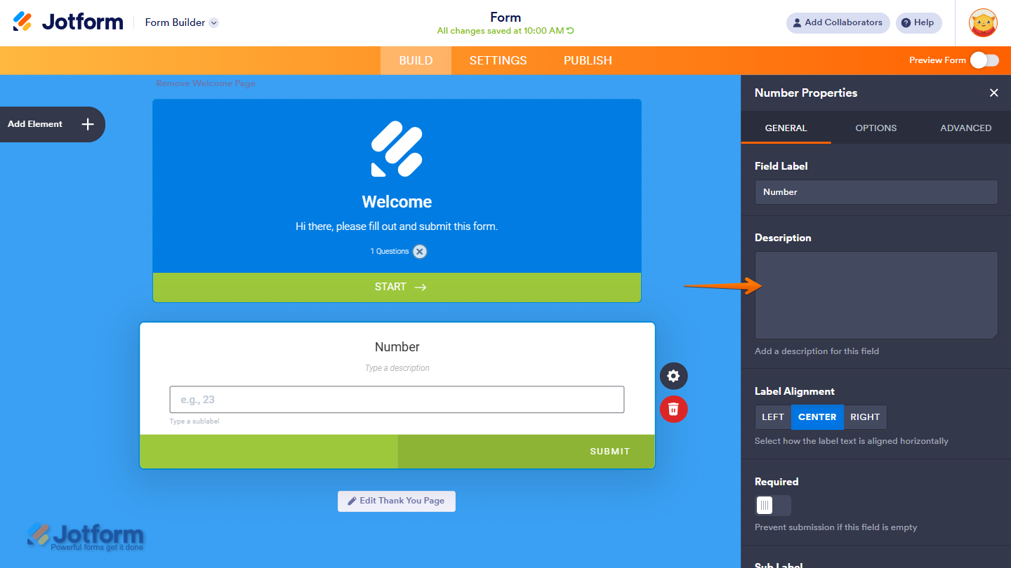
In Card Forms, you can enter text in the Description property to add context or instructions that appear below your field label.
Note
Label Alignment in Card Form is applied globally to all fields. Individual fields cannot have separate label alignment settings.
That’s it. You’ve configured the General tab properties of the Number element on your form.
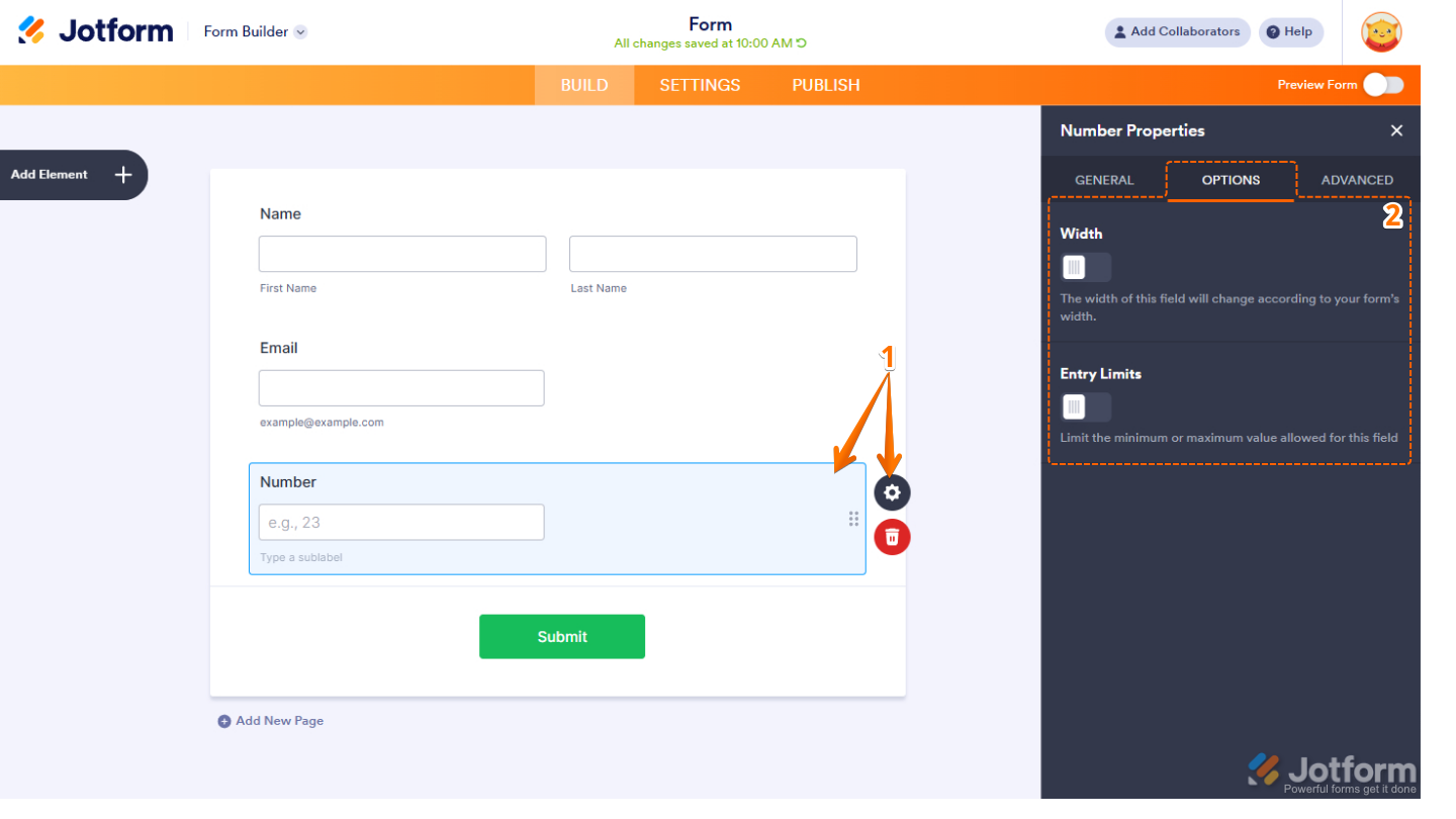
Setting Up the Options Tab
The Options tab of the Number element lets you adjust the field size, set minimum and maximum values to control how users enter numeric data. Here’s what to do next:
- In Form Builder, while your Number element is selected on your form, click on the Gear icon.
- Then, in the Number Properties menu that opens on the right side of the page, under the Options tab, configure these things:
- Width — Adjust the field width to fit your form layout and improve spacing.
- Entry Limits — Set the minimum and maximum values allowed for this field to control user input.
Note
The Width option is not available in Card Forms, as the field automatically adjusts to fit the card layout.
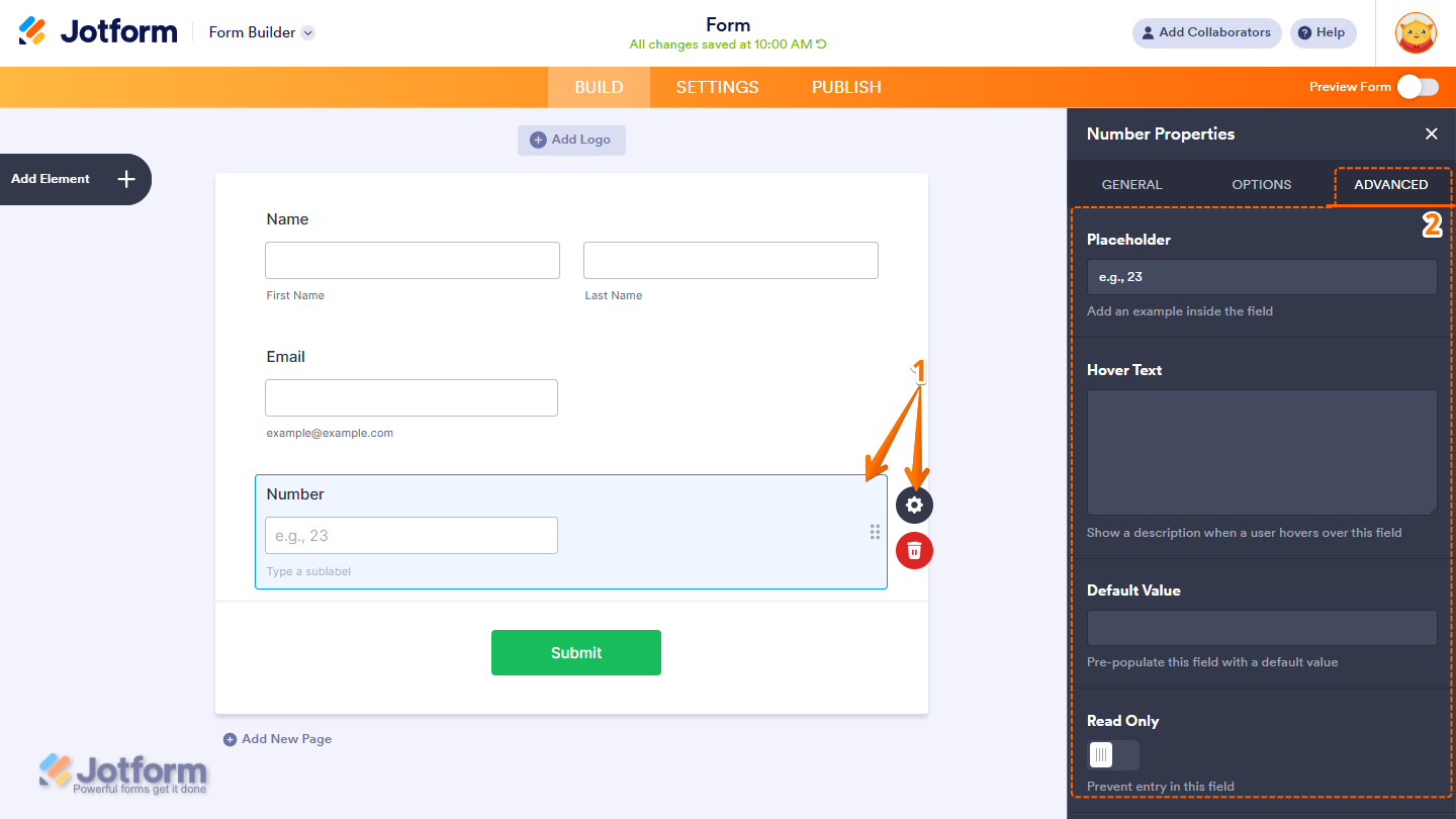
Managing the Advanced Tab
In the Advanced tab of the Number element, you’ll find the options that let you add more text to the display of the field and control how it behaves in your form. Here’s how to set it up:
- In Form Builder, while your Number element is selected on your form, click on the Gear icon.
- Then, in the Number Properties menu that opens on the right side of the page, under the Advanced tab, configure these things first:
- Placeholder — Display example text inside the field to guide users on what to enter.
- Hover Text — Show additional information or instructions when users hover over the field.
- Default Value — Automatically pre-fill the field with a default number or value.
- Read Only — Make the field non-editable to prevent users from changing its value.
Note
The Hover Text in Classic Forms is equivalent to the Description box in Card Forms.
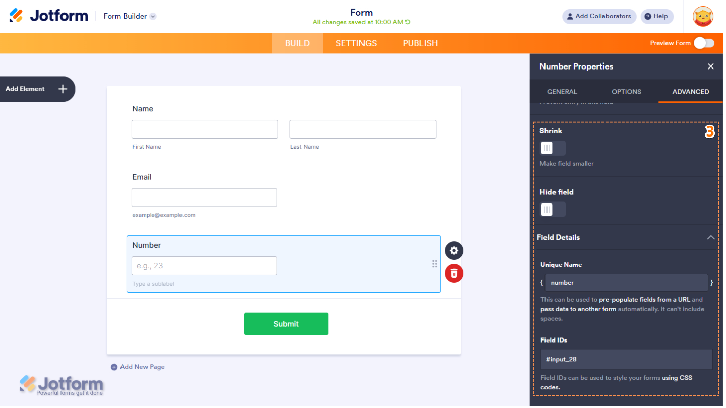
- Next, scroll down to the bottom and then optionally complete these options:
- Shrink — Reduce the field’s width to make it appear smaller in the form layout. Check out our guide on Setting Up Form Columns to learn more. You’ll only find this property in Classic Forms.
- Hide Field — Keep the field hidden from users, which is useful for storing admin-only or internal data.
- Field Details — Click on this section to expand it and view, copy, or update your Number field’s Unique Name, which is used to reference it in integrations, calculations, and other advanced form features. Check out our guide on How to Find Field IDs and Unique Names to learn more.
Note
The Shrink option is not available in Card Form Layouts due to the fixed design and structure of card-based fields.
That’s it! You now have the Number element set up on your form. Users can now enter numeric values accurately and within the limits you’ve configured.

Send Comment: