The Single Choice element lets users select one option from a list of predefined choices in your form. It’s a simple and effective way to collect clear, organized responses for questions where only one answer is allowed, such as selecting a preferred option, choosing a category, or confirming a decision. The Single Choice element helps make forms easier to complete while keeping submitted data accurate and consistent.
Here are a few ways to use it:
- Let users select their preferred contact method, such as Email, Phone, or SMS.
- Allow customers to choose a subscription plan or pricing package.
- Collect responses for yes or no questions, such as confirming attendance or agreement.
- Ask applicants to select their department, role, or area of interest in a registration form.
- Let users choose a payment method, delivery option, or appointment type.
Pro Tip
The Single Choice element is available in both Classic and Card Forms. You can check out our guide on When to Use Card Forms to learn more.
Adding the Single Choice Element
Whether you’re creating a new form or updating an existing one, you can add the Single Choice element in a few easy steps. Here’s how to do it:
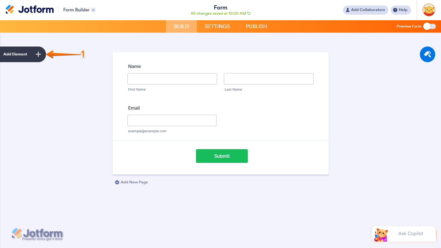
- In Form Builder, click on Add Element on the left side of the page.
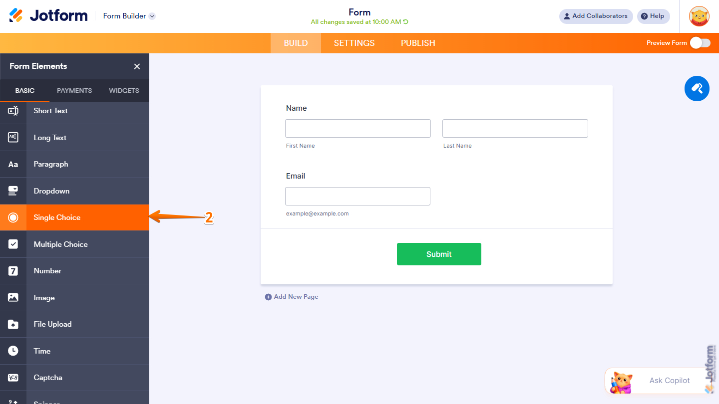
- Then, in the Form Elements menu, under the Basic tab, scroll down and then click on Single Choice. Or just drag and drop it to where you want it on your form.
Once you’ve added the Single Choice element to your form, you can adjust how it appears and how the options work through the following tabs:
Configuring the General Tab
The General tab of the Single Choice element lets you customize the labels, including their alignment and overall display settings. It only takes a minute to set up—here’s how:
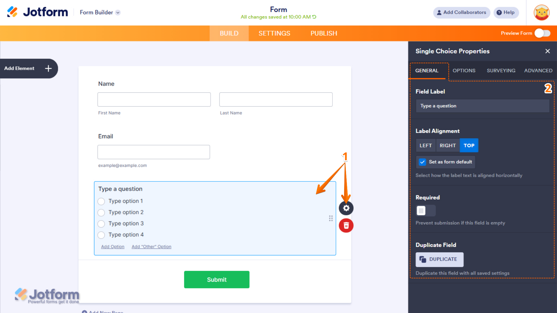
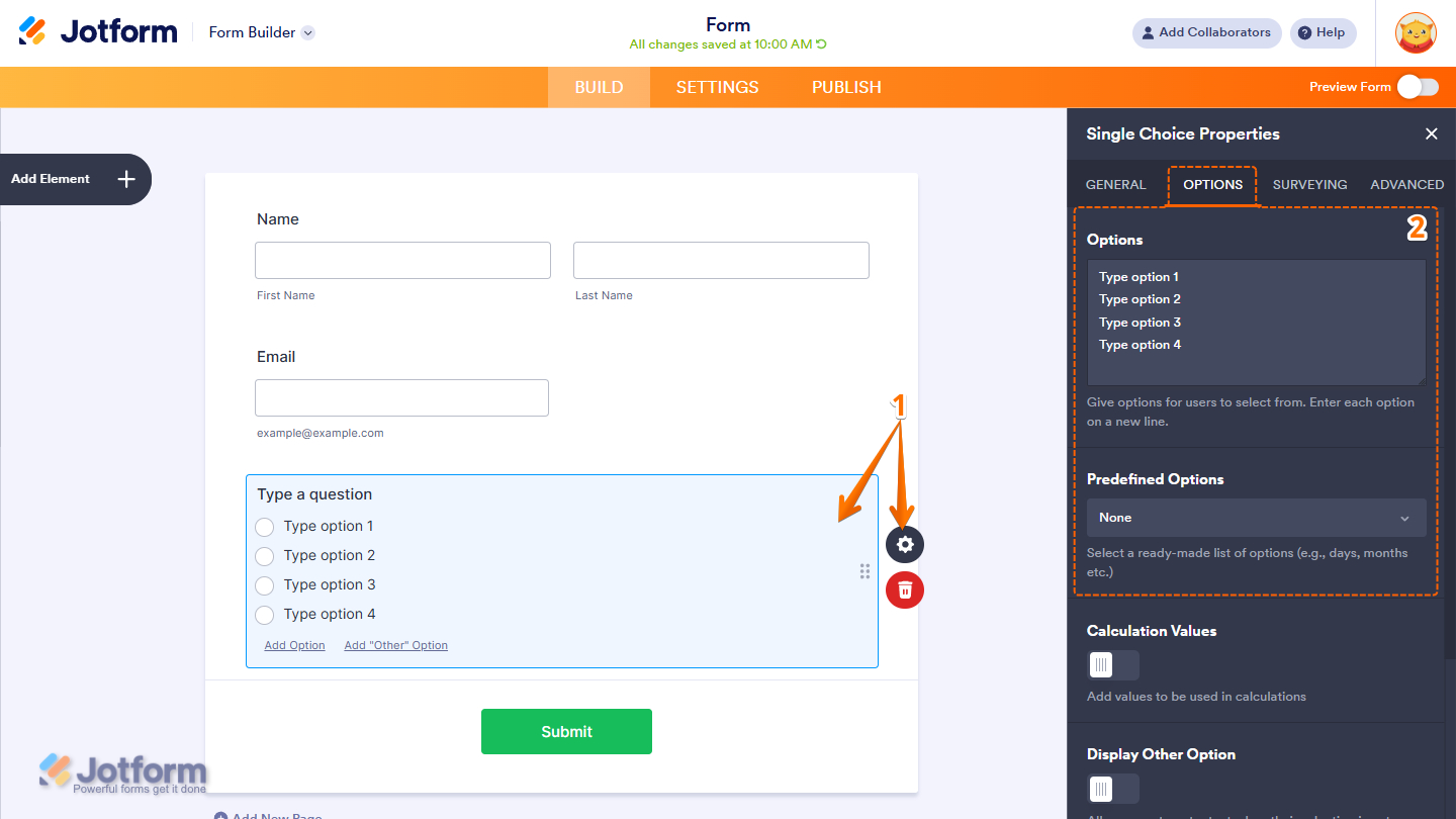
- In Form Builder, select the Single Choice element, and then click on the Gear icon to open Single Choice Properties.
- Then, in the Single Choice Properties menu that opens on the right side of the page, under the General tab, set up these things:
- Field Label — Enter the text that will appear as the label for the field.
- Label Alignment — Choose whether the label appears on the Left, Right, or Top of the field.
- Set as Form Default — Enable this option to apply the selected label alignment as the default for all form fields.
- Required — Turn on this option to make the field mandatory and prevent form submission when left empty.
- Duplicate Field — Creates a copy of the field, including all its current settings and configurations.
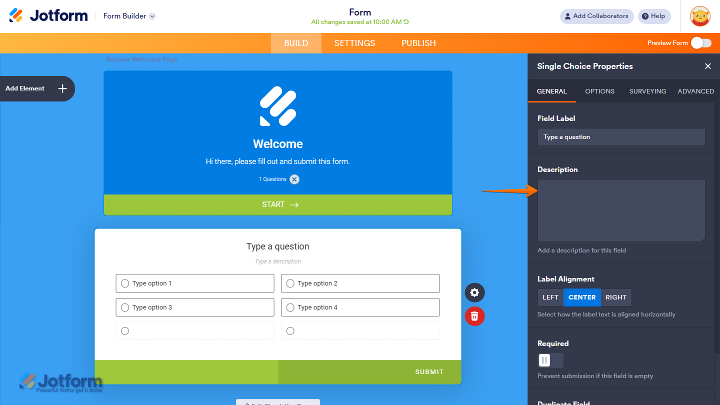
In Card Forms, you can enter text in the Description field to add context or instructions that appear below your field label.
Note
Label Alignment in Card Form is applied globally to all fields. Individual fields cannot have separate label alignment settings.
Setting Up the Options Tab
The Options tab lets you manage the items displayed in the Single Choice element, including how they are added, organized, and shown on the form. Here’s what to do next:
- In Form Builder, select the Single Choice element, and then click on the Gear icon to open Single Choice Properties.
- Then, in the Single Choice Properties menu that opens on the right side of the page, under the Options tab, configure these things:
- Options — Add the choices users can select from. Enter each option on a separate line.
- Predefined Options — Select from ready-made option lists, such as Gender, Days, and Months.
Pro Tip
In both Classic and Card Layouts, you can quickly add new options by clicking Add Option at the bottom of the field. You can also edit existing options anytime by simply clicking on the option text and entering a new name.
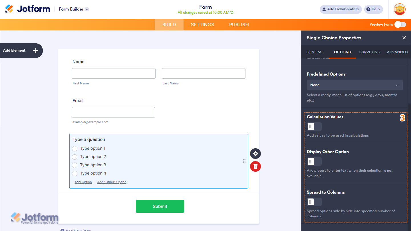
- Next, scroll down to the bottom and continue setting up these options:
- Calculation Values — Assign custom numeric values to each option for use in form calculations, formulas, and conditional logic.
- Display Other Option — Enable this option to add an “Other” choice, allowing users to enter their own custom response.
- Spread to Columns — Arrange options side by side by distributing them into a specified number of columns for a cleaner layout.
Notes
- The Calculation Values option is useful for forms with simple product listings or pricing selections. You can assign values to each dropdown option and use them to automatically calculate totals based on the user’s selection. Check out our guide on How to Assign Calculation Values to learn more.
- In both Classic and Card Layouts, you can quickly add the Other option by clicking Add “Other” Option at the bottom of the field.
- The Spread to Columns option is not available in Card Form Layouts because the choices are already displayed in a column-based format.
Setting up the Surveying Tab
The Surveying tab lets you set the options in a random order each time the form is opened. This helps reduce bias in survey responses by preventing choices from always appearing in the same position. Here’s how to get going:
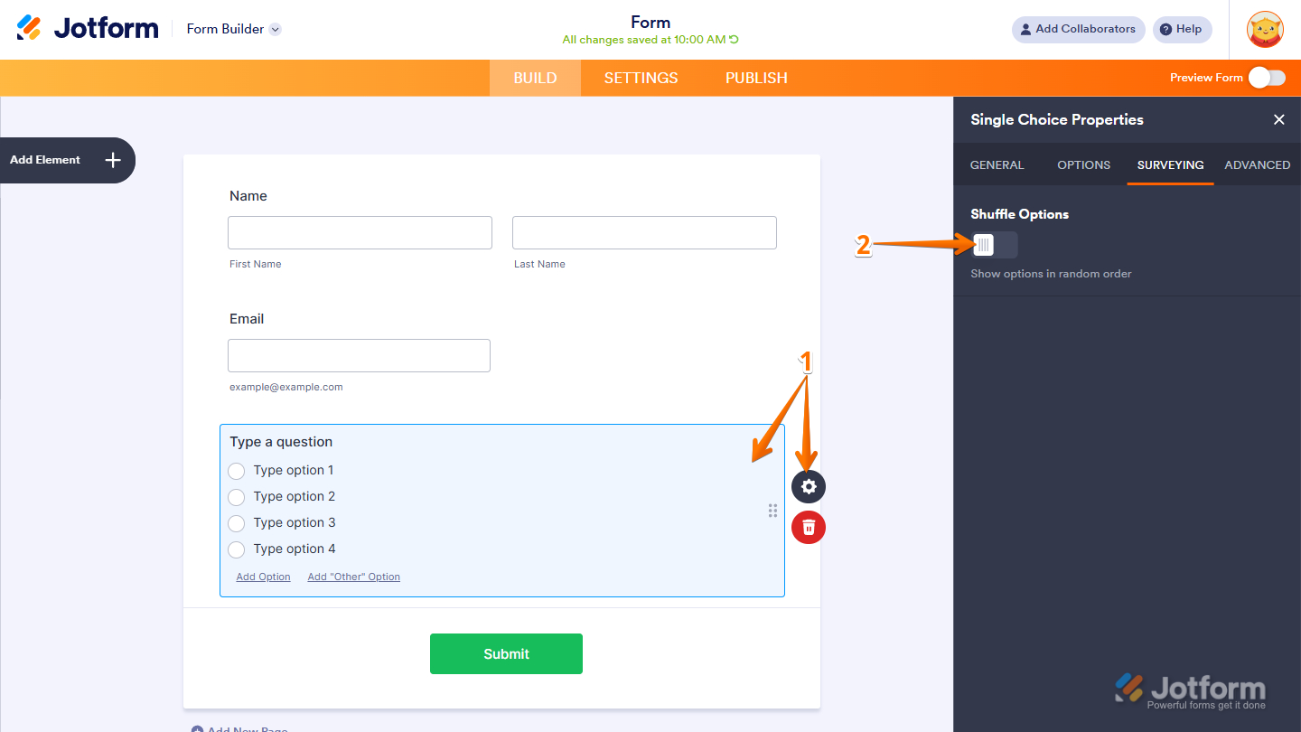
- In Form Builder, select the Single Choice element, and then click on the Gear icon to open Single Choice Properties.
- Then, in the Single Choice Properties menu that opens on the right side of the page, under the Surveying tab, toggle on the Shuffle Options to show the options you’ve added in a random order.
Managing the Advanced Tab
The Advanced tab of the Single Choice element contains additional settings that let you customize how the field looks and behaves in your form. Here’s how to set it up:
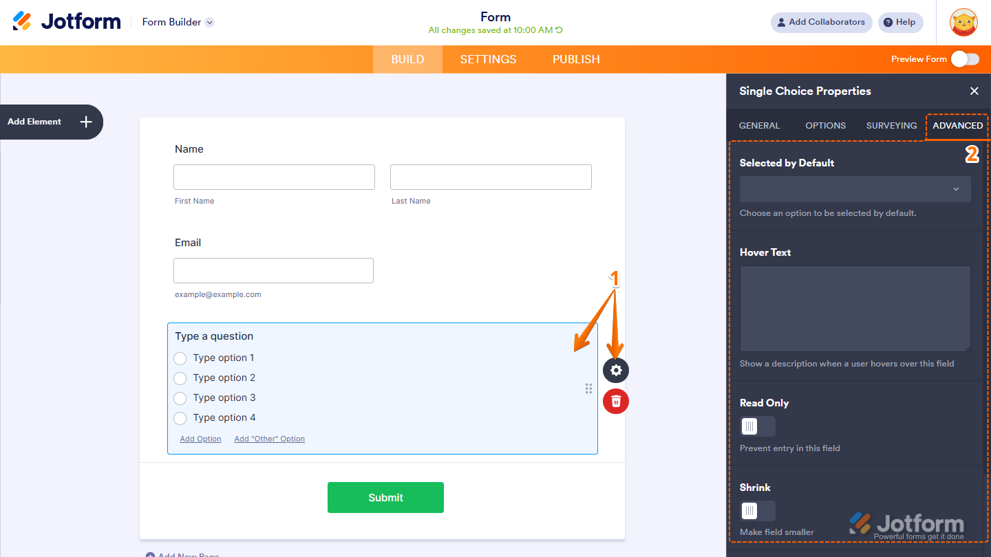
- In Form Builder, select the Single Choice element, and then click on the Gear icon to open Single Choice Properties.
- Then, in the Single Choice Properties menu that opens on the right side of the page, under the Advanced tab, configure these things first:
- Selected by Default — Set an option to be automatically selected when the form loads.
- Hover Text — Display a short description or helpful information when users hover over the field.
- Read Only — Make the field non-editable to prevent users from changing its value.
- Shrink — Reduce the field’s width to make it appear smaller in the form layout. Check out our guide on Setting Up Form Columns to learn more. You’ll only find this property in Classic Forms.
Note
The Hover Text and Shrink settings are not available in Card Form Layouts due to the fixed design and structure of card-based fields.
- Next, scroll down to the bottom and optionally complete these options:
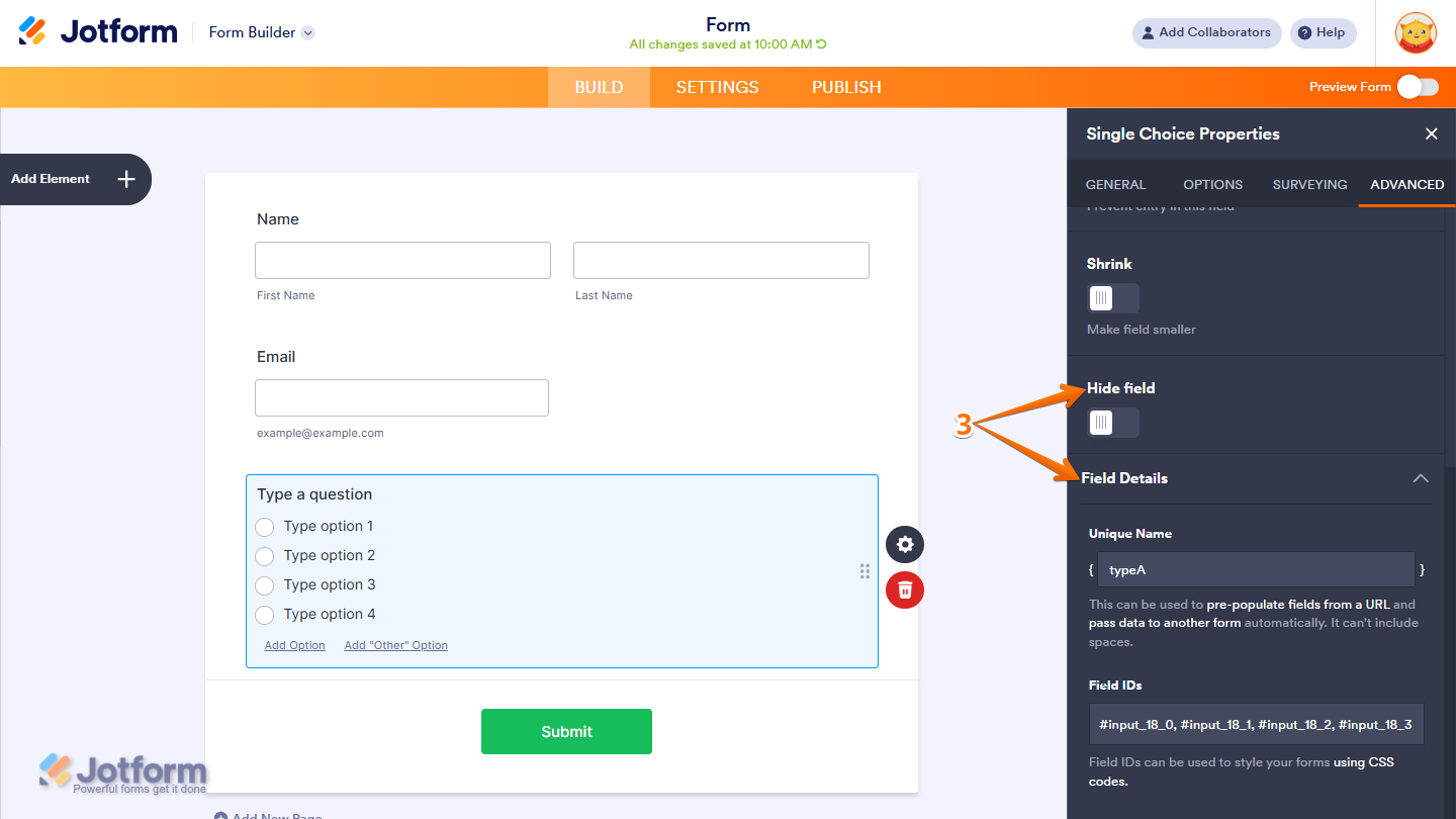
- Hide Field — Keep the field hidden from users, which is useful for storing admin-only or internal data.
- Field Details — Click on this section to expand it and view, copy, or update your Single Choice field’s Unique Name, which is used to reference it in integrations, calculations, and other advanced form features. Check out our guide on How to Find Field IDs and Unique Names to learn more.
That’s it! You now have the Single Choice element set up on your form. Users can now easily select and submit a single option from the choices you’ve provided, helping you collect clear and organized responses.

Send Comment: