Jotform’s Star Rating Comment widget lets you collect star ratings and written feedback together, giving you both a measurable score and the context behind it. It’s useful for product reviews, customer satisfaction surveys, course evaluations, support feedback, and other forms where you want to understand not only how respondents rate something, but why. With flexible rating and comment options, you can tailor the feedback experience to your needs while keeping it simple and convenient for respondents.
Here are a few ways to use it:
- Collect product ratings with written review details.
- Measure customer service satisfaction and understand the reasons behind each rating.
- Gather course evaluation scores with learner feedback.
- Collect feedback and comments after support interactions.
- Pair research ratings with qualitative observations.
Note
The Star Rating Comment widget is available on both Classic and Card Forms. Check out our guide on When to Use Card Forms to learn more.
Whether youʼre creating a new form or updating an existing one, you can add and configure the Star Rating Comment widget in just a few steps. Here’s how to do it:
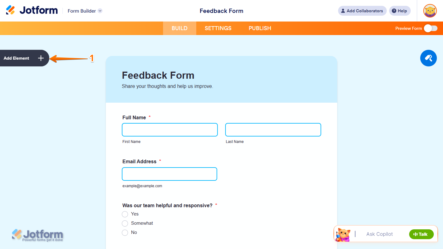
- In Form Builder, click on Add Element on the left side of the page.
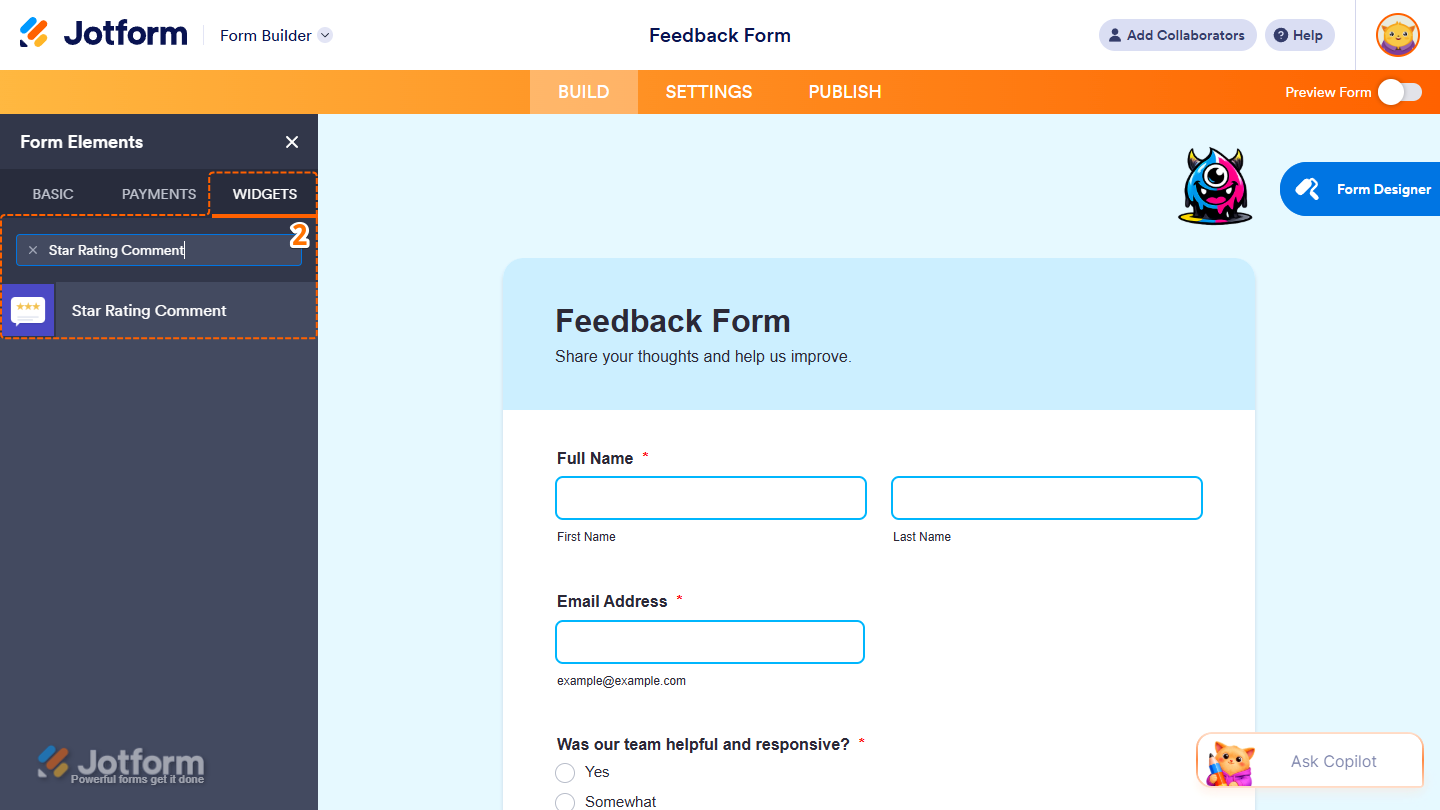
- Now, in the Form Elements menu, under the Widgets tab, search for Star Rating Comment and click on it. Or, drag and drop it to where you want it to appear on your form.
Note
You can only add one Star Rating Comment widget to your form.
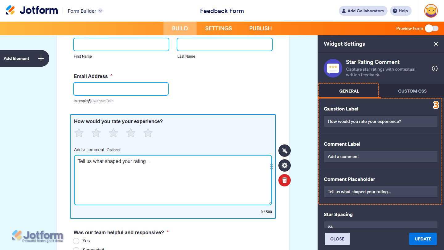
- Next, in the Widget Settings menu that opens on the right side of the page, you’ll see this list of settings you can configure:
- Question Label — Enter the question for the star rating.
- Comment Label — Enter the label for the comment field.
- Comment Placeholder — Enter the placeholder text for the comment field.
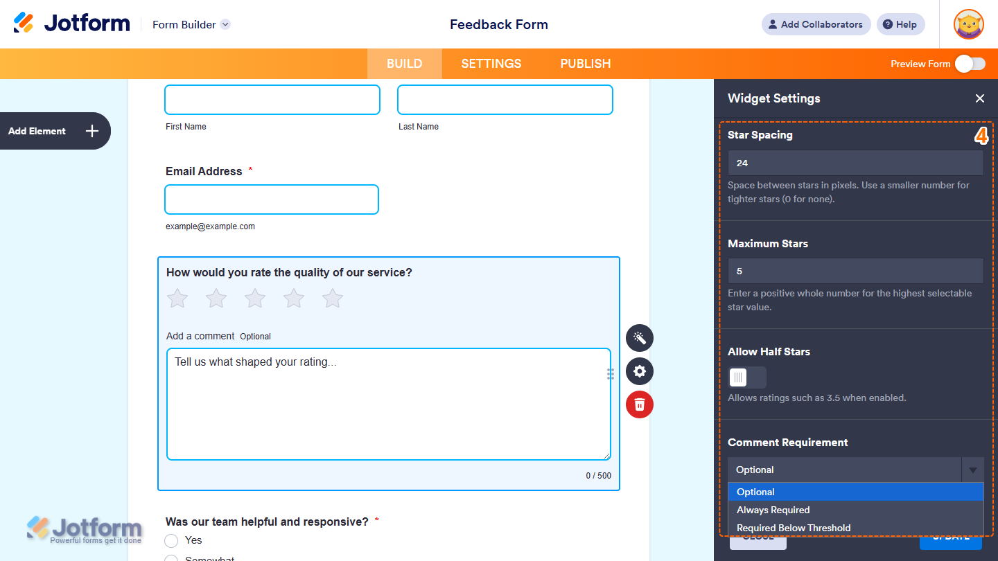
- Then, scroll down to the bottom and continue to set up these settings:
- Star Spacing — Enter the space between the stars in pixels.
- Maximum Stars — Enter the maximum number of stars respondents can select.
- Allow Half Stars — Toggle this on to allow respondents to select half-star ratings.
- Comment Requirement — Click on the Downward Arrow icon and in the Dropdown menu, select when you want comments to be required:
- Optional — Allow respondents to submit a rating without a comment.
- Always Required — Require a comment with every rating.
- Required Below Threshold — Require a comment when the rating is below a specified value.
- After that, continue scrolling and adjust these settings:
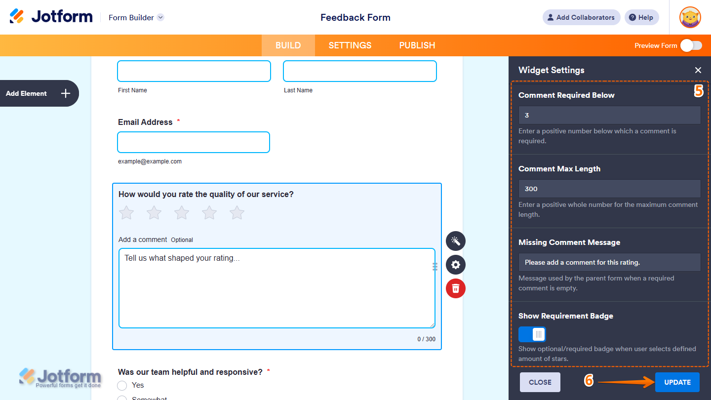
- Comment Required Below — Enter the rating below which a comment is required.
- Comment Max Length — Enter the maximum number of characters allowed in a comment.
- Missing Comment Message — Enter the message shown when a required comment is left empty.
- Show Requirement Badge — Toggle this off to hide the optional or required badge for the selected star rating.
- Once everythingʼs set, click on Update.
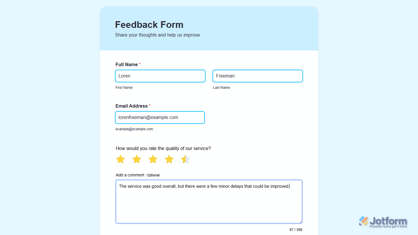
That’s it! You’ve now successfully added and set up the Star Rating Comment widget on your form. Wondering how it looks in action? Check out this demo form.
Notes
- For advanced styling of the Star Rating Comment widget, you can add your own custom CSS code under the Custom CSS tab in the Widget Settings. Our guide on How to Inject CSS Codes to Widgets walks you through everything.
- You can also configure the widget properties, like alignment, labels, size, visibility, and more, to control how it looks and behaves on your form. Check out our guide on How to Access and Configure the Question Properties of a Widget to learn more.

Send Comment: