


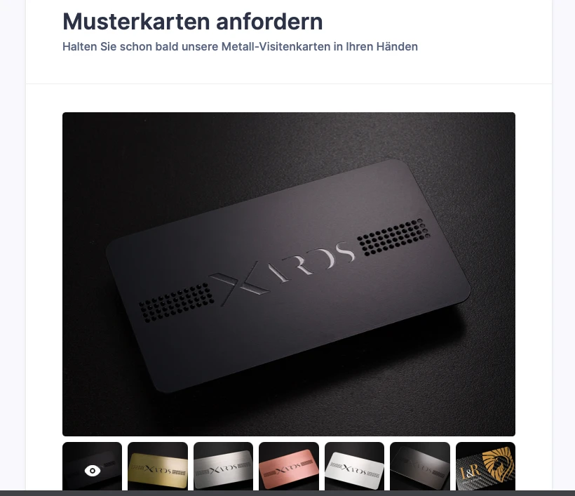
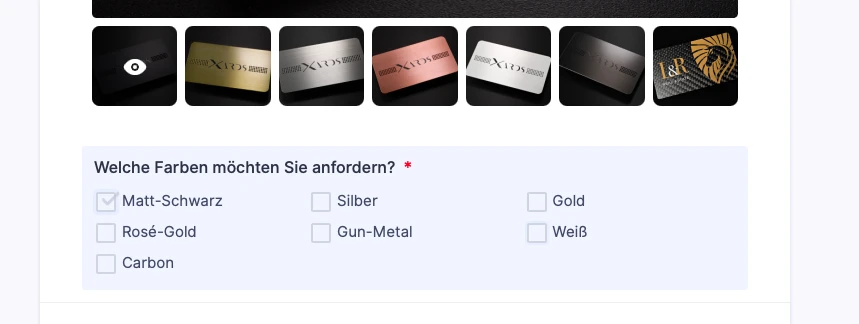
-
XARDSAsked on June 12, 2021 at 2:37 PM
Dear Support,
I have some enquiries regarding our Form:
1) I'm using a slideshow widget and it looks great on PC preview but when turning on Mobile preview the pictures are getting cropped so much that the pictures a barely recognisable anymore. Why are the pictures not scaled down to fit the screen, is this somehow configurable?
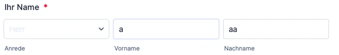
2) Every time a field is being clicked on or edited in preview it turns blue like a a selection marking. Can I deactivate that?
3) The fonts colour in multi select and dropdown fields do not seem to respond to any configuration. It stays light grey and is hardly visible despite having changed font colours in Theme designer. Any idea why this isn't working?
Thanks in advance.
%20On_mobile.png)
-
XARDSReplied on June 12, 2021 at 2:40 PM
This is how it looks on PC instead:
2) Screenshot for the blue marking of active fields
3) Screenshots for Dropdown font colour
-
Alexander_GReplied on June 12, 2021 at 6:04 PM
Hi there, 👋
Thanks for contacting us.
Please, allow me some time to check your issue and provide an answer.
Soon we will reply to you here.
Thanks for your patience,
Alex
-
Alexander_GReplied on June 12, 2021 at 6:47 PM
Hi again! 👋
Thanks for waiting.
1) Kindly, Copy&Paste this code to your widget:
Guide: 👉 How to Inject CSS Codes to Widgets
@media screen and (max-width: 480px), screen and (max-device-width: 767px) and (orientation: portrait), screen and (max-device-width: 415px) and (orientation: landscape) {

div#slider-container {

    width: 100% !important;

    height: auto !important;

}

img.slidesjs-slide {

    width: 100% !important;

    height: auto !important;

}

div#slides {

    width: 100% !important;

    height: auto !important;

}

.slidesjs-container {

    width: 100% !important;

    height: auto !important;

}

img.slidesjs-slide {

    width: 100% !important;

    height: auto !important;

}

.slidesjs-control {

    width: 100% !important;

    height: 220px !important;

}

.image-slider-widget

{

  height: 250px !important;

}

}
2),3) You can change the style and color of the check box using the Form Designer Tool.
You can check the related thread to learn more about Form Designer.
Related thread: 👉 https://www.jotform.com/answers/991865
Also, you can remove the active background using this code to the Style page:
.form-line.form-line-active {

  background : none !important;

  background-color : transparent !important;

}
👉 How to Inject Custom CSS Codes
In the Advanced designer you can change the color of the text too:
If you need any further assistance - feel free to contact us again. 😊
Thanks,
Alex -
XARDSReplied on June 13, 2021 at 5:07 PM
Great thank you for your assistance.
1) The code works well, it loos much better, but the picture is still cropped a little bit. Could you tell me which value I need to play around with to configure the size to my liking?
2) The blue marking is now deactivated, thank you!
3) The check box style is changed now, thanks. The only thing that is left is the font color of dropdown fields. They are light grey and hardy visible although I changed the font color in theme designer (see screenshot).

-
Alexander_GReplied on June 13, 2021 at 6:36 PM
Thanks for your reply,
1.) You can play with all width/height parameters in the code above. But you can change the parameters into pixels or percents.
 width: 100% !important;

 height: auto !important;
However, if the images will be not cropped - it might affect their dimensions.
3.) You can add this code in order to change the
.form-dropdown {

    color: #0e0e0e !important;

}
👉 How to Inject Custom CSS Codes
You can change the color using the code in order to change the color.
#0e0e0e // Change this code to change the color.
Thanks,
Alex
-
XARDSReplied on June 13, 2021 at 10:01 PM
Thank you, almost finished.
Can you tell me the parameters to have the pictures fully displayed in mobile view?
This is how they are being displayed right now:


And also in mobile portrait mode there is some additional spacing under the gallery I'd like to remove:

Thank you for your help.
Kind regards
Sergio
-
Rehan Support Team LeadReplied on June 14, 2021 at 1:59 AM
Greetings Sergio,
You can inject the following CSS in your form to remove the white space on mobile devices.
@media screen and (max-device-width: 415px) and (orientation: landscape), screen and (max-device-width: 767px) and (orientation: portrait), screen and (max-width: 480px) {

iframe#customFieldFrame_21 {

      height: 390px !important;

}

}
Here is the related guide:
https://www.jotform.com/help/117-how-to-inject-custom-css-codes
Should you need further assistance then please let us know.
Thanks
-
XARDSReplied on June 14, 2021 at 8:00 AM
Thank you, that worked. Now I only need to get the pictures displayed fully in mobile portrait and landscape mode. They are being cropped. I attached 2 screenshots in my las message (June 13, 2021 at 10:01 PM).
-
Tommaso_FReplied on June 14, 2021 at 8:47 AM
Hello there,
Please inject this custom CSS code into the widget
https://www.jotform.com/help/428-how-to-inject-css-codes-to-widgets@media only screen and (max-width: 680px) {
img{
width: 100% !Important;
height: auto !important;
}
.slidesjs-container,.slidesjs-control{
height: 257px;
}
}
You can check how does it work by checking this clone form https://jotform.com/form/211643375737965
Best regards. -
XARDSReplied on June 14, 2021 at 10:15 AM
Great they are now being fully displayed thank you.
1) Now this generated some space between the displayed picture and the gallery below. Can this be minimised?

2) When displaying in mobile portrait mode the gallery pictures on the bottom are cropped. Any code to recover them?

3) We are not using a logo on the top of the form because it is going to be integrated into our website which already has the logo on top. This generates a blank space on every device at the top. Is it possible to remove it?

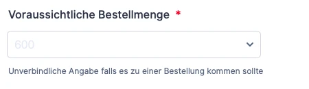
4) When editing the form, the "please select" text in the dropdown is being displayed in german, as it should be. When switching to preview mode it will be displayed in english. How can I make it stay in german?


5) When previewing an error in mobile portrait mode the error text gets squeezed between the 2 buttons. It doesn't look good and the "next" button is being pushed out of the frame. Any solution to that?

Kind regards
-
Marco JotForm SupportReplied on June 14, 2021 at 2:14 PM
Hello there,
Thanks for reaching out to us.
1) Now this generated some space between the displayed picture and the gallery below. Can this be minimised?
Unfortunately, customizing the Image Slider as you've been doing, requires you to develop all the media queries based upon the device the users are filling out the form on. For such level of customization we'd suggest you to hire a developer on websites like upwork or fiverr for example.
The property below for example, would be suitable on iPhone X phones, but for older models, as said, you need to create all the related media queries.
.j-slider-footer {

margin-top: -80px;

}
2) When displaying in mobile portrait mode the gallery pictures on the bottom are cropped. Any code to recover them?
You need to add the following property into your Image Slider CSS code:
.j-slider-footer-item img {

max-height: 100%;

}
3) We are not using a logo on the top of the form because it is going to be integrated into our website which already has the logo on top. This generates a blank space on every device at the top. Is it possible to remove it?
You need to add the following property into your Form CSS code (not into the Image Slider):
.form-all {

  margin-top:0 !important;

}
4) When editing the form, the "please select" text in the dropdown is being displayed in german, as it should be. When switching to preview mode it will be displayed in english. How can I make it stay in german?
Currently it's not possible to customize the language of a Dropdown's "Please select" placeholder. A feature request has already been created though, and maybe it'll be possible in the future:
https://www.jotform.com/answers/2842877-translate-the-please-select-text-in-the-dropdown-field
In the meanwhile, you could hide the placeholder if you wish, as shown in this thread:
https://www.jotform.com/answers/2769011-change-the-language-of-the-please-select-of-a-dropdown
5) When previewing an error in mobile portrait mode the error text gets squeezed between the 2 buttons. It doesn't look good and the "next" button is being pushed out of the frame. Any solution to that?
As the form already shows the red warning messages in case of errors, you can hide the additional footer message:
form-button-error {

display: none;

}

I hope it helps!
Marco
-
XARDSReplied on June 14, 2021 at 5:43 PM
4) When trying to insert css for removing the "please select" text nothing happens. The code also doesn't really looks complete:
select > option[value=""] {

display: none;

}
Isn't there something missing?
The rest works like a charm, thanks for the great support.
-
XARDSReplied on June 14, 2021 at 5:47 PM
5) doesn't seem to work

-
Alexander_GReplied on June 14, 2021 at 7:22 PM
Thanks for your reply,
Please, allow me some time to check.
Soon we will reply to you back.
Cheers,
Alex
-
Alexander_GReplied on June 14, 2021 at 8:01 PM
Thanks for waiting.
4.) The suggested workaround hides "Please Select" from the dropdown. But still showing as a placeholder.
You can add an option in German and then remove this option from the dropdown list:
Result:

Code:
.form-dropdown > option[value="Bitte auswählen"] {

 display:none !important;

}

.form-dropdown > option[value=""] {

 display:none !important;

}
------
5.)
Regarding this question, I have found some mistakes in the code and already corrected them to:
@media screen and (max-device-width: 415px) and(orientation: landscape), screen and (max-device-width: 767px) and (orientation: portrait), screen and (max-width: 480px){

  .form-error-message {

    display: none !important;

}

}
Now, this should work okay:
Regards,
Alex
-
XARDSReplied on June 14, 2021 at 11:27 PM
Hi Alex,
unfortunately both codes didn't bring any change. Please select ist still an option in dropdown and the error message is still being displayed.
On the first page the error isn't a problem, beginning on page 2 it becomes problematic because the error text is being pushed between the two buttons.
kind regards.
Sergio
-
Rehan Support Team LeadReplied on June 15, 2021 at 12:52 AM
Greetings Sergio,
I've checked your form on my Android phone and I do not see the error message. Here is how it looks on my mobile.

I've checked different pages of your form and I do not see the error message. Could you please check it on your mobile? Looking forward to hearing from you.
Thanks
-
XARDSReplied on June 16, 2021 at 11:33 AM
Ok I checked on my iPhone on Safari and I am still getting the error:

The "Please select" text is also still present. The code from above didn't bring any change. Also the font color of the dropdown text doesn't

As I'm seeing now I have an Error message with 22 errors for my CSS section:

-
Alexander_GReplied on June 16, 2021 at 3:21 PM
Hi again, 👋
Thanks for your reply.
Please, note that this code disables this banner:
Regarding your screenshot, the code is working properly and disables this error message:
But the text code is still remaining.
I have corrected the code and you can copy&paste it on this:
@media screen and (max-device-width: 415px) and(orientation: landscape), screen and (max-device-width: 767px) and (orientation: portrait), screen and (max-width: 480px){

  .form-error-message {

    display : none !important;

  } /* Hides little error message */

  .form-button-error {

    display : none !important;

  } /* Hides text between buttons */

}
You can copy&paste it. If you want to show the big error banner on the top - just add this part:
  .error-navigation-container {

    display : none !important;

  } /* Hides the Big error message on the top of the form */
This screenshot shows where to add the code:
Result:
Result with the added part:
I have changed this part of the code on your form (without the optional part that hides a big banner).
____
Regarding the "Please Select" issue:
As we said before, there's no way to hide the Please Select Placeholder with the CSS code.
However, you can do it using a workaround I mentioned in the reply above.
The code I provided hides the option "Please Select" from the dropdown. But Placeholder Still visible. In order to change it - you will need to add a Predefined Option to your dropdowns:
Please, let us know if you need any further assistance.
Thanks,
Alex
-
XARDSReplied on June 16, 2021 at 5:35 PM
Great, I finally got the error message as I wanted, thanks.
1) The dropdown, however, I'm not getting right. I added 1 option in german ("Bitte auswählen") and put it as standard selection, then added the codes to remove them from dropdown. No luck, they are still both being displayed:

2) Another thing that came up now was the font color of available Meeting times in the corresponding widget on the right side:

They look very light, I'd like to have it black or at least darker.
-
Alexander_GReplied on June 16, 2021 at 7:03 PM
Thanks for your reply,
1)
I did check your form and it seems okay on my side:
Please, try to clear your browser's cache and check again.
Guide: 👉 How to clear Browser's cache.
Regarding your second question - I have moved it to another thread to avoid any confusion.
Thread: 👉 https://www.jotform.com/answers/3165376
Soon we will reply to you there,
Thanks,
Alex
-
XARDSReplied on June 17, 2021 at 4:44 PM
I cleared my browser cache but still no change. A colleague of mine tried it, too. Same result. "Please select" as well as "bitte auswählen" are both visible. We are both using Safari on Mac.
I also just tested to go to the next page while leaving
"bitte auswählen" selected and as it practically is an option it will not prevent to go to the next page without having selected a real value. This is probably the price we have to pay for this workaround, right? -
Alexander_GReplied on June 17, 2021 at 6:46 PM
Thanks for your reply.
I did check the form again in Safari and Chrome both.
Chrome:
Safari:
I was able to replicate your problem on Safari. I reported this problem on your behalf and later the developers can look at it. Unfortunately, we can't provide the ETA for providing a solution. It could be a browser-related thing.
"bitte auswählen" selected and as it practically is an option it will not prevent to go to the next page without having selected a real value. This is probably the price we have to pay for this workaround, right?
Yes, unfortunately, this workaround uses a pre-selected option.
However, you can manually show the text error and hide the "Submit button" if "bitte auswählen" Selected.
-
Alexander_GReplied on June 17, 2021 at 6:51 PM
Also, I have created a separate ticket for "bitte auswählen" issue and will provide you with the demo for this.
Also, there you will receive a reply from our developers if they can fix this.
Thread: 👉 https://www.jotform.com/answers/3167808
Thanks,
Alex
-
XARDSReplied on June 18, 2021 at 9:58 AM
Thank you.
-
XARDSReplied on June 18, 2021 at 9:14 PM
Hi,
I just exchanged the pictures in the gallery with smaller ones for faster speed and now there is a lot spacing under the gallery. The css codes probably don't coincide with the new resolution of the pictures. Could you tell me how to rewrite the code to fit the new pictures?
-
Rehan Support Team LeadReplied on June 18, 2021 at 11:11 PM
Greetings,
We can help you with adjusting the code. Kindly share screenshots so we can see what you are referring to.
Looking forward to hearing from you.
Thanks
-
XARDSReplied on June 19, 2021 at 11:07 AM
I just realised that this issue has already been there before and needs individual programming. We discussed that in this thread already. Thank you.
- Templates
- Integrations
- INTEGRATIONS
- See 100+ integrations
- FEATURED INTEGRATIONS
 PayPal
- Slack
- Google Sheets
- Mailchimp
- Zoom
- Dropbox
- Google Calendar
- Hubspot
- Salesforce
- See more Integrations
- Products
- PRODUCTS
- Form Builder
- Jotform Enterprise
- Jotform Apps
- Store Builder
- Jotform Tables
- Jotform Inbox
- Jotform Mobile App
- Jotform Approvals
- Report Builder
- Smart PDF Forms
- PDF Editor
- Jotform Sign
- Jotform for Salesforce Discover Now
- Support


