
Your goal as a designer or a developer is to always try to find a way to create an environment which is easy for users. Consistency is the key which helps you to achieve that goal.
Consistency across all mediums and content is a brilliant branding strategy which provide a quality experience to users and should not be underestimated.It separates an amazing user experience from a less polished one.
My definition of Consistency is Logical Coherence, which means that the brand is always developing and still feels familiar to users. Users should feel the same way when they visit your site, your mobile app, and any other view of your product. They should not spend a long time to finding what they are looking for or spending unnecessary effort for it. A consistent branding should be predictable and also quickly learnable.
The designers who spends more time thinking about “What does the user expect?” will have more successful results.


Where Should We Be Consistent and Where We Should Not?
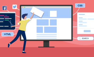
DESIGN (Visual Language): The design that’s inconsistent from page to page will feel illogical and chaotic. Typography, general visuals, layout, colors, icons, fonts, sizes, weights, marks and other graphic elements should fill user expectations according to your brand’s identity on every page. If you don’t do this, your users will prefer those that do.
Since sight is the strongest human sense, your visual language should flow logically. Do an analysis of your design according to visual hierarchy, such as contrasting colors, varying sizes, and other methods.
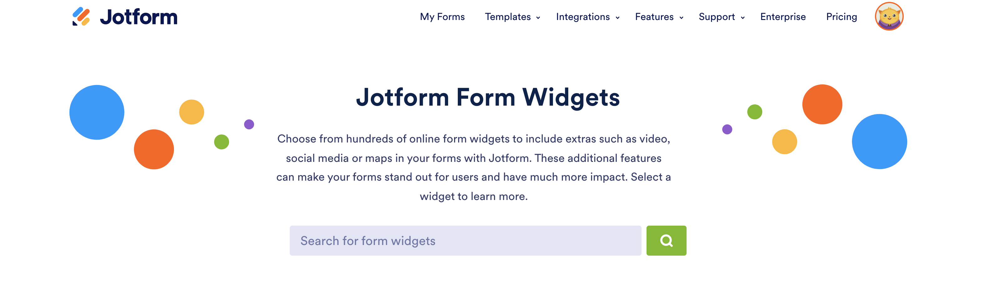
A good example for visual hierarchy is the Widgets page of Jotform which has a sense of logic. The Login tab in the navigation has the darkest color and gets the attention immediately. (It’s an easy change, but efficient.)
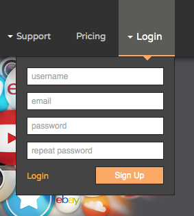
And if your Sign In form is as basic as Jotform’s- “Congratulations you have a new user!’’
Even if users are not clicking on something you made clickable, that doesn’t mean they don’t appreciate the visual consistency.
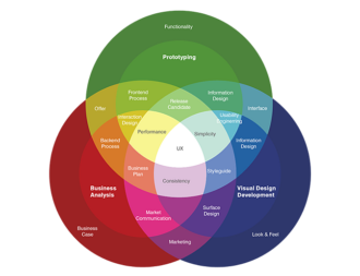
Be consistent according to the medium. Take a look at good examples of style sheets and integrate them with your brand’s style guide (Yes, I advise you to create brand guideline -a visual design pattern- for your own brand).
Excellent Style Guide Examples: iOS Design Guide , Android Design Guide , Adobe
Should we never surprise users?
The meaning of consistency is doing the same things over and over. I am not telling you to pick a style and stick with it forever. At the same time, please do not make users re-learn everything they already know. It takes work to be inconsistent and innovative without leading your design into chaos. Maintain your own consistency. Design based on what your users already know and love. What I mean is create an experience which is relevant to your users’ previous experiences. Evolve your ideas depending on that. The goal is to create a balance between consistency and new design.
CONTENT (Language): Tell your story with your brand’s vocabulary. For example:
Jotform uses great language on the Theme Store page according to their target users. The tagline “Easy’’ is targeting the right users- those who have zero coding knowledge.

Also, in this example the content enriched with a video (design element) which emphasizes the simplicity of Jotform and includes clear language which describes the Theme Store. It is a pretty good example of successful team work of the content and design elements.
And do not forget that users visit your website for a particular reason and get used to your content, so do not give them the things they are not interested in.
INTERACTION: Transitions, rollovers, tips, sounds, etc. should behave consistently. I know that some developers like to make animations and think that it results in better feedback. But you should not view them as the focus of the user experience. Do not make different interactions just to be different – be different when it makes sense.
A successful animation should helps users without drawing attention to itself. Forgetting that the data is the most important thing and distracting users with unnecessary interactions is a mistake that you would like to avoid.
Finally, when design, content and interaction are consistent across all mediums (website, mobile application or a system), users get what they need a whole lot faster and are happy with their experience. In addition to happy users, consistency can help you to minimize your development and designing processes and set you free from re-thinking every step from the beginning.
Final Notes:
- Be Consistent, Not Boring!
- Empathize with you users. Ask yourself “What does user expect?“
- Ask your users, create surveys and learn about their experiences.
- Do Usability Tests.
- Create a design guide.


Send Comment: