
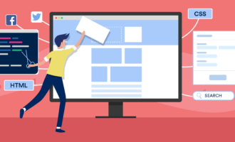
Simplicity in website design doesn’t necessarily equate with a minimalist design aesthetic. Simple sites just remove all unnecessary elements from the design, content, and code. While minimalist sites generally fit this criteria, there are plenty of sites that wouldn’t, by any stretch of the imagination, be considered “minimalist” that still fit the definition of simple.

Below is a rundown of some of the benefits of simplified website designs, as well as some easy techniques for simplifying your own web design process.
Advantages of Simple Websites
1. Easier to Navigate
Simple websites don’t have extraneous information. This helps navigation in two wyas: generally, sites have fewer pages and sections; and the design of the site is usually less cluttered, making it easier to find navigation elements.
Simplifying your website designs can be a great solution to navigation usability problems. Here are some tips for simplifying your navigation:
- Use only one main navigation menu.
- Make sure navigation is consistent throughout the site.
- Use subnavigation for individual sections to simplify your main navigation.
- Don’t use dropdowns for navigation, which can easily hide a cluttered menu. Instead, force yourself to incorporate the navigation elements into the site’s design. Generally, this will result in cleaner navigation.
2. Simple Designs Load Faster
Simple designs generally result in smaller file sizes. And smaller files load faster. Also, if you keep your code simple and streamlined, you’re less likely to be calling multiple stylesheets, a ton of JavaScript files, or lots of other content that increases the number of HTTP requests your site makes. Faster loading and faster responding websites improve user experience.
3. Content is More “Scannable”
When there aren’t tons of complicated decorative elements in your site’s design, your content takes center stage. Content that is put to the forefront of a website is easier to scan by visitors.
One study showed that 79% of test users scanned any new page they visited, while only 16% read the page word-for-word. It’s better to work with these scanning visitors than to try to fight them. By putting your content front-and-center, you make it easier for visitors to quickly scan what’s there. These visitors will perceive your site as more user-friendly and are more likely to return in the future.

4. Simple Sites are Quicker to Design and Build
If your site’s design is simple, the code will likely follow suit. Designing a site with a simple layout, one or two page templates, and simple typography is a lot quicker than designing a site with eight sections (each with different page templates), complex typography, and a background that needs complicated slicing and coding.
Just beware of creating a site that looks simple but is actually very complex. Aim to keep your code as bare-bones as possible. Sometimes just tweaking a margin or padding on a certain element or moving something around a little bit can make it possible to greatly simplify your site’s code without making any noticeable impact on the frontend design.
5. Simple Code is Easier to Debug
If your code is simplified, it’s easier to find bugs. If you have a stylesheet with 300 different properties, it’s going to take you a lot longer to figure out why something isn’t working than if you have 30.
Look for ways to simplify your code right from the outset. Things like combining CSS properties and definitions can make your stylesheets a whole lot shorter. Combining stylesheets or JavaScript files can also greatly simplify your overall code. And take advantage of automated programs that can strip out unnecessary markup from your stylesheets, scripts, and other files before you upload them (just make sure you double-check that everything still works as intended).
6. Smaller File Sizes Mean Less Server Space
It’s already been mentioned that simple sites generally have smaller file sizes than complex ones. This means that your sites will take up less server space and bandwidth than other sites. While this might not be a big deal for a site with only a few thousand visitors a month or with limited content, for site with more pages and more visitors, this can actually add up to a huge savings. Consider that some minimalist homepages with few images might be less than 100kb, while more complicated sites can sometimes approach 1mb. That means that you could have ten times as much traffic with the simple site for the same cost as the more complicated one. If you have a lot of content or a lot of visitors, it makes sense to simplify your site and reduce your file sizes.
How to Simplify Your Websites

Remove unnecessary decorative elements
Many initial website designs incorporate a lot of decorative elements that really serve no purpose. While it’s not necessary to remove every decorative element from your designs, removing at least some of them can often make your site appear cleaner and more polished.
Elements that might be able to be removed or simplified include image borders, drop shadows, extra images in your header or footer, extra illustrative images on individual pages, and visual effects like parallax scrolling. When you do use visuals, opt for clean, high-quality images from sources like Unsplash.com (oftentimes one or two images is plenty).
Ask yourself: “Is this element really important?”
This is somewhat of the “golden question” when creating simple websites. On every element, whether design, code, or content, you should be asking yourself if it’s really necessary.
Look at what elements on your site could be combined, too. Are there pages that could be combined into one? Can you combine styles to simplify your stylesheets? There are almost certainly elements within your design and code that can be combined to simplify things.
Make sure the backend of your site is as simple as the frontend
So many designers only focus on the frontend of their designs and pay little attention to their code. Some simple-looking sites are a mess in the backend. Make sure that the markup for your site is as simple as you can make it. This could be limiting the number of styles in your stylesheets or the number of JavaScript effects you use. It also means writing good, standards-compliant markup.
This also means you should choose an appropriate CMS for your site’s backbone. Some CMSs are overly complicated and, while some sites benefit from their complexity, they can easily be overkill for a lot of sites. Choose a CMS that offers only the functions you need or allows you to turn functionality on and off as needed.
Excellent Examples of Simple Website Designs
Below are a dozen examples of great, simple website designs to get you thinking about how to simplify your own designs.


Photo by Lee Campbell on Unsplash


Send Comment:
66 Comments:
March 28, 2023
Thank you for emphasizing the advantages of simplicity in good web design. Your insights have helped us understand that a simple design can improve user engagement, reduce bounce rates, and increase conversions. Your advice has helped us achieve our online goals while providing a positive user experience for our visitors.
July 6, 2021
This is an outstanding piece of content. I'm working on a website and want to make it as accessible and readable as possible. This post taught me a lot Keep up the good work!
Web design
November 25, 2019
Amazing piece of content. I’m trying to create a website and I want to make sure that it is accessible and readable. I learned a lot from this post, thanks for sharing such amazing details, I'm gonna use them in working with web design & printing company in toronto. Keep it up!
June 18, 2019
This is an excellent web design & printing company in toronto resource. I will definitely use and bookmark this. Keep it up and we readers are really thankful, It is extremely useful.
June 20, 2013
Responsive web design = faster website + better user experience.
May 12, 2012
What makes design easier is developing a good work-flow, a good system for design. It is not about the design itself – it is about how you work to achieve that design.if we have make anything some design means where we have to edit that item.
January 4, 2012
you're truly a just right webmaster. The site loading pace is incredible. It seems that you are doing any distinctive trick. Moreover, The contents are masterwork. you've performed a wonderful process in this matter!
April 26, 2011
Thank you! Really well written article not only explaining why, but how.
February 8, 2011
Really nice..
Thank you for sharing...
Regard
Wiyono
Indonesia
January 18, 2011
very good post, i definitely love this website, carry on it
November 21, 2010
Ocaam's razor is one of the key principles that drive my site and has always guided my thought process throughout my work.
Simple designs not only look better, but they work better too. Most people struggle with simplicity because they can't prioritize what's important and what's not important. To do this, you have to be able to see black and white.
June 7, 2010
People overdesigning sites, because they fear it will be boring for visitors to read it. Thought it’s not true.
Clients fear to pay designers for «empty» space, so designers «filling holes with stuff».
November 17, 2009
Clean and professional looking website always get proper
attention, there are some themes they don't require very clean look but a combination is always good, thanks for bringing this topic here.
November 11, 2009
oh my my, such a beautiful collection of great web designs!
November 3, 2009
Hello Anne!
I really impressed with your own perspective about web design. I agree in what you are trying to say that all depends on the clients needs and how you simplify your work as a desiner/developer.
Keep up the good work.
More thanks!
October 22, 2009
Why do a lot of simlicity-sites look like wordpress templae? huh.
October 18, 2009
Nice article ... will help me on new web projects.
October 2, 2009
This article is great.
I am looking for a perfect simple wordpress theme which can handle large number of pages and posts ?
Any suggestions ?
September 29, 2009
Nice list! Always good to be reminded of the smaller details that can really make a website go from good to great.
September 25, 2009
Nice article, i agree that simple designs are the way to go. i think that the question “is this element really important” is one of the main issues
when creating a simple design.
September 24, 2009
Really great article. Thanks! I believe that simplicity is so important in modern web design... so much so, I named my business after it! Keep up the good work.
September 24, 2009
Here are some additional tips for keeping your site simple and easier to read …
Keep the same grid on every page
Keep the same navigation placement on each page
Make sure to each page is labeled with the section name and the headline. For example, instead of “Rotomolding Machines” use “Products | Used Equipment | Rotomolding Machines” so users can keep track of where they are in the site.
Keep page lengths short and to the point. Use bulleted lists. This will quickly guide users to pertinent information.
September 24, 2009
hi.
Nice article, i agree that simple designs are the way to go. i think that the question "is this element really important" is one of the main issues
when creating a simple design.
thanks for sharing these great examples of simple web designs the y really show how effective they can be.
September 24, 2009
I lean towards simplistic design myself, and I especially love the extra benefits that they're quick to create, easy to debug, etc!
September 23, 2009
i really like this article very much! well i hope i did the right thing fixing my own layout.