
Have you ever been on a flight that lasts more than a couple of hours? That’s when airlines spring for a few amenities — maybe you get better snacks or a meal, more legroom, and a selection of new movies to choose from.
Having screens on the back of plane seats is a great perk for a long-distance flight — not only do you get entertainment options, but you can also take advantage of the flight tracker feature. You can monitor the plane’s progress in real time, with the flight path revealing itself as you get closer to your destination.
There’s something calming about a quick visual representation of your progress, and that’s true when it comes to Gantt charts as well. Making a Gantt chart in Google Sheets is an effective way to help your business stay organized. And it gives you a centralized place to monitor your work from start to finish.
Here’s what you need to know about making a Gantt chart in Google Sheets.
Break it down
Before you set out to make a Gantt chart in Google Sheets, it’s important to understand the individual elements of the process and how they fit into your workflow.
Basically, a Gantt chart is a timeline that represents how much work you’ve completed and how much you still have to do. You can arrange it by day, week, or month; clearly separate your tasks; and identify the team member responsible for each task. Plus, since Google Sheets is a cloud-based program, everyone on your team can collaborate on and share your Gantt chart.
However, it’s a good idea to consider whether the type of data you have and the project you’re working on are right for this type of chart — while Google Sheets has lots of capabilities, it might not be the best for a large-scale, long-term project. Consider the scope of the project and what it requires.
Create your own chart
Because Google Sheets doesn’t actually have specific Gantt chart capabilities, setting one up requires some work.
You can use an existing template (the easiest way to go), but if you’d rather build your own chart manually, you can do so using formulas.
Essentially, it involves telling Google Sheets the tasks you have left to complete and creating a sequence of days or weeks when that will happen. If you’re starting a project with a large number of micro tasks under a bigger one, this feature is extremely helpful to ensure you have all your ducks in a row.
After you’ve highlighted the data you want to include in your chart, like tasks, start dates, and due dates, select Insert and click Chart within the Google Sheets menu. Make sure the chart you’ve chosen is a Stacked bar chart.
Stacked bar charts work well for project management because they are easy to read and provide a clear picture of the different stages of your project. You can easily see how much longer you have until the finish line.
Customize your chart
You can become a Google Sheets master and set your Gantt charts up perfectly, but if they don’t match how your business operates, then they won’t make a whole lot of sense. It’s important to adapt your chart to your company’s processes so that everyone on your team is on the same page.
To customize your Gantt chart, make sure it’s highlighted (a box will appear around it), select the three dots that appear inside the box, and click Edit chart. From there, the Chart editor will appear.
Click on the Customize menu and select Series. This will allow you to change the colors of your chart as well as specify how your chart will break down your tasks.
Customize with Jotform Tables
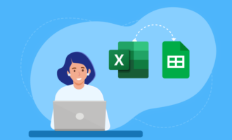
You might find that Google Sheets just doesn’t have the right functionality for the type of project tracking you need to do. With Jotform Tables, you can take your project workflow a step further.
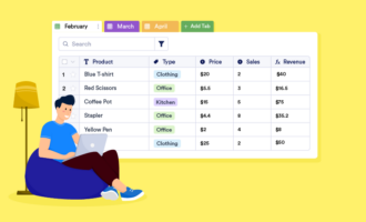
With more than 30,000 users and counting, Jotform Tables gives you a range of customization options and different ways to view your projects. You can assign tasks and collaborate within your team as well as create visualizations of your project data while you’re still working on it.
Plus, Jotform offers built-in formulas you can work with to arrange your daily schedule. You can use the Cards view to break down and assign individual tasks so that everyone on your team knows what they’re supposed to be doing. Jotform Tables is an all-in-one interface that makes sure you won’t have to go anywhere else for your project planning needs.
Track your progress
Gantt charts are an essential tool for organizing project timelines. If you’re not tracking how your projects are faring and how much time it’s going to take to complete them, your business is going to be inefficient and out of sync.
Taking advantage of the resources provided by Google Sheets — or leveling up your project tracking with Jotform Tables — is the best way to make sure your business runs smoothly and you have the systems in place to be successful each time you embark on a new project.


Send Comment: