
When you start collecting data, there’s a sense of excitement and unpredictability. The results are yet unknown but promise insights that can help your business swiftly adapt to emerging trends.
One of the most effective ways to analyze and present data is through bar charts, especially using accessible tools like Google Sheets. Bar charts are incredibly flexible, allowing you to present data clearly and creatively.
Here’s how to make a bar chart in Google Sheets to present data in creative and effective ways.
Bar graph types in Google Sheets
Google Sheets provides various bar graph options to suit different types of data presentations:
1. Horizontal bar graph
Use case:
Ideal for comparing values across different categories when category names are long or when there are many categories. Horizontal bar graphs are especially effective in surveys or rankings where the focus is on the relative size of each category rather than time progression.
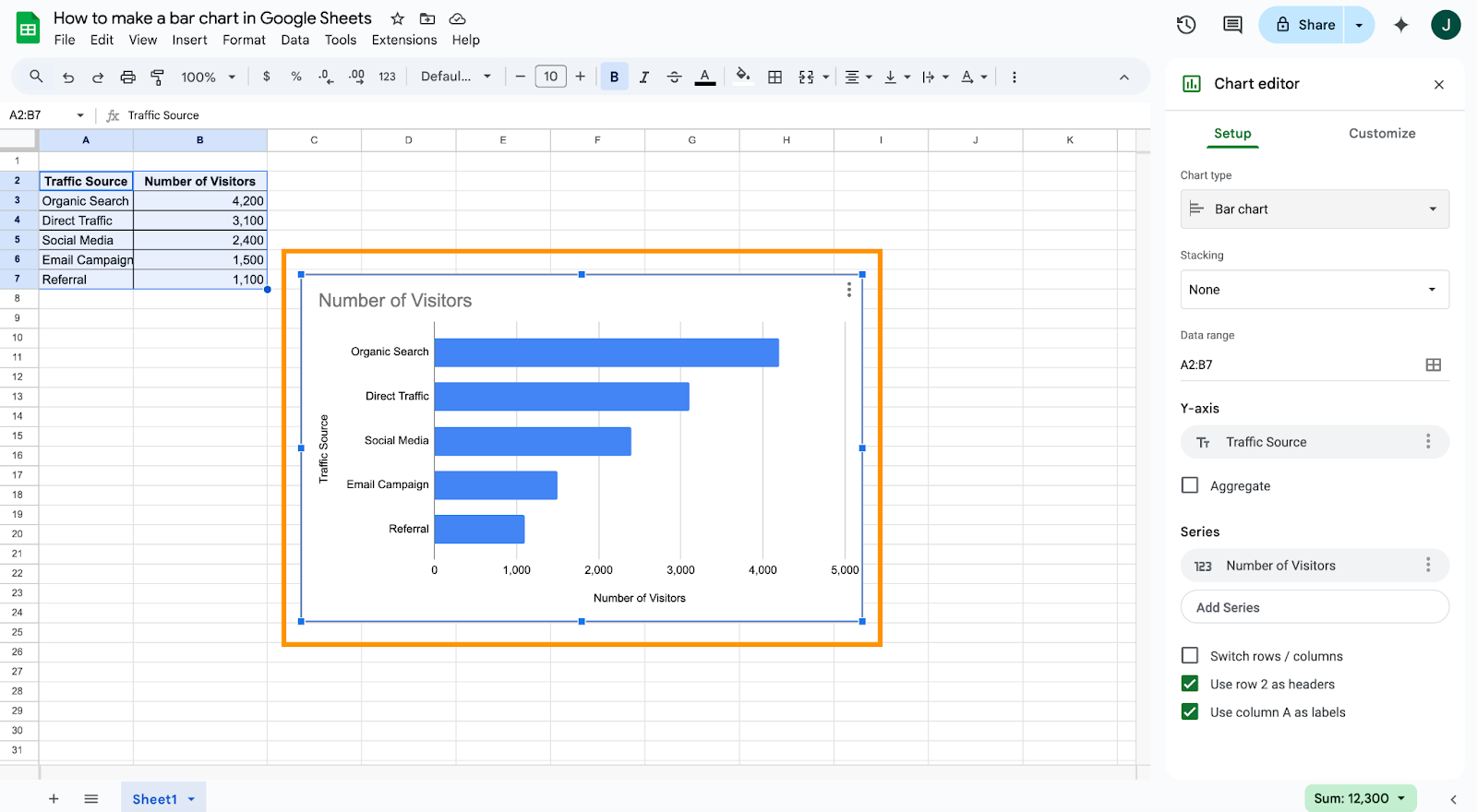
Example:
Visualizing customer satisfaction levels across multiple service centers, where labels like “Technical Support – East Region” would be hard to fit vertically.
2. Vertical bar graph
Use case:
Perfect for tracking changes over time or showing performance trends. This format emphasizes chronological progression and is typically used when the x-axis represents time intervals such as days, months, or years.
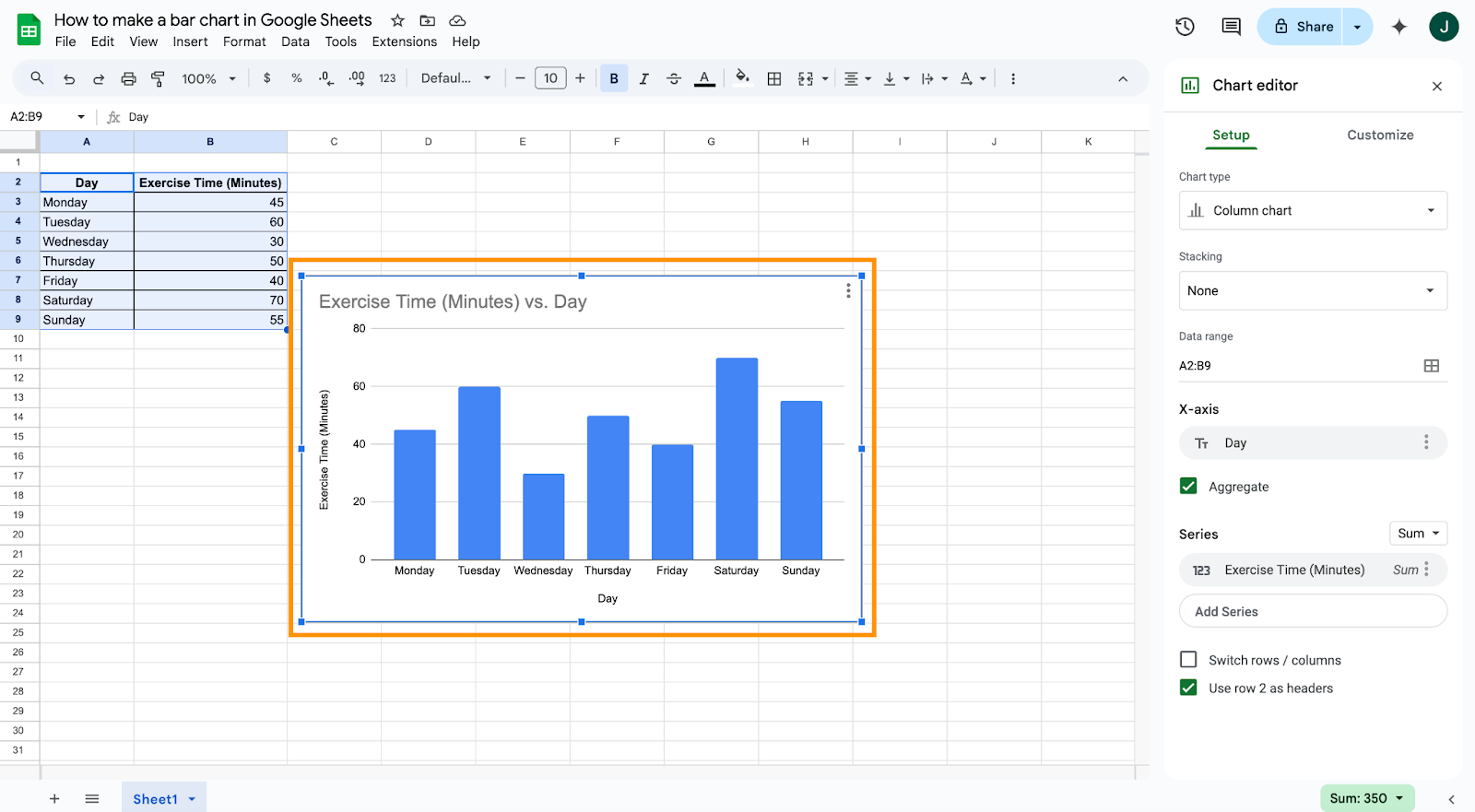
Example:
Displaying quarterly revenue growth for a company over the past three years to highlight seasonal patterns or upward trends.
3. Stacked bar graph
Use case:
Useful for showing the total value made up of different subcomponents, while also comparing those subcomponents across categories. It’s helpful when you want to compare not only the overall size but also the composition within each bar.
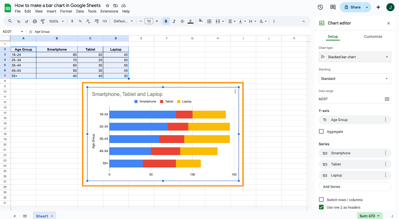
Example:
Breaking down total monthly expenses into subcategories like rent, utilities, groceries, and transportation across several months.
4. 100% stacked bar graph
Use case:
Best for illustrating the relative percentage of subcategories within a total, making it easy to compare proportions across different categories, even when the totals differ.
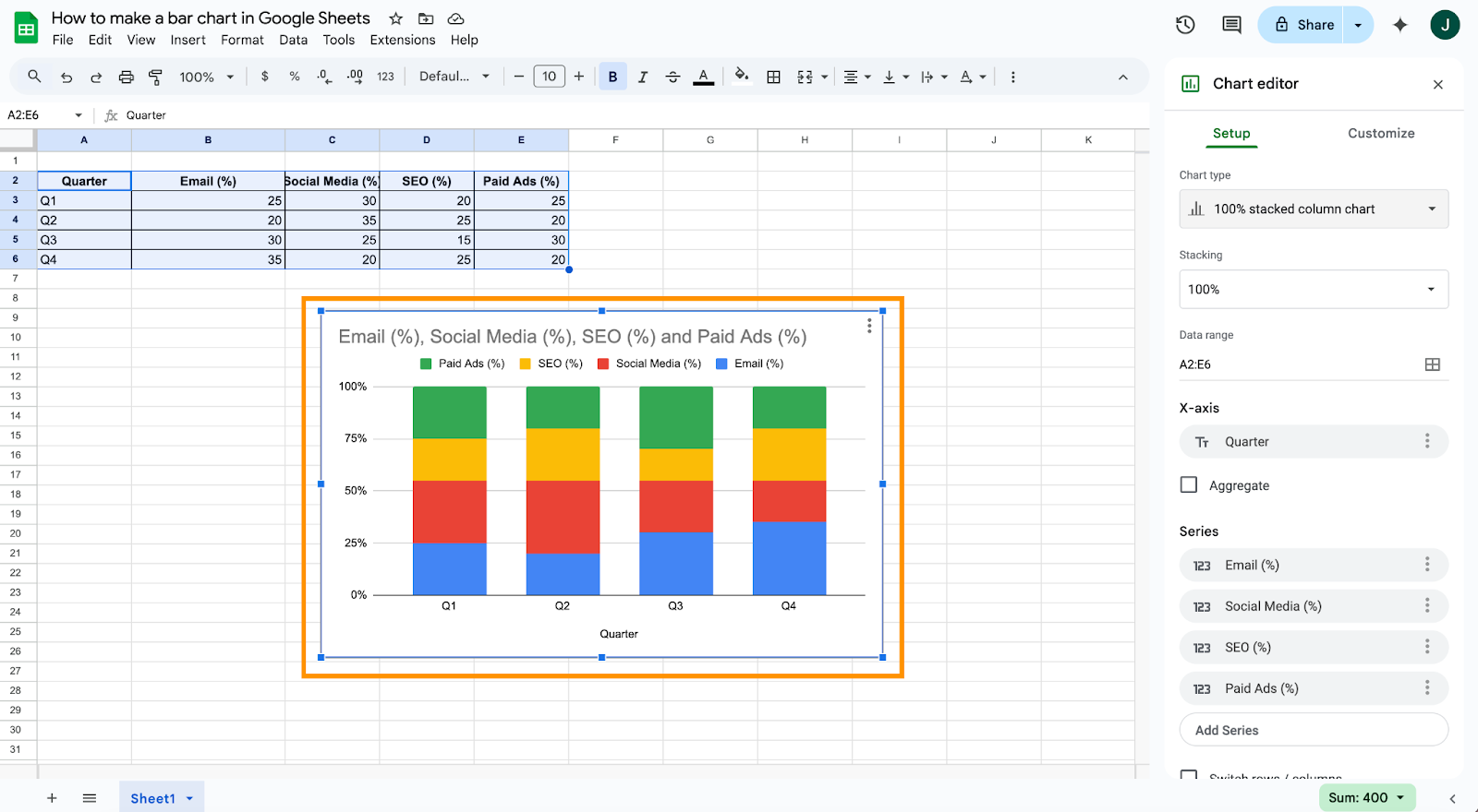
Example:
Showing what percentage of total website traffic comes from mobile, desktop, and tablet devices across various marketing campaigns, regardless of the campaign size.
How to make a bar graph in Google Sheets (Step by step)
Follow these detailed steps to create your bar graph:
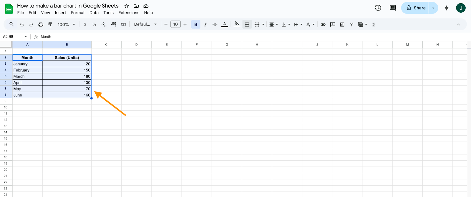
Step 1: Open your Google Sheet with the data.
Step 2: Highlight the data you want to represent in your bar graph.
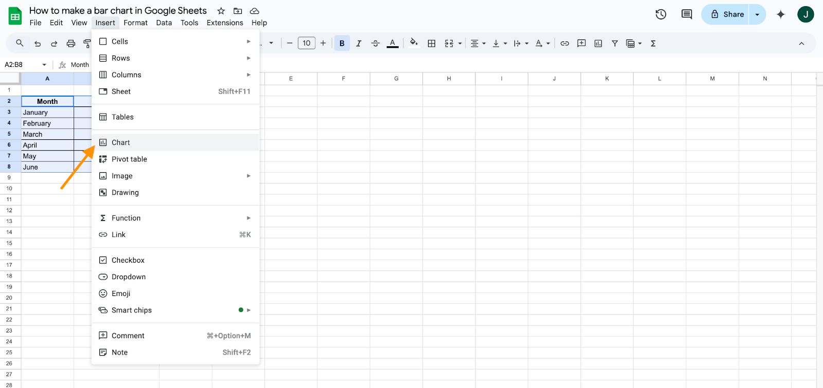
Step 3: Click Insert from the top menu, then select Chart.
Step 4: In the Chart Editor, choose Bar chart under the Chart type dropdown.
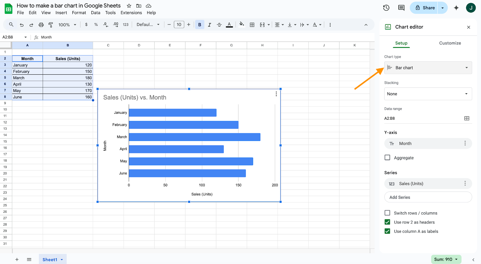
Step 5: Confirm the data range and adjust if necessary. Google Sheets automatically generates your bar graph.
How to customize a bar graph in Google Sheets
Customizing your bar graph is straightforward:
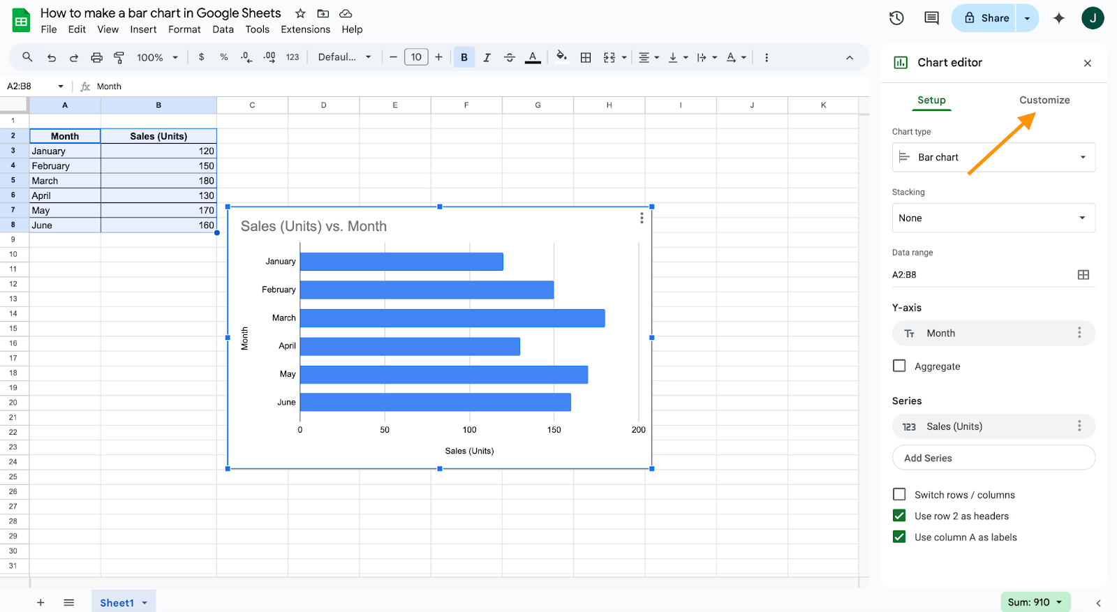
Step 1: Click on your bar chart to select it.
Step 2: Use the Customize tab in the Chart Editor sidebar.
Step 3: Adjust the bar colors, font types, background, chart title, and axis labels to match your branding.
Step 4: Optionally, you can style individual bars if particular data points are significant.
Why and when to use bar graphs in Google Sheets?
Bar graphs provide clear advantages:
- Simplicity: Bar graphs are visually intuitive. Even non-technical audiences can quickly understand what the data means. The length of the bars directly represents the values, making comparisons easy without the need for complex explanations.
- Versatility: They work with a wide range of data types — from categorical data, such as survey responses, to numerical data, like monthly revenue. Whether you’re comparing performance, tracking growth, or summarizing distributions, bar graphs can be adapted to meet your needs.
- Comparative analysis: Bar graphs shine when you need to compare values across multiple categories or time frames. Whether it’s product performance, regional differences, or budget versus actual spending, the visual layout clearly highlights these differences.
- Effective for survey results: If you’re summarizing feedback from a customer satisfaction survey, employee engagement poll, or product rating, bar graphs help turn raw response counts or percentages into a digestible visual summary.
When to use bar graphs?
- Year-over-year or month-by-month comparisons: Need to show how sales, traffic, or conversions have changed over time? Vertical bar graphs (also known as column charts) make it easy to illustrate trends at regular intervals.
- Survey results and market research: Bar graphs help showcase preferences, rankings, and frequency data from research findings. For example, displaying how many users prefer feature A vs. feature B provides immediate insight.
- Demographic or categorical breakdowns: Want to show age groups in a population, gender distribution, or usage patterns by region? Horizontal bar graphs are well-suited for this purpose, especially when category labels are lengthy.
- Budget and financial visualizations: Whether you’re allocating funds across departments or comparing projected vs actual spending, bar graphs offer a neat overview that makes budget discussions much more actionable.
Consider the Jotform option
Even if you follow the steps above, your end result might not meet your expectations. If that’s the case, think about using Jotform’s Report Builder. The Report Builder offers even more functionality than Google Sheets, including the ability to display multiple charts per page and customize them to suit your needs.
You can draw data straight from a form within Jotform, and you’ll have control over individual elements of your chart, so you can place them exactly where you want them. Jotform is a great option for leveling up your data visualization game, offering a flexible and intuitive interface for bar chart creation.
Raise the bar
Bar charts have remained among the most popular options for representing data since they first appeared on the scene. It’s what you choose to do with your data and your charts that will illustrate the data-gathering expertise of your business.
Communicating your expertise well helps you separate yourself from competitors, inspire confidence internally, and convince your clients and potential customers that your business is the right one for the job. And whether you use Google Sheets or maximize your bar charts’ potential with Jotform, you’ll be equipped with the knowledge you need to create visually pleasing and detailed data presentations.
Photo by picjumbo.com from Pexels


Send Comment: