
A straightforward navigation structure can increase the usability of your website, and make information easy to find. By using basic HTML and CSS, you can build a horizontal nav bar that provides interaction when a user hovers over a navigation link.

Photo by Kurt Liebhaeuser on Unsplash
Pro Tip
Sign up for a free Jotform account to create powerful online forms in minutes — with no coding required.
Start with Markup First
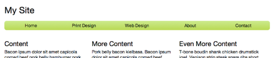
While you probably already have a design in mind that fits with the rest of your site, concentrating on HTML first, before worrying about the presentation and CSS, will help you keep your markup clean and tight. This results in better front-end performance and aids in organization as you continue your development. Figure 1 illustrates the end result.
Break It Down
You’ll learn the rationale and code for each step in the build process:
- HTML structure
- Structural styles: aligning the items, padding, and margins
- Decorative styles: gradients, text color, border radius
- Special interactive styles using pseudo class selectors
HTML Structure
Solid HTML structure is the foundation of any Web page. There are many different ways to achieve the same visual result, but some structures offer advantages like semantic meaning and can help you keep your corresponding CSS stylesheets in order.
Using HTML5 Semantic Tags
Before HTML5, the tag <div> was a one-size-fits-all containing element for anything from main text sections to footers. However, new semantic tags like <header>, <nav>, <section> and <footer> better organize markup into meaningful sections and reduce the need for repetitive class names in your stylesheets. Since most modern browsers support HTML5, it’s best to take advantage of these new descriptive tags to give your markup contextual meaning.
Semantic markup not only keeps the document tree neat and tidy, it assists users who experience the Web site through means other than pixels in a browser window, such as a screen reader or other assistive device. Additionally, having sound markup structure is efficient and can eliminate the need for class names (for example, instead of <div class=”list”>, use <ul>) and therefore keep your CSS files smaller and better performing.
What About Compatibility?
If you’re working on a project that requires support for older browsers like IE7 and IE8, you’ll need to include a small script called html5shiv (or html5shim) in a conditional comment in your <head>. This script allows legacy version of IE to use html5 and provides some basic styling. It works well out-of-the-box, so there’s little need for configuration.
Include the script in your<head> file in a conditional comment targeting IE9 and lower.
- <!–[if lt IE 9]>
- <script src=”https://www.noupe.comdist/html5shiv.js”></script>
- <![endif]–>
Make sure that you include this file after you link to your stylesheets. Otherwise, there may be a flash of unstyled content on the screen while the script loads. To help prevent high load times, it’s best to minify the shiv script, using a tool like JSCompress.
Marking up the Navigation Bar
At its core, a navigation bar is a simple list of links. HTML has several list types: an ordered list <ol>, unordered list <ul>, and definition list <dl>. Within each list, items are wrapped in list item tags, <li>, which in this case will contain anchors that link to other pages.
Since this list serves the purpose of navigation, a <nav> tag is appropriate as the containing parent element. Then, because the links don’t necessarily belong in any numbered order, <ul> is the best choice for list type. Within the <ul>, each navigation link is housed in an <li>. Each link, or <a>, points to a link, which is defined by the using the anchors href attribute. This reference can be either an absolute or relative path. An absolute path is a full URL like “http://www.google.com.” With site navigation, you’re more likely to use a relative link, which is a reference to a file within the same directory as the referring page, like “/contact.”
- <a href=”/contact”>Contact</a>
You can also use ../ to move back a folder.
Additionally, you can specify the link’s target, or where the link should open: in a new tab, a new window, or in the current window. Since navigation bars typically only contain links within the same website, specifying a target isn’t necessary except for special cases.
Your markup will look something like this:
- <nav>
- <ul>
- <li>
- <a href=”/”>Home</a>
- </li>
- <li>
- <a href=”/print”>Print Design</a>
- </li>
- <li>
- <a href=”/web”>Web Design</a>
- </li>
- <li>
- <a href=”/bio”>Bio</a>
- </li>
- <li>
- <a href=”/contact”>Contact</a>
- </li>
- </ul>
- </nav>
Why Not Just Anchors?
It’s true: you could easily reproduce the same visual style and behavior with the following markup:
- <div class=”nav”>
- <a href=”#”>Home</a>
- <a href=”#”>Print Design</a>
- <a href=”#”>Web Design</a>
- <a href=”#”>Bio</a>
- <a href=”#”>Contact</a>
- </div>
This is even less markup than the example provided above. But imagine this snippet of code was taken out of context. Sure, it would still be a collection of links. However, it wouldn’t be apparent that these particular links were the main navigation for the page, or even that they should appear within the context of a list. Now imagine you’re using a screen reader and can’t see the rest of the page. Using semantic tags, though it may cause another level of nesting in your markup, actually creates a better-organized and accessible page. Additionally, using semantic tags like <nav> actually negate the need for a class name like “nav,” therefore reducing the complexity of your site’s markup.
Styling with CSS
Now that the HTML is in place, you can use CSS to arrange and decorate each element.
Many CSS frameworks advocate separating structural CSS, like alignment, margins, and padding, from decorative CSS, like gradients, text color, and rounded corners. While this approach may or may not suit your project, we’ll keep these two types of CSS separated to better understand the styles being applied to the navigation bar.
Pro Tip
As you style your navigation bar, consider adding a CSS print stylesheet so printed pages hide unnecessary elements like menus and display the main content in a cleaner, more readable format.
Reset Stylesheet
In any project, using a good reset stylesheet can save you from overriding browser-specific default style behaviors in multiple places. A very basic reset stylesheet might look something like the following:
- h1, h2, h3, h4, h5, h6, p, a, ul, ol, li, small {
- margin: 0;
- padding: 0;
- border: 0;
- outline: 0;
- font-size: 100%;
- background: transparent; }
Essentially, a reset stylesheet simply sets each element back to a common default. This prevents you from having to manually override default structural or decorative rules in your individual style declarations, since browsers often apply their own styles and formats to the above elements, causing them to look inconsistent across browsers.
Eric Meyer’s reset stylesheet is a popular choice for many projects, and Richard Clark updated it to add HTML5 element.
Whatever type of reset stylesheet you use, make sure that it’s the first stylesheet added to your head. That way your site will take advantage of CSS’s cascading behavior, and your subsequent stylesheets will simply modify an already-consistent common style.
Structural CSS: Width, float, and spacing
First start by declaring a width and some margin spacing for the navigation bar.
- /* Give the body a width */
- body {
- width: 100%;
- max-width: 960px;
- margin: 0 auto; }
- /* Make the nav take up the whole body width, and give it some top and bottom margin space */
- nav {
- width: 100%;
- margin: 20px 0; }
- /* Make the list of links take up the whole width of the nav */
- nav ul {
- width: 100%; }
There are five navigation links, so they each need to take up 1/5 of the total nav bar width. This means each <li> should be 20% wide, and the anchors inside of them should take up 100% of the <li>. We also want to set the anchor display to block, since we haven’t declared that yet. Making the anchor a block will make it fill the height and width of its parent <li>. Depending on your reset stylesheet, you may not need to declare this rule again.
- nav ul li {
- width: 20%; }
- nav ul li a {
- display: block;
- width: 100%; }
While you may prefer that lists in other parts of your site to be visually distinguishable with bullets, dashes, or discs for each list item, you definitely don’t want those to show up in the navigation bar. Adding the following style rules will override any existing list-item or spacing styles being applied. Note: if you are using a reset stylesheet, these rules may not be necessary.
- nav ul {
- width: 100%; /* from above */
- list-style: none;
- margin: 0;
- padding: 0; }
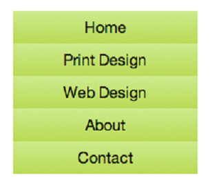
The last piece of the structural CSS is getting each of the links to line up side by side, creating the horizontal bar. By default, each of the <li> elements will stack vertically as Figure 2illustrates.
To make them appear in a horizontal row, use float.
- nav ul li {
- width: 20%; /* from above */
- float: left; }
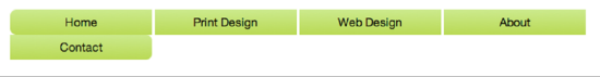
Floating left will stack items from left to right, starting with the first item in your list. Since there are five items that take up 20% of the nav bar’s width, the end result, Figure 3, is a horizontal bar with five equally spaced items.

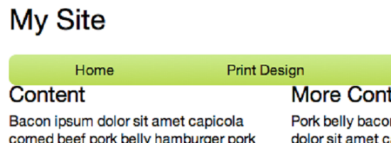
One unique characteristic of float is that it takes elements out of the page flow and pulls them either left or right. Because of this, the <ul> thinks it has no children within it, and will collapse. This issue exists with all parent/child relationships when the children are floated, not just in the case of your nav bar. To trick the parent element into recognizing its floated children, declare overflow: hidden on the parent. Your <ul> height will again be correct. You may not have any styles applied to the <ul>, but ignoring the height may lead to other layout problems. For example, if you leave the <ul> with a height of 0, subsequent elements may be spaced incorrectly (see Figure 4 for an example).
If float’s a pain, why not use inline block?
It’s true that display: inline-block will also make each of the <li> elements stack next to each other in a horizontal row. However, inline-block also adds some default space between elements (see Figure 5) that is difficult to override consistently in browsers.
Since the design of this particular nav bar doesn’t have any space between items, it’s better to use float because it’s guaranteed to stack the <li>s next to each other without any unexpected gaps.
Decorative CSS
Now that each of the HTML blocks is properly spaced and positioned, it’s time to decorate.
Each nav item has a slight gradient background, and the gradient darkens when a user hovers over the link. The first and last items also have rounded corners. CSS3 makes both of these previously-painful designs easy to implement.
Gradients
Instead of using a repeating background image for gradients, most modern browsers now support CSS3 gradients, which creates the gradient from your input and uses it as a background-image. Writing your own CSS for linear or radial gradients is a bit of work, but it’s not always necessary. There are plenty of gradient generators online, and ColorZilla (a browser plugin that allows you to copy color codes from sites) has a great one of their own. If you prefer working with Sass, you can toggle the code output.
Since the anchor is the element that the users are interacting with, not the li, it’s better to make style rules for the anchor itself. It would also be possible to add style rules to the <nav> itself, but depending on your style choices, you may be setting yourself up for conflicts in the future.
Start by adding the default gradient background to the links.
- nav ul li a {
- text-align: center;
- padding: 8px 0;
- display: block;
- width: 100%;
- background: #cdeb8e; /* Old browsers */
- background: -moz-linear-gradient(top,
- #cdeb8e 0%, #b0ca34 100%); /* FF3.6+ */
- background: -webkit-gradient(linear,
- left top, left bottom, color-stop(0%,#cdeb8e),
- color-stop(100%,#b0ca34)); /* Chrome,Safari4+ */
- background: -webkit-linear-gradient(top,
- #cdeb8e 0%,#b0ca34 100%); /* Chrome10+,Safari5.1+ */
- background: -o-linear-gradient(top,
- #cdeb8e 0%,#b0ca34 100%); /* Opera 11.10+ */
- background: linear-gradient(to bottom,
- #cdeb8e 0%,#b0ca34 100%); /* W3C standard, IE10+ */
- filter: progid:DXImageTransform.Microsoft.gradient(
- startColorstr=’#cdeb8e’,
- endColorstr=’#b0ca34′,GradientType=0 ); /* IE6-9 */
- }
This gradient output is directly from ColorZilla, and already includes prefixes and workarounds for older versions of IE. Note that for the unprefixed linear-gradient, it is recommended to precede the directional declaration with the word “to,” such as “to bottom” or “to top,” which is a change from just “top” or “bottom”.
Hover Styles
Pseudo class selectors allow you to target specific elements based on their position or state. For an interactive navigation bar, using pseudo class selectors (sometimes just called pseudo classes or pseudo selectors) grants more precise control of the appearance of the navigation item list. Pseudo classes are recognized by their preceding colon; for example, :hover or :active.
You might be familiar with the type of pseudo classes that target <anchor> elements based on their state.
- :visited
- :hover
- :active
In order to make the nav link appear visually different when the user hovers over it, append the :hover pseudo class to the a selector, and define a different background style.
- nav ul li a:hover {
- background: #b0ca34; /* Old browsers */
- background: -moz-linear-gradient(top,
- #b0ca34 0%, #96c40d 100%); /* FF3.6+ */
- background: -webkit-gradient(linear, left top, left bottom,
- color-stop(0%,#b0ca34),
- color-stop(100%,#96c40d)); /* Chrome,Safari4+ */
- background: -webkit-linear-gradient(top,
- #b0ca34 0%,#96c40d 100%); /* Chrome10+,Safari5.1+ */
- background: -o-linear-gradient(top,
- #b0ca34 0%,#96c40d 100%); /* Opera 11.10+ */
- background: linear-gradient(to bottom,
- #b0ca34 0%,#96c40d 100%); /* W3C standard, IE10+ */
- filter: progid:DXImageTransform.Microsoft.gradient(
- startColorstr=’#b0ca34′,
- endColorstr=’#96c40d’,GradientType=0 ); /* IE6-9 */
- }
Depending on the reset stylesheet you’re using (or not using!) you may need to override the default behavior of links in each of its dynamic pseudo class states. Typically, links change color when visited, and are underlined on hover.
- nav ul li a,
- nav ul li a:focus,
- nav ul li a:visited,
- nav ul li a:hover,
- nav ul li a:active {
- color: #000;
- text-decoration: none; }
Rounding Out the Corners
To round the corners on the first and last items in the nav list, you’ll need to use another type of pseudo class selector that note the position of an element within the document tree. Thesestructural pseudo classes show a relationship between an element and its parents or siblings. While not an exhaustive list, the most common structural pseudo classes are:
- :first-child
- :last-child
- :nth-of-type(n)
/* Where n is a number, targets the nth child. You can also use “even” or “odd” instead of a number. */
To round the corners, target the <a> in the first child and last child <li>.
- nav ul li:first-child a {
- border-top-left-radius: 8px;
- border-bottom-left-radius: 8px;
- }
- nav ul li:last-child a {
- border-top-right-radius: 8px;
- border-bottom-right-radius: 8px;
- }
Remember, there is only one anchor in each <li>, but many <li>s in the <ul>. Therefore, first target the <li> you want, and then the anchor within that element. A common mistake is to add the pseudo class to the anchor, and not the <li>. But since there’s only one anchor, it’s both the last child and the first child of its parent, and your styling will not work as planned. Moreover, the rounded corner will be applied on every single <a>.
Browser Compatibility
Depending on how important rounded corners are to you, prefixing might be necessary. A good resource for checking CSS browser support is https://www.caniuse.com/, which will explain the level of support each browser type and version offers for a CSS property.
There is a known conflict between filter (which is what legacy IE browsers use for gradients) and border-radius. The filter does not listen to border-radius, so you’ll end up with square corners regardless of border-radius rules. Since IE10 supports background gradients (rather than a filter), I typically omit the filter rule from all gradient styles, and allow IE9 and lower to fall back to a simple background-color.
Personalize Your Design
Now that you have structure and styles for your navigation bar, take some time to personalize the color scheme, fonts and layout. There are some other fairly simple CSS properties that have big visual impact. text-shadow and box-shadow add dimension to your text and containing elements, and transition can apply a fade animation to the background-image without using any jQuery.
- box-shadow: 0 0 1px #000; /* x offset, y offset, size, color */
- text-shadow: 2px 2px 2px #000;
- transition: background 2s;
Similar to border-radius, not all browsers support these properties, so make sure to prefix appropriately.
Review
With some basic HTML and CSS, you can create a simple navigation bar with a lot of visual impact.
- Start with HTML to nail down a simple, semantic document structure
- Focus on structural styles next. Tweak margins, paddings, and move your blokc elements into the position you want.
- Next, it’s time to decorate. Take advantage of CSS3 gradients and border-radius. Refer to www.caniuse.com to know when to prefix, and employ the help of pseudo class selectors for interactive styles, or to target specific elements without needing an extra class name.
Full Code Example
HTML
- <nav>
- <ul>
- <li>
- <a href=”#”>Home</a>
- </li>
- <li>
- <a href=”#”>Print Design</a>
- </li>
- <li>
- <a href=”#”>Web Design</a>
- </li>
- <li>
- <a href=”#”>Bio</a>
- </li>
- <li>
- <a href=”#”>Contact</a>
- </li>
- </ul>
- </nav>
CSS
- body {
- width: 100%;
- max-width: 960px;
- margin: 0 auto; }
- nav {
- width: 100%;
- margin: 20px 0; }
- nav ul {
- list-style: none;
- overflow: hidden; }
- nav ul li {
- float: left;
- width: 20%; }
- nav ul li a {
- text-align: center;
- padding: 8px 0;
- display: block;
- width: 100%;
- background: #cdeb8e; /* Old browsers */
- background: -moz-linear-gradient(top,
- #cdeb8e 0%, #b0ca34 100%); /* FF3.6+ */
- background: -webkit-gradient(linear, left top, left bottom,
- color-stop(0%,#cdeb8e),
- color-stop(100%,#b0ca34)); /* Chrome,Safari4+ */
- background: -webkit-linear-gradient(top,
- #cdeb8e 0%,#b0ca34 100%); /* Chrome10+,Safari5.1+ */
- background: -o-linear-gradient(top,
- #cdeb8e 0%,#b0ca34 100%); /* Opera 11.10+ */
- background: linear-gradient(to bottom,
- #cdeb8e 0%,#b0ca34 100%); /* W3C, IE10+ */
- filter: progid:DXImageTransform.Microsoft.gradient(
- startColorstr=’#cdeb8e’,
- endColorstr=’#b0ca34′,GradientType=0 ); /* IE6-9 */
- }
- nav ul li a,
- nav ul li a:focus,
- nav ul li a:visited,
- nav ul li a:hover,
- nav ul li a:active {
- color: #000;
- text-decoration: none; }
- nav ul li a:hover,
- nav ul li a:active {
- background: #b0ca34; /* Old browsers */
- background: -moz-linear-gradient(top,
- #b0ca34 0%, #96c40d 100%); /* FF3.6+ */
- background: -webkit-gradient(linear, left top, left bottom,
- color-stop(0%,#b0ca34),
- color-stop(100%,#96c40d)); /* Chrome,Safari4+ */
- background: -webkit-linear-gradient(top,
- #b0ca34 0%,#96c40d 100%); /* Chrome10+,Safari5.1+ */
- background: -o-linear-gradient(top,
- #b0ca34 0%,#96c40d 100%); /* Opera 11.10+ */
- background: linear-gradient(to bottom,
- #b0ca34 0%,#96c40d 100%); /* W3C, IE10+ */
- filter: progid:DXImageTransform.Microsoft.gradient(
- startColorstr=’#b0ca34′,
- endColorstr=’#96c40d’,GradientType=0 ); /* IE6-9 */
- }
- nav ul li:first-child a {
- border-top-left-radius: 8px;
- border-bottom-left-radius: 8px; }
- nav ul li:last-child a {
- border-top-right-radius: 8px;
- border-bottom-right-radius: 8px; }
About the Author
Laura Athanasiou is a developer at HP Cloud. She’s passionate about semantic HTML, responsive design and sassy CSS. Follow her on Twitter at @rhein_wein.
Banner Image by James Osborne from Pixabay


Send Comment:
11 Comments:
June 3, 2022
I have read this blog often, it is a very impressive and informative blog. the vip gentlemens club.
September 8, 2019
this is nothing....its not worth it
June 14, 2019
Great work Laura, you thought me a full book of lessons from your short lecture on navigation bars. Thanks once again.
May 10, 2019
hello i need abit of help Ugently please
whatsapp 0713826326
March 20, 2014
I have few different ideas:
Idea #1: Load entire site into one page, all "non-active" parts of the site using display: none. When you click one of the links, use javascript to hide the current part of the body and to show the page you want to show.
Idea #2: Use AJAX. When you click a button, a call to a server-side function is called that returns the body for the link's corresponding page. that html is loaded into your body.
Idea #3: Use a javascript template. By using javascript templates, you can create your html pages and then easily load them into your body using javascript. You could read into Handlebars.
I would probably go with idea #3, as the first two, in my opinion, are a little more cumbersome.
March 3, 2014
How do you create a navigation bar that doesn't reload everytime you press a link? I want just the body part to change. I've searched for hours without finding anything, given my extremely limited knowledge.
November 21, 2013
Thank you !!!!!
August 30, 2013
Thanks for the value added.
August 29, 2013
While the information is good, three things stuck out at me
1. the title of the post is "interactive navigation bar" but i was expecting more than just :hover - images, animation, drop downs
2. a link to a live example is always helpful
3. due to the large amount of mobile/responsive design, adding that to the css (@media) would have been good as well
August 29, 2013
Why is there no demo to see it all in action? I put it in a fiddle, here you go:
August 29, 2013
"having sound markup structure is efficient and can eliminate the need for class names (for example, instead of , use ) and therefore keep your CSS files smaller and better performing."
I don't agree with this. I do understand what you mean but I don't think that's how one could understand it just by reading this.
If you write your styles based on element names, you can end up with very unefficient code, the kind that sets some default properties and then overrides them a hundred times... all thoses overrides add up to your file size and performance cost. In a few words, "always use a class when you can".
Choosing the right markup for you navigation is another story. You can always write `...` and base your styles on `.menu`
Btw, I've been a loyal reader for a few months but never had the chance to say "very nice job on this blog": I really appreciate the work and the effort that are put into theses posts