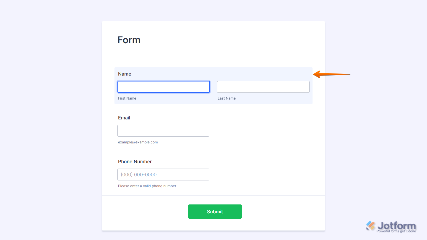
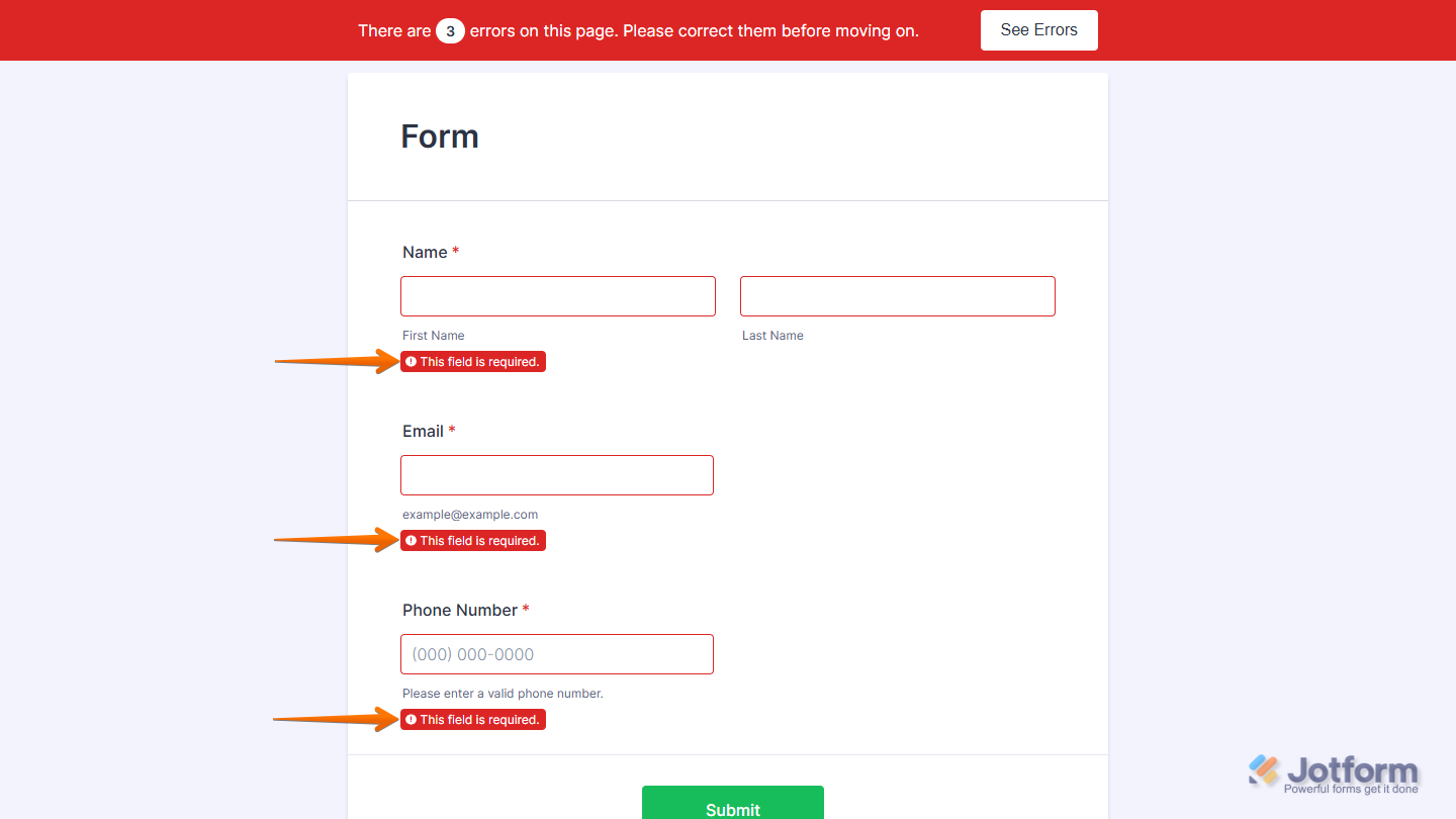
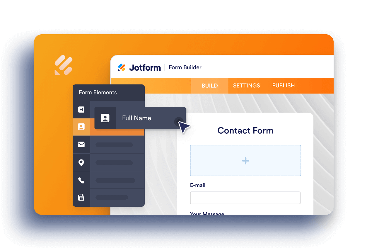
Jotform makes it easy to manage how fields behave when users make mistakes or interact with your form. Every form includes two built-in features: the error state, which alerts users when required fields are left empty or filled incorrectly, and the highlight effect, which visually emphasizes a field when it’s selected. Together, these features guide users to complete forms accurately and improve the overall experience.
You can disable or customize both features to better match your form’s design and improve the overall user experience.
Notes
- If you’re using the old default theme, you can reach out to us through our Help Center.
- A visual error state is a key part of form validation, and we strongly recommend keeping it enabled. Without a clear error message, users may become confused, which can reduce your form’s completion rate.


How to Remove the Error State
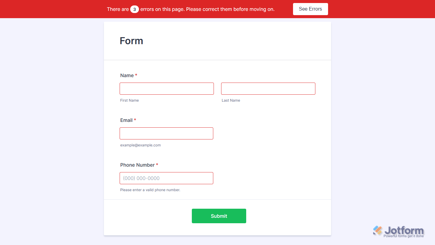
If you prefer not to use Jotform’s default error messages, you can inject custom CSS to remove them. This keeps the form clean but still gives users a subtle visual cue. Here’s what to do:
- First, copy this code:
.form-error-message {
display: none;
}
.form-validation-error {
box-shadow: none !important;
}
.form-line-error {
background: none;
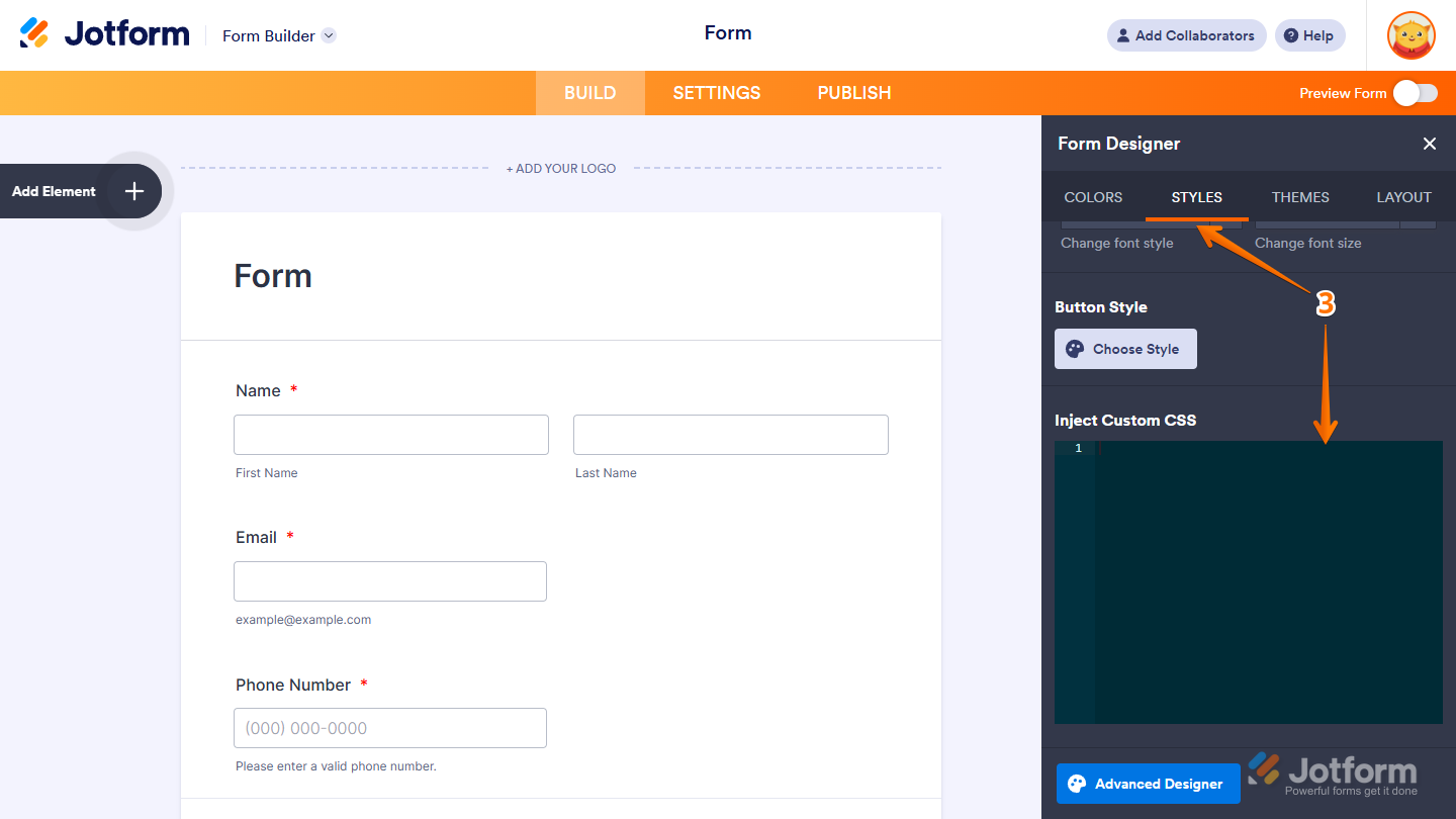
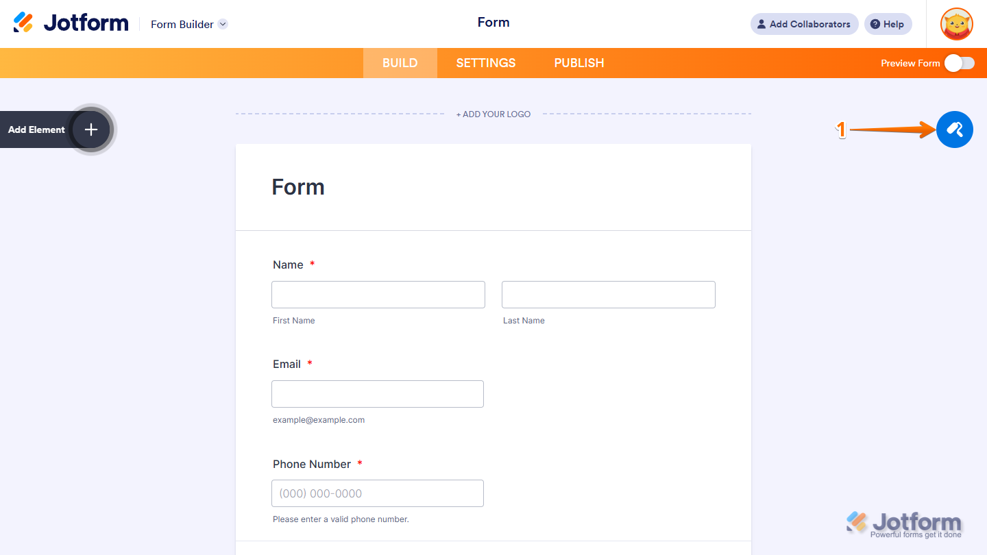
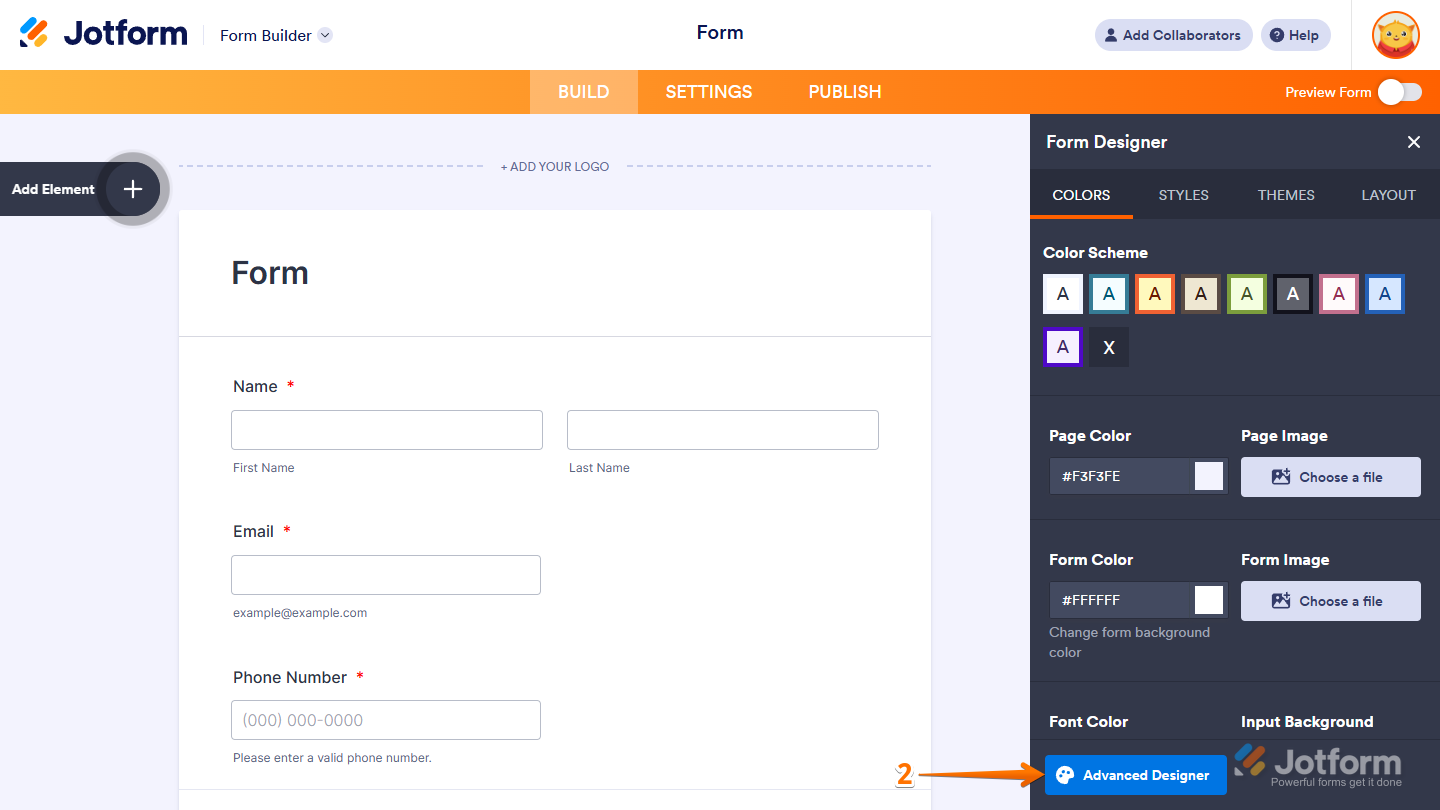
}- Then, in Form Builder, click on the Paint Roller icon on the right side of the page to open Form Designer.
- Now, in the Form Designer menu, click on the Styles tab, scroll down then paste the code into the Inject CSS Code box, and you’re all set.
That’s it! This will remove error messages and highlight errors with a simple red border instead. Here’s how it’ll look:
How to Disable the Highlight Effect
The highlight effect adds a subtle background change when a field is selected, but if you’d rather keep your form clean and distraction-free, you can easily turn it off. Here’s how to do it:
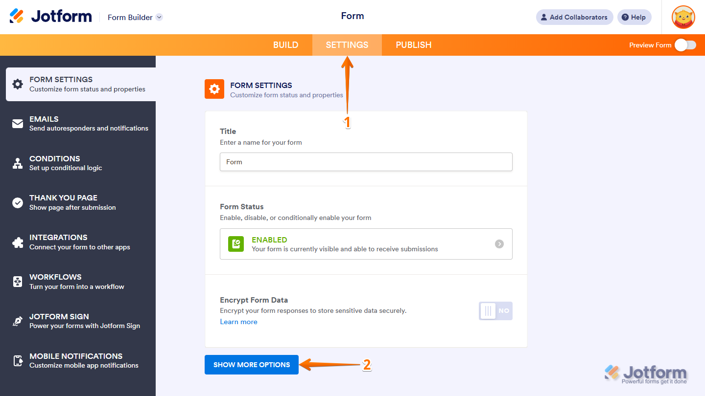
- In Form Builder, in the orange navigation bar at the top of the page, click on Settings.
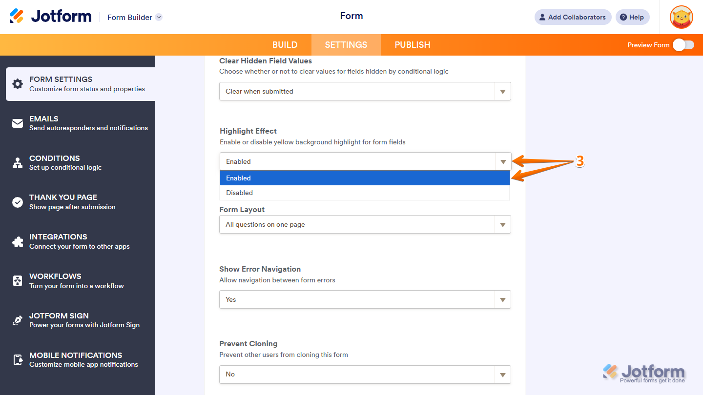
- In the Form Settings page, click on Show More Options.
- Next, scroll down to the Highlight Effect Dropdown menu, choose Disabled, and you’re good to go.
How to Customize the Error State
Error states help people quickly spot and fix mistakes on your form. You can adjust how these messages look to match your style and make them stand out. Here’s a quick how-to:
- In Form Builder, click on the Paint Roller icon on the top-right side of the screen.
- Then, in the Form Designer menu that opens, click on Advanced Designer.
- Now, in the Designer tab, under the Color Scheme section, check the box before Simulate Error State to see how it looks while customizing the effect.
- Then click on the Gear icon next to it.
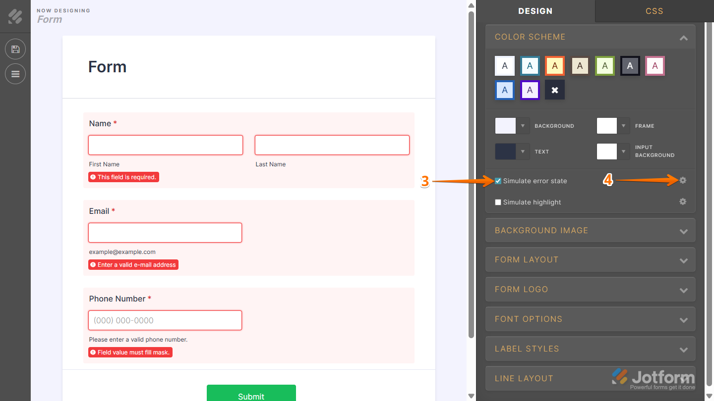
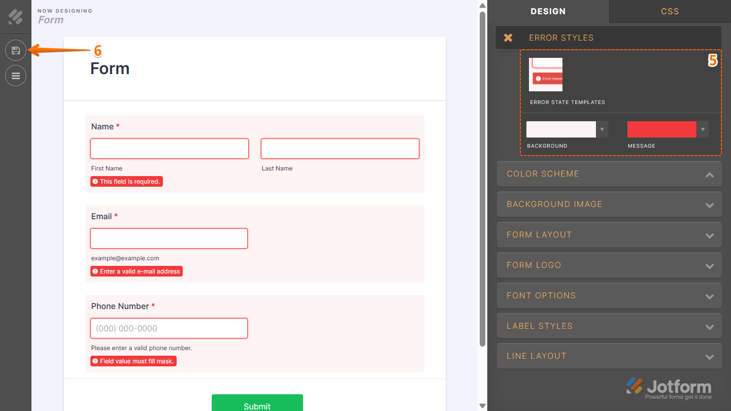
- Next, in the Error Styles section that comes up, configure these things:
- Now, in the top-left corner of the page, click on the Disc icon to save the changes, and you’re ready!
How to Customize the Highlight Effect
The highlight effect makes fields stand out when someone clicks on them. You can easily adjust the style to match your form’s design. Here’s a quick how-to:
- In Form Builder, click on the Paint Roller icon on the top-right side of the screen.

- Then, in the Form Designer menu that opens, click on Advanced Designer.

- Now, in the Designer tab, under the Color Scheme section, check the box before Simulate Highlight to see how it looks while customizing the effect.
- Then click on the Gear icon next to it.
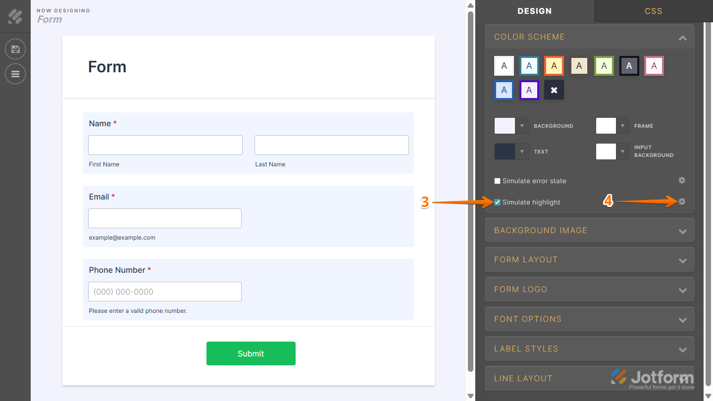
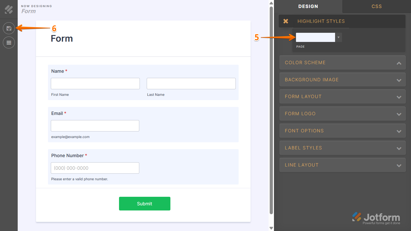
- Next, in the Highlight Styles section that comes up, click on Page, and set your highlight color.
- Now, in the top-left corner of the page, click on the Disc icon to save the changes, and you’re done.
That’s it! With these options, you can remove, disable, or fully customize error states and highlight effects to create a form that not only looks the way you want but also guides your users effectively. Whether you keep things simple or make them more visually dynamic, these settings give you full control over the form-filling experience.

Send Comment:
1 Comment:
December 13, 2023
Error message consistently shows up on form.
Would really like confirmation on gettin rid of it