With Jotform, you can easily collect multiple types of information in a single, organized field using the Input Table element. It’s a practical way to gather structured responses without making your forms feel cluttered or overwhelming for users. Whether you’re collecting ratings, selections, schedules, or other grouped data, the Input Table helps keep responses structured, organized, and easy to understand. You can also create custom tables with rows, columns, and multiple input types to match different kinds of forms, surveys, and workflows—all without needing any coding experience.
Here are a few ways to use it:
- Organize expense reports, budget entries, or payment breakdowns in financial forms.
- Let users submit schedules, availability, or time-related details in booking and planning forms.
- Capture ratings, rankings, or evaluation data in surveys and feedback forms.
- Manage itemized service requests, project details, or task lists in workflow forms.
- Simplify data entry for registration, application, or onboarding processes that require grouped information.
Note
The Input Table element is available in both Classic and Card Forms. You can check out our guide on When to Use Card Forms to learn more.
Adding the Input Table Element
Whether you’re creating a new form or updating an existing one, you can add the Input Table element to your form in a few easy steps. Here’s how to do it:
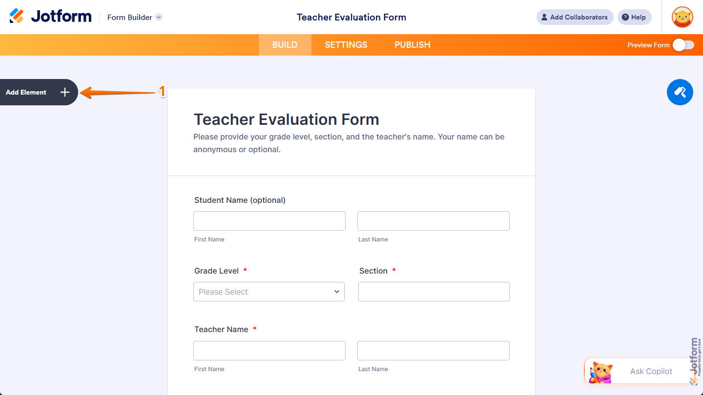
- In Form Builder, click on Add Element on the left side of the page.
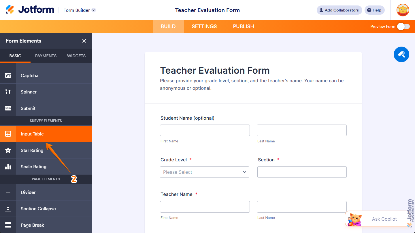
- Then, in the Form Elements menu, under the Basic tab, scroll down and then click on Input Table. Or, just drag and then drop it to where you want it to be on your form.
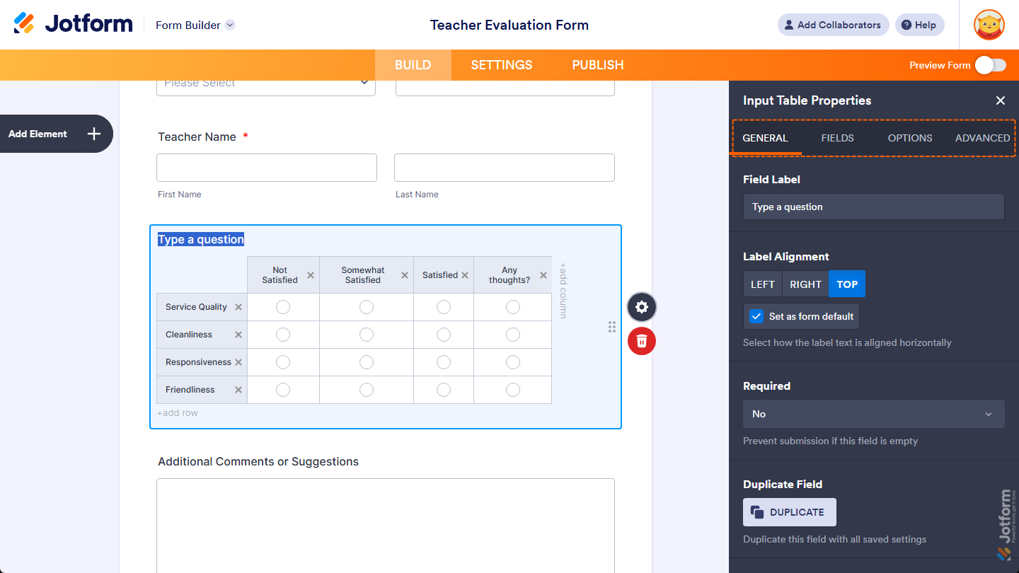
Once you’ve added the Input Table element to your form, you can adjust how it appears and works through the following tabs:
Configuring General Tab Properties
After adding the Input Table element, you can configure its basic properties to control how it looks and behaves on your form. Follow these quick steps to get started:
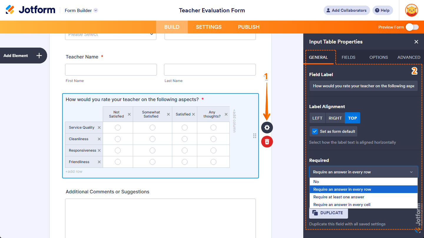
- In Form Builder, while your Input Table element is selected on your form, click on the Gear icon on the right side of it.
- Then, in the Input Table Properties menu that opens on the right side of the page, under the General tab, you’ll see a list of properties you can set:
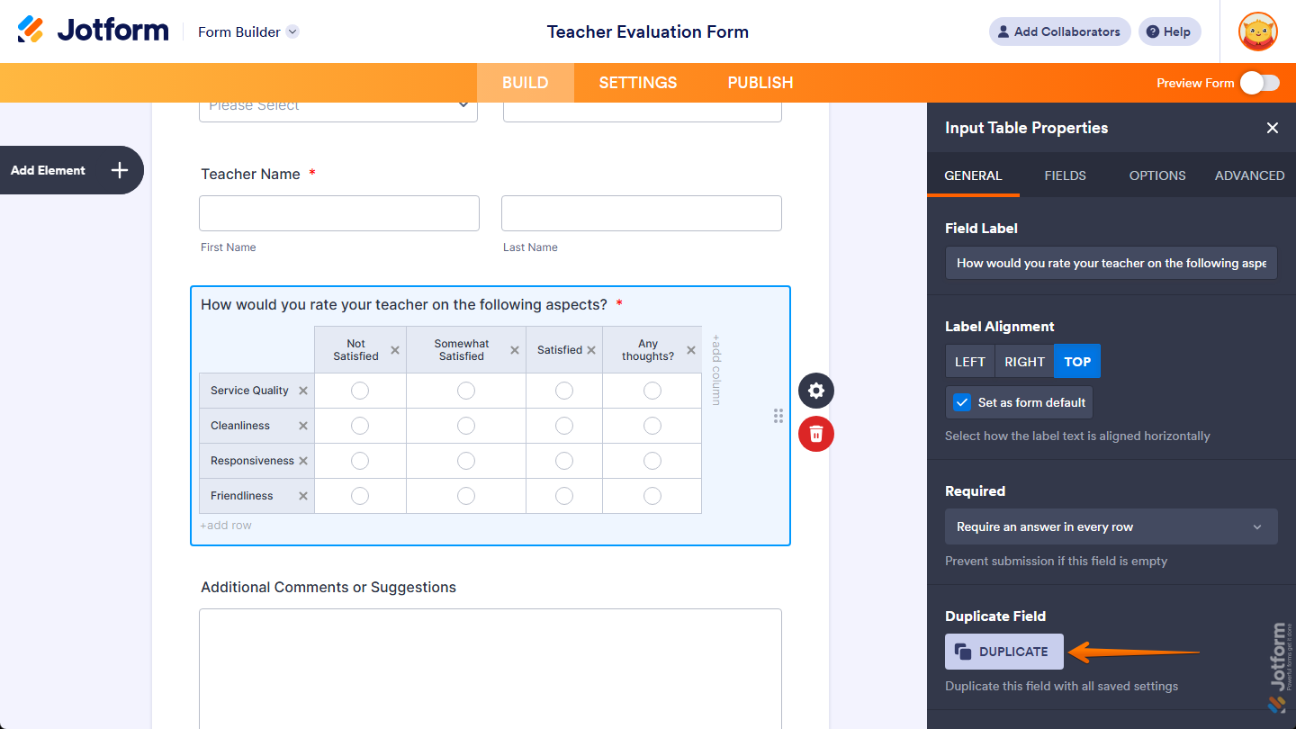
- Field Label — Delete the default text and enter a label in the input box if you want to customize your Input Table field’s question.
- Label Alignment — Keep this set to Center to position your Input Table field’s label in the middle of its width, or select Left or Right to position it on either side.
- Set as Form Default — Keep the check in the box next to this option, or remove it if you want other fields to retain their current label alignment when you change your Input Table field’s label alignment. You’ll only find this option in Classic Forms.
- Required — Keep this set to No or click on the Dropdown menu and select one of the following options if you want respondents to complete your Input Table field before they can submit the form:
- Require an answer in every row — Select this option to ensure respondents enter or select an answer in each row of your Input Table before submitting the form.
- Require at least one answer — Select this option to ensure respondents provide at least one response anywhere in your Input Table before submitting the form.
- Require an answer in every cell — Select this option to ensure respondents fill out every cell in your Input Table before submitting the form.
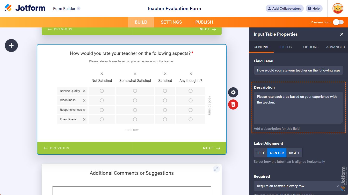
In Card Forms, you can enter text in the Description property to add context or instructions that appear below your field label.
That’s it. You’ve configured the General tab properties of the Input Table element on your form. If you want to create a copy of your field with the same setup, click on the Duplicate button at the bottom of this tab.
Managing Fields Tab Properties
Once your Input Table element is in place, you can adjust its properties to display time ranges and durations in your form. Here’s how to proceed:
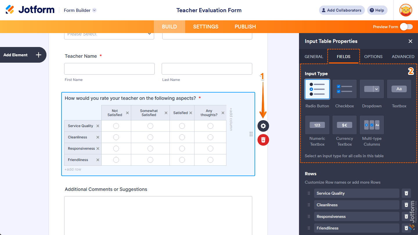
- In Form Builder, while your Input Table element is selected on your form, click on the Gear icon on the right side of it.
- Then, in the Input Table Properties menu that opens on the right side of the page, under the Fields tab, select the type of input you want respondents to use to enter or select answers in the table.
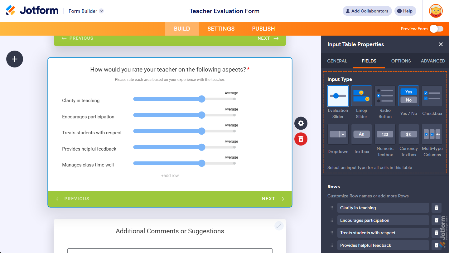
In Card Forms, you can select additional input types for your Input Table, such as Evaluation Slider, Emoji Slider, and Yes/No, to create a more interactive and engaging experience for respondents.
- Next, you’ll see a list of properties you can configure:
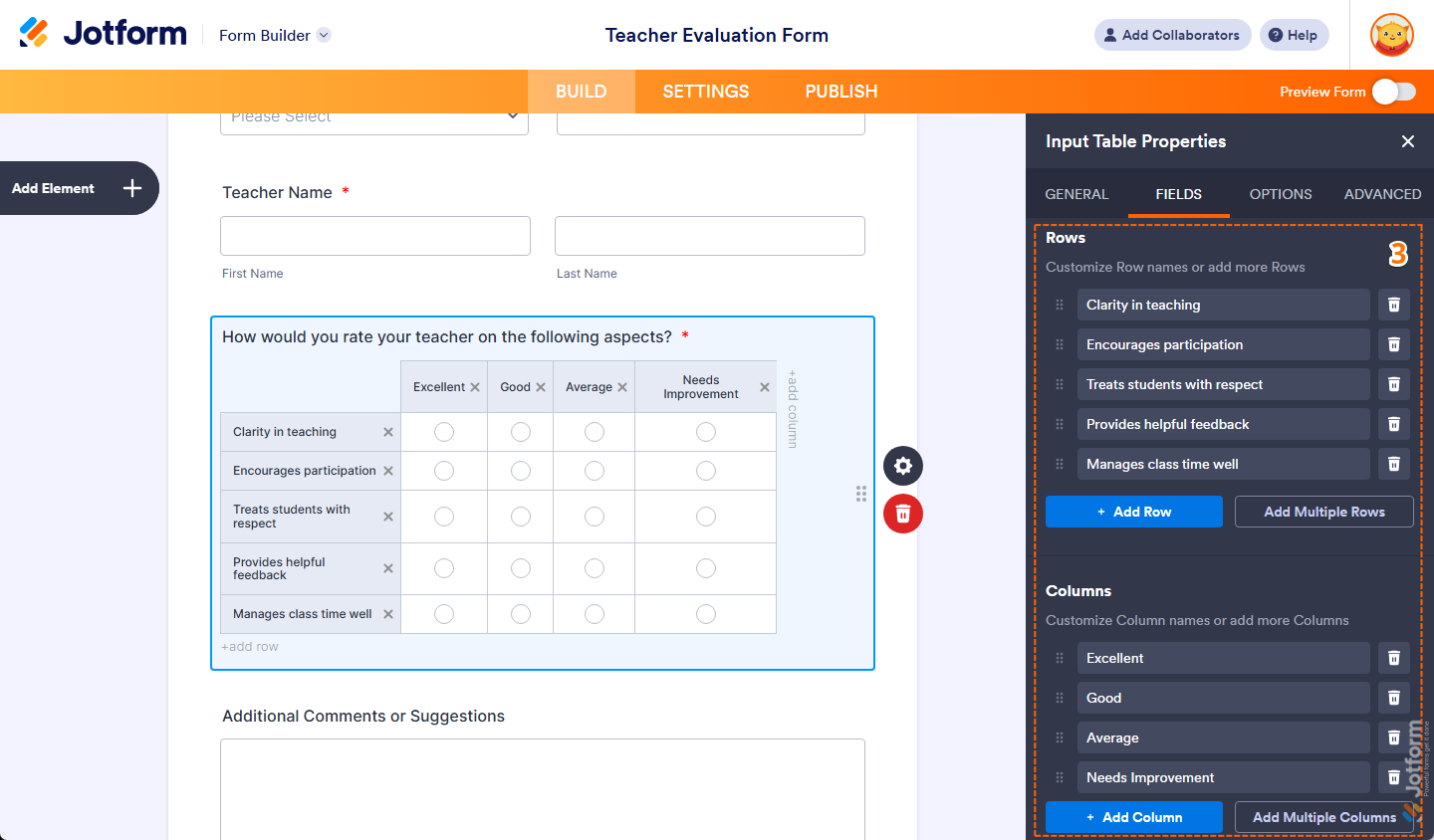
- Rows — Delete a default row name in an input box, then enter a new one to customize a row header, or click on the Trash icon on the right side of it to remove it. You can click on and hold the Six Dots icon on the left side of a row to grab it, then move it and drop it before or after another to change their order. You can also click on Add Row or click on Add Multiple Rows at the bottom of this property to include more rows.
- Columns — Delete a default column name in an input box, then enter a new one to customize a column header, or click on the Trash icon on the right side of it to remove it. You can click on and hold the Six Dots icon on the left side of a column to grab it, then move it and drop it before or after another to change their order. You can also click on Add Column or click on Add Multiple Columns at the bottom of this property to include more columns.
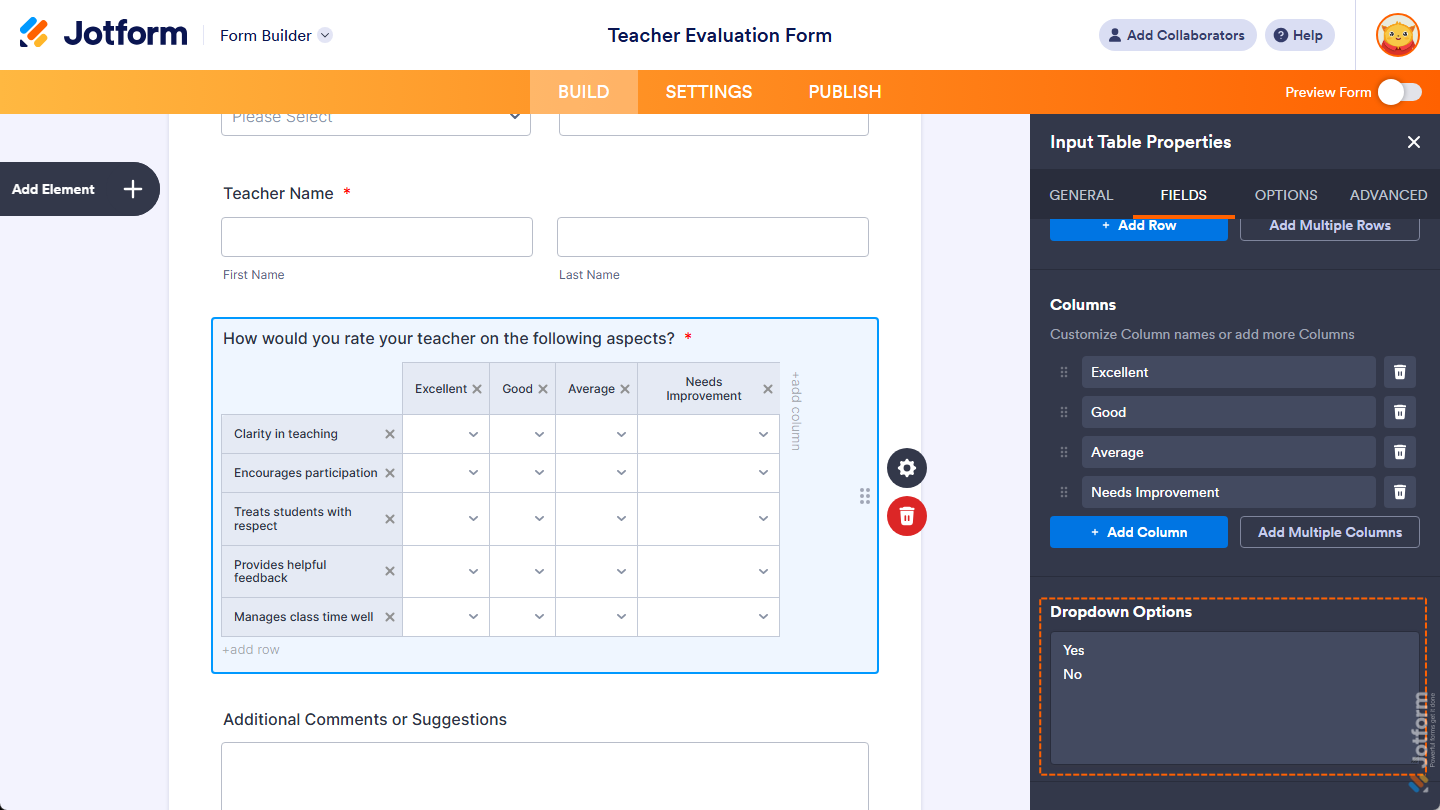
When you select the Dropdown input type, scroll down to the bottom of the Fields tab to see the Dropdown Options property. You can delete the default options set for the dropdown fields in your table’s columns, then enter new options separated by a new line to customize the available choices for respondents.
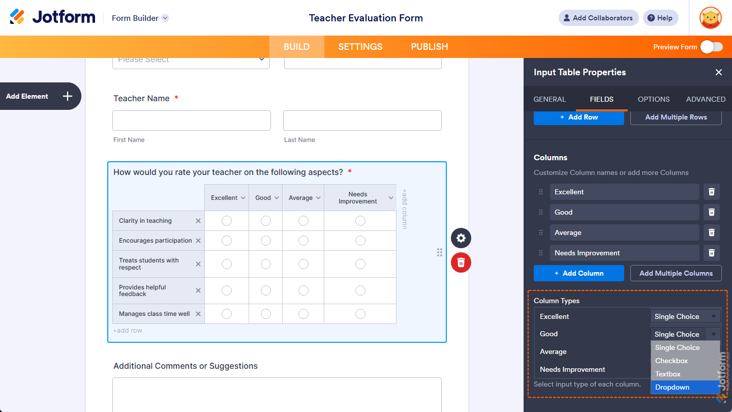
When you select the Multi-type Columns input type for your table, scroll down to the bottom of the Fields tab to see the Column Types property. You can keep a column’s input type set to Single Choice, or click on the Dropdown menu on the right side of its name to change it to Checkbox, Textbox, or Dropdown.
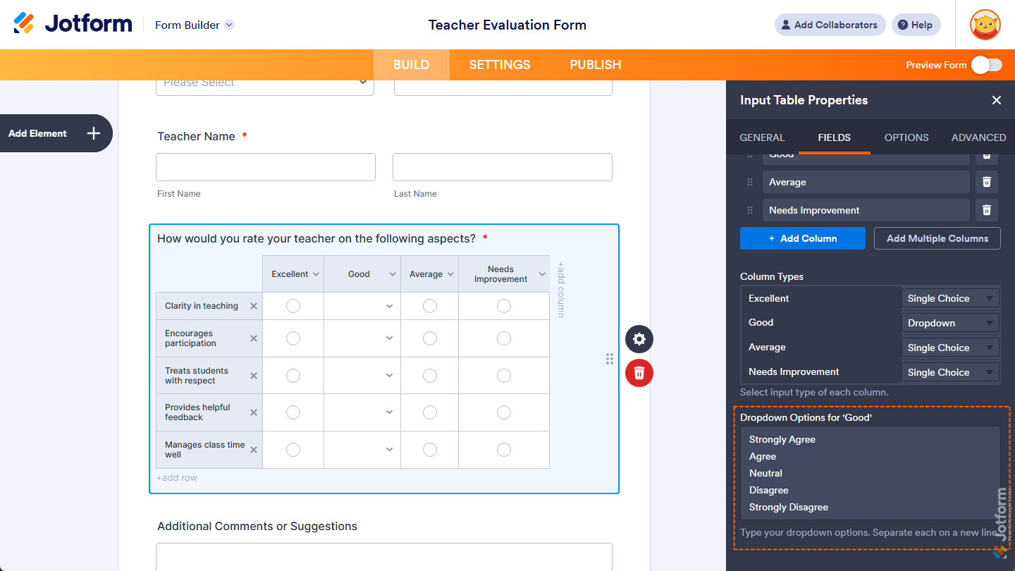
When you select the Multi-type Columns input type for your table and set a column to Dropdown, you’ll see the Dropdown Options for [Column Name] property, where you can enter available options for that column separated by a new line for respondents to choose from.
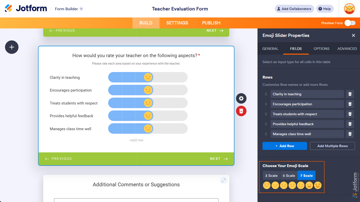
When you select the Emoji Slider input type in Card Forms, scroll down to the bottom of the Fields tab to see the Choose Your Emoji Scale property. You can keep it set to 5 Scale, or select either 3 Scale or 7 Scale instead.
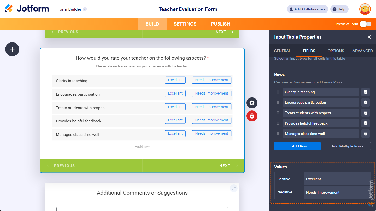
When you select the Yes/No input type in Card Forms, scroll down to the bottom of the Fields tab to see the Values property. You can delete the default values in the input boxes next to the Positive and Negative options, then enter new values to change the Yes and No button text in the table, which will also appear in submissions.
That’s it. You’ve set the Fields tab properties of the Input Table element on your form.
Setting Up Options Tab Properties
With the Input Table element added to your form, you can tweak its properties to set how time values are shown and limited for respondents. Here’s what to do:
- In Form Builder, while your Input Table element is selected on your form, click on the Gear icon on the right side of it.
- Then, in the Input Table Properties menu that opens on the right side of the page, under the Options tab, you’ll see a list of properties you can set up:
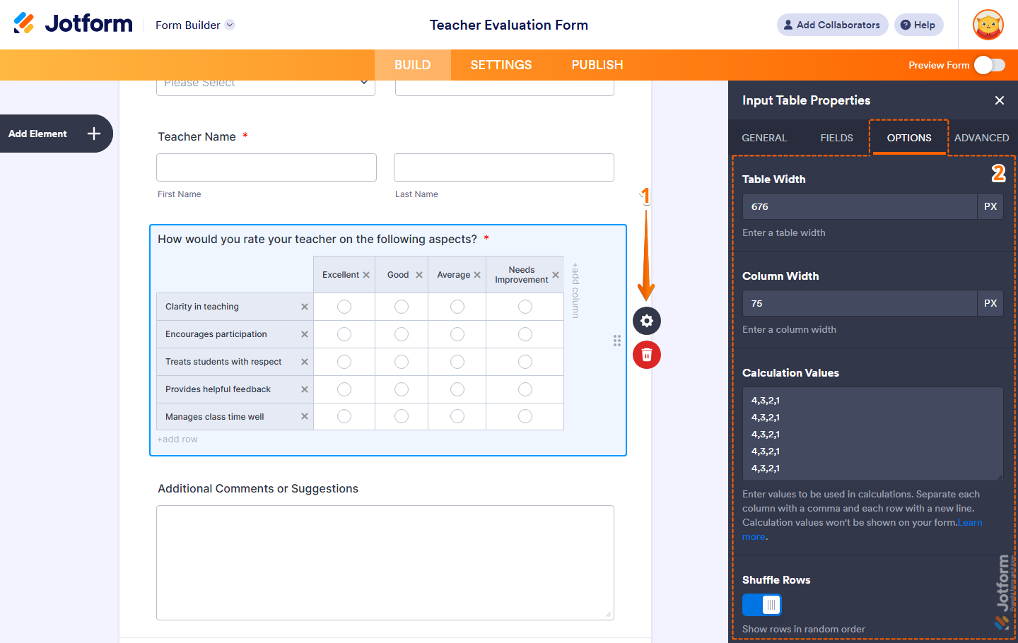
- Table Width — Keep this empty if you want your table to cover the entire width of your field, or enter a value in px if you want to set a specific width for your table within it. You’ll only find this option in Classic Forms.
- Column Width — Keep this empty if you want each column in your table to automatically adjust its width based on the length of its header, or enter a value in px if you want to set an equal width for all columns. You’ll also only find this option in Classic Forms.
- Calculation Values — Enter values for each cell that will be used to calculate totals or results in your form. Separate the value for each column with a comma and each row with a new line. These values won’t be shown on your form and are mostly useful for Radio Button and Checkbox input types. Take a look at our guides on Performing Calculations With Input Table and How to Calculate Values in the Input Table using Conditional Logic for more details.
- Shuffle Rows — Toggle this on if you want to display rows in random order. You’ll only find this option in Classic Forms.
That’s it. You’ve defined the Options tab properties of the Input Table element on your form.
Customizing Advanced Tab Properties
After you’ve added the Input Table element to your form, you can customize its additional properties to manage how it works with different form features. Here’s what to do next:
- In Form Builder, while your Input Table element is selected on your form, click on the Gear icon on the right side of it.
- Then, in the Input Table Properties menu that opens on the right side of the page, under the Advanced tab, you’ll see this list of properties you can customize:
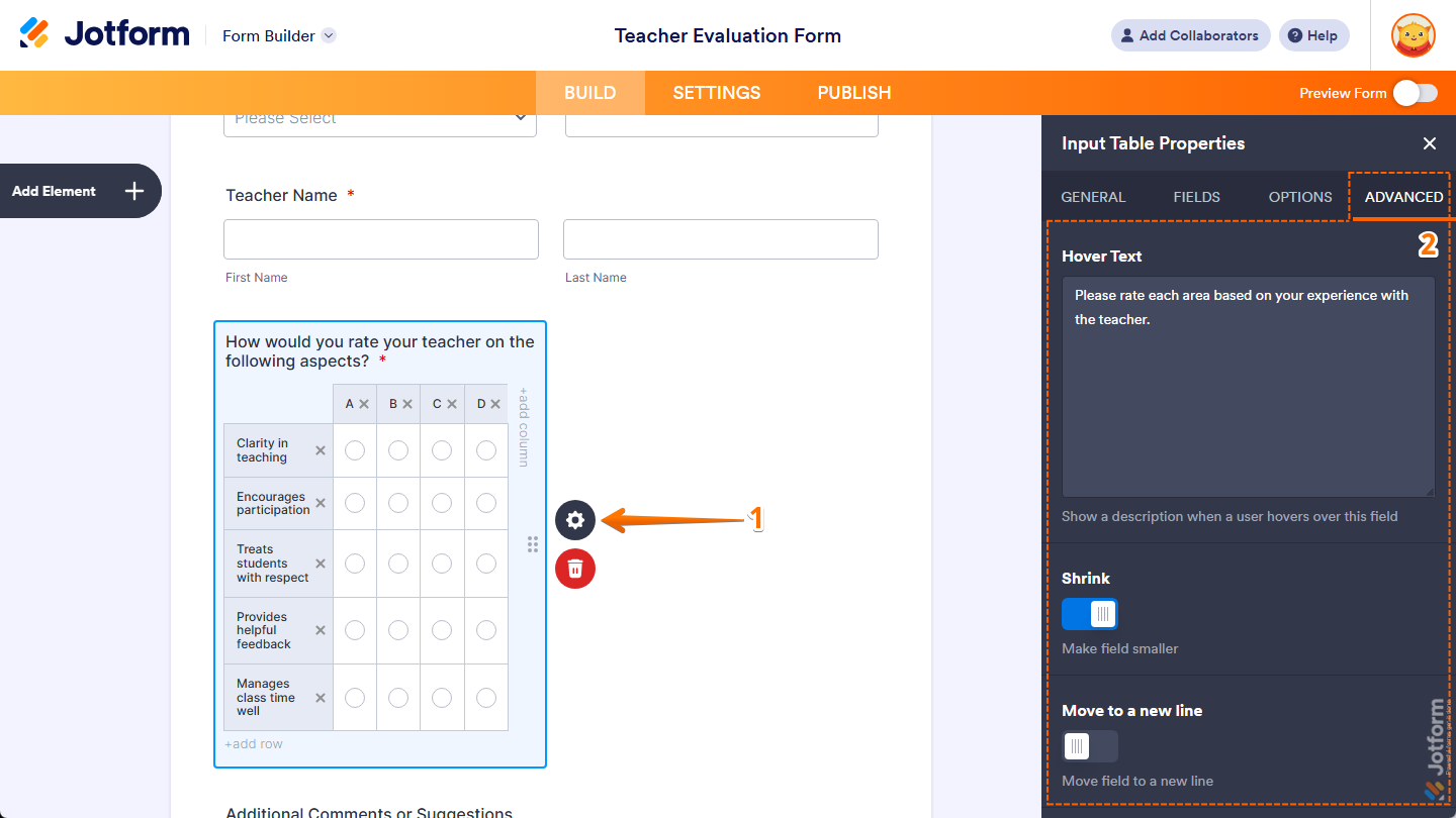
- Hover Text — Enter the text you want to show as a short description when users hover their mouse over your Input Table field. You’ll only find this property in Classic Forms.
- Shrink — Toggle this on if you want to reduce your Input Table field’s width to half or to fit within the width of your form’s column. You can check out our guide on Setting Up Form Columns to learn more. You’ll only find this property in Classic Forms.
- Move to a New Line — You’ll only see this when the Shrink property is enabled. Toggle this on if you want to move your Input Table field to a new line instead of placing it next to another shrunk field.
- Next, scroll down to the bottom and continue customizing these properties:
- Hide Field — Toggle this on if you want to hide the Input Table field on your form. Take a look at our guide on How to Hide Form Elements for more details.
- Field Details — Click on this section to expand it and view, copy, or update your Input Table field’s Unique Name, which is used to reference it in integrations, calculations, and other advanced form features. Check out our guide on How to Find Field IDs and Unique Names to learn more.
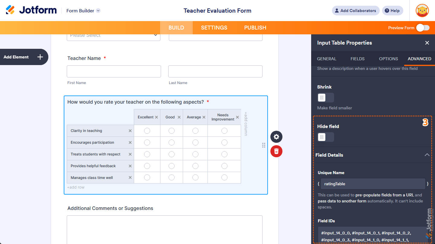
That’s it. You’ve customized the Advanced tab properties of the Input Table element on your form.
Note
Any changes you make in the Input Table Properties menu are automatically saved on your form.

Send Comment: