
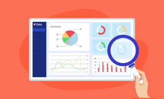
Best data presentation tips
- Keep your audience in mind
- Focus on the big picture
- Use visuals to highlight main points
- Think about how you’re presenting hard data
- Choose the best type of chart for each main point
Collecting the right data and managing it correctly are essential to a successful business strategy. Data management helps you analyze raw data and glean insights to inform your next moves as a business.
But you also need to be able to effectively communicate insights from that data. That’s where data presentation comes in. The future of your company is built on the data you collect in the present — and with proper data presentation, you can make sure the insights you’ve gained reach the stakeholders who matter.
The value of effective data presentation
Any business can collect data on its industry, customers, and performance — but successful businesses turn that raw data into action. Once you’ve gleaned insights from your data, it’s time to share them with decision makers and other stakeholders to convince them to pursue a course of action.
Rather than sharing random data points, you need to present information in a structured way that takes your audience on a journey to educate them on what you’ve found.
Spreadsheet after spreadsheet of data, no matter how solid and informative, can go to waste if you don’t present it in a way that’s easy for stakeholders to digest. In essence, data presentation is where the analytical and creative parts of data management meet.
Pro Tip
Turn your data insights into engaging, voice-guided presentations with Jotform Presentation Agents. Narrate key takeaways, highlight visuals, and keep stakeholders engaged — no live presenter needed.
5 tips for improving data presentation
Here are some quick and easy tips on how best to visualize and structure your data to make an impact and influence opinion.
1. Keep your audience in mind
Put yourself in your audience’s shoes before you set foot in the boardroom. Is the data you’ve collected easy to understand? Will it translate well from your laptop to a larger screen for you to present it? Are the colors and the formatting creating a pleasant visual experience?
Try a couple of practice runs of your presentation before you do the real thing. Ask a colleague who’s not connected to your upcoming meeting to observe you and offer feedback. You’re showcasing important data, and that should come across in the presentation.
2. Focus on the big picture
There’s a limit to the amount of information a person can absorb in one sitting. Don’t push your luck by overwhelming your audience with too many major data points and letting important takeaways slip through the cracks.
Instead, pick one major data point for each graph or visualization and stick to it. Stakeholders will more easily tie the insight you’re giving them to a graph or visualization if you don’t overload them.
Think back to some of your favorite classes as a student. Teachers often understand the value of tying important information to visuals — it can help students remember what they’ve learned. You’re the teacher in this scenario, so the same principle applies.
3. Use visuals to highlight main points
To that end, you can create visual highlights that draw attention to a particular number or data range you need your audience to understand. There are several ways to do this.
You can literally highlight that information in a graph or chart, or you can craft a specific slide around it. Just make sure there are clear visuals tied to the “aha” moment you want to communicate.
To bring the point home, take a moment to explain why this data is important. Accompany this pause with bullet points stating the same information for greater effect.
4. Think about how you’re presenting hard data
If your job involves a lot of data management, odds are you’re comfortable with numbers. Unfortunately, not everyone feels the same way. For some, seeing a lot of figures and percentages can be more confusing than illuminating, so do your best to reduce the anxiety some people feel when faced with big or complicated numbers.
Try these tips:
- Don’t make your audience count zeroes (“10,000” instead of “10000”).
- Avoid decimals if possible (“5” instead of “5.02”).
- Align important data on the right side of a chart, allowing your audience to quickly compare values.
5. Choose the best type of chart for each main point
Charts and graphs are useful when you’re showing and comparing data, so they’re an essential part of data presentation. But your audience is likely already familiar with different types of charts (and their intended purposes), so picking the wrong one is a fast way to lose credibility during a presentation. Here’s a quick reference to help you choose the right chart for different data:
- Line graph: These graphs are great for depicting trends and plotting specific data points along a trend line.
- Bar chart: These charts are best used when making comparisons between data points.
- Pie chart: Pie charts show percentages of a whole — for example, the percentages of respondents who chose each answer option in a survey.
- Scatter plot: These charts place different variables on an X/Y axis to investigate the relationship between one variable and another. If you want to show which variable has the greatest impact in a given situation, a scatter plot can help.
Tools for enhancing data presentation
Once you’ve got a good idea of how you’d like to present your data, you can reduce some of the legwork in crafting a great presentation by automating the visualization processes. With Jotform’s report building tool, you can generate dynamic visual reports based on the data you provide and the customization options you select, or you can even utilize a presentation feedback form if you want further insight on your presentation.
The more you work on data management, the better the data you collect can work for you. Harnessing the power of numbers is vital to implementing the next strategy that will define your business, and effective data presentation will ensure your organization’s stats get the attention they deserve. If you’re looking for a starting point, exploring the best AI chart maker options available today can help you find a tool that matches your data type, audience, and workflow.
Photo by ThisIsEngineering


Send Comment: