
Icon Fonts vs. SVG Icons used to be a very hot topic a while back. A lot has been said about it but not much about making it work in a high performance, continuous deployment setting. We went to the extreme ends of both sides while working on Jotform 4.0, a fairly complex web app.
In this article, I’ll be covering how we arrived at the decision to use SVG Symbols over Icon Fonts and how we are doing it in React.
Why design your own icons in 2017?
There have a been a number of new advancements in the icon market in past years, from Fontello & Icomoon receiving significant traction to the announcement of Fontawesome5 and many others.
While their offerings are quite nice, their selection will not always have just the right icon you’re looking for and you will be forced to either emulate their style and create a new icon yourself, or disregard the visual discrepancy and roll with an icon from another set.
We opted to design most of our own icons in Jotform 4.0 in order to have total control.
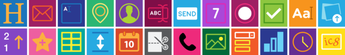
Producing the icons
A lot had already been written about icon design, but whether it’s SVG icons or icon fonts, the single most important factor to get the best look out of your icons, as in pixel-perfect icons, is the base grid size.
To be able to decide on that, you need to examine the sizes of the icons in your designs and make an inventory of all the different sizes. Doing this will allow you to stay organized and standardize use cases for your icons. Do you really need that one icon at 24×24 px and the rest on 16×16 pixels?
It’s a game of balance. A larger grid means more detail, but if you’re going to be displaying a 32×32 icon in a 16×16 container, chances are most of those details will be lost anyways and you’ll end up with a blurry-looking icon.
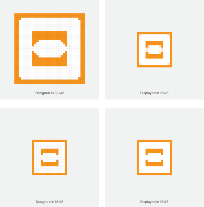
Consider all use cases first, then set your standards. You don’t need to have a single standard — you can have two or even more depending on where you apply them. Our product has a lot of feature depth, so we’ve found that one-size-fits-all solutions don’t really work out well in the end.
Lessons learned from initial mistakes
Initially, we used Icomoon as a central database for our icons. While it was fairly usable before production began for the new version of Jotform, it turned into a nightmare for us when Jotform 4.0 went beta live and we introduced versioning to our style guide.
We wanted to serve the icon font ourselves, so this meant that we needed to export the icons from Icomoon, import it into our codebase and then keep track of revisions between several GitHub repos every time we added a new icon. I’m sure you can imagine how frustrating this can get.
The last straw was a bug that was caused by a new stylesheet that called an older version of the icon stylesheet, which in turn overrode the CSS declaration but not the font file. After an hour spent debugging, it was clear that we needed to take a step back, analyze and definitely internalize this lengthy build process.
Making the switch
This is when we started weighing our options. By now, we had already run into a few issues specifically related to Icon Fonts:
- Impaired functionality when(not if) icon fonts fail to load
- Fonts can be overridden by browser settings or apps.
- Slightly inconsistent rendering due to font hinting
- Requires more CSS to position properly.
Alas, that is how another great SVG Icons vs. Icon Fonts battle came to pass. Details of this gruesome battle will be published very soon in another article, discussing the issues mentioned here and more. (Psst. Follow Jotform Stories to read it first when it’s published.)
In the end, we decided to move forward with inline SVG symbols.
The beauty of SVG symbols is that they create reusable reference points that are independent of each other. You can style them without affecting each other, and they can be scaled to fit while preserving aspect ratio.
Basically, you’re getting everything Icon Fonts can offer without any of its issues. What’s more, you’re getting a few other benefits such as simple multi-color icons, SVG presentation attributes that can drastically alter the style of the icons, an absurdly simple deployment, more control over your environment and etc.
The Icon Load System
Since Jotform 4.0 uses React & Webpack (why aren’t you?), we opted to use the svg-sprite-loader to import all of the SVG files under our assets folder and inline them inside the page as SVG symbols.
Once the loader was setup(just like any other), all we needed was an Icon component that we could call to create instances of these symbols, an example of which was also included in the svg-sprite-loader repo:
Many thanks to @kisenka over at GitHub.
Finally, just simply call the icons from wherever you need it:
While we haven’t gotten around to it yet, this system also means that you can build a reference page with all your icons and implement small features such as fuzzy search or quick copy actions to improve your workflow even more. React has a ton of ready-to-use libraries that can get the page up & running in no time.
Conclusion
The main benefit of our workflow is that it’s far easier for everybody involved and it just takes less time.
Designers can just create an icon in Illustrator, push the SVG file to the GitHub repo, and it is immediately available to our UI developers. No caching issues or extra steps needed. On top of that the version tracking for icons is completely free.
Having a workflow for our icons allowed us to focus on more important things: How to build a great product. Jotform 4.0 is an accomplishment we are all extremely proud of.


Send Comment: