

You could write at length about last quarter’s sales, the economy of Ecuador, the adoption of alternative energy sources, or any other large data set. No single stat or trend, though, will stick in your readers’ minds as much as a single chart.
Visualizations bring numbers to life. “Use a picture,” newspaper editor Arthur Brisbane is reported to have said. “It’s worth a thousand words.” A chart, especially an interactive one that helps you draw conclusions from its data, is surely worth even more.
Data is easier to visualize than ever. You can create a chart in Google Sheets or make an interactive pivot table with sparklines in Excel. You can use data platforms such as Tableau or Power BI to analyze and graph data; hand the data to ChatGPT or similar AI tools to decipher and visualize it; or use a platform like Jotform to gather data and visualize it all in one place.


The best AI-powered data visualization tool depends on what you want to accomplish with it. The best tool for deciphering thousands of data points won’t be the best tool for quickly whipping up an image for a presentation or gathering and charting data.
Here are six of today’s best tools for visualizing data with AI, each built for a specific data visualization task.
| Tool | Best for | Standout features | Pricing |
|---|---|---|---|
 Jotform |
Gathering and visualizing data in a single platform |
Report Builder for automatically creating a presentation with charts from data |
Free for five forms; paid from $34/month |
 Julius AI |
Interactive surveys |
AI insights, Smart recommendations |
Free – $83/month |
 ChatGPT |
Quickly getting takeaways and charts from data |
Downloading generated graphs in a single click |
Free for shorter conversations; paid from $8/month |
 Microsoft Power BI |
Building detailed reports with graphs and text |
Familiar Microsoft Office-style interface |
From $14/month/user |
 Tableau |
Graphing data from a wide range of databases and data lakes |
Visualizing data offline with desktop apps |
Free for basic features on desktop; paid from $75/month |
 Polymer |
Automatically turning a spreadsheet or data set into charts and graphs |
Explain with AI button for getting more details about AI-generated graphs |
Free 14-day trial; paid from $50/month |
Jotform
Why it made the list: The ability to gather and visualize data in the same platform

Key strengths
- Gather data from forms and surveys, store it in tables, and analyze it with AI-powered tools in the same platform.
- Drill down into data with Jotform’s AI Data Assistant inside Jotform Tables.
- Automatically create chart-filled presentations from data with Jotform Report Builder.
Key drawback: Jotform is built for forms and survey data, so its AI-powered data tools are designed for smaller data sets; dedicated data analysis platforms handle larger sets.
Jotform does more than gather data. It’s equally useful for getting quick insights from your data and sharing the results with your team. You start by building a Jotform or using Jotform Surveys to build out the questions needed to help you gather data.
You can build almost anything in Jotform, including a feedback form, event registration page, job application, order form, inspection workflow, or a work or support request form. The data you gather can automatically flow into a Jotform Table, a database that’s as easy to use as a spreadsheet, with built-in AI to help you surface details from your data. It’ll automatically show the results of your survey with Jotform Form Analytics, the quickest way to analyze survey data.
You can use other Jotform tools to work with your form results or any other data, such as the sales results from your Shopify store, customer support data from Zendesk, client details from Salesforce, and more. Pull the data into Jotform Report Builder to automatically turn the results into charts embedded in a shareable presentation. Or import it into Jotform AI Chart Generator to create bar, pie, and doughnut charts from data in any spreadsheet.
Jotform AI Data Assistant is packed with powerful features that analyze data from any form. If you want to answer questions about a Shopify sales spreadsheet, such as “Which product had the highest sales this month?,” AI Data Assistant could create graphs to showcase the data, which you can download as images. And if something goes wrong, you can refine the results with plain-language follow-up questions. It worked best in my tests with smaller data sets (a few months’ worth of e-commerce sales data, for example, rather than a full decade of sales with thousands of rows). It’s one of the easiest data visualization tools for quickly turning data into graphs and takeaways.
Pricing
Free for up to five forms and 100 monthly submissions; from $34 per month for Bronze plan, which includes 25 forms and 1,000 monthly submissions
Julius AI
Why it made the list: The ability to analyze, graph, and present data from chat

Key strengths
- Use ChatGPT-style interaction for large data sets.
- Create graphs, videos, presentations, and spreadsheets from data.
- Connect to data warehouses including BigQuery and Snowflake; databases such as MySQL or Postgres; apps such as Google Sheets or SharePoint; and Google or Meta Ads.
Key drawback: No interface for manually cleaning up or editing spreadsheets and other data files
Julius AI is like ChatGPT for big data. It’s a chat-centered data analysis tool that can take on your largest data jobs, needing no input but text prompts. That gives it a lower learning curve than most other data visualization tools, plus the power to work on larger data sets than ChatGPT supports. Julius AI can work with up to 32 GB of data at a time versus ChatGPT’s cap of 512 MB data sets.
You can import spreadsheets or connect Julius AI to databases; data warehouses; apps including Google Sheets; OneDrive and SharePoint Excel files; and Google or Meta Ads. Upload a spreadsheet and it instantly opens for review on the right, with an interactive chat on the left. Ask it questions to drill down into details, find quick answers, and visualize data.
I analyzed a set of 5,000 e-commerce orders, and in under a minute, Julius AI told me the top-selling category, its total revenue, and which type of orders had the largest basket size — and simultaneously created graphs to showcase that data. In follow-up questions, I was able to change the graphs to my brand colors, do significance testing to find trends with common statistical methods, and turn it all into a presentation. Developers and data teams can use Julius to generate Python, SQL, and R queries to speed up data work or install libraries and packages for specialized data analysis functions.
Julius AI is the tool to reach for if you’ve hit ChatGPT’s limits and want to use AI-powered data analysis and visualization for large data sets.
Pricing
Free for daily credits and limited features; from $20 per month for Plus plan, which includes 2,000 monthly credits, frontier AI models, unlimited charts, and export options
ChatGPT
Why it made the list: Quick takeaways and charts from data, for free
Key strengths
- Quickly dig into data from the leading AI chatbot.
- Download graphs and data subsets to use in other projects.
- Use free plan to analyze data and generate graphs, with daily limitations.
Key drawback: Cannot work with larger files; potential for drop in response accuracy in longer conversations
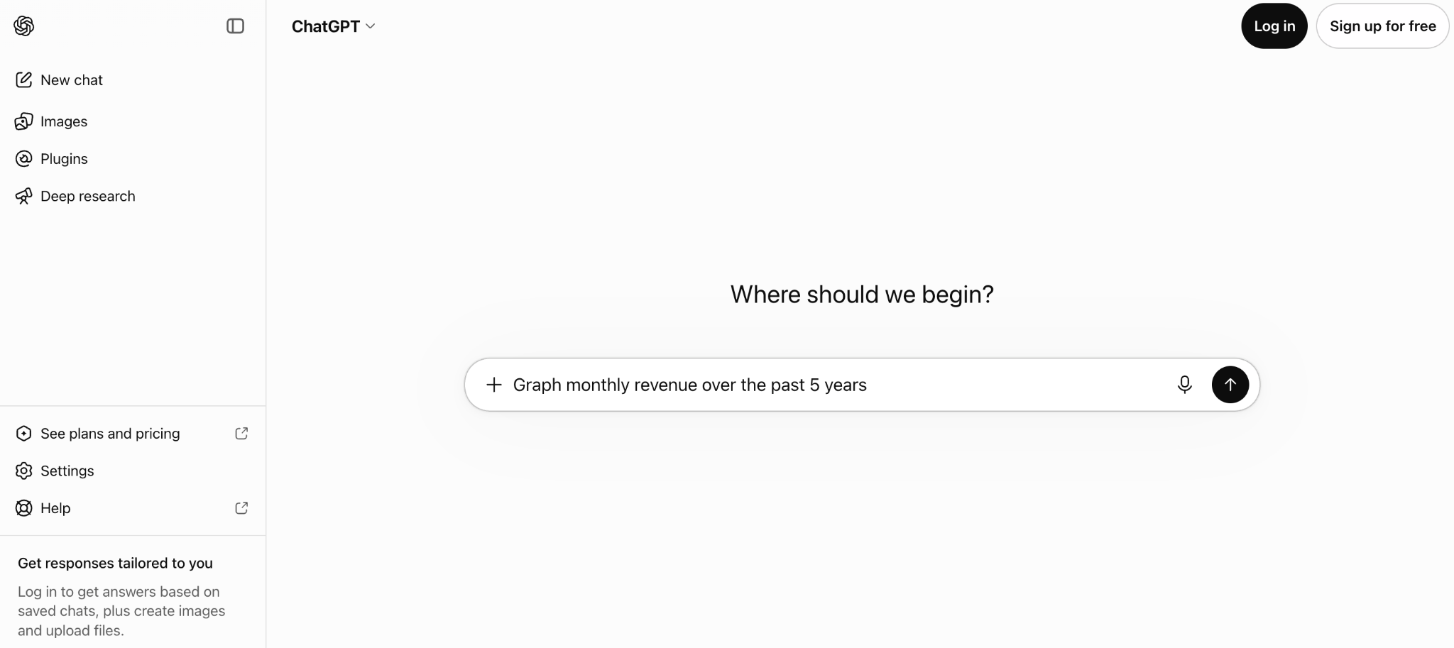
ChatGPT, the chatbot that taught the world how to converse with AI, is as handy for data visualization as it is for answering your questions. Start a conversation by uploading a spreadsheet of data or connecting it to external data with a plug-in, then ask ChatGPT anything you’d like.
Even with the free version, ChatGPT can handle the data sets that most small businesses work with. I was able to upload the same spreadsheet I used with Julius AI into ChatGPT and get similar answers. It was just a bit slower to respond, taking 12 seconds to find the categories with the highest revenue and average items per order, then graph them in bar charts, and taking 16 seconds to run significance tests and trend analysis. The free plan also failed to create images or presentations after that first request, something a paid ChatGPT plan could handle.
For smaller data sets and quick answers, for which Julius AI might be overkill, ChatGPT is a quick way to find needles in your data haystacks with natural-language queries. It’s especially useful for keeping everything in one place if you’re using other ChatGPT conversations to do research and make plans around your data.
Pricing
Free for shorter queries and conversations; from $8 per month for Go plan, which includes more messages and image creation; from $20 per month for Plus plan, which includes advanced reasoning models and more complex image creation
Microsoft Power BI Copilot
Why it made the list: Detailed reports that combine interactive graphs with formatted takeaways in an Office-style editor
Key strengths
- Pull in data from the Microsoft ecosystem, including Excel, Azure, SQL Server, and SharePoint.
- Use a Microsoft Office-style interface to interact with data.
- Build detailed reports with formatted text, interactive graphs, and multiple pages of data.
Key drawback: Limited features on the free plan; enterprise only for paid plan, which requires signup with company email address.
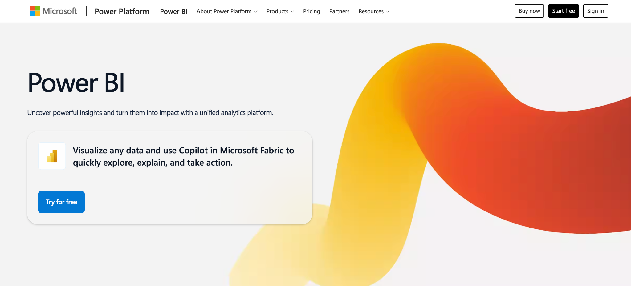
Microsoft Power BI is a suite of products designed to create a data-driven culture in your office. Power BI looks a lot like Office; if you’re familiar with Excel or PowerPoint, you’ll feel at home in Power BI with its drag-and-drop editor, formatting toolbars, and options to chat in Microsoft Teams.
If you need a simple chart or graph, the tools in Excel or PowerPoint (or a simpler platform like Jotform) would suffice. Microsoft Power BI is built for larger data sets. It can pull in data from an Excel or CSV file, a OneLake data lake, or an SQL or Azure server. You can visualize the data in graphs, export subsets of data in spreadsheets, and drill down through data sets with pivot table-style matrixes that automatically generate graphs underneath. To speed things up, you can chat with Power BI’s Copilot to find takeaways and build graphs automatically with AI.
Reports are the core reason to use Power BI. Drag in text boxes, format them as you would in PowerPoint, and arrange details around graphs. It’s a tool for finding details in data and then telling the story with graphs, an end-to-end data visualization platform that fits in with a Microsoft-centric office.
Pricing
Free to test demo features; from $14 per month, per user, paid annually, for Power BI Pro, which publishes and shares Power BI reports; an estimated $262.80 per month, per team, for Microsoft Fabric plan, which includes data analysis and use of Copilot
Tableau
Why it made the list: Analysis of data offline on your computer or collaboration on larger data sets in the cloud
Key strengths
- Integrate with a wide range of databases and data lakes.
- Proactively monitor data via Tableau Pulse and Agent, which can alert you in Slack about anomalies.
- Use built-in AI to drill down into the largest data sets.
Key drawback: Far more expensive than other tools in this roundup, and designed more for enterprise use cases
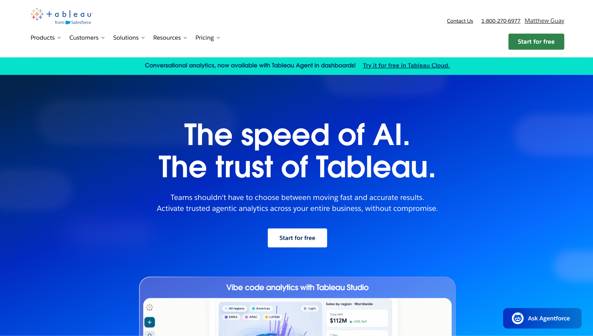
You have options when you work with Tableau, one of the earliest data visualization platforms to hit the market. You can download a free version to run on your computer, run it on your company’s servers, or use it online with a subscription. It’s been a mainstay of data analysis for more than two decades; the latest versions include AI to vibe code interactive graphs, answer questions from data, and build graphs and charts you can share with your team in Slack.
Tableau connects to over 55 data sources, including everything from Oracle and MongoDB databases to Snowflake, BigQuery, Databricks, and Alibaba Data Lake. Or you can pull in individual files from Dropbox, OneDrive, or Box. Using tools similar to those in Microsoft Power BI, you can build graphs around your data, add filters to make interactive time series and let viewers update the graphs to show what they want, and add text and other details to tell a complete story.
It’s built for the largest data sets: Power BI is capped at 2 billion rows of data, but Tableau can scale to larger databases without relying on a data lake. You’re limited only in what your server can handle, making Tableau the tool data teams reach for when analyzing and visualizing massive amounts of data. And its detailed graphing tools make it easy to stick to data visualization best practices when sharing insights gleaned from your data sets.
Pricing
Free for data analysis and visualization; from $75 per month, per user, paid annually for Tableau Cloud
Polymer
Why it made the list: The ability to automatically build dashboards with graphs and takeaways from spreadsheets, integrations, and data sets
Key strengths
- Automatically find insights in data.
- Edit any graph or takeaway to reflect your thoughts, backed by AI research.
- Present graphs and data tables to your team directly.
Key drawback: Potentially overwhelming default dashboard results if you want a single, smaller graph or takeaway
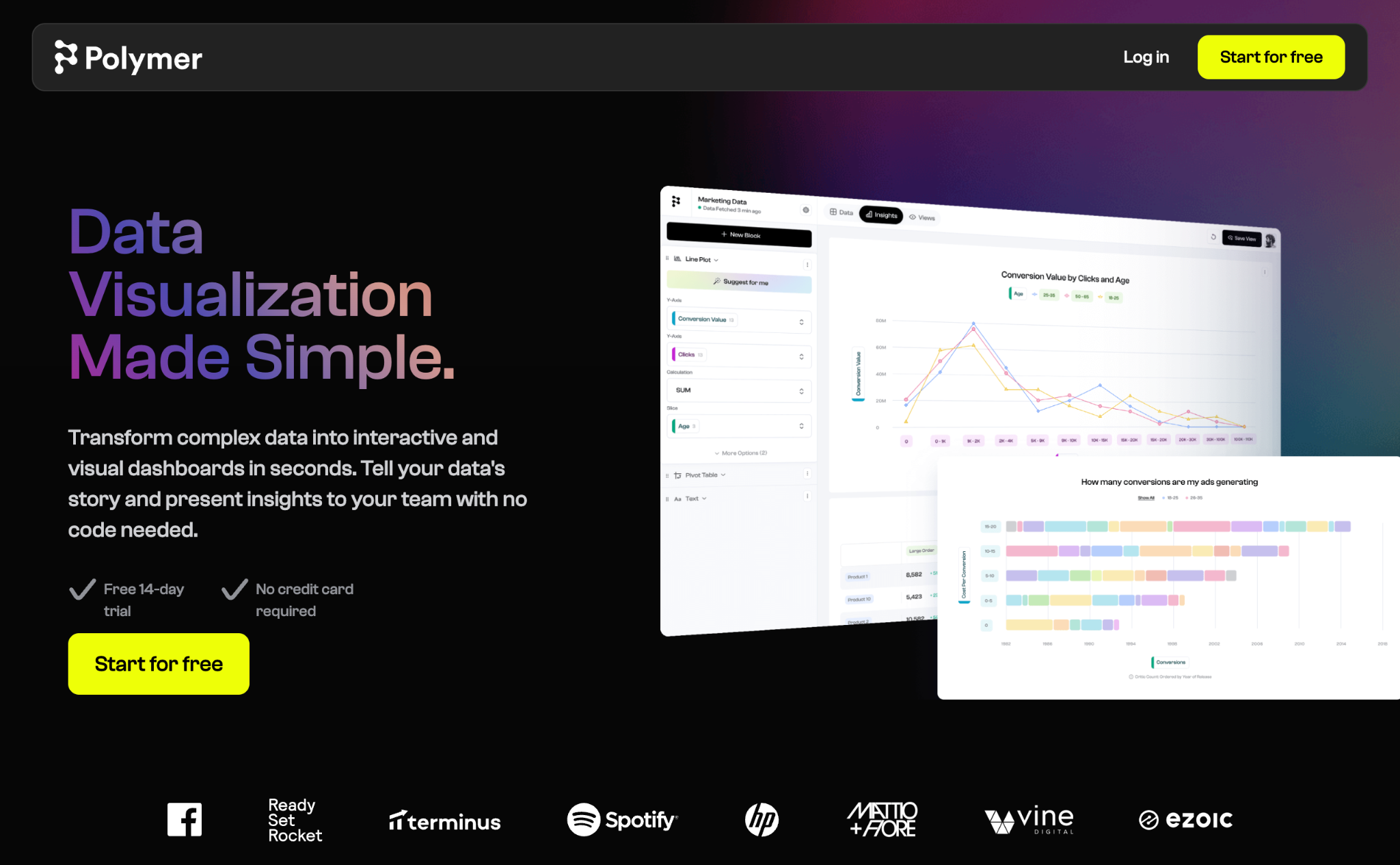
Polymer is the tool that surprised me most when testing. It automatically does all of the data visualization work for you, making it one of the best AI chart makers available.
Start by connecting it to the software where your data is stored. It promotes connecting Google Sheets, Google Analytics, Google Ads, or Facebook Ads; uploading an Excel or CSV file; or adding an API by default. But it also supports Shopify, Zendesk, Jira, Linear, Airtable, Google BigQuery, and Dropbox, and it says more are on the way. I started by uploading a spreadsheet, and it quickly built a dashboard with graphs, tables, and questions about the data with insights.
That’s where you start drilling down. You can filter data, add new charts, or edit the widgets Polymer built out for you. Or you can click an Explain with AI button on any chart for a detailed analysis of your data. (For example, Polymer said “electronics outperform beauty products significantly” in my sample sales data set.) You can then filter to show comparative revenue broken down by region. You can edit the explanations, using the details from AI as a starting point, before presenting it to your team.
Polymer is one of the fastest ways to turn data into graphs and takeaways. It gives you the key benefits of data visualization without any of the work.
Pricing
14-day free trial for Polymer Data Visualization; from $50 per month for Starter plan, which includes all data connectors, with one account per data connector, and 10 responses per chat conversation
How to choose the right AI data visualization tool
When deciding on a data visualization tool, consider the amount of data you typically work with, your preferred interaction model, and your budget, among other factors.
Enterprises and companies working with large data sets will find Microsoft Power BI or Tableau invaluable for surfacing insights and building detailed reports with charts and data. But if you want a tool that can produce a wide range of charts and visualizations from a spreadsheet quickly, Polymer can do that, following data visualization best practices. For smaller data sets, you can use ChatGPT’s data visualization tools; Julius AI is best for larger databases.
For teams just starting to learn what data visualization is, Jotform’s all-in-one suite of tools make it easy to visualize data with AI. You can gather data with Jotform forms and Jotform Surveys; organize it in Jotform Tables; chat about it with Jotform’s AI Data Assistant; and then create with Jotform’s AI Chart Generator or, for an AI-generated presentation, Jotform Report Builder. Using Jotform tools is a simple way to gather data and present it to your team, with AI helping every step of the way.
FAQs about AI data visualization tools
The best tool for AI-powered data visualization depends on your needs.
Some AI data visualization tools are built into existing platforms. Microsoft Power BI and Tableau’s AI pair with built-in tools to create graphs and drill down into data. Julius AI offers chat-centric AI data visualization tools, and Polymer auto-generates dashboards and graphs. Some multipurpose tools are also good at AI visualization, including ChatGPT, and Jotform’s wide range of tools can gather info in forms and surveys and visualize it with AI.
Yes. Many generative AI tools, such as dedicated AI data visualization tool Julius AI and broad-use tools ChatGPT and Claude, can create charts and graphs from data. You upload a spreadsheet or paste a table of data into the AI chat, then ask the chatbot to find insights in the data and build them into charts and graphs. You can ask follow-up questions to refine the results or re-theme the visualizations.
Image generation AI models such as Midjourney may also create graphs, but because they’re designed for creating photos and illustrations instead of for data analysis, their graphs are unlikely to be accurate.
ChatGPT can create data visualizations effectively from data shared in chat, uploaded from spreadsheets, or pulled in from app integrations. You can ask for insights about the data, refine the data, and create graphs and charts to visualize the data. You can download the images from ChatGPT to use however you like.
ChatGPT is limited to smaller data sets, and it caps responses and image creation on free plans, but it’s an effective tool for quickly creating AI data visualizations for free.
AI data visualization tools can be accurate, depending on how they’re implemented. The best AI data visualization tools use custom-built graphing tools, such as those in Jotform’s AI Chart Generator or Microsoft Power BI’s platform, to build charts directly from your data. Others, such as ChatGPT, write code to graph data. These approaches keep the data visualizations accurate.
You should still double-check the graphs and takeaways to ensure they’re free from AI hallucinations. You should also only ask a few questions per chat conversation; accuracy can decrease in longer, more detailed sessions.
Jotform has a number of tools that can visualize data, from automated form analytics that graph data around form responses to its standalone AI data visualization tools Jotform AI Chart Generator and Jotform AI Data Assistant. They can graph data gathered in Jotform or uploaded from spreadsheets, and the AI Data Assistant can answer questions about data, create takeaways, and refine data visualizations directly from an AI chat conversation.
This article is for small business owners, marketers, operations teams, survey and research teams, analysts, educators, nonprofits, and managers who need to turn spreadsheets, form submissions, survey results, customer feedback, or business records into clear charts, dashboards, visual reports, and data summaries without spending hours in spreadsheets or BI tools.







































































































Send Comment: