
7 opt-in form examples
Well-designed opt-in forms are essential for any business that uses email as a growth strategy. While website visitors will ignore a poorly designed form, well-designed forms can achieve conversion rates of 2 percent to 11 percent. Increasing your user engagement rate can ultimately help your business become more profitable.
In this article, we’ve highlighted seven opt-in form examples that showcase best practices, including explanations of why they work. Use these as inspiration for building your own high-converting opt-in forms. But first, let’s clarify the definition of an opt-in form and the two types you can use.
What is an opt-in form?
“Opt-in form” typically refers to a digital form that collects a website visitor’s email address (and sometimes other information too) and asks for consent to send them marketing materials. The marketing materials they are opting to receive may include newsletters, discount offers, free resources, or access to exclusive content.
There are two main types of opt-in forms: First are those that are embedded into your website, which are always visible on the page. Second are those that are triggered to appear (such as a popup or floating bar) by an action the user takes, such as remaining on a page for a defined number of seconds or moving to exit the site.
If your business serves EU customers, you need to ensure your forms are compliant with the General Data Protection Regulation (GDPR). This means your opt-in forms must make consent explicit and unambiguous, which requires the use of simple, transparent language and boxes that users must check themselves (no prechecked boxes allowed).
7 opt-in form examples for increased conversion
To give you an idea of what these forms might look like for different purposes, we’ve rounded up screenshots spanning several uses, including email opt-in form examples and newsletter signup form examples.
1. Newsletter opt-in
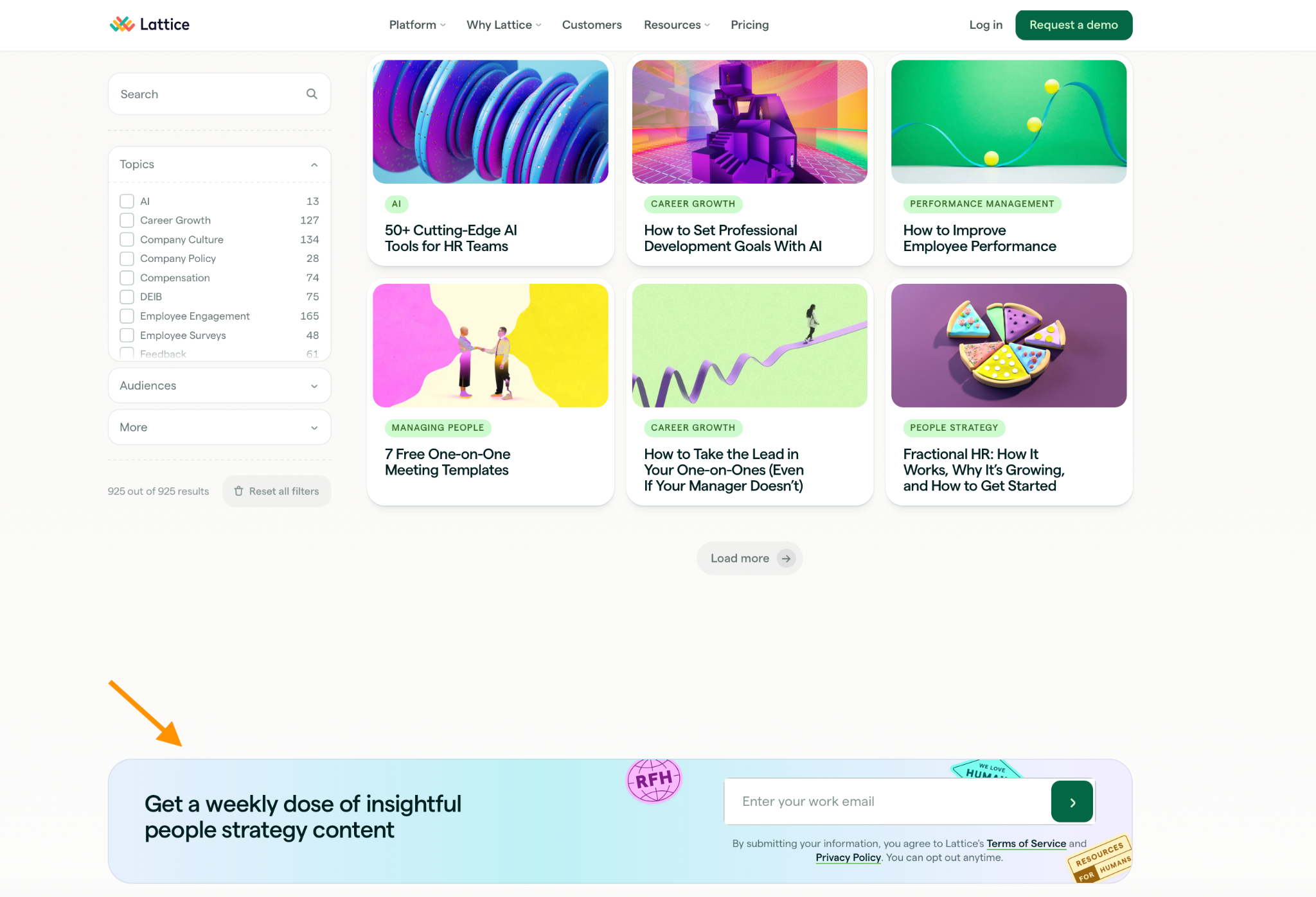
Usual placement: Sidebar, footer, or end of blog post
Headline: “Get a weekly dose of insightful people strategy content”
Fields to include: EmailCTA: A simple (but obvious) arrow
Why it works: This unobtrusive footer box appears on the Articles page of a popular HR platform’s website (Lattice). It minimizes friction by asking for only one piece of information, and once the visitor has submitted their email address, the box simply delivers the message “Thank you! Your submission has been received!” This allows the visitor to continue their journey where they left off. Additionally, the value proposition is clear and the language is transparent.
2. Lead magnet/e-book
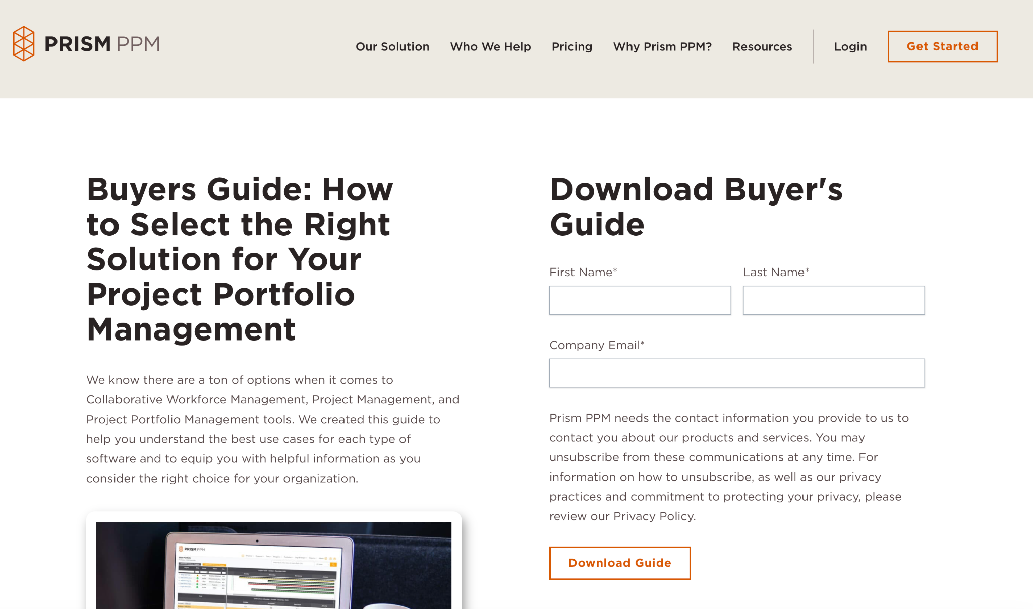
Usual placement: Popup or dedicated landing page form
Example headline: “Download Buyer’s Guide”
Fields to include: Email; first and last name
CTA: “Download Guide”
Why it works: With just three fields and a succinct paragraph that clearly states what readers will get out of the download, this simple lead magnet opt-in form from Prism PPM makes the transaction quick and easy. The copy also clearly addresses a concern many recipients have, which is the ability to unsubscribe from future communications. The only suggested change would be to reduce the “Name” fields from two to one (first name only), lowering the barrier for completion even further for this form.
3. Discount/first purchase (e-commerce)
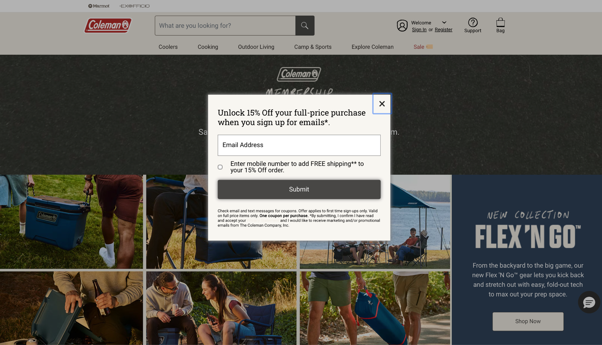
Usual placement: Popup triggered after 10–15 seconds on site or on scroll
Example headline: “Unlock 15% off your full-price purchase when you sign up for emails”
Fields to include: Email only; mobile number optional
CTA: “Submit”
Why it works: This popup opt-in form example is low friction: one field, one click. It also gives the visitor the opportunity to get an additional discount in exchange for their mobile number. (Avoid requesting mobile information without giving anything else in return.) Additionally, the form is very clear about the fact that the visitor is signing up to receive emails, not just to get a discount (something other opt-in forms don’t always make clear).
4. Exit-intent popup
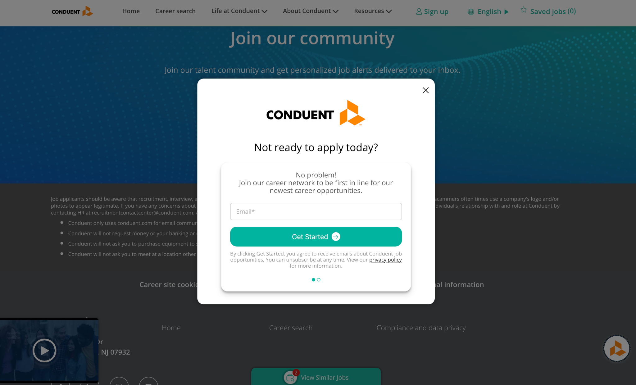
Usual placement: Triggered when the user’s cursor moves toward the browser close button
Example headline: “Not ready to apply today?”
Fields to include: Email only
CTA: “Get Started”
Why it works: This is an excellent use of the exit-intent popup. In this case, it’s an attempt to stay in touch with people who came to the site to explore open positions but begin to leave without having applied for anything. It’s a great way for your company to stay in touch with people who may not be ready to take the intended action (in this case, apply for a job) immediately but could change their minds later.
5. Floating bar
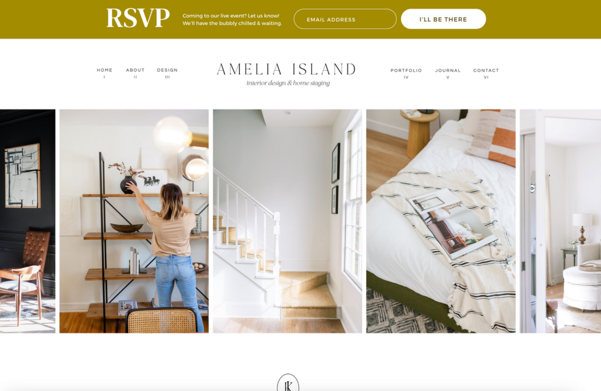
Usual placement: Persistent banner anchored to the top or bottom of the page, visible as the user scrolls
Example headline: “RSVP”
Fields to include: Email only
CTA: “I’ll be there”
Why it works: The banner remains at the top even while visitors scroll, yet it doesn’t interrupt the reading experience. This type of opt-in form ensures critical messages are visible but nonintrusive, especially on pages with long-form content where readers might otherwise forget the message once they’re done reading. Single-field forms work best in this case because they take up minimal space.
6. Webinar registration
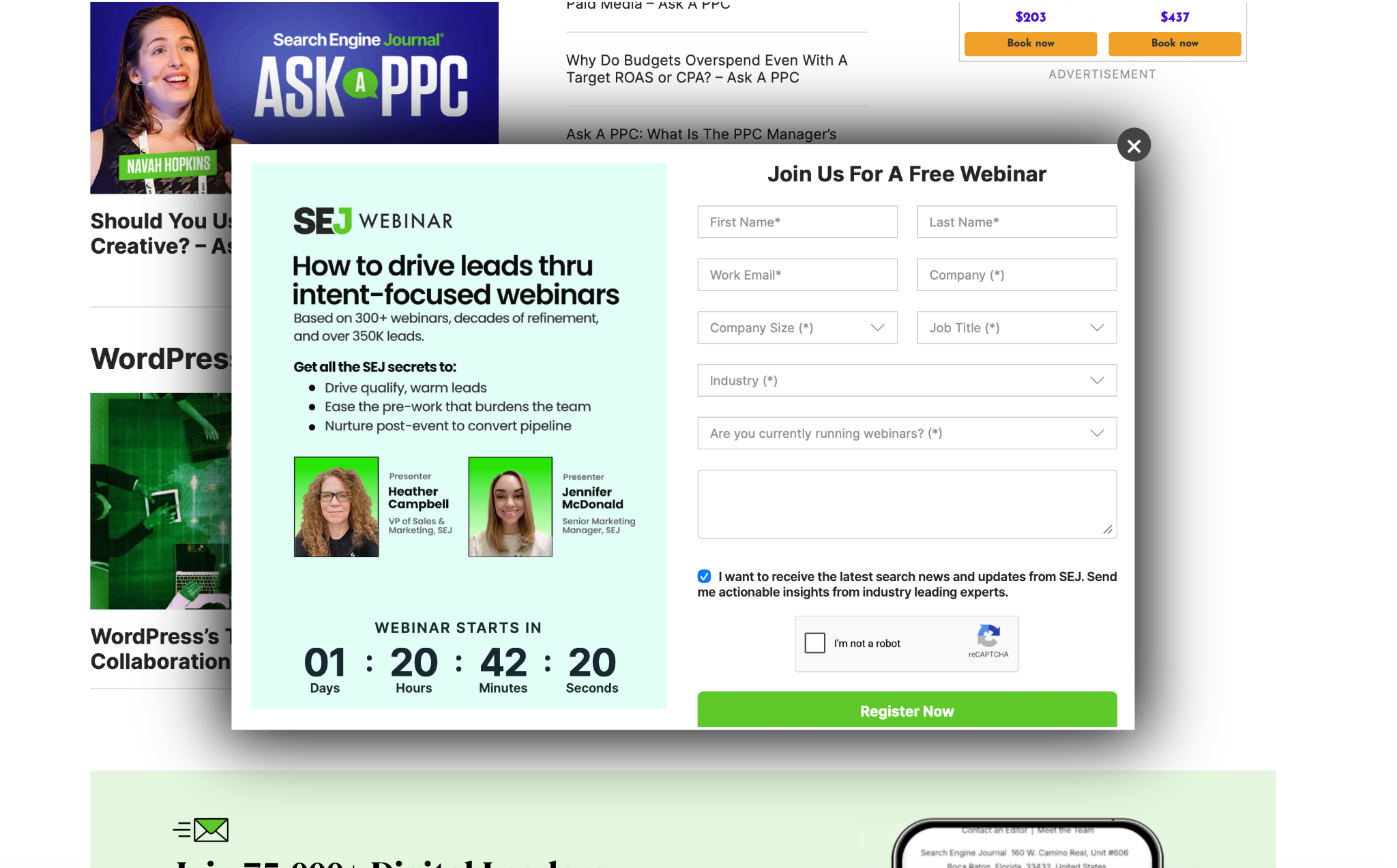
Usual placement: Standalone form or popup promoting a live or on-demand event
Example headline: “Join us for a free webinar”
Fields to include: First and last name, email, company name and size, job title, industry, relevant question
CTA: “Register Now”
Why it works: This webinar form includes a countdown that lends a sense of urgency to the decision to sign up. Plus, the copy is written to indicate authoritativeness (“Based on 300+ webinars …”) and exclusivity (“Get all the SEJ secrets …”), increasing the offering’s perceived value. Note that most webinar signup forms have more fields than discount or lead magnet forms because organizations see it as an opportunity to get better insight into their ideal customer. You can replace the “company size,” “job title,” and “industry” fields with questions that are more relevant to your business.
7. GDPR-compliant opt-in
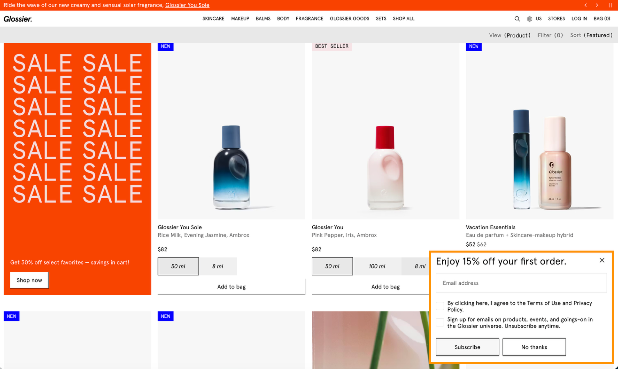
Use case: Used by businesses serving EU audiences.
Key difference: There are two checkboxes in this GDPR opt-in form example: one for acknowledging acceptance of the terms of service and privacy policy and one indicating explicit agreement to receive company emails. Both are unchecked by default, which means the visitor must actively acknowledge both.
Example notice: “Sign up for emails on products, events, and goings-on in the Glossier universe. Unsubscribe anytime.”
Why it works: By being clear about the terms surrounding the discount, the company is building trust with privacy-conscious users. This approach is also legally required for any company that interacts with EU audiences; not complying with the terms of the GDPR means your business could incur significant fines.
What makes a high-converting opt-in form?
If you’re thinking of using these types of forms on your website, follow these five opt-in form best practices:
- Make sure it has a clear value proposition: The benefit to the visitor should be obvious and convincing so they feel compelled to act. Discounts are clearly a valuable offering, but you can also make subscribing to an email list sound appealing by indicating they’ll receive “exclusive” content or “early release” information.
- Place forms strategically: Placement will vary depending on the form’s purpose. Discount popups appear shortly after arrival to draw in shoppers, for example, and downloadable content forms might appear in the middle of a related blog post. Test and add new locations periodically.
- Keep form fields to a minimum: Ask only for what you need, especially for early-relationship offerings such as first-time buying discounts or newsletter subscriptions. The trick is to nurture your audience over time, gradually gathering more information in exchange for higher-value offerings.
- Optimize for mobile: Simpler forms are better for mobile devices, which is where people will often encounter them. Use design elements such as single-column layouts and large buttons and fields to make filling out mobile forms easier.
- Comply with data privacy regulations: Avoid using prechecked boxes, and consider implementing a double-opt-in strategy for some forms. This requires visitors to confirm their signup via email after completing the form. It adds steps to the process, but it ensures adherence with data privacy laws.
(Bonus: The quality of your email list improves with the addition of these motivated visitors.)
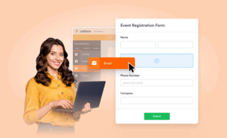
Build your opt-in form with Jotform
You don’t need to be a developer or a designer to build high-converting opt-in forms.With Jotform, everyone can produce attractive forms quickly and easily. Either create your own from scratch or take advantage of Jotform’s opt-in form templates or AI form generator to make the process even faster.
Jotform opt-in forms can be customized to match your needs; the easy-to-use form builder gives you control over the number of fields, the copy, the CTA text, the design, and the GDPR compliance settings. You can also use it to build robust mobile forms.
Once you’ve built a form, you can use it any way you like. Jotform forms integrate with most popular apps and services, such as Google Drive, Salesforce, and Dropbox. That means it’s easy to transfer form submission data into other tools you use daily and create workflow automations that simplify form-related tasks.Jotform opens up a world of possibilities for forms, even allowing you to collect payments and electronic signatures. It’s considered one of the best online form builders for good reason. So don’t wait. Start building your first opt-in form for free today with Jotform.
This article is for marketers, content creators, and small business owners who want to grow their email list and are looking for real-world opt-in form examples, proven copy frameworks, and actionable inspiration to build their own.


Send Comment: