Online Survey Chart Maker
Jotform’s survey chart maker lets you turn survey responses into visual charts that clearly show your data insights. With this survey chart maker, you can build professional surveys, customize charts, and share results via links or embedded reports to analyze and present feedback efficiently.
Szablony
Start with an Online Survey
Not sure where to start? Choose a ready-made template to send to your subscribers in seconds — or to customize with our no-code builder.
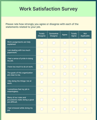
Work Satisfaction Survey
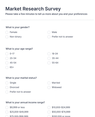
Ankieta Badania Rynku
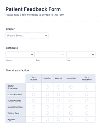
Formularz Opinii Pacjenta
Benefits
Instantly Create Surveys
Centralized Survey Responses
Collect survey responses in one Jotform account so survey data stays in a single place from collection to review. Manage and organize submissions in Jotform Tables when the team needs a workspace for sorting and reviewing response data. This helps teams analyze results faster because survey forms and survey responses stay connected in the same platform.
Generate Professional Survey Reports
Turn survey responses into visual reports in Jotform Report Builder in a few clicks. Choose chart formats such as bar graphs, pie charts, and submission grids, and add data tables when a detailed view is needed. Customize report visuals with options like color palettes, icons, shapes, and images so the report reflects the findings clearly.
Easily Share Your Survey Results
Download survey charts and reports as PDFs when results need to be printed or emailed. Publish a report and share it with a direct link when stakeholders need quick access to the latest version. Embed the report on a website or portal so the report can be viewed where the audience already goes, and embedded reports can update as new submissions arrive.
Customize Reports
Customize reports in Jotform Report Builder so the report layout matches the way the team presents survey results. Use layout and slide settings to adjust the structure of the report, and add or refine elements such as tooltips when additional context helps explain a chart. Add branding details such as a logo and brand colors so reports are consistent when shared with stakeholders.
Zaświadczenia
Co użytkownicy mówią o Jotform
Learn More About Survey Chart Maker
Poznaj odpowiedzi na wszystkie Twoje pytania dotyczące Jotform. Przeczytaj nasze FAQ, by poznać odpowiedzi na często zadawane pytania lub skontaktuj się z naszym zespołem wsparcia, by dowiedzieć się więcej.
How do you make a survey chart?
Making a survey chart is simple with Jotform. To get started, follow these easy steps:
- Select the survey form that you’d like to generate a chart from on the My Forms page.
- Open the Reports menu.
- Click the Add New Report button.
- Select the Visual Report Builder option to open the Report Builder.
- Enter a name for the report.
- Select the Report Type you’d like, then click the Create button.
- To add specific charts, click on + Add Element, then Form Field to choose the data and chart type.
What is the best way to graph survey results?
There are many ways to graph your survey results — from simple to more complex — depending on the data you’re presenting. For example, the stacked bar chart is one of the best options for visualizing the results of rating scale questions in a straightforward, easy-to-follow way.
How do you visualize survey results?
You can visualize your survey results using charts, tables, icons, grids, and more, depending on your needs. Consider the following types of charts to visualize your survey results:
- Likert scale chart
- Score bar chart
- Rating bar chart
- Survey score summary chart
- Score detail chart
- Rating score chart
- Sentiment analysis chart
How do I track survey results in Jotform?
With Jotform, it’s easy to track your survey results. You can view and organize all submitted data for your form in Jotform Tables. To see results at a glance, generate a visual report with your survey data using the Jotform Report Builder.
How do you summarize survey data?
Summarizing your survey data is a breeze with Jotform. Automatically generate a visual report to show all your data in easy-to-understand charts and tables. Once you’ve created your report, filled with key insights and user feedback, customize the design to fit your needs and share it with others.