
-
angiehillsAsked on April 18, 2014 at 5:38 PM
Can I set a css code to reduce my video for mobile?
http://form.jotformpro.com/form/41066720474957
-
jonathanReplied on April 18, 2014 at 7:33 PM
Hi,
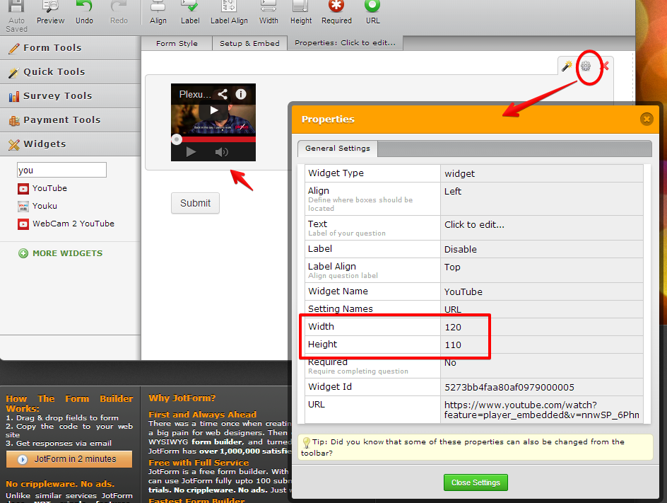
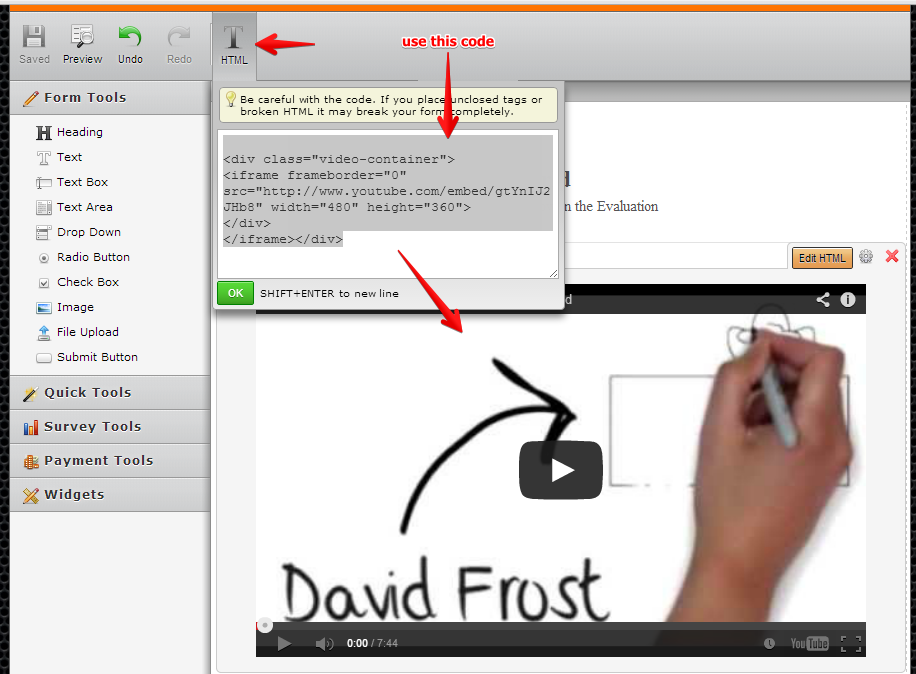
If you meant the Youtube widget embeded dimension, it has a dimesion property (width, height) that you can set to resize the embedded video on the form.
Please refer to the image below how to do this

here is a test form where I tested this http://form.jotform.me/form/41077073737457?
Please take note that you can resize the widget's dimension, but it will not be able to override the minimum resolution of the video embedded. If you noticed on my test form, the video content will not resize anymore since its minimum resolution is about 144.
Hope this help. Inform us if you need further assistance.
Thanks!
-
angiehillsReplied on April 18, 2014 at 7:46 PM
Is there a way to make it Responsive? I've had images in forms before & created a css code (given to me by jotform support) to leave image full size & reduce/responsive on mobile.
Can I do the video the same way? Leave it large as is for desktop & have it responsive for mobile?
-
jonathanReplied on April 18, 2014 at 8:38 PM
Hi,
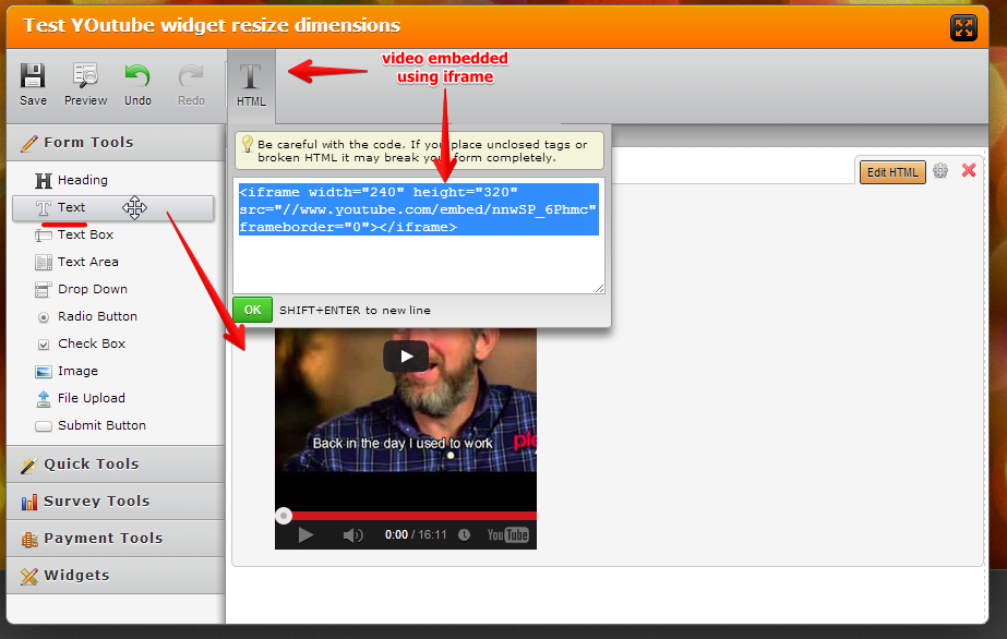
You can instead embed the video within an iframe code using the TEXT field(found in Form Tools)
when you do this, you will now be able to use the field to when Injecting CSS code to make the form mobile responsive.
You may want to review this thread also for details on how to make the form mobile responsive
In your form you can start with CSS code like this
/*-----------RESPONSIVE LAYOUT-----------*/@media (max-width: 480px) {.form-textarea,.form-textbox,.form-dropdown,
.form-html
{width: 100% !important;-webkit-box-sizing: border-box;-moz-box-sizing: border-box;box-sizing: border-box;}.form-label-left, .form-label-right{width: auto;}.form-buttons-wrapper{margin-left:0 !important;}.form-input {width: 100%;}.form-all{width: 75%;}.form-sub-label-container {width: 100%;display:block;}}
Here is a cloned version of your form http://www.jotformpro.com/form/41077816914964 where I have used the TEXT field to embed the video and then injected the CSS code I mentioned.
You can try test viewing the form in your mobile device.
Hope this help. Inform us if you need further assistance.
Thanks!
-
angiehillsReplied on April 19, 2014 at 1:13 PM
When I click on your cloned version - on my desktop - the video is already very small.
When I copy & apply your css provided - and try mine on my desktop & shirnk browswer window - the text on form is reducing but the video still doesn't appear to shrink for me.
http://form.jotformpro.com/form/41068671357964
-
jonathanReplied on April 19, 2014 at 5:47 PM
Hi,
In my cloned version, I had the iframe height of the embedded video smaller than what you had -- this is the reason it looks small already on your desktop.
Anyway, I also realized that the embedded youtube video is still not responsive on mobile when I tested it again.
So I made the adjustments. Please follow this steps.
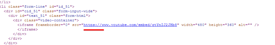
1. Modify the TEXT(HTML) field of the youtube iframe embed video to like this http://pastie.org/9094150
2. Remove all the previous injected CSS codes and use this http://pastie.org/9094181
If OK with you, you can just clone my form http://www.jotformpro.com/form/41087012170947 so that you have a copy of it on your account.
Use this guide to clone -How-to-Clone-an-Existing-Form-from-a-URL
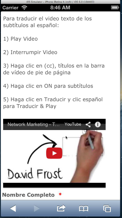
I tested it on a mobile device simulator and it behave like this
Hope this works for you. Inform us if still not.
Thanks!
-
angiehillsReplied on April 25, 2014 at 9:53 PM
I tried following your directions & not cloning as I have a few different versions of this - so wanted to edit each one.
But - it still doesn't seem to be working fo me.
Can you please check & see if I edited it correcly per your instructions.
Thanks!
-
NeilVicenteReplied on April 26, 2014 at 6:04 AM
Hi,
Jonathan's solution works on devices with limited static viewport (i.e., mobile devices). It will not make the video responsive to the point that it will react on shrinking browsers.
According to my tests so far, it is quite impossible to make the video as responsive as you want, but I probably need to do more tests.
In the meantime, try viewing the form on a mobile device (phone or tablet) and you'll find that the video is resized to fit the screen.
-
angiehillsReplied on April 26, 2014 at 8:31 PM
I'm trying on my mobile phone & the video doesn't seem to shrink for me. I have multiple forms that I'm trying to get this on.
http://www.jotform.com//?formID=41086118320950
http://www.jotform.com//?formID=41066720474957
http://www.jotform.com//?formID=41068671357964
Any help would be appreciated - Thanks!
-
jonathanReplied on April 26, 2014 at 10:57 PM
Hi,
I checked the 1st form https://www.jotform.com/41066720474957 we had been working on the discussion, and I noted that you had not applied my suggested TEXT(html) code in embedding the youtube video. This code http://pastie.org/9094150
This was my step
1. Modify the TEXT(HTML) field of the youtube iframe embed video to like this http://pastie.org/9094150
--
Will you give me permission to access and modify your form so that I can try to apply this workaround instead?
So far, that is the difference I see between my form and your form, the reason your form embedded video is not responsive when viewed on mobile browser.
Will wait for your update.
Thanks!
-
jonathanReplied on April 26, 2014 at 11:11 PM
Correction:
Please disregard the last part of my latest response.. because, I just realized that you wanted to do it yourself, so I should not do it for you.
What I suggest you can do this time is clone my test form as I've suggested much earlier
If OK with you, you can just clone my form http://www.jotformpro.com/form/41087012170947 so that you have a copy of it on your account.
Use this guide to clone -How-to-Clone-an-Existing-Form-from-a-URL
--
Clone the my form so that at least you will be able to open the actual form and see for yourself what had been setup and configured on the form.
Inform us if you have further question.
Thanks!
-
angiehillsReplied on April 27, 2014 at 7:53 PM
I did try adding your text - but I hit the edit HTML box in the text box & the html at the bottom right of the wysiwyg editor. But it seems it didn't save? So - I have cloned yours & have tried placing the html as you did in your image & as far as I can tell I have the correct info.
On my phone - it looks like 2 of my forms are reducing for mobile - they are the same form, but a diff video.
http://form.jotformpro.com/form/41066720474957
But it seems the 2nd two with the original video in your clone - is still not reducing on my mobile? I tried to refresh my mobile to make sure it wasn't an old view in my memory - but it still doesn't seem to work on these two:I have tried to re-copy both of your edits into both of these forms - but still not correct.Can you please assist? :)Thanks! -
jonathanReplied on April 27, 2014 at 8:52 PM
Hi,
I went ahead and fix the problem with the 2 remaining forms that was not working
http://form.jotformpro.com/form/41068671357964
http://form.jotformpro.com/form/41086118320950
One thing I noticed that seems to fail on the 2 remaining form was the protocol used in the youtube link. It seems youtube wants the URL to always used https only.
I updated this in the TEXT(html) where the video was embedded for the 2 forms, and they become mobile responsive when I test
You may check the 2 forms again on your mobile device to see if they display properly now.
Inform us if there are further issue.
Thanks!
-
angiehillsReplied on April 27, 2014 at 9:31 PM
Awesome! Thank you so much for your assistance! Greatly appreciated!
-
Ashwin JotForm SupportReplied on April 28, 2014 at 12:08 AM
Hello angiehills,
On behalf of my colleague, you are welcome.
Do get back to us if you have any questions.
Thank you!
-
NGHSReplied on August 27, 2015 at 2:51 PM
For the folks wanting a one-post solution, here is what I did. Use the below HTML and CSS for extreme happiness. Enjoy!
HTML:
<div class="item-video"><iframe frameborder="0" src="https://www.youtube.com/embed/n0g9K_C2C2c" width="100%" height="360" alt="How can I set my video to reduce for mobile? Image-0" /></iframe></div>
CSS:
@media screen
and (min-device-width: 800px)
{
.item-video {
width : 100%!important;
font-size : 12px!important;
height : 0px!important;
padding-bottom : 56.1%!important;
position : relative!important;
}
.item-video iframe {
width : 100%!important;
height : 100%!important;
position : absolute!important;
}
}
- Templates
- Integrations
- Products
- PRODUCTS
- Form Builder
- Jotform Enterprise
- Jotform Apps
- Store Builder
- Jotform Tables
- Jotform Inbox
- Jotform Mobile App
- Jotform Approvals
- Report Builder
- Smart PDF Forms
- PDF Editor
- Jotform Sign
- Jotform for Salesforce Discover Now
- Support
- GET HELP
- Contact Support
- Help Center
- FAQ
- Dedicated Support
Get a dedicated support team with Jotform Enterprise.
Contact Sales - Professional ServicesExplore

