
-
hje0001Asked on January 7, 2017 at 2:06 PM
I am trying to make my jot form mobile friendly. We have optimized it for mobile but our restaurant options are lined up horizontally and we need them to be vertical so people on mobile devices can use it easier.
Any way we can do this?
Page URL: https://form.jotform.com/62705554721152 -
Kevin Support Team LeadReplied on January 7, 2017 at 9:22 PM
Please inject this CSS code to display the widget as you need:
th {
display: none;
}
tr {
display: block;
}
.col1:before, .col2:before, .col3:before, .col4:before{
font-weight: bold;
display: block;
}
/* Naming the fields*/
td.col1:before {
content:"Restaurant";
}
td.col2:before {
content:"Meal";
}
td.col3:before {
content:"Drinks";
}
td.col4:before {
content:"Sides";
}
/* Positioning the fields in multiple columns*/
td.col2 {
display: block;
position: relative;
top: 3px !important;
margin-left: 0px;
}
td.col3 {
display: block;
position: relative;
top: 6px !important;
margin-left: 0px;
}
td.col4 {
display: block;
position: relative;
top: 6px !important;
margin-left: 0px;
}
td.col5 {
padding-bottom: 11px;
padding-top: 5px;
}
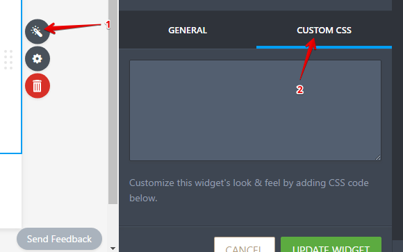
To inject the code, please open your form in the form builder and click on the restaurant options, once there open the widget's wizard:

Go to the custom CSS tab and paste the given code there:
Do note that if you would like to change the fields names, for example, you will need to add it in the widget and change it in the given CSS code too.
Here's my cloned form of yours if you want to take a look to the result: https://form.jotform.com/70068451089964
Hope this helps.
- Templates
- Integrations
- Products
- PRODUCTS
- Form Builder
- Jotform Enterprise
- Jotform Apps
- Store Builder
- Jotform Tables
- Jotform Inbox
- Jotform Mobile App
- Jotform Approvals
- Report Builder
- Smart PDF Forms
- PDF Editor
- Jotform Sign
- Jotform for Salesforce Discover Now
- Support
- GET HELP
- Contact Support
- Help Center
- FAQ
- Dedicated Support
Get a dedicated support team with Jotform Enterprise.
Contact Sales - Professional ServicesExplore