
-
hansfahdenAsked on January 21, 2017 at 12:56 PM
Hello
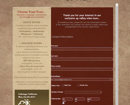
The booking form we created looks good on our desktop site, but the mobile version is not previewing properly.
It is very large and slides around all over the place making it user-UNfriendly.
Screen shot attached for reference.
Any thoughts on how we can quickly remedy this?
 Page URL: http://www.calistogawinetour.com
 -
John_BensonReplied on January 21, 2017 at 3:14 PM
Please try adding the Mobile Responsive widget to your form. Here's how:
1. Go to the Widgets tab.
2. Search for Mobile Responsive in the search bar.
3. Select the Mobile Responsive and drag it to the bottom of your form. After that, save your form.Hope that helps. Let us know if you need further assistance. Thank you.
-
hansfahdenReplied on January 24, 2017 at 9:41 AM
Thanks John
This does remedy the issue on mobile site.
However, now we have an issue on desktop site. See the attached screen grabs comparing form preview in Chrome on a MAC and form preview on a PC.
Margins look good on MAC but fields run to edges on PC.
Any thoughts?
-
Welvin Support Team LeadReplied on January 24, 2017 at 11:48 AM
I've fixed it. Can you check again? I have removed the responsive widget and added a custom CSS for mobile. Let us know if the layouts are still not responsive.
- Templates
- Integrations
- Products
- PRODUCTS
- Form Builder
- Jotform Enterprise
- Jotform Apps
- Store Builder
- Jotform Tables
- Jotform Inbox
- Jotform Mobile App
- Jotform Approvals
- Report Builder
- Smart PDF Forms
- PDF Editor
- Jotform Sign
- Jotform for Salesforce Discover Now
- Support
- GET HELP
- Contact Support
- Help Center
- FAQ
- Dedicated Support
Get a dedicated support team with Jotform Enterprise.
Contact Sales - Professional ServicesExplore