-
ClintlunaAsked on January 21, 2019 at 8:40 PM
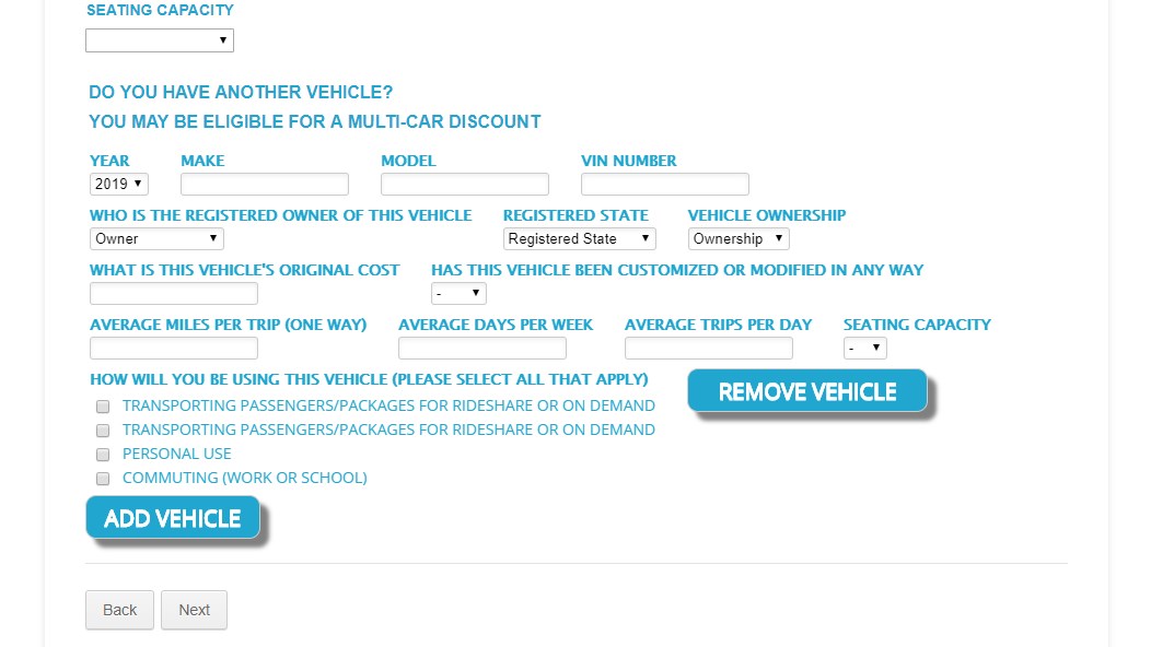
On this form below, on page 4 on the add vehicle config list, there is too much space between the multi choice check boxes and the text...
how can I fix this?
Also is there a way to get this text to match the blue color of the rest of the text? Thanks!
It's this form: https://www.jotform.com/build/82815789429171
-
Ashwin JotForm SupportReplied on January 21, 2019 at 11:36 PM
I have injected the following custom css code in your form's configurable list widget to fix the gab between the checkbox and label:
input[type=checkbox], input[type=radio] {
width: 25px !important;
}
and the following css to change the color of the checkbox options:
.checkbox {
color: #21a6cf !important;
}
Please test your form and get back to us if you need any other changes.
-
ClintlunaReplied on January 22, 2019 at 2:56 PM
Thanks that worked great!
Lastly, I'd like to have more space in between each column because the text questions run into each other and it looks hard to read. Thanks!
-
Elton Support Team LeadReplied on January 22, 2019 at 4:19 PM
I added this CSS code on the vehicle config list widget to add more space between the columns.
td[class^="col"] {
padding-right: 25px;
}
Result:

-
ClintlunaReplied on January 22, 2019 at 5:26 PM
This worked great! Thanks!
- Templates
- Integrations
- Products
- PRODUCTS
- Form Builder
- Jotform Enterprise
- Jotform Apps
- Store Builder
- Jotform Tables
- Jotform Inbox
- Jotform Mobile App
- Jotform Approvals
- Report Builder
- Smart PDF Forms
- PDF Editor
- Jotform Sign
- Jotform for Salesforce Discover Now
- Support
- GET HELP
- Contact Support
- Help Center
- FAQ
- Dedicated Support
Get a dedicated support team with Jotform Enterprise.
Contact Sales - Professional ServicesExplore