
-
stormingrobotsAsked on February 22, 2020 at 8:16 AM
fform : 200284540480145

Should the bottom show the next section tab instead of just blank? Please advise.
-
Mike_G JotForm SupportReplied on February 22, 2020 at 12:49 PM
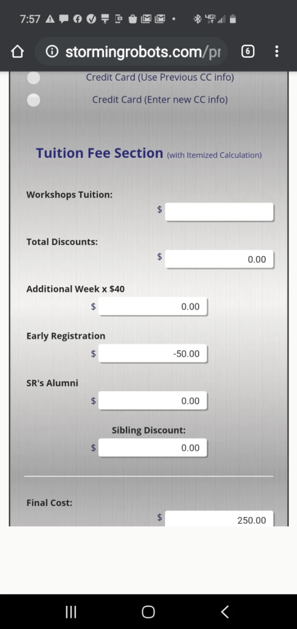
I have tested the form you mentioned you are having issues with on my Android device and I was not able to reproduce the issue you have described.
Here's a screenshot of my test.
That was taken from Google Chrome on my device.
Perhaps you were already able to fix the issue. Otherwise, please let us know how we can reproduce it on our end. May we also know the device and browser you were using when you encountered the issue, please?
-
stormingrobotsReplied on February 22, 2020 at 8:02 PM
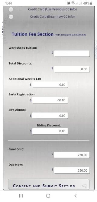
sorry...it still looks cut off. I am using an android Samsung 10e.
Perhaps,if I can shrink each of the line back to one line, i will be great. The current looks like each row span to 2 rows. Shouldn't the row length adjusted based on the screen size ? I thought I had it in the custom css.
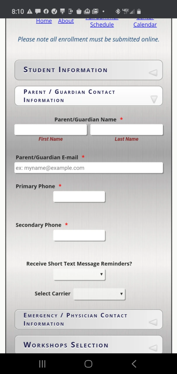
Also the next tag is supposed to show up right after the current tab even when i has expanded - see below - between the Parents and emergence section .
but, Unless the tab for Tuition (see the image in the last email post), the next tab does not show up. Instead, it is blank; unless I click on the current tab again.
Please advise.
-
Girish JotForm SupportReplied on February 22, 2020 at 9:53 PM
Could you try reducing the vertical spacing between the fields to check if that would solve?
Here is a related guide for your reference: https://www.jotform.com/help/62-How-Can-I-Change-Spacing-Between-Questions
There are three methods suggested here.
Please give it a go and let us know the update.
-
stormingrobotsReplied on February 23, 2020 at 8:02 AM
also, how to reduce the padding between the two rows. I can force the height, but prefer just removing the padding. I tried, but it did not work. Please advice.
-
John Support Team LeadReplied on February 23, 2020 at 9:58 AM
You may try using this custom CSS code below to reduce the distance between the two fields in the screenshot:
li#id_88 {
margin-top: -20px;
}
@media screen and (max-width: 480px), screen and (max-device-width: 768px) and (orientation: portrait), screen and (max-device-width: 415px) and (orientation: landscape){
li#id_88 {
margin-top: -30px!important;
}
}
Please try that and let us know how it goes.
Here's what it looks in the cloned form:
https://form.jotform.com/200534302631945
- Templates
- Integrations
- Products
- PRODUCTS
- Form Builder
- Jotform Enterprise
- Jotform Apps
- Store Builder
- Jotform Tables
- Jotform Inbox
- Jotform Mobile App
- Jotform Approvals
- Report Builder
- Smart PDF Forms
- PDF Editor
- Jotform Sign
- Jotform for Salesforce Discover Now
- Support
- GET HELP
- Contact Support
- Help Center
- FAQ
- Dedicated Support
Get a dedicated support team with Jotform Enterprise.
Contact Sales - Professional ServicesExplore