
-
rahulchavan34Asked on December 12, 2020 at 3:41 AM
Hello,
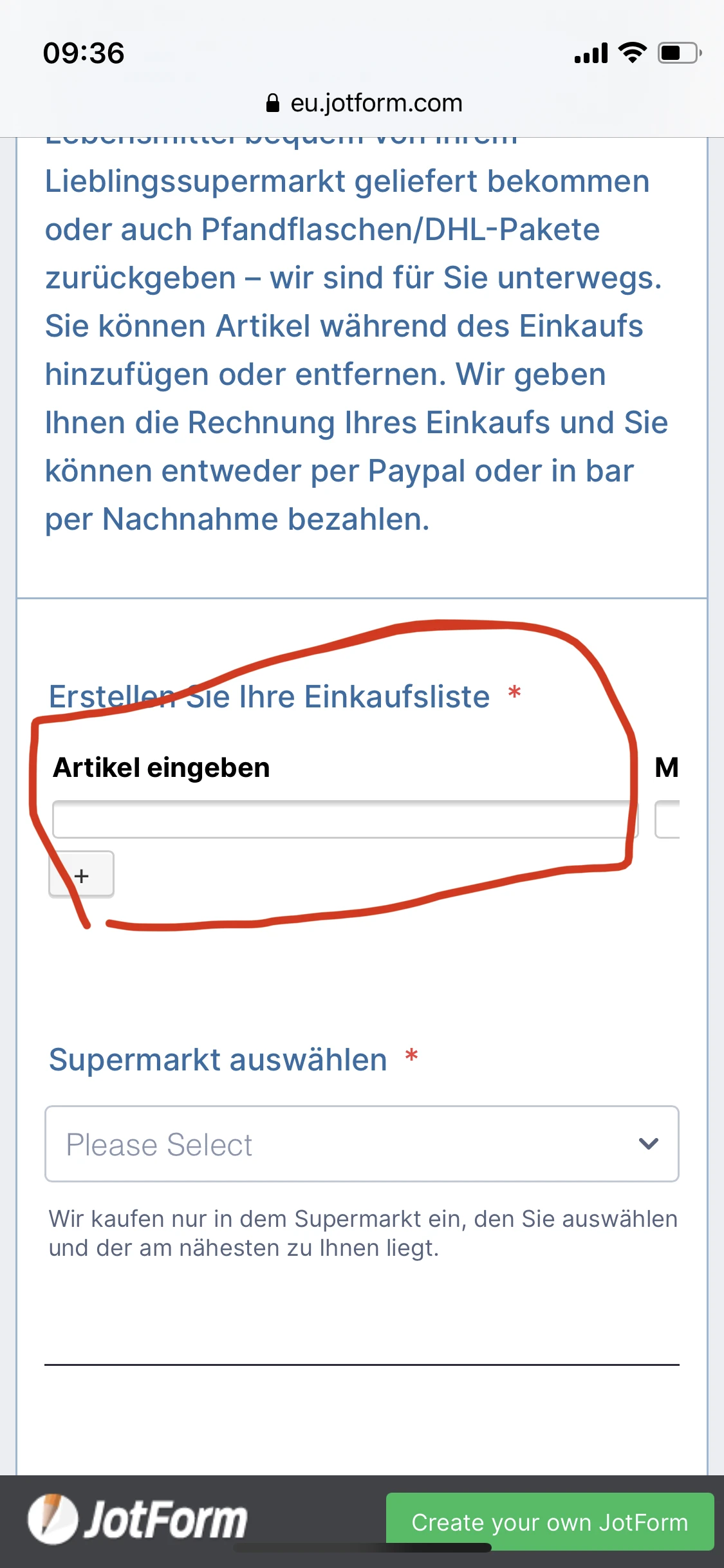
I am using a widget "Configurable List" and I have just 2 fields as show in the screenshot below. I would like the width of the fields to be around 140px and i have also added in the CSS for it, but it doent show the change in mobile screen. On normal desktop screen i want it to be around 300px and this shows correctly on larger screens, but on mobile its not. Is there something wrong with the CSS?

-
Kenneth JotForm SupportReplied on December 12, 2020 at 4:17 AM
Thank you for reaching support,
After customizing the form, here is how it looks:
If that is acceptable, then insert these codes to the Configurable List Widget's Custom CSS Area:
@media screen and (max-width: 480px){
input.translatable {
width: 100% !important;
}
}
I hope that helps.
Best.
-
rahulchavan34Replied on December 12, 2020 at 6:47 AM
Hello,
It works for mobile screens, but for desktop screen i would like to be widespread with width 300px. How can i keep the CSS above for mobile screen and inject a new CSS for desktop screen? Could you provide me the CSS for desktop screens?
-
rahulchavan34Replied on December 12, 2020 at 7:56 AM
hello, could you provide me the css for both the screens sizes
-
rahulchavan34Replied on December 12, 2020 at 8:25 AM
hello,
i solved it myself thanks
- Templates
- Integrations
- Products
- PRODUCTS
- Form Builder
- Jotform Enterprise
- Jotform Apps
- Store Builder
- Jotform Tables
- Jotform Inbox
- Jotform Mobile App
- Jotform Approvals
- Report Builder
- Smart PDF Forms
- PDF Editor
- Jotform Sign
- Jotform for Salesforce Discover Now
- Support
- GET HELP
- Contact Support
- Help Center
- FAQ
- Dedicated Support
Get a dedicated support team with Jotform Enterprise.
Contact Sales - Professional ServicesExplore