
-
ezchoicefinancialAsked on June 12, 2015 at 3:38 PM
Hi there i am having a bunch of issues with my form that i need help with.
The form in question is form id 51376919239971
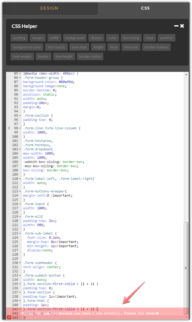
1- The first issue is .form-sub-label under the phone number. I don't want that to be there at all. it has a minimum height of 13px and margin-top 1 px. i tried manny different css commands and nothing worked. i won't list them all but here is the last one :
.form-sub-label { font-size: 0.1em; margin-top: 0px!important; min-height: 1px!important; display:none; }
it looks funny on the form because there is too much space between the phone number field and source field
2- I want the "form input" width of Phone number, Source, and Reason to be the same width as Name, Email, And Zipcode in both DESKTOP and Mobile. I looks funny on desktop and mobile in my opinion how the width doesn't match. Essentially i want the Phone number, Source, and Reason to match the widthof Name, Email, And Zipcode in both desktop and mobile . see image below

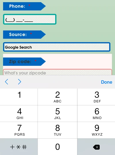
3- The drop down arrow for "Source and Reason" Does not show on my mobile phone using safari and chrome. Maybe cause they are not wide enough ( i made them wider though and they still dont show) . so please i need the drop down arrow to show. see image below:
4- Form html has too much space around it. in other words the space between the form html and reason as submit is too much, is there a way to decrease it . see image below
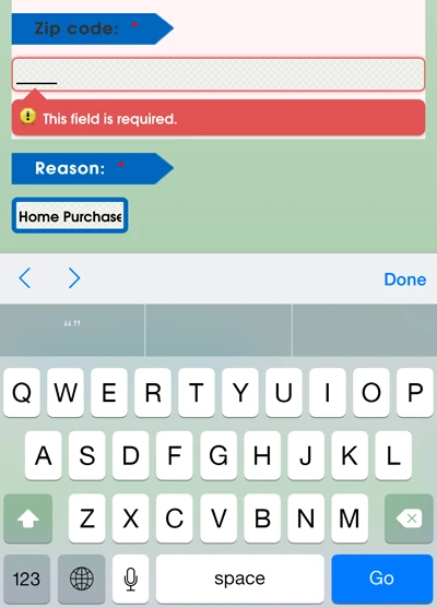
4- Is there a way to make the zip-code code field only populate the numeric keys on mobile phones just like the telephone field does ?
-
MikeReplied on June 12, 2015 at 5:26 PM
There is a CSS error caused by missing closing curly brace on injected CSS.
You can add it to fix the error.
Then, hide the sub label with the next CSS:
.form-sub-label {
display: none;
}Other questions have been moved into separate threads, so we will be able to address them properly.
-
ezchoicefinancialReplied on June 12, 2015 at 5:41 PM
i cant seem to fix the curly brace no matter what i do
-
ezchoicefinancialReplied on June 12, 2015 at 5:46 PM
i added the extra curly brace in the end and now my form is super narrow. what should i do to make it look like before
-
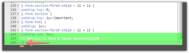
MikeReplied on June 12, 2015 at 5:46 PM
The issue seems to be fixed. However, added sub label CSS is currently within @media mobile CSS rule. So you might consider moving it, or adding an additional CSS rule for desktop version.
Thank you.
-
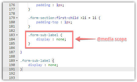
ezchoicefinancialReplied on June 12, 2015 at 5:50 PM
good catch but i have no idea how to do so . i thought i moved above the media scope thingy but that didnt change anything. Now even my font is gone. what a mess.
i should have not asked for help. now my form is all messed up. the background is not transparent anymore and there is too much padding in top and bottom
i think i fixed by using the old code. the design css kind of sucks. i still need to know about my other questions. where threads opened for those?
-
raulReplied on June 12, 2015 at 6:27 PM
We're sorry to hear that your form is all messed up.
You can always use your form's revision history to revert unwanted changes in your form.Regarding your threads, I found 3 recent besides this one. You can find the links below:
http://www.jotform.com/answers/587658-Drop-Down-arrows-are-missing-on-mobile-form#1
http://www.jotform.com/answers/587660-How-to-decrease-white-space-around-Text-html-field-using-CSS#1
http://www.jotform.com/answers/587657-How-to-set-fields-to-the-same-strict-width#1 -
ezchoicefinancialReplied on June 15, 2015 at 2:03 PM
-
MikeReplied on June 15, 2015 at 2:26 PM
The 4th question has been moved into a separate thread:
http://www.jotform.com/answers/589063
We will update it as soon as possible.
- Templates
- Integrations
- Products
- PRODUCTS
- Form Builder
- Jotform Enterprise
- Jotform Apps
- Store Builder
- Jotform Tables
- Jotform Inbox
- Jotform Mobile App
- Jotform Approvals
- Report Builder
- Smart PDF Forms
- PDF Editor
- Jotform Sign
- Jotform for Salesforce Discover Now
- Support
- GET HELP
- Contact Support
- Help Center
- FAQ
- Dedicated Support
Get a dedicated support team with Jotform Enterprise.
Contact Sales - Professional ServicesExplore