
-
allgas01Asked on July 22, 2015 at 2:19 PM
I've tried several form layout settings, line layouts, button styles and shapes, etc but nothing works. I've spent hours on this - it's driving me insane! Hope you can help.
Please note - the desktop version of the form is fine, it's the mobile version that has the problem (view on a screen size less than 720px wide)PaulL
-
Elton Support Team LeadReplied on July 22, 2015 at 3:16 PM
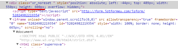
I was able to reproduce the problem when viewed on mobile. The submit button is a bit cut off. The reason why is due to the div container height where the form is embedded. It has 600px height limit which cuts the form display when it passes this height. Since the form height expands a bit further when viewed on mobile, this is causing the submit button to be hidden or cut.

The easiest way to resolve this is to extend the height of that div element a bit further, maybe around 680px will do. Or include the following styles just above the form code, this should help.
<style>
@media screen and (max-width:768px){
.xr_noreset {
height: 680px !important;
overflow: inherit !important;
}
}</style>
Thanks!
- Templates
- Integrations
- Products
- PRODUCTS
- Form Builder
- Jotform Enterprise
- Jotform Apps
- Store Builder
- Jotform Tables
- Jotform Inbox
- Jotform Mobile App
- Jotform Approvals
- Report Builder
- Smart PDF Forms
- PDF Editor
- Jotform Sign
- Jotform for Salesforce Discover Now
- Support
- GET HELP
- Contact Support
- Help Center
- FAQ
- Dedicated Support
Get a dedicated support team with Jotform Enterprise.
Contact Sales - Professional ServicesExplore