
-
clarkschoolAsked on March 8, 2016 at 3:29 PM
Hi there,
Can you please provide me with the custom CSS that I would need to align the Back and Submit buttons on my form?
Thank you!
Page URL: https://form.jotform.com/60635067877163 -
Kiran Support Team LeadReplied on March 8, 2016 at 9:56 PM
Please move the Submit button above the page break and inject the following CSS code to your JotForm in order to align the buttons:
#cid_32 {
margin-left: 157px !important;
position: absolute !important;
padding-top: 25px !important;
}
#input_32 {
width: 248px !important;
}
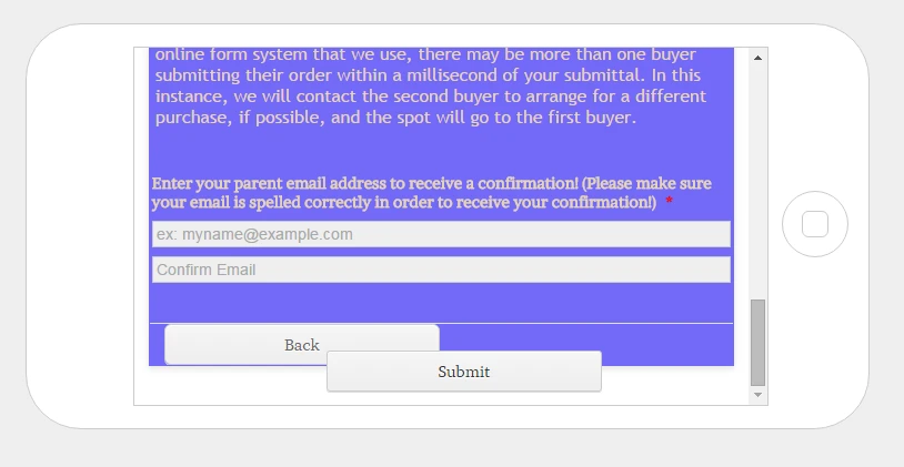
The buttons should be displayed as shown below after injecting the code above.

Hope this information helps!
-
clarkschoolReplied on March 9, 2016 at 10:33 AM
Thank you! Your code works well for PC/Mac and tablet viewing. However, when viewed on a smart phone it looks like this:
Is there a way to fix this? It does the same thing in portrait orientation.
Thank you for your help!
-
Kiran Support Team LeadReplied on March 9, 2016 at 10:43 AM
Since we change the position to absolute, it may affect the position when viewing on mobile devices. Let me check on this and get back to you with relevant code that might need to be added.
Thank you for your patience.
-
Kiran Support Team LeadReplied on March 10, 2016 at 10:56 PM
Thank you for being patient. Could you also add the following CSS code to your JotForm to align the submit button properly on mobile devices and see if that works?
@media screen and (max-width: 480px), screen and (max-device-width: 768px) and (orientation: portrait), screen and (max-device-width: 415px) and (orientation: landscape) {
.form-buttons-wrapper {
margin: 0px !important;
}
#cid_32 {
margin-left: 0px !important;
padding-top: 40px !important;
position: absolute;
}
}
@media only screen and (max-device-width: 550px) {
.form-buttons-wrapper {
margin: 5px !important;
text-align: center;
}
#cid_32 {
margin-left: 0px !important;
padding-top: 40px !important;
position: absolute;
}
}
If you still experience any issue with the alignment, please let us know the device model that you are using so that we'll try to replicate the issue at our end and provide you with necessary assistance.
Thank you!
-
clarkschoolReplied on March 22, 2016 at 12:41 PM
Hi there,
Thank you for your work on this!
Should I add the second block of code you gave me as an addition to the original block, or in place of it?
Thank you!
-
David JotForm SupportReplied on March 22, 2016 at 12:46 PM
You would add the second block of code in addition to the first. The first block of code takes care of desktop devices, the second set should take care of mobile devices. With both added all your bases would be covered.
- Templates
- Integrations
- Products
- PRODUCTS
- Form Builder
- Jotform Enterprise
- Jotform Apps
- Store Builder
- Jotform Tables
- Jotform Inbox
- Jotform Mobile App
- Jotform Approvals
- Report Builder
- Smart PDF Forms
- PDF Editor
- Jotform Sign
- Jotform for Salesforce Discover Now
- Support
- GET HELP
- Contact Support
- Help Center
- FAQ
- Dedicated Support
Get a dedicated support team with Jotform Enterprise.
Contact Sales - Professional ServicesExplore