
-
idmmarketingAsked on August 9, 2016 at 2:58 PM
Hi,
I've tried everything. The two fields on my form just won't come any closer together. Mainly I want the form to be centered on my website but it seemed like it was being slightly pushed to the left. When I added padding to the form on the left it would look correct on desktop but push it off screen on mobile. So I left that alone and tried to remedy the situation by decreasing the size of the input field to match the size of the submit button. Only now I get a big space in between them. I tried to target the input field with a padding-right: 0 !important; but that did not work. Any help appreciated. I want the two fields to be the same size and centered on my webpage.
I should mention it looks correct when I'm in theme designer but when I embed it on my site it's not the same.

-
MikeReplied on August 9, 2016 at 4:22 PM
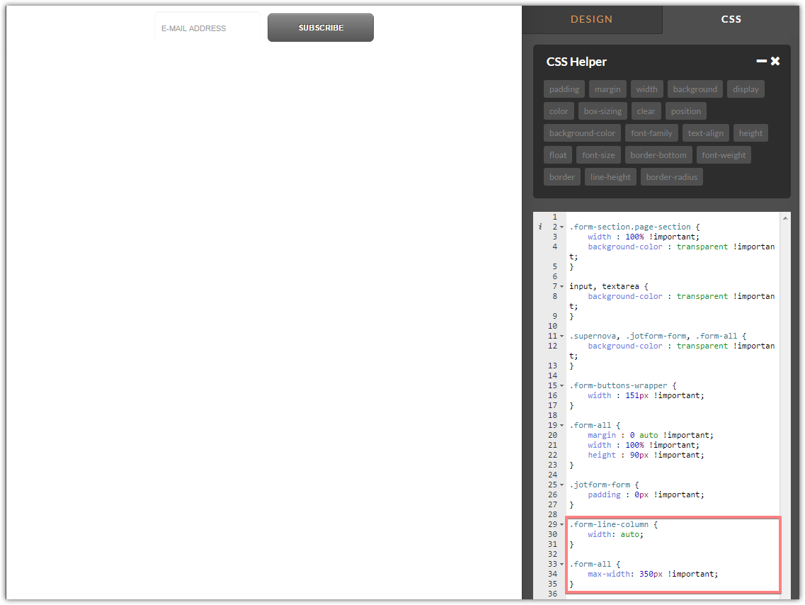
Please try adding the next CSS to see if that helps.
.form-line-column {
width: auto;
}
.form-all {
max-width: 350px !important;
}Thank you.
-
idmmarketingReplied on August 9, 2016 at 4:41 PM
That did the trick. Thanks so much!
- Templates
- Integrations
- Products
- PRODUCTS
- Form Builder
- Jotform Enterprise
- Jotform Apps
- Store Builder
- Jotform Tables
- Jotform Inbox
- Jotform Mobile App
- Jotform Approvals
- Report Builder
- Smart PDF Forms
- PDF Editor
- Jotform Sign
- Jotform for Salesforce Discover Now
- Support
- GET HELP
- Contact Support
- Help Center
- FAQ
- Dedicated Support
Get a dedicated support team with Jotform Enterprise.
Contact Sales - Professional ServicesExplore