-
JHobbs1958Asked on October 30, 2016 at 6:05 PM
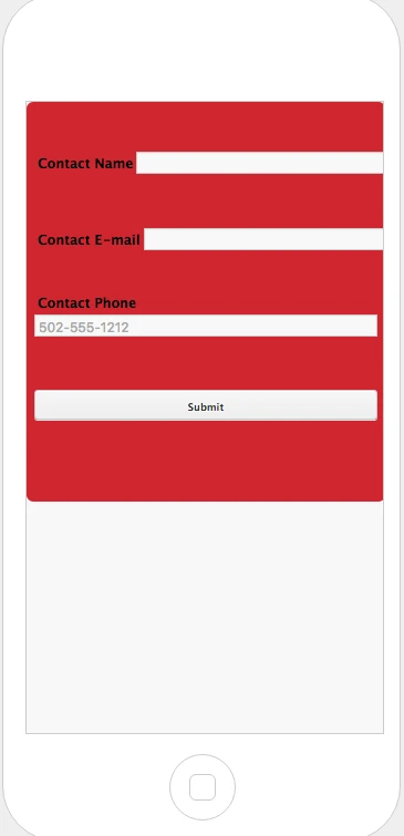
The first two input fields are not visible on the screen when using form on mobile.

-
omerorkun JotForm Data ScientistReplied on October 31, 2016 at 1:43 AM
Hi,
I have cloned your form and reproduced the issue. Width of the first two fields are far too much to fit in a mobile screen and they slide far right because of that.
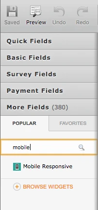
In the cloned version of your form I added our Mobile Responsive widget. Please see how it looks like on mobile after that:

Text boxes are now aligned to their respective headlines and their width are now fit to the mobile screen. Please try this widget:

Do let us know if the issue still persists. Thank you for contacting us.
-
JHobbs1958Replied on November 5, 2016 at 10:03 PM
I created a new page at segregationholding.con/guru-index-new.html and added the widget. It didn't fix the problem. I inserted some CSS that also did not help:
@media only screen and (min-width: 320px) and (max-width: 480px) and (orientation: portrait) {
li#input_5 {width: 100px !important;} li#input_4 {width: 100px !important;}
form-all { width: 100%; color: black; background-color: #d2232a;
}
}
-
Mike_G JotForm SupportReplied on November 6, 2016 at 11:42 AM
Can you try to add the CSS codes below to your form and check the result, please?
@media (min-width : 304px) and (max-width: 717px){
#label_5, #label_6, #label_4 {
width : 23% !important;
}
#id_6 {
width : 100%;
}
#cid_5, #cid_6, #cid_4 {
width : 75% !important;
}
.form-all .form-submit-button {
height : initial !important;
}
}
You might need to remove the Mobile Responsive widget to avoid conflict.
Or, you can also try to add the codes above to the codes on your website instead within <style></style>.
Thank you.
- Mobile Forms
- My Forms
- Templates
- Integrations
- Products
- PRODUCTS
Form Builder
Jotform Enterprise
Jotform Apps
Store Builder
Jotform Tables
Jotform Inbox
Jotform Mobile App
Jotform Approvals
Report Builder
Smart PDF Forms
PDF Editor
Jotform Sign
Jotform for Salesforce Discover Now
- Support
- GET HELP
- Contact Support
- Help Center
- FAQ
- Dedicated Support
Get a dedicated support team with Jotform Enterprise.
Contact Sales - Professional ServicesExplore
- Enterprise
- Pricing


