
I’m a UX designer at Jotform, an easy-to-use online form builder. Every day, our design team tries to help our users have a richer, more productive experience with our product. A year and a half ago, we embarked on a lofty journey that was full of challenges along the way: A complete redesign of our product to take it to the next level.
Jotform has 2.5 million users, and the immense challenge for us was to universally raise the bar in user experience for them, taking into account the variety of ways that our customers across different industries use our tool. We didn’t want to just make the interface prettier — we wanted to create an unparalleled experience for all things online forms.
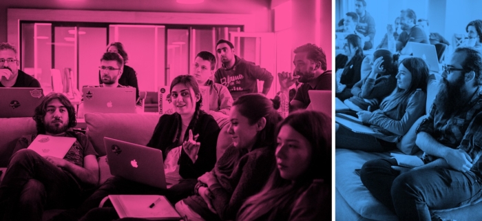
At Jotform, we have a culture of using friendly competition to drive creativity and encourage collaboration — one way we do is by holding hack weeks.
Hack Weeks
Our hack weeks are basically high speed sprints towards a specific goal where multiple groups compete for the best result. We are divided into five cross-functional teams. Each team has 4–6 team members. We have five days to sprint and get ready for the demo day on Friday. During our demo days, each team will get in front of the whole company and present what they have accomplished that week. Hack Days are great for solving big problems. During our product design, we’ve held many hack weeks.

Rule #1: Have Simple Goals
We first made sure that we have clearly defined goals for the hack week. We needed to make the goal simple but powerful. Here’s what we came up with:
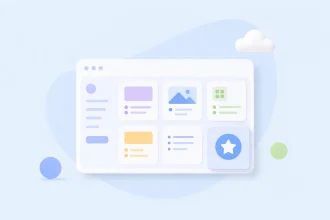
Create a mobile-first, simple form builder from scratch.
When we decided on this goal, everyone knew it was about being “mobile-first.” So, all of our creative energies were focused on how to make the greatest mobile-first form builder.
Rule #2: Think
We decided on the goal a few weeks before the start of hack week. This gave each team time to think about the problem thoroughly. So, when the time came, they were ready to tackle the problems head on.
Rule #3: Push Through
Since we only had five days, we didn’t spend too much time on preparations. We started building things right away.
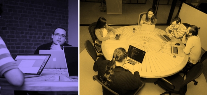
On the first day, we dived into the cold water head first. It was time to get serious and create a simple Form Builder. We laid the foundation for our challenge by researching UX and programming environments, then five separate teams built five form builders in parallel.
At first, having such limited time seemed to be a big challenge, as we had a hard time simultaneously planning and working together without blocking or going against each other. Our one question for the week was: How can we pull off ideation and execution of this within a week?
Rule #4: Create and Iterate
Nothing brings out awesome new ideas better than a competition under a tight deadline. So, instead of trying to apply all of the ideas that we liked, we tried to come up with a priority order of our ideas. Usually, we all have hard time making decisions when there many opposing good ideas. Having less time made our team’s job much more easier. We did not have time to waste time finding the perfect idea. We executed with what we had.
In the following days, everyone on the team got to a certain level of work tempo and motivation for creating and trying new things. And we also got used to the new layout and the new programming environment quickly.

At the end of our five-day stretch, it was time for our demo day. It was time for presentations. All five form builder prototypes were very inspiring and innovative. They were all good in different ways. There were so many creative ideas and solutions. Once all of the presentations were completed, the winners were announced shortly after. Winners were picked for different categories.
- Most Innovative
- Best Mobile UX
- Best Instant Edit Implementation
- Fastest Form Builder
- Best Drag & Drop Implementation
As a team, we were all in agreement with the results. At the end of the day, we wanted the best form builder to win. All form builder prototypes had a lot of potential and it was inspiring to see what my co-workers had all come up with.
Although it was a stressful and competitive atmosphere, I have to admit that hack weeks encourage us to be more productive and creative than usual. We also learn how to work faster.
A lot of ideas may have never seen the light of day if it weren’t for hack weeks.
As a designer, I thought that our form builder prototypes had a lot of new features that our users wanted. They were full of intuitive interactions that I got to see for myself as we watched usability tests.
Although these ideas had strong potential, they needed to be honed to better fit with our users’ needs. Because our prototypes were created from scratch, they were based on an entirely new design.
Finding Our Way
Before diving into redesigning Jotform, it was essential for us to get an understanding about what we should improve according to user tests. Then winners of the hack weeks and testing our prototypes gave us some clues about which way we should go. But, it was still a big mess waiting our design team to sort it out.
We were basically free to design anything we’d like in hack weeks, but then it was time to snap back to reality and decide which idea works best for our users. Making decisions is hard. It was the time for us to define our focus and decide what the look and feel of Jotform 4.0 should be.
We started with a design meeting where we wrote down our mission for Jotform 4.0:
1. Let our users focus on their forms (without distractions)
2. Clean and modern page layout (more white space)
3. More meaningful navigation and content architecture
4. Allow building forms as a team (Collaboration)
5. Smoother drag & drop
6. Improve mobile experience without crippling any features
Going Beta
We had a strict deadline anda busy todo list. We had to go beta quickly to find out where we were. We quickly put together a design and launched our beta to some Jotform users.
The beta allowed users to go back to the old version. But not without telling us exactly why they were abandoning the beta. We received hundreds of feedbacks this way.
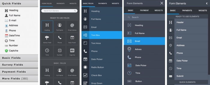
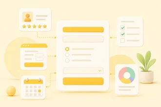
We tried to come up with different ways of grouping our form elements in the sidebar for easier access. First, we tried to remove all groupings and put our form elements according to usage levels. The reason we removed categories was to create a space for showing more form elements at one time, without forcing users to scroll to search for what they need.
At times, we received a lot of harsh feedbacks from our beta users. Some of them told us that their reasons for switching back to the old version was our decisions regarding form element categories.
We all had different ideas about how to make our users’ lives easier. But without continuous beta releases and user feedbacks, it would have been impossible to find the right one. I would have never guessed that such small changes could cause so much negative user experiences.
All in all, it was a great thing that our users responded and clarified to us that this is not something they would accept. The negative feedback gave us room to reconsider our design decisions and come up with better solutions. It gave us a chance to rethink many things before the big launch day. We tried to be humble and flexible. Instead of assuming we knew what was right, we let our users take us to the right solution.
We revised the product to serve our main goal: Allow users to focus on building forms without any distraction.
Then we started to build our content architecture from scratch and remove all the unnecessary buttons from UI without crippling any of our features. After watching over a hundred of usability tests and getting thousands beta user feedbacks, we’ve finally found the best design and experience for our users.
While redesigning something, it’s easy to imagine that the process won’t be a hard one because you are free to go in any direction. That couldn’t be farther from the truth. A redesign isn’t about building a new solution. It is about finding what works and building on it from scratch.
Designing Jotform 4.0 has been a great journey, and it will be launched on February 1. I hope you’ll like our new fresh look and functionality.
Curious about our new form builder? Meet Jotform 4.0 now!


Send Comment: