
These days, it seems like storytelling is the biggest buzzword in business. As of 2019, there were over two hundred TED Talks hashtagged #storytelling.
As Susan Credle, chief creative officer at a global advertising agency, writes for the Wall Street Journal:
“Great marketing isn’t about one ad, one piece of content, one moment in time. It is definitely about more than data and technology. It is about a relentless and lasting commitment to a brand’s story, and the elation of waking up every day with an opportunity to help write the next chapter.”
There’s no doubt, weaving an ongoing, compelling narrative can be a powerful strategy for a brand. But another tool that’s equally important is strong visuals — when we translate collected data into clear visual representations. In fact, well-designed visualizations will enhance, rather than detract from, great storytelling.
As researcher Alexandra Samuel tells Harvard Business Review:
“Knowing how to develop and deliver a data-driven presentation is now a crucial skill for many professionals, since we often have to tell our colleagues stories that are much more compelling when they’re backed by numbers.”
In a data-driven world, a picture truly is worth a thousand words — or more precisely, 60,000. According to marketing experts, the human brain can process images up to 60,000 times faster than words.
I’m CEO of Jotform, a company that creates user-friendly web forms. It doesn’t sound too snazzy, I know. But the way we tell it, we aim to make our users’ lives easier and their organizations more productive. And we’ve managed to do so over the past 14 years, in an increasingly crowded market and with heavyweights like Google tossing their hat into the ring.
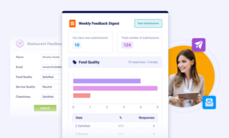
When I share information, either with colleagues or users, visuals are invaluable. Our latest product will help users to translate their data into digestible visual reports, too — more on that below.
But first, a closer look at some of the most significant benefits of strong visuals.
How great visuals will benefit your organization
1. Distilling data
You may have heard of Boeing’s Osprey program. It’s a high tech aircraft with an extraordinary range of capabilities. In order to make improvements, like increasing the efficiency of takeoffs and landings, Boeing needs to sift through the aircraft’s recorded data — a ton of it.
Writing for Harvard Business Review, Scott Berinato explains:
“[E]ach time the Osprey gets off the ground or touches back down, its sensors create a terabyte of data. Ten takeoffs and landings produce as much data as is held in the Library of Congress.”
Without visualizations, this colossal amount of information would probably take years to process. Even if you’re not launching aircrafts, visuals can help your business to collect and distill huge amounts of data on all types of things — from browsing and purchasing habits to customer feedback and satisfaction.
And, as Berinato writes:
“Decision making increasingly relies on data, which comes at us with such overwhelming velocity, and in such volume, that we can’t comprehend it without some layer of abstraction, such as a visual one.”
The amount of data at our fingertips is only proliferating. Finding a way to translate it into a user-friendly format can help entrepreneurs to make faster, more informed decisions.
2. Wrapping your head around it
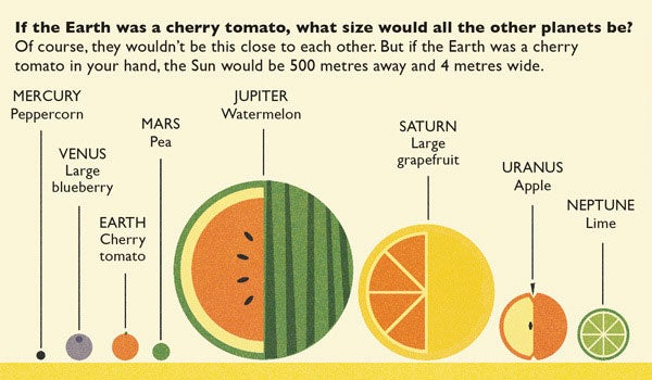
If I told you that Jupiter’s surface area is 6.1419×10¹⁰ km2, that probably wouldn’t mean much. But, if I told you to picture the Earth as a cherry tomato and Jupiter as a watermelon, you’d have a better idea of just how big we’re talking. As marketing strategist Gregory Ciotti writes for Entrepreneur:
“[A] visual can go a long way toward grasping an abstract idea.”
At times, the issue is having too much data. Sometimes, it’s that we can’t wrap our heads around it. Creative visuals make our lives easier by helping us to comprehend and share abstract concepts.
But in order to be effective, the visual design must be simple, too. The intended insight shouldn’t require a long explanation. As Harvard Business Review underlines:
“If an everyday dataviz can’t speak for itself, it has failed — just like a joke whose punch line has to be explained.”
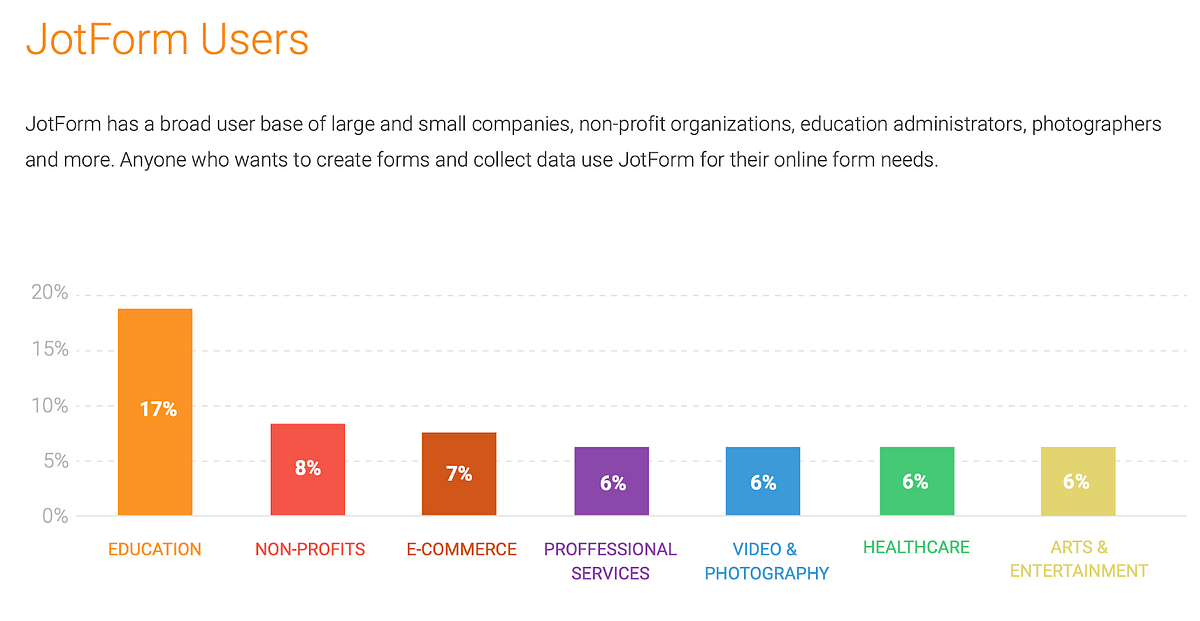
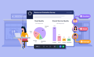
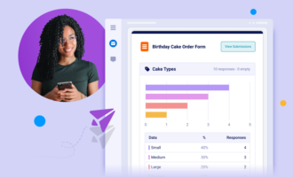
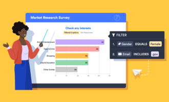
At Jotform, our upcoming product, Jotform Report Builder, will help users to land the punch line every time with clear and concise automatically generated reports. This visualization of information “at a glance” will enable users to quickly view and share form responses, analyze data, and make important decisions about their business.
Incomprehensible data has little value. Visualizations give meaning to otherwise useless information.
3. Make comparisons at a glance
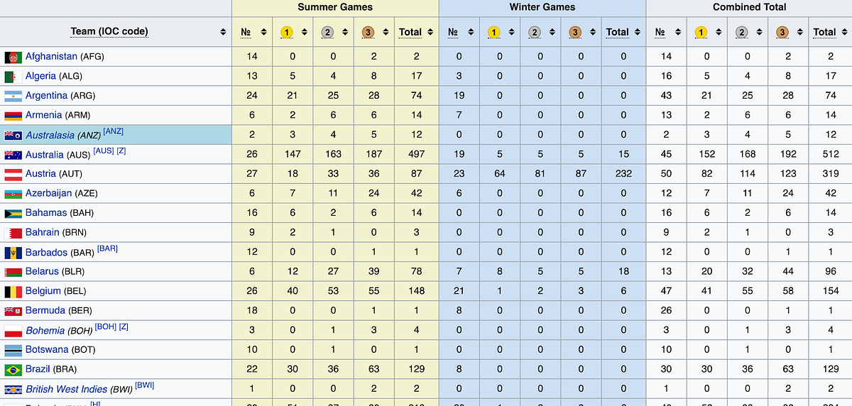
Have you ever scanned a list of Olympic medal winners by country?
If you have, then I’m sure you’ll agree: it takes time to figure out where everyone stands. A visual can make that information jump out in an instant. Just check out the below bubble chart of all Olympic medals won since 1896.
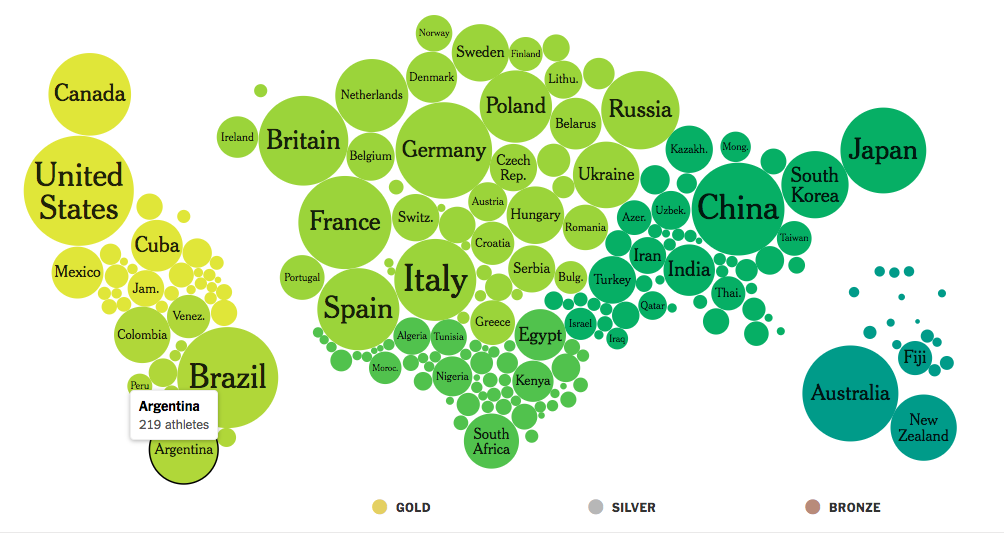
Not only can you compare countries’ performances against each other, but you can also make further inferences about that information. For example, the Olympic medal bubble chart instantly shows that Brazil has won more medals than Spain. But generally speaking, we see that South America has fewer medals than Europe.
Writing for Entrepreneur, Gregory Ciotti sums it up well:
“The very nature of visuals encourages ‘at a glance’ learning, making them well suited for showing a clear contrast between two items.”
I’d take that one step further and say you can compare multiple items at the same time.
4. Strengthen your persuasiveness
Consider this: if I tell you that beef is bad for the environment, you might remember my point before ordering lunch. But if I show you the below chart by Sarah Bartlett, demonstrating how much greater the adverse impact is, chances are you’d be much more persuaded.
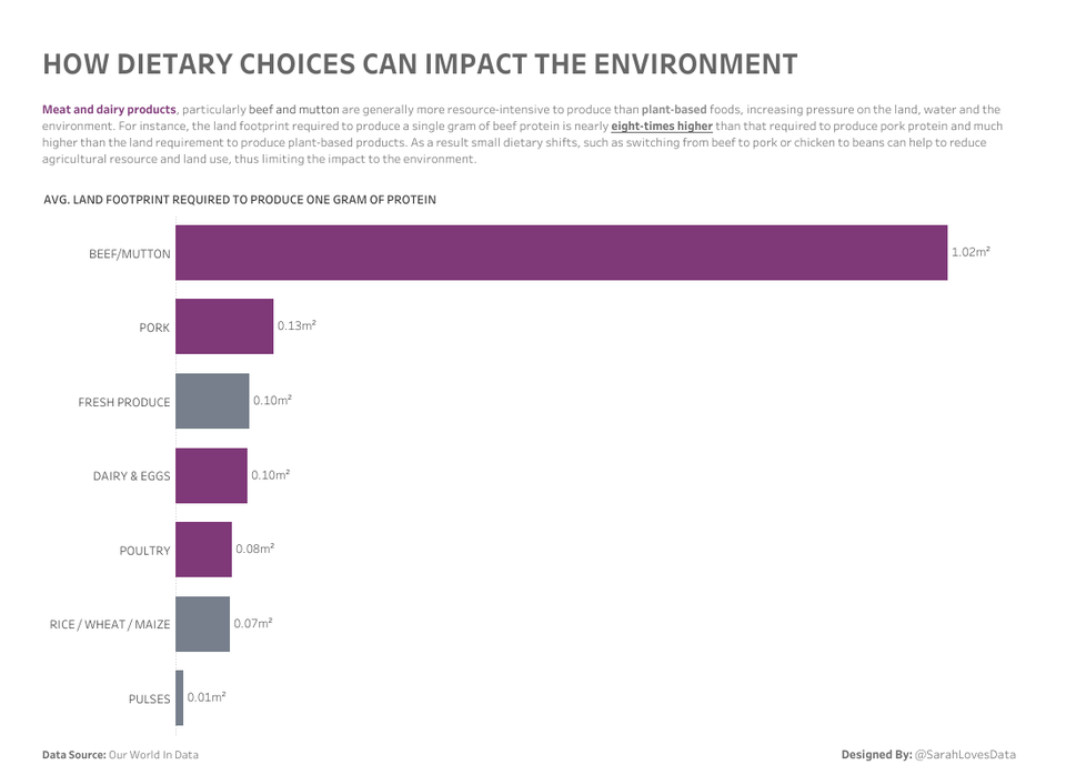
Even if the viewer can’t immediately deduce the cause for the disparity — because squeezing too much information into a visual can overwhelm and defeat the purpose — it’s enough to spark their interest and inspire them to seek more information about the “why.”
Visualizing collected data can help you to tell richer, more convincing stories about your brand. These days, when the economy is evolving at an ever-faster pace, sometimes unpredictably, easily usable, and shareable data is crucial for both long-term and everyday decision-making.


Send Comment: