
-
Varun1103Asked on December 18, 2016 at 2:49 PMI'm having one more issue now, this entire set of fields is not mobile responsive, even though I have the mobile responsive widget on my form and i've also enabled the option for making the form responsive in the advanced designer. This is how this part of the form looks like on a mobile:

-
jonathanReplied on December 18, 2016 at 6:30 PM
Can you please confirm if you have resolve this already on your form https://www.jotform.me/form/63473984140460
Because as of this checking I see it differently when I test on mobile browser.
Its like this
Thanks.
-
Varun1103Replied on December 19, 2016 at 2:18 AM
Hi Jonathan,
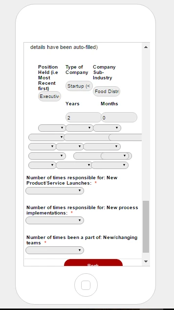
The problem is not with the initial pages actually. It does not seem to be responsive for this particular section on the next page:
It seems to be just for the fields under the Work Experience Headings for each team member (form v4).
Is there a solution for this?
Cheers,
Varun
-
emilyReplied on December 19, 2016 at 3:51 AM
Hi Varun,
Thank you for contacting us.
It seems like you have shrinked those fields in your form and your fields are overlapping.
Please give me some time for further inspections. Once I have a solution, I will notify you via this thread.
-
emilyReplied on December 19, 2016 at 6:34 AM
Hi Varun,
Thank you for your patience. I inspected your form with ID: 63473984140460. You were having this issue because of the field with id 301.
To fix the issue, please add this custom CSS code to your form.
#id_301 {
clear: both;
}
This is the overview of the fixed Work Experience field.
Here is the guide on injecting custom CSS codes.
https://www.jotform.com/help/117-How-to-Inject-Custom-CSS-Codes
I hope this helps. If you need further guidance, please let us know.
Thank you.
-
Varun1103Replied on December 20, 2016 at 12:31 AM
Hi Emily,
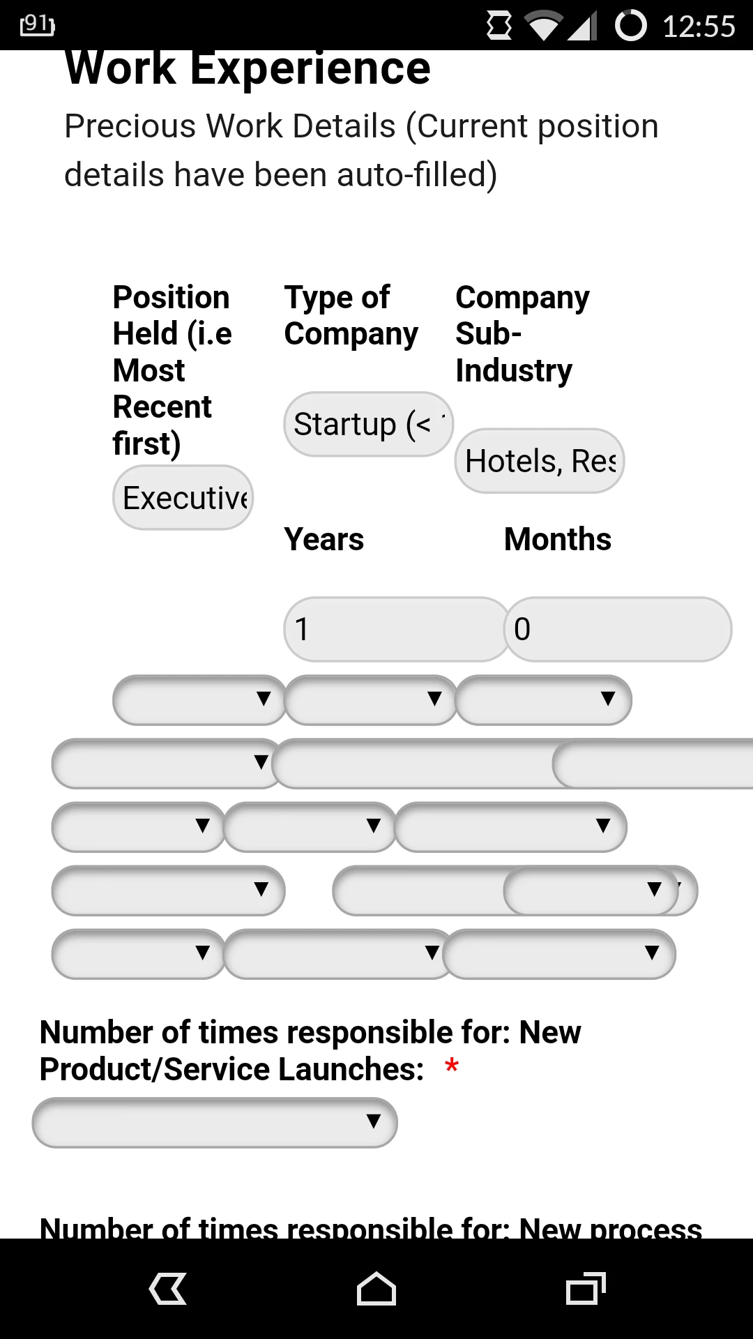
Thanks for the response. The code you provided sorted out the alignment and positioning for the desktop version, Appreciate that! However, it is still kind of all over the place and some fields are overlapping on a mobile screen for this particular section:
Could this be sorted out?
Cheers,
Varun
-
emilyReplied on December 20, 2016 at 2:06 AM
Hi Varun,
I viewed your form on multiple mobile devices. However, I could not replicate the same problem. The fields under the Work Experience heading did not overlap.
Here is the screenshot of the form viewed from iPhone 7.
The screenshot of the form viewed from iPhone 5.
Are you opening your form from a simulator? If you are, please check if you are having the same problem from your mobile device.
If the problem still persists when you open the form from your mobile, for further inspections could you please provide us the details of the device, its operating system and which browser you are using, etc.?
Waiting for your response.
Thank you.
-
Varun1103Replied on December 20, 2016 at 2:36 AM
Hi Emily,
I think that's because you're looking at the wrong form (an earlier version). The one that has this problem is v4 (formID=63473984140460). We removed the configurable widget and made it a simple field list for this form.
It doesn't view properly on the preview for mobile screens on the advanced designer and also when tested on an actual mobiles
Here's a test screenshot result from my OnePlus One phone:
Here's a screenshot result from an iPhone 6Plus:
Sorry for the trouble! Hope you can help us with this. Appreciate all the help we've received thus far!
Cheers,
Varun
-
CharlieReplied on December 20, 2016 at 4:37 AM
Hi,
Your form seems to have a lot of things on it that changes the responsiveness of it. Example, you have CSS codes that fixates other elements width and position, you also have the mobile responsive widget and the "make this form responsive" option enabled.
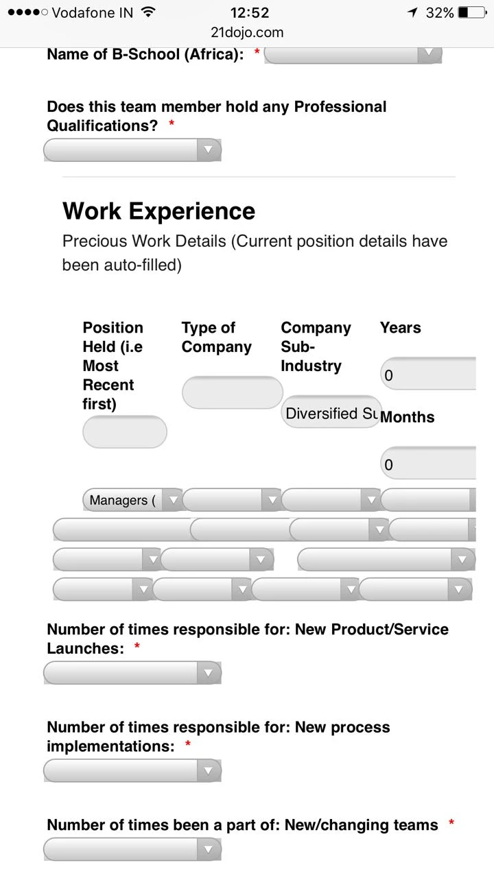
Now with regards to your specific concern, the form and section where you are having problems is presented as a table like manner. But they are individual fields:
I'm not sure how they will be mobile responsive because the 5 column field you have does not match the length of the mobile device, which pushes the fields on a new line. Same thing with the other fields at the bottom. They are not in a true table so will will adjust if needed.
You mentioned that you used a Configurable list widget on this part? Is that correct? That one formats the fields in a true table, so we can make that one more mobile responsive. Here's a cloned form with the solution I am proposing: https://form.jotform.com/63541944030955
This is how it looks like in mobile device:
You can see that the Configurable list widget is now presented in a much more readable manner, but the "table" like feature is not anymore there, the reason is that the 5 column won't fit on a horizontal format, so it is presented on a vertical format instead.
You can clone my form and see the custom CSS code that was added in the widget.
Let us know what you think.
-
Varun1103Replied on December 20, 2016 at 8:24 AM
Hi Charlie,
Thanks for the reply. This method with the configurable list is interesting but we're worried that the audience would then see the entire form as too long. We also wanted simple fields because we wanted to auto-fill the entire first row of the list which couldn't be done via the configurable widget which is why we switched to simple fields. This also saves users time since it's already quite a long form to fill out.
We're going to try a few other options and see if those work. We'll get back to you if we need some more help.
Thanks for taking out the time and explaining things so nicely.
Cheers,
Varun
- Templates
- Integrations
- Products
- PRODUCTS
- Form Builder
- Jotform Enterprise
- Jotform Apps
- Store Builder
- Jotform Tables
- Jotform Inbox
- Jotform Mobile App
- Jotform Approvals
- Report Builder
- Smart PDF Forms
- PDF Editor
- Jotform Sign
- Jotform for Salesforce Discover Now
- Support
- GET HELP
- Contact Support
- Help Center
- FAQ
- Dedicated Support
Get a dedicated support team with Jotform Enterprise.
Contact Sales - Professional ServicesExplore


