


-
diamontejetsAsked on December 14, 2018 at 11:09 AM
I have a form that has three columns, but I would like to have two fields that span across the three columns. Is this possible?
-
David JotForm SupportReplied on December 14, 2018 at 12:34 PM
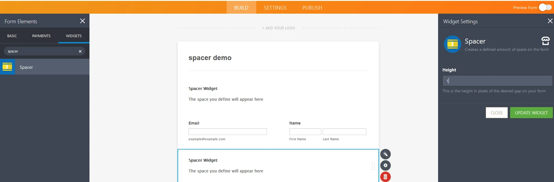
It is indeed possible to have a column form with 2 fields side by side. The easiest way to do so is to use a spacer on the top and bottom of those two widgets to separate them from the fields above and below:

That will prevent any of the fields above or below the two fields from being placed on the same line.
-
diamontejetsReplied on December 14, 2018 at 1:56 PM
Hi David,
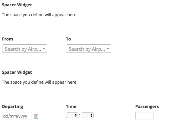
Many thanks for your prompt reply! Please see image below, where form has three columns (as most clearly seen by Departing, Time and Passengers on bottom row).
However, I'd like the 'From' and 'To' fields to better use the white space to the right, and would effectively like that row to be treated as 'two columns'.
Is there a work around that'll allow me to do this?
-
David JotForm SupportReplied on December 14, 2018 at 2:17 PM
If you'd like to push the "To" field a bit more to the right, add the following code to your form:
https://www.jotform.com/help/117-How-to-Inject-Custom-CSS-Codes
#id_3 {
margin-left : 100px;
}Here is how the form would look with the code added:
-
diamontejetsReplied on December 15, 2018 at 11:46 AM
Many thanks - this works well in every view except portrait mobile. Would I have to write a device width specific bit of code for this?
-
DonaldHagReplied on December 15, 2018 at 4:02 PM
Make use of media queries to add device-specific CSS. For the field above, add the following CSS to align the fields correctly on mobile portrait and landscape view.
@media screen and (max-width: 992px){
#id_3 {
margin-left : 2px;
}
}
}
@media screen and (max-width: 600px){
#id_3 {
margin-left : 2px;
}
}
This resets the margin for the field such that it aligns correctly on mobile.
- Templates
- Integrations
- Products
- PRODUCTS
- Form Builder
- Jotform Enterprise
- Jotform Apps
- Store Builder
- Jotform Tables
- Jotform Inbox
- Jotform Mobile App
- Jotform Approvals
- Report Builder
- Smart PDF Forms
- PDF Editor
- Jotform Sign
- Jotform for Salesforce Discover Now
- Support
- GET HELP
- Contact Support
- Help Center
- FAQ
- Dedicated Support
Get a dedicated support team with Jotform Enterprise.
Contact Sales - Professional ServicesExplore
