
-
avrsAsked on March 12, 2014 at 2:59 PM
I am in the process of re-creating our site. Previously I was able to add two different HTML codes (one for desktop view and one for mobile view). However, I am trying to create my site on Wix now and it is not allowing me to have two separate codes for desktop and mobile. I was wondering if there was a way to use a single form and have the width automatically adjust to conform to the user's view (mobile vs. desktop).
Here are my two previous form:
Desktop:
http://www.jotformpro.com/form/12063925189
Mobile:
http://form.jotform.com/form/11453943172
Thanks in advance!
-
Mike_TReplied on March 12, 2014 at 5:33 PM
It is possible to inject specific styles for mobile devices to the form.
For example, you can try to inject the following CSS from this thread:
/*-----------RESPONSIVE LAYOUT-----------*/
@media (max-width: 480px) {
.form-textarea,
.form-textbox,
.form-dropdown{
width: 100% !important;
-webkit-box-sizing: border-box;
-moz-box-sizing: border-box;
box-sizing: border-box;
}
.form-label-left, .form-label-right{
width: auto;
}
.form-buttons-wrapper{
margin-left:0 !important;
}
.form-input {
width: 100%;
}
.form-all{
width: 75%;
}
.form-sub-label-container {
width: 100%;
display:block;
}
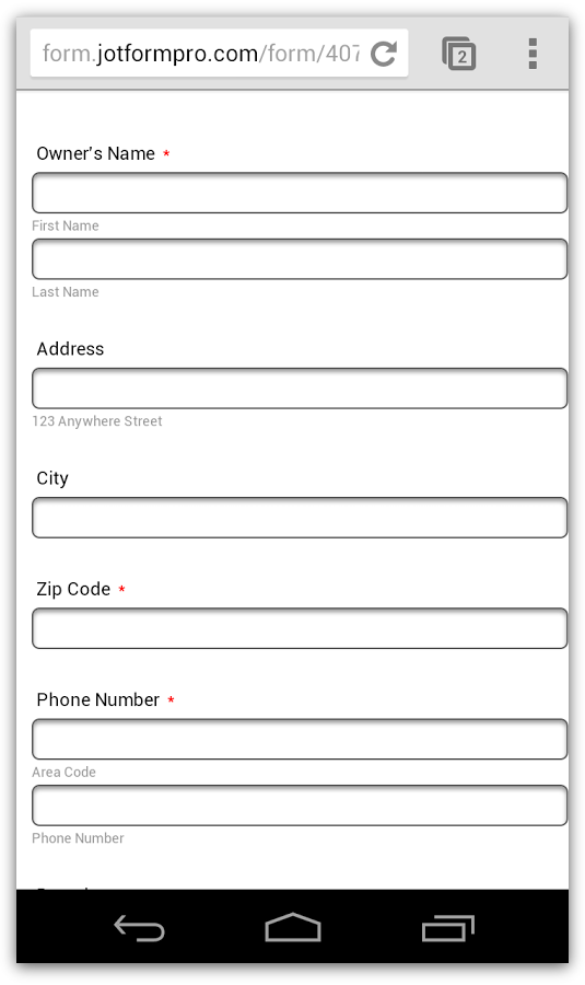
}And this is how it will look like on the mobile browser:

If you need any further assistance, please let us know.
- Templates
- Integrations
- Products
- PRODUCTS
- Form Builder
- Jotform Enterprise
- Jotform Apps
- Store Builder
- Jotform Tables
- Jotform Inbox
- Jotform Mobile App
- Jotform Approvals
- Report Builder
- Smart PDF Forms
- PDF Editor
- Jotform Sign
- Jotform for Salesforce Discover Now
- Support
- GET HELP
- Contact Support
- Help Center
- FAQ
- Dedicated Support
Get a dedicated support team with Jotform Enterprise.
Contact Sales - Professional ServicesExplore