
-
stephselAsked on September 1, 2016 at 1:27 PM
Hi,
I love this widget and have embedded into my Wordpress site however, when I expand or shrink my web browser, the form is not responsive. I hate to not be able to use this form because it truly is wonderful and perfect for what I'm looking for. With that said, is there a way to make this responsive? *fingers crossed*I tried the "Make this form responsive" in the "Design Builder" but that did not seem to fix the problem. Please help as soon as possible as I'd love to use this.
Thank you,
Stephanie
-
MikeReplied on September 1, 2016 at 3:55 PM
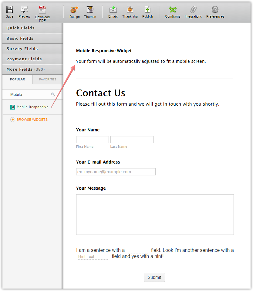
Please try adding a Mobile Responsive widget to the form.

To test the mobile form open your web page using a mobile device.
If this does not help, please provide us with a link to the web page with your embedded form.
-
stephselReplied on September 1, 2016 at 4:13 PM
Hi Mike, thank you for the assistance! That definitely helped however it appears that the form gets cut off. I've allowed the site to go live for review and further assistance. Even in just a window browser, as I shrink the window, the form ends up getting cut off; I've tested on my iphone and same thing happens.
I appreciate the help! If this ends up being fully responsive, you will have made my day as I love the form!
The url is http://www.theneedforcreative.com/collaborate
-
MikeReplied on September 1, 2016 at 7:48 PM
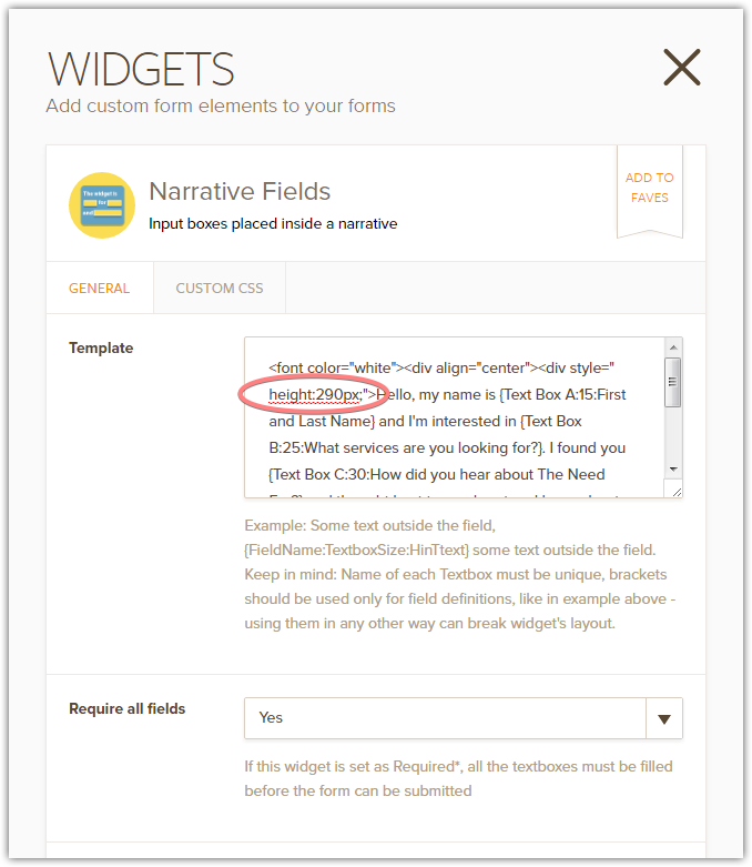
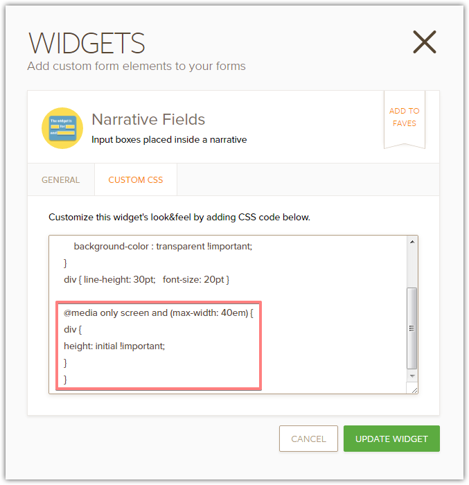
It seems that there is a height issue on the mobile layout caused by a specified height value within your widget template.
Please test the next CSS added to the widget.
@media only screen and (max-width: 40em) {
div {
height: initial !important;
}
}Thank you.
-
stephselReplied on September 2, 2016 at 8:55 AM
Hi Mike, Thanks for taking another look at it. I removed the height:290px code and added your recommendation. Unfortunately, when I shrink the browser it is still cutting off words. Any further recommendations are definitely appreciated! Thanks Mike.
-
CharlieReplied on September 2, 2016 at 10:53 AM
Hi,
See if this cloned form that I have works for you: https://form.jotform.com/62454540344957. You can clone my form by following this guide: https://www.jotform.com/help/42-How-to-Clone-an-Existing-Form-from-a-URL. Please also try re-embedding the form using the iFrame embed code.
Here's how I did mine:
1. First, set the maximum width in your Form Designer Tool to 500px.
2. Now in your CSS tab. Add this custom CSS code:
.form-all, .supernova, .jotform-form {
width : 100% !important;
max-width: none !important;
}
#cid_1 {
width : inherit !important;
max-width : none !important;
}
@media screen and (min-width: 260px) and (max-width: 640px) and (orientation: portrait){
#customFieldFrame_1 {
width : 100% !important;
min-height : 640px !important;
height : auto;
}
}
@media screen and (min-width: 360px) and (max-width: 640px) and (orientation: landscape){
#customFieldFrame_1 {
width : 100% !important;
min-height : 400px !important;
height : auto;
}
}
@media screen and (min-width: 641px) and (max-width: 1024px) and (orientation: portrait){
#customFieldFrame_1 {
width : 100% !important;
min-height : 641px !important;
height : auto;
}
}
@media screen and (min-width: 641px) and (max-width: 1024px) and (orientation: landscape){
#customFieldFrame_1 {
width : 100% !important;
min-height : 400px !important;
height : auto;
}
}
3. Make sure to also remove the CSS code you previously added inside the widget to avoid conflicts:
Let us know if that one works.
-
stephselReplied on September 2, 2016 at 11:56 AM
Hi Charlie. Yes, that did the trick! Thank you!!!! I had some issues with the error message popping up in random spots on the form when shrinking/expanding the view so I went ahead and placed it back at the bottom, so all is well without further fussing unless you know of a quick fix for that message staying fixed. I was using the following code:
.form-button-error{
position:relative; top:-430px; font-size:11pt; color:#FE006F;
}
I really appreciate the help! I did the iFrame embed as well and everything works. Thanks Charlie.
-
CharlieReplied on September 2, 2016 at 1:01 PM
Unfortunately, it seems like this is hard to resolve. The warning message is actually positioned at the very bottom, so the hierarchy of the elements dictates the position of it.
We can set a position "relative" or "absolute", but the values will be in relation with other elements so when elements adjust, the position will also adjust.
I'll try to find a workaround, but I can't promise on this.
-
stephselReplied on September 2, 2016 at 1:10 PM
Not a problem! Not quite sure I was clear on what was happening either. Regardless, I moved the message back to the bottom so when I shrink the window or view on mobile, it's still at the bottom and not overlapping any portion of the form. That's fine. I just didn't want to use the code above with mobile as the message would pop up over the form.
Thank you again Charlie for all your help! I really appreciate it! I love the form (my first go at a form with you guys) and have had superb technical support. Thank you!
-
Nik_CReplied on September 2, 2016 at 2:12 PM
On behalf of my colleague, you're welcome. I'm sorry it wasn't a solution that works perfectly, but we appreciate the nice words from you.
Thank you for your feedback!
- Templates
- Integrations
- Products
- PRODUCTS
- Form Builder
- Jotform Enterprise
- Jotform Apps
- Store Builder
- Jotform Tables
- Jotform Inbox
- Jotform Mobile App
- Jotform Approvals
- Report Builder
- Smart PDF Forms
- PDF Editor
- Jotform Sign
- Jotform for Salesforce Discover Now
- Support
- GET HELP
- Contact Support
- Help Center
- FAQ
- Dedicated Support
Get a dedicated support team with Jotform Enterprise.
Contact Sales - Professional ServicesExplore