Key Takeaways
- Brand refresh is the activities to change the identity of a company. There are many reasons to do this, including targeting new audiences and keeping up with the visual trends.
- Brand refresh should begin after conducting proper research on the market and audience cannot be conducted without setting clear goals.
- Logo, color palette, icon, typography and brand voice can all undergo some changes as part of a brand refresh.
- All the changes coming as part of brand refresh should be done in a certain order.
- The audience should be notified properly via emails, social media posts and ads.
Although we might not associate the everyday objects and tools we use with the companies responsible for them, brands surround us almost everywhere we go. In the morning, we might wake up on a Sealy, Casper, or Sleep Number mattress; caffeinate with a Starbucks or Peet’s coffee; power on a MacBook or HP laptop; or drive to work in our Nissan, Honda, or Chevy.
Each brand creates an idea about the object it’s attached to, which leads to expectations about its quality, value, and even the buyer’s lifestyle. As a result, brands become identifiable and valuable.
How? Through both intangibles (public perception, company mission, values, and market position) and more tangible assets (logos, aesthetics, slogans, and other trademarks). All these elements converge to promote products and services and their value in a particular market.
A brand’s public perception can change over time — sometimes even beyond the owner’s control or intention. For example, look at how Facebook was viewed by the media and public during its initial public offering nearly a decade ago compared to now. After congressional investigations into company conduct, Facebook has rebranded to try to shift the narrative.
Facebook isn’t the first company to attempt an image refresh. Throughout history, brands have altered their market identifiers to influence public perception. However, companies must carefully think through their rebrand to avoid the risk of uprooting their market progress.
What is rebranding?
Put simply, rebranding is the process companies follow to change their identities. When successful, consumers quickly forget the rebrand ever happened, and profits improve.
Why would companies put themselves in the precarious situation of rebranding? Here are a few reasons.
Changing public perception
In the face of scandal, failure, or just a lack of public interest, it’s impossible for a brand to wipe the slate clean. But pivoting into a new identity can be almost as effective.
Rebranding has the potential to fundamentally change a company’s appearance, which can help it start fresh. When done well, the public moves on from the event that led to the brand’s devaluation in the first place.
Reaching new markets
In today’s increasingly globalized world, brands face the challenge of trying to appeal to a massive pool of people. As a result, companies expanding overseas often have to completely rebrand with the global market in mind or spin off a new brand specific to a region or audience.
Appealing to new demographics
A consumer’s age plays a significant role in the aesthetics and messaging they prefer. For example, luxury brands attracting older populations may convey social status and class. But when they’re trying to reach consumers in their 30s, they may emphasize upscale adventure and independence.
Keeping up with the times
Nothing lasts forever, and that’s especially true for cultural trends. Brands heavily defined by the conventions of a particular time period will eventually need to update. Remember how everything in the 1990s was “x-treme”? Now, that identity and messaging are outdated and stick out like a sore thumb.
Similarly, the tech companies from the 2000s and 2010s that adopted silly naming conventions may eventually phase out. For example, Tumblr and Flickr embody the missing vowels trend, while Reddit is one of the last surviving companies forged during the short period where misspelled words or phrases were popular for company names.
Undergoing a merger
Company acquisitions and mergers are also a common reason for rebranding, creating a new identity out of the two (or more) that came together. In most cases, the new brand will simply merge the two company names.
For example, America Online and Time Warner simply became AOL Time Warner after their (in)famous merger in 2000. Other times, a merger can launch an entirely new brand. Most recently, South Korean record label Big Hit Entertainment merged with producer Scooter Braun’s Ithaca Holdings, transforming the two entities into HYBE.
What goes into rebranding?
An effective rebranding campaign requires strategic changes to a number of elements. These changes can go far beyond the cosmetic and become part of a more significant company transformation. Here are some of the changes that go into rebranding.
Mission and values
When a company pivots to focus on a new market, recover from a failure, or leave a scandal behind, a rebrand can involve going back to the drawing board to reevaluate the company’s mission and driving values. The extent of this scrutiny will depend on the reason for the rebrand. Once a new mission or value system is in place, it’s often used to inform a new aesthetic and brand identity.
Logo
Logos are among the most important and recognizable parts of a brand, and are sometimes synonymous with the brand itself. For example, the famous “golden arches” comprise the M in the McDonald’s logo. Amazon’s ethos as an “A to Z” company is captured in the logo depicting an arrow pointing from the A to the Z.
Tagline
Taglines are important brand signifiers, especially in commercials and radio ads. Sometimes, the tagline is more important than the brand name or logo itself. For example, on its own, “Walmart” doesn’t convey much about the company. But the “always low prices” tagline perfectly summarizes its customers’ perceptions.
Aesthetic and color palette
Changes to visual elements like a brand’s overall color palette, font, and aesthetic are often part of rebranding campaigns and help to set the tone for new corporate values or to appeal to a different demographic.
Voice
Voice refers to the language and tone a brand chooses to use in public-facing communication. During the social media age, companies like Wendy’s have made headlines with their sassy comebacks on Twitter. Soap brand Dr. Squatch has also risen to viral fame with a series of YouTube ads known for their matter-of-fact talking points and clever sarcasm.
Brand refresh vs rebrand
Not all rebrands are so comprehensive. A brand refresh is a lighter identity update akin to a personal makeover instead of full-on plastic surgery. Often, the goal is to impact the way your company looks, sounds, or feels without making foundational changes.
A brand refresh usually involves changes to
- The logo and overall aesthetics, including fonts
- The website and social media profiles
- The tagline or slogan
- The color palette and fonts
- The look and feel of marketing materials
A full rebrand, however, involves
- Engineering a new company background, mission, or value system
- Creating a new “personality” for your brand
- Launching a new version of the brand for a different market
- Overhauling the entire image and aesthetics of a company
Companies often do a brand refresh to stay current with the times or appeal to a new market or demographic, but choosing whether to do a brand refresh vs rebrand depends on your goal.
The Jotform guide to a brand refresh
Even though a brand refresh isn’t as comprehensive as a full rebrand, creatives must still tread carefully to avoid missteps that can cost valuable market share their company has earned. In this guide, we’ll cover the following topics:
- How to maintain your brand during the redesign
- How to protect your website, including domain authority 301 rebranding
- Elements of a brand refresh
- Which brand refresh strategy is right for you
- How to engage and manage key stakeholders during the redesign process
- How to develop rebranding a checklist
- How to create new assets and brand guidelines
- How to launch the refreshed brand
Brand refresh strategy
Remaking your company’s image involves a lot of moving parts — and without proper planning, the process could turn into complete chaos. Even worse, if you don’t have an effective strategy in place, your brand refresh could fail to make the impact you need it to or even put your company in a worse position.
After all, the whole point of doing a brand refresh is to elevate it in the eyes of consumers and announce a new era for your company.
Haphazardly updating your brand assets and guidelines could undo all your hard-won victories in the marketplace, as well as waste a lot of time, money, and energy. There’s only one way to execute an effective brand refresh campaign — and that’s to get it right the first time. Of course, not everyone in the consumer market will like the final results of your image makeover, but if you follow protocol, you can avoid major mistakes.
In this chapter, we’ll look at what goes into effectively strategizing a brand refresh, what you need in place to execute it, and how to determine when you need a brand refresh.
When is it time for a brand refresh?
When it comes down to it, there are only two reasons to do a brand refresh:
- Because you need to do it
- Because you want to do it
A brand refresh can be expensive and require a lot of resources. However, there may be several reasons to do one even when it’s not absolutely necessary.
For example, if new high-level leadership enters the picture, they may want to make their mark on the company. A brand refresh could also support a new product launch or company-wide pivot, even if it’s not completely necessary to the success of a particular project.
It’s a different story when you need to do a brand refresh. Here are the biggest signs it’s time to take the plunge and invest in an update.
Your branding is outdated
In the same way music, fashion, and architectural style evolve every decade, so does branding. Looking back, certain art styles, typefaces, voices, and even company naming conventions come to embody a particular era.
For example, psychedelic aesthetics, flowers, and fonts evoking smoke are commonly associated with the 1970s. The 1980s were dominated by art deco, pastels, and neon noir. And of course, in the 1990s, there was grunge and anti-design.
It can be hard to tell if you have outdated brand guidelines, but if you forged your identity amid any fleeting trend, you’ll probably have to update sooner than later. Aim for a timeless aesthetic to stay relevant.
Many company brand identities have survived the test of time. For example, the logo for HBO as we know it was created in 1975. The logo was updated slightly in 1980 so that the O didn’t overlap with the B and has remained unchanged for more than four decades. Despite this, HBO is one of the most successful broadcasting companies in the world.
You’ve outgrown your brand
Aesthetics change over time, but so do companies. When a brand achieves major success and a significant level of power in a marketplace, its original identity might not reflect what it has become. This is a clear indicator that it’s time for a refresh.
Google is an excellent example of a brand’s identity evolving to match what it’s become. In 1998, the company was a mere search engine, with an ornate, bubbly, and colorful font evoking the letters found on children’s building blocks. As the brand became synonymous with search, there was even a brief period when the logo featured an exclamation point after the name.
Throughout the 2000s, Google refined the logo with typefaces associated with academia, law firms, and legacy corporations. Despite these transitions, the brightly colored letters never changed.
In 2015, during the height of the tech takeover of our everyday lives, Google dropped the curliness of its lowercase “g” for a cleaner, more streamlined look. Now, it’s hard to remember the company’s humble origins as a competitor to Ask Jeeves.
You’ve changed your business model or strategy
Many of the most successful companies in the world didn’t start on the trajectory that brought them success. Ultimately, businesses must follow the money. If the original reason for their inception isn’t viable in the marketplace, they can either fail or move in a direction that will generate profit. If that change is drastic enough, it may warrant a brand refresh or even a complete rebrand.
Initially, the company that would become known worldwide as Groupon started as The Point, an online fundraising platform. However, after failing to generate traction, the company founder realized the crowdsourcing models the company developed could work for couponing. So the core team built a new product around this principle, rebranded as Groupon, and the rest is history.
You need to reach new audiences
Having an outdated brand doesn’t just make you look bad — it can limit your appeal to potential customers, especially young consumers. Creating a more timely logo and updating packaging aesthetics is one of the best ways to get a second look from consumers who are used to passing over a product on the shelves.
Sometimes, a brand refresh is necessary to compete in a new market. For example, many brands that have succeeded in the e-commerce space may need to update their logo and refresh the packaging and other design elements to compete on store shelves. Dr. Squatch, which rose to prominence through a series of clever YouTube ads, did a complete brand refresh after going on sale at Target, ahead of its surprise Superbowl ad.
You need to change perceptions or reignite interest
A brand refresh can also be a strategy to escape controversy or renew interest in a company. For example, in the midst of whistleblower hearings and congressional inquiry, Facebook rebranded into a completely new company. When profits are falling due to negative public perception, sometimes one of the best things a company can do is change its identity.
A brand refresh can also be an excellent strategy for long-established brands trying to drum up renewed public interest. Starbucks, long synonymous with coffee in North America, famously updated its logo in 2011 to great fanfare, generating headlines and media mentions worldwide.
Your company is merging
Sometimes, a brand refresh is unavoidable because the original company will no longer exist. For example, in mergers and acquisitions, it’s common for two or more company names to unite in a new iteration, requiring a visual update. Some of the most powerful companies in the world were formed exactly this way.
For example, when H.J. Heinz Company and Kraft Foods Group Inc. created a new joint venture in 2016, the company became the Kraft Heinz Company, with a logo featuring the typeface elements of the two former companies. The change was subtle to consumers but required a complete brand refresh and new guidelines.
The building blocks of a brand refresh strategy
Before you begin your brand refresh, it’s important to lay the groundwork through comprehensive research so the process is as smooth as possible. Fortunately, with a refresh, you should already have a strong brand identity in place. Careful planning will prevent you from undoing the work that went into creating it.
Do a brand audit
Before you begin a brand refresh, understand what your brand is and how it’s been used. Look at every element, including
- Visual identity. This includes your logo, as well as your color palette, typeface, packaging, imagery, art styles, and other elements that make up your company’s overall aesthetic.
- Brand voice or personality. Brands don’t just have a visual identity — consumers associate a personality with them as well. Brand voice encompasses the tone of advertisements, as well as word choice in consumer-facing communication. Pepsi, for example, is best known for its association with power, running commercials that often depict famous stars rallying audiences with a song. On social media, Wendy’s is infamous for harsh clapbacks on Twitter.
- Marketing and advertising assets. The visual identity and brand voice defined in the brand guidelines don’t matter until they’re conveyed through commercials, billboards, marketing materials, social media, and the website. These assets are what make an impression on the public. Carefully review these in your audit as well.
Conduct market research
Once you understand your brand and the ways it’s conveyed, take a look at your environment. Use market research to uncover consumer perception of your brand and overall trends in your industry.
Consumer perception is the overall opinion your customers — and your competitors’ customers — have of your brand. Consumer perception directly correlates to the value customers place on your goods or services, their desirability, brand reputations, and many other emotional nontangibles.
Luxury brands are especially concerned with managing customer perception. For example, luxury vehicles are known for providing a smoother drive and higher quality than mid-tier vehicles, but even more, they announce to the world that the owner has “made it.”
Also consider market or industry trends when it comes to your brand identity. Sticking with the automotive market as an example, consumers are increasingly interested in mitigating carbon emissions with more fuel-efficient or fully electric vehicles. A brand known for low gas mileage or excess pollution would need a serious brand refresh.
Conduct a competitor analysis
Competitors are another important part of the market landscape. In addition to auditing your brand, take a look at your competitors’ visual identities, brand voices, consumer perception, and performance.
Sometimes, the only way to stand out in a crowded marketplace is to see what everyone else is doing — so you can be the missing piece that customers need or simply do it better. A deep understanding of your competitors’ brands can also help you avoid rebranding mistakes.
Set a clear goal
Before you even begin a brand refresh campaign, you should have a good idea of what you want to get out of it. Just knowing you want to change the perception of your brand or reach a new audience can sometimes be enough. But unlike many marketing endeavors, a brand refresh can be hard to measure in specific key performance indicators (KPIs).
For example, if you’re updating your visual assets because of a corporate merger, your goal is to create a new brand identity that reflects the new company’s values. Draft your brand refresh goals in the most measurable terms possible, regardless of their simplicity.
Define what you want to refresh
A brand refresh is much less intensive than a rebrand because there are fewer changes involved. To save time, effort, and money, don’t change more than you need to. For example, if you’re updating your logo, avoid changing the brand voice unless you want to invest in doing so.
Leverage expert stakeholders
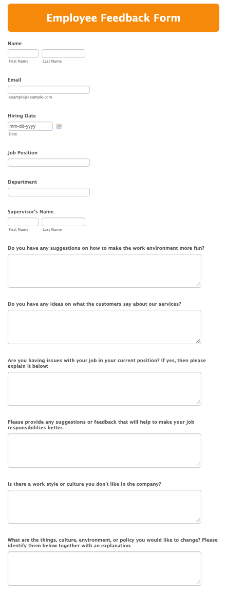
Throughout the process, draw insight and feedback from customers, employees, company stakeholders, researchers, and creatives specializing in brand identity. Jotform can facilitate this with an employee feedback form you can customize. In addition to getting insight into the effectiveness of visual assets, also consider how new brand guidelines can impact the user experience.
The risks of a brand refresh
Doing a brand refresh can be incredibly rewarding, but there’s always the risk of ending up in a worse place than where you started. For example, Tropicana had one of the biggest rebranding fails in history when it inadvertently transformed its highly recognizable label into one that looked like it belonged to a generic product.
Follow the advice in this section to avoid these failures, and your brand will have a chance to come out on top after the refresh.
Creating the assets and brand guidelines
A brand refresh is directionless until you have a strategy and goals in place. Once those details have been ironed out, you can move forward with the fun part — designing the new brand identity. This is the most creative part of the refresh campaign, but it still requires structure.
This chapter covers the process of creating visual assets for your brand refresh and how to keep the process on track. Here are some important points to remember.
What to keep in mind
As creatives start drafting different versions of the logo and other brand identity assets, it’s easy to get lost in the potential of each design or details that distract from the overall goal. A brand refresh campaign doesn’t come with a compass that keeps you heading toward your true north, but remembering these five points can prevent you from taking a costly detour.
1. Keep the brand essence and core values intact
Above all else, this is a brand refresh, not a full rebrand. Your company’s core values and mission statement are still the same, and your asset updates should reflect this. Don’t fundamentally change what your logo, color palette, and overall aesthetic are supposed to convey. For example, a children’s toy brand wouldn’t do well adopting the look and feel of a luxury cosmetics company — even if the resulting logo looked cool.
2. Remember, less can be more
Though you may be tempted to justify the expense and labor that go into a brand refresh, resist the urge to make more changes than necessary. Subtle updates can be enough to alter consumer perception.
Aston Villa brought its brand into a new era by reimagining its crest with a modern art style and giving it more room to breathe in its badge. Likewise, Guinness elevated itself simply with new typography and a more detailed, prominent harp illustration.
3. Keep stakeholders engaged
Throughout this process, it’s imperative to collect feedback from stakeholders. The last thing you want is for someone to be surprised by a design after all the work has been completed. So be diligent about sharing designs and seeking approvals from appropriate parties every step of the way.
4. Be mindful of the budget and deadlines
Unfortunately, a brand refresh doesn’t exist in a vacuum. Usually, the refresh is part of a larger marketing effort, such as a product release or a significant company milestone. Always keep this in mind when developing assets so your timeline works in tandem with larger goals.
Remember, the creatives spearheading this campaign don’t work for free — and the brand refresh budget isn’t infinite. Keep costs to a minimum by communicating efficiently and respecting everyone’s time. This will ensure good working relationships and help everyone deliver higher quality work.
5. Consider the overall brand strategy
As you develop this brand refresh, be aware of how it fits into the larger brand strategy. For example, does your company plan to refresh the brand frequently to capitalize on mini trends, or is this a one-time project meant to mark a new chapter?
For example, Google often does a mini brand refresh with new iterations of its logo at Google.com, positioning itself as a destination for those seeking knowledge and entertainment. Through these Google Doodles, the company has commemorated International Women’s Day, honored pioneering architects, celebrated office equipment, and even created interactive games.
Of course, Google has far more resources to invest in this kind of branding than most companies, but your overall strategy can inform how much time, money, and energy you invest into your brand’s refresh.
If your company expects to refresh its brand frequently to stay on top of trends, keep that in mind and limit the resources you allocate to each refresh. A brand refresh looking to remain current for several years will warrant heavier investment to ensure it’s executed flawlessly.
Follow your brand’s style guide
A brand style guide, or a brand guideline, is a document that outlines the designs of every asset, as well as how they can be used. This includes components like color palette, logo, typography, and spacing between letters.
When looking for inspiration, seek out brand guideline examples. Many companies, especially in the tech industry, like to publish their style rules to show off their creativity. Jotform has even published some of its visual elements.
To maintain a consistent brand image, it’s important to pay special attention to your existing brand guidelines, as they’ll specify rules that absolutely cannot be broken. Each facet of a brand identity affects the other facets — some brand guidelines even illustrate these relationships in a flow chart.
If you modify a logo, you may have to translate those changes to other assets to maintain brand consistency. For example, if a designer closes the spacing between the letters of the company name in the logo, they may need to do the same in the brand tagline. Following your style guide will remind you which assets need to be updated
The elements of (brand) style
Essentially a design bible, your brand style guide details every aspect of your brand’s identity, including the following.
Brand story
As the name suggests, your brand story explains what your brand is all about. This is usually conveyed through a mission statement and a summary of core values, often using the brand voice. Unlike a value proposition or description of the business, your brand story is best understood as the feelings or ideas you want your company to convey to consumers.
Logo
Your style guide shouldn’t just show what your logo looks like — it should explain in depth how to properly display your logo in multiple scenarios.
Designers will outline the rules that need to be followed, such as acceptable color variations for situations where your logo’s primary colors can’t or shouldn’t be used (such as grayscale documents), how much space there should be between your logo and other elements, and the minimum size your logo can be reduced to.
Color palette
Brands often use more colors in their designs than are present in the logo. Style guides outline which colors are acceptable and will include the Pantone color code, RGB and CMYK color value, and hexadecimal code for each to avoid confusion or accidental misuse. Many style guides will even detail which colors should be used in specific circumstances.
Icons
In our digital world, style guides give special attention to icons because of their prominence. In some cases, icons are more memorable than the logo. Case in point, you can probably picture the interactive Clippy the paperclip from Microsoft Word more clearly than you can picture the Microsoft logo. In fact, Microsoft is bringing Clippy back as a different kind of icon: an emoji.
Effective icon design is imperative for a high-quality user experience. It’s not enough for icons to look like they fit with the brand — they need to be easy to identify.
Typography
Your style guide should list the font(s) to use on branded assets, as well as the styles, sizes, and weights. The guidelines should also clarify the type hierarchy and when to use each style.
Brand voice
Currently, many brand style guides describe their brand voice with a series of single adjectives. Words like “upbeat,” “edgy,” and “unique” are common in brand guideline documents. In addition to these descriptors, guidelines will usually clarify the appropriate words to describe topics associated with the brand and which words to avoid.
Imagery guidelines
Especially useful for social media, image guidelines spell out how to choose appropriate stock photos for use in assets that aren’t created in house. This includes elements like composition and concept so that all imagery stays on brand.
Test new assets in the field
As you develop new visuals in your brand refresh, don’t judge them as standalone assets — create mockups that show these new elements in action on different collateral. Test out what a new logo looks like on
- Your website
- Social media accounts
- Apps and software menus
- Packaging
- Business cards
- Brochures
- Merchandise
- Commercials and video ads
Test new designs on every type of collateral. This is especially important in branding for apps and software platforms. In this digital age, logos are often part of a menu, so it’s crucial to understand them from the user’s perspective. Once you finalize new brand assets, enshrine them in a new style guide, complete with usage dos and don’ts.
Applying the assets to your website
So far, we’ve covered what a brand refresh is, how to develop the refresh strategy, and how to do the work. But what goes into the actual implementation of new assets? This chapter will explore how to incorporate a new brand identity into a website for a software-as-a-service (SaaS) company.
Fortunately, with the advent of advanced web development software, implementing a rebrand is much less challenging than it was even a few years ago. There are things to keep in mind throughout the process, no matter which platform you’re using. Here’s how to apply new brand assets to your website.
Finalize your new brand identity
Before anything else, make certain the key assets for your brand refresh are finished. This includes key components like your logo and extends to color palette, typography, tagline, and anything that needs to remain consistent with updated assets. “Finished” also includes sign-offs from key stakeholders.
Depending on the size of your company and how many decision-makers are in the mix, the process of approving these assets can be quite complicated. Jotform Workflows makes it easy to share assets for stakeholder review and confirm their acceptance with the click of a button.
The platform integrates seamlessly with most project management software. You can also create robust approval workflows within the tool itself. Jotform can even collect e-signatures.
Audit your website
Once you’ve confirmed the assets are final and ready to go, do a thorough review of your website and take note of every instance of your brand identity. This includes the header and footer of each page, menus, the about page, key art and design flourishes, and even navigation buttons. While you’re at it, don’t forget to check your website text (if any part of your refresh involved altering your company’s brand voice).
Don’t just look on the surface, either. Remember to investigate the source code to see if any outdated words or assets are embedded in the code. For example, if part of your brand refresh involves referring to your SaaS product as a “platform” instead of a “tool,” make sure the metadata doesn’t reference tools.
Create your timeline or checklist
If your brand refresh needs to be completed by a specific date for a product launch or milestone, plot out deadlines in your project management tool and leave plenty of time for editing and approvals. If time isn’t an issue, create a checklist of all the assets you identified in your audit that need updating.
When designing this workflow, be diligent about including all steps necessary for the review and approval process and defining the conditions that route work back to designers. This will ensure everyone stays on the same page about what needs to get done.
Implement your new logo
Start by updating all instances of your logo throughout your website. Make sure it displays correctly on both web and mobile devices and never shrinks below the minimum allowable size defined in your brand style guide. If the logo changes size based on user interaction, like scaling up or down while scrolling, make sure it adheres to brand guidelines at all times.
During this process, review your website again to make sure you update every appearance of your logo and brand identity. You might notice screenshots of the SaaS product, photos of the office, or other images throughout the site that contain old brand assets. Include these updates in your workflow.
Continue with other updates
After implementing your logo, begin making other adjustments to the website that reflect your new brand identity. This includes modifying typography, changing color palettes, and updating buttons and icons. Don’t forget to make all necessary changes to source code and metadata.
Review before publishing
Before publishing, preview the updated website in a staging environment to solicit feedback from all key stakeholders. Next, expand beyond key decision-makers to get as much input as possible. Fresh eyes are more likely to catch mistakes than those looking at the same pages for days or weeks.
Conduct user experience (UX) testing on the new website
Beyond brand consistency, it’s essential to test how user-friendly your new brand identity is. Do any design elements distract from the content? Is it clear where to click and what each button does? Without extensive UX testing, your new brand identity can backfire.
For example, in 2020, Google rebranded G Suite as Google Workspace, complete with a fresh set of icons for all the platform’s tools. Unfortunately, they were panned by tech websites across the board. In an October 2020 article, TechCrunch declared that Google’s new icons “are bad.”
Many users said it was hard to tell what the icons depicted unless they hovered over them for text, which made it difficult to navigate. Others were visually overwhelmed by the colors and unable to differentiate between the different shapes. A few weeks after TechCrunch’s negative review, Creative Bloq published a guide to help users get the old icons back.
Google rebranded to fully establish itself as a competitor to Microsoft 365. Instead, the company’s announcement was overshadowed by criticism of the new designs.
Continue updating your style guide
While updating the brand assets on your website, designers may find coding issues that make it difficult to fully adhere to the style guide. Work with other decision-makers to determine whether the coding challenge needs to be overcome or if it’s necessary to update the brand guidelines instead. Also, remember to add new website-specific design elements to your style guide to streamline any future rebranding efforts.
Launching the new brand
Implementing new brand elements on your website can be a big job — but it’s just a fraction of a total rebranding rollout plan. In today’s multichannel world, brands live on social media, ads, billboards, commercials, in the news media, and even in user-generated memes. Once a brand refresh is complete, it’s imperative to announce it properly so you get the maximum benefit. After all, makeovers are meant to be shown off.
This chapter covers how to build a brand refresh within your organization and effectively unveil it to the general public. The goal is to get your employees excited about a new chapter for your company, delight existing customers with new energy, and attract attention from the broader marketplace.
Announce the brand refresh internally
Ultimately, every brand is made up of the people who bring it to life, from the board of directors and CEO to part-time employees and interns. A brand refresh won’t amount to anything unless each is on board and excited about their company’s new chapter. The best way to generate this buzz is to tell a compelling story about the brand identity update.
The story should explain “who” your company currently is, why it’s necessary to do an update, and what you hope the brand will become after this refresh — the more engaging and inspiring, the better. Remember, the buzz you hope to create in the marketplace needs to be created internally first.
Get feedback from employees as part of the design process. They work with the brand every day and will likely have insight into the company’s identity. Seeing their ideas implemented will make them more invested in the end product and, in turn, the work they do for the organization.
Update employees frequently with internal emails. When designs are finalized, reveal the new identity assets in an all-hands meeting and explain exactly how the new identity was created and what it means for your company moving forward. You can leverage employee excitement on social media for the external rollout.
Update your other public-facing channels
After you update and perfect your website, it’s time to roll out the rebrand to all external channels.
Social media
Update your profile photos, banner images, bios, and other social media profile sections with your new logos, visuals, and other assets to match your updated website. These changes may appear on your followers’ timelines, so consider including a brief message announcing the makeover with more information to follow. Also, make sure the new assets adhere to the brand style guide, even on social media platforms.
Email templates
If your brand has an email newsletter, remember to update your templates with the new identity. This could be an opportunity to make other needed tweaks to your newsletter’s aesthetic.
Consider creating multiple layout styles with your new assets and conduct A/B testing to see which has a better click-through rate. Also, remember to test how the new assets display in emails on both desktop and mobile devices.
App and software design
For SaaS brands, the app and product dashboard get more views than the website. Take special care to update these interfaces with your new brand identity. Pay extra attention to the UX design, as users will work with these tools frequently.
UX testing is especially important as part of your brand refresh strategy. You could spend a lot of time and money creating a new identity and building a beautiful website, but if it harms your users’ experience of your product, it could destroy your brand.
Swag
People love free stuff — even if it’s a coffee mug or a pen with a corporate logo on it. This type of branded swag can be a great way to show off your new look and spread the word. It never hurts to slap your new logo on everyday items if you’re executing an extensive campaign to unveil your new identity. You can give these items away at events or use them as rewards for employees.
Other assets
Have extra assets on hand, even if you’re not sure what you’ll need them for yet. Create different versions of the logo with different color variations, for example, in case there are circumstances where the official logo won’t work. Make sure these variations adhere to brand guidelines. Also, consider having a logo file with a transparent background that you can easily implement in ads or as a video watermark.
Some brands even have animated logos, especially for SaaS products, that come to life during transitions between screens or when an app or website first loads. Have these assets ready for implementation in commercials, ads, and YouTube videos.
Execute your refresh campaign
Once you’ve rallied the troops and refreshed your public-facing channels with your new brand assets, it’s time to take it all to the public. You can go as big or as small as you want in your announcement, but there are two channels you should cover no matter what.
1. Blog
Even if you don’t regularly update your blog, it’s important to publish a post that marks the launch of your new identity. Often, brand refreshes come about after a company milestone (such as celebrating 10 years in business) or a new product launch (like a new app). Tie the brand refresh to the momentous occasion and let that be part of your story.
The blog post should highlight what’s new about your brand’s look and feel, why you made the update, and what you’re hoping to accomplish. Don’t be afraid to go in depth about the journey it took to get here. Feel free to do a comparison with your old brand assets as well.
Many companies even publish their brand style guides to show off the work they’ve done. This gives consumers more insight into how leadership thinks and can help creatives at other companies in your industry better understand the work they’re doing.
2. Social media
Examples of how to announce a rebrand on social media could fill a book. It’s an absolute must for any brand undergoing an update.
At the very least, a post or series of posts should announce the new look and link to the blog for more information. Share exclusive social media content like work-in-progress screenshots that show the evolution of the new design or photos from the employee event celebrating the rebrand.
Don’t be afraid to solicit feedback from your followers about the new identity — people will give their opinions anyway. Ahead of officially unveiling the new look, consider doing a countdown on social media to drum up anticipation. You could also launch a contest on social media and offer free swag as the prize.
Make a splash
After these basic announcements, you can step your rollout up a notch if you want to attract more attention. Here are a few strategies for getting the most mileage out of your refresh.
Email blasts
Including an announcement in your e-newsletter is a great way to drive more traffic to your blog or provide detailed follow-ups to your social media posts. For example, if you’re conducting a contest on any of your profiles, consider announcing it in your e-newsletter to drive more followers from your subscriber list to your social channels.
Digital ads
If your brand refresh correlates with a new product launch or other milestone, mention the update in your advertising. Boosted social media posts and YouTube ads are great ways to highlight your brand’s new look and feel. You can also use the opportunity to conduct more A/B testing to see which iterations of the identity perform best.
Media outreach
If your brand already has a large following and is regularly in the spotlight, your refresh campaign will be newsworthy on its own. Capitalize on this by working with media outlets to cover the new identity. Write a press release that details the design process and includes quotes from company stakeholders and the creatives who made the refresh happen.
Use this as an opportunity to set the tone for the next chapter of your company in direct conversation with the public.
Jotform’s example
Rebranding and brand refreshes are long-term processes, regardless of how many or how few assets are changed. Part of the reason is the large role creativity plays in the new design. Another reason for the long time frame is how many stakeholders need to buy in throughout the process and be on board with proposed new designs. Yet another factor is the role third parties play in a rebrand.
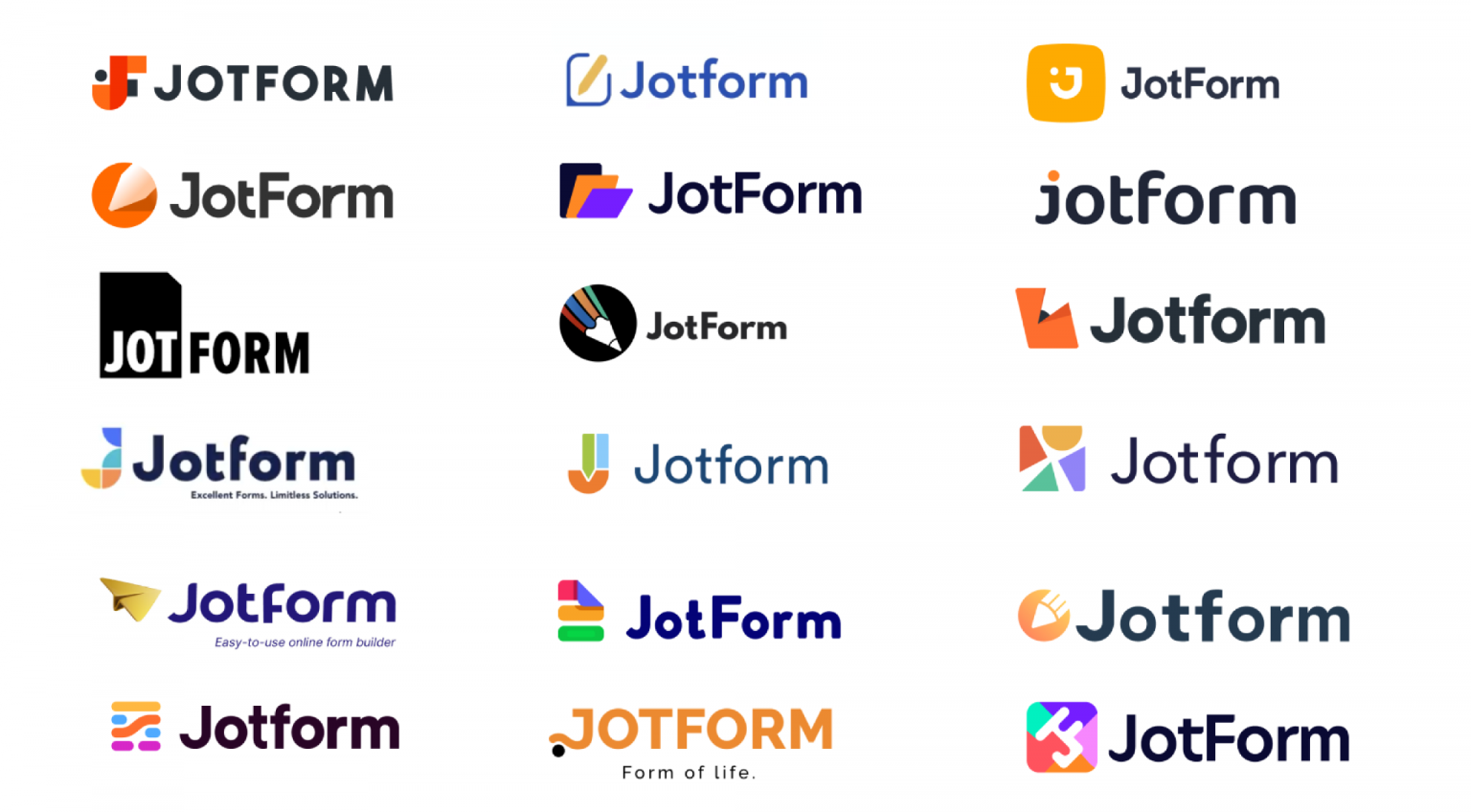
Jotform rolled out its own brand refresh in October 2021. In the process, we premiered a new logo, changed the styling of our name from Jotform to Jotform, updated our color palette, and completely overhauled the look and feel of our site and products.
Though it was just a refresh and not a complete rebrand, the debut of the new assets was several years in the making. Here’s a look into our design and rollout process so you can get a better idea of how to update your own SaaS identity.
The journey from Jotform to Jotform
How do you update a brand that can do almost anything for almost everyone?
Since our founding in 2006, Jotform has grown to offer more than 20,000 free form templates, serving users in business, nonprofit, education, marketing, insurance, entertainment, and even healthcare — almost every sector you can think of.
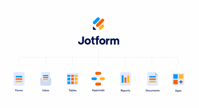
The product offering has also expanded to include Jotform Tables for managing data and Jotform Workflows to automate everyday business processes, project management, and payments. In addition, Jotform integrates seamlessly with hundreds of third-party solutions.
Taking all our capabilities into consideration for our new identity proved quite a challenge — one that took almost a year to overcome. In fact, we even spent two separate weeks in hackathons to design dozens of potential new identities, following the same process we’ve used to create many of our new products.
In early 2021, we chose our new identity from the assets designed during those hackathons, roughly 15 years since our company’s founding. Our internal design team created dozens of potential new logos, each with a unique take on what our brand had become, as well as its future.
In the end, we created our new identity out of some of the strongest elements to come out of these hackathons — especially those that highlighted our diverse offerings while continuing to honor the pencil icon at the core of our logo.
A brand-new Jotform
Jotform’s pencil icon remains the foundation of our brand, but for this new identity, we overhauled it completely. The new color palette and multiple lines represent the family of products that Jotform now includes.
Our platform boasts such an impressive array of features that it can serve as an alternative to almost any type of business, project management, or payment platform. As a result, anyone can use Jotform for nearly any task or project.
The new logo design and color palette also play a key role in the icons for our products. In every instance, the three colored lines morph to become mini logos for our Form Builder, Tables, Workflows, Apps, and other products.
But we didn’t just develop a new logo and icons. We also created a new tagline to encapsulate everything we have become: Powerful forms get it done. This statement reflects Jotform’s evolution from an easy-to-use form builder into a powerful enterprise solution — one that remains uniquely accessible and user-friendly.
An all-hands-on-deck rollout
Once we finalized this new identity, the work for our brand refresh was far from over. We thoroughly audited our website and product pages to pinpoint exactly where our old visual assets needed to be replaced. We followed the same steps on our social media pages, including YouTube.
After this preliminary work, we developed our calendar and started planning the workflows. From there, it was up to designers from every team to make the necessary changes. This was time-consuming in and of itself, but with so many tiny tweaks impacting overall brand cohesiveness, it required even more time to iron out the details and create a consistent visual identity across all our properties and channels.
The launch was just the beginning
Once our assets and updates were implemented behind the scenes, we could “flip the switch” and make them live all at once. This proved to be the perfect way to celebrate our 15th anniversary, as well as commemorate our 10 millionth user. Even better, we got to share every step of that journey on our blog.
However, we still had more work to do. For many companies, search engines are a major source of organic traffic. However, if they index an old version of your website, it can create brand inconsistencies that don’t reflect the new styling of your company name.
The team at Jotform had to keep this in mind during our redesign, and continually monitor and push for external updates on search engines and browsers. Over the next few months, we worked with search engines to replace our old indexed pages with those containing the new assets. We also continued smoothing out asset consistency as issues came to light.
Even now, we’re still refining our user experience, making more (subtle) changes to page layouts and interfaces to achieve the smooth accessibility our customers deserve. In some ways, a brand refresh is never done — it’s an ongoing process of improvement. And, eventually, we’ll update our identity again.
Get a brand refresh done with Jotform
Jotform’s powerful forms allow you to collect employee and customer feedback about your brand identity and the changes you’d like to make. You can customize a variety of templates to collect information and collect it automatically in Jotform Tables.
Here, marketing professionals and managers can analyze the information with charts and reports. In addition, you can use our other robust tools to track assets that need to be changed in a website audit.
As you assign tasks to your team during the refresh, you can plug them into Jotform Workflows, streamlining the way you assign work and track progress. Once it’s time to review changes to assets, Jotform Workflows makes it easy to collect the necessary sign-offs from stakeholders.
If it’s time to refresh your brand, use the same tools we did to manage our brand refresh. Starting your company’s new chapter will be as easy as turning a page.


Send Comment:
1 Comment:
February 7, 2022
We’re on track to gain our millionth user in Q1 of next year and are planning to make some changes to our logo and user experience. We’re still a small team so the project has felt incredibly daunting, but this is making everything so much more manageable!