Most people think of popup forms as annoying interruptions, and to be fair, they often are. But when done well, a popup form can convert a percentage of visitors who would otherwise leave your site without taking any action.
What separates a popup that’s ignored from one that gets filled out usually comes down to timing, relevance, and copy. When those are in good shape and you use the right online form builder to capture entries, visitors will find your popup useful rather than intrusive.
If you want to improve lead generation and increase conversions using popup forms but aren’t sure what kind of popup form will actually do the job, here are eight popup form examples worth borrowing from. The examples also include when to trigger each type and adaptable copy frameworks.
What is a popup form?
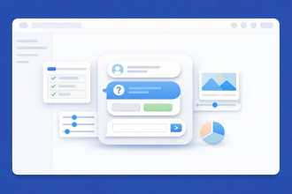
A popup form is a form that appears over a web page’s content, triggered by a specific user behavior or a time condition. It’s a deliberate interruption, which is also why timing and relevance matter so much.
There are four common trigger types worth knowing:
- Exit intent: This appears when a visitor moves to close the browser.
- Time delay: It shows up after a set number of seconds.
- Scroll point: This one doesn’t appear until a user has scrolled a certain percentage of the page.
- On click: This triggers when a specific button or link is clicked.
Choosing the best timing for your site’s popup will have a big impact on whether it leads to a conversion or is ignored.
8 popup form examples that work
Whether you’re configuring simple email signups or multistep B2B forms, there are specific psychological or user experience principles to consider when designing your popup form. Each of the following provides a starting point you can adapt to your goals and visitors.
1. Email newsletter signup popup
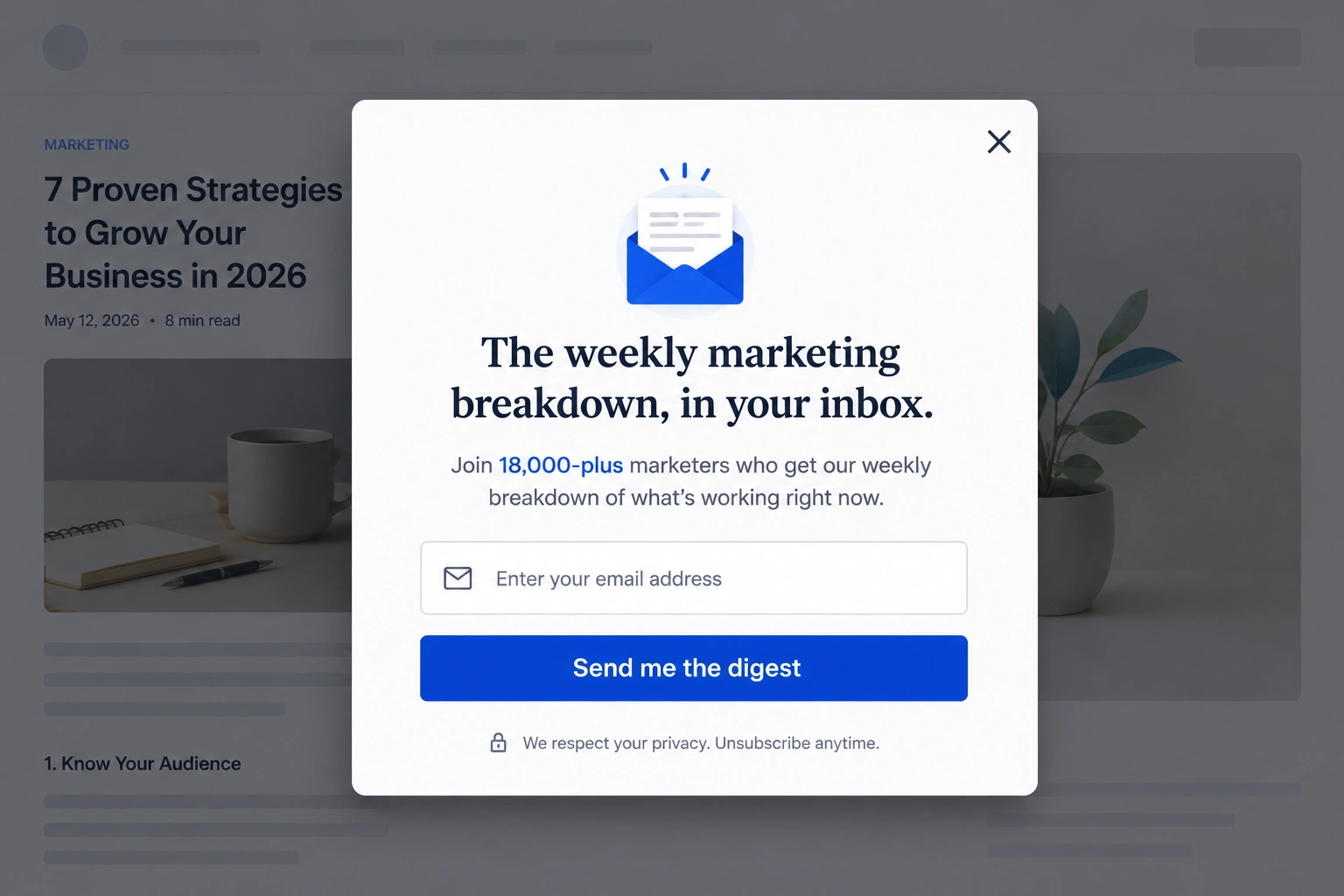
An email newsletter signup is likely one of the most common popups you’ve encountered. On a blog or content-heavy site, readers are already interested in what’s published, so a popup asking for their email turns that interest into a direct line to reach them the next time a piece is published.
- Trigger: Time delay (10 to 15 seconds) or scroll point (50 percent of the page).
- Headline: “The weekly marketing breakdown, in your inbox.”
- Subheadline: “Join 18,000-plus marketers who get our weekly breakdown of what’s working right now.”
- Fields: Email only.
- Call to action (CTA): “Send me the digest.”
- Design tip: Pick a single contrasting color for the CTA button so it stands out against the popup background.
Why it works: What makes this email popup example work is its combination of relevant details. The subscriber count in the subheadline serves as social proof, signaling that others have already decided the content is worth receiving. Asking for just an email keeps friction low, which matters most when the visitor doesn’t know the brand yet, and triggering on scroll means the popup appears only after the reader has already shown interest in the page.
2. Discount/first-purchase popup (e-commerce)
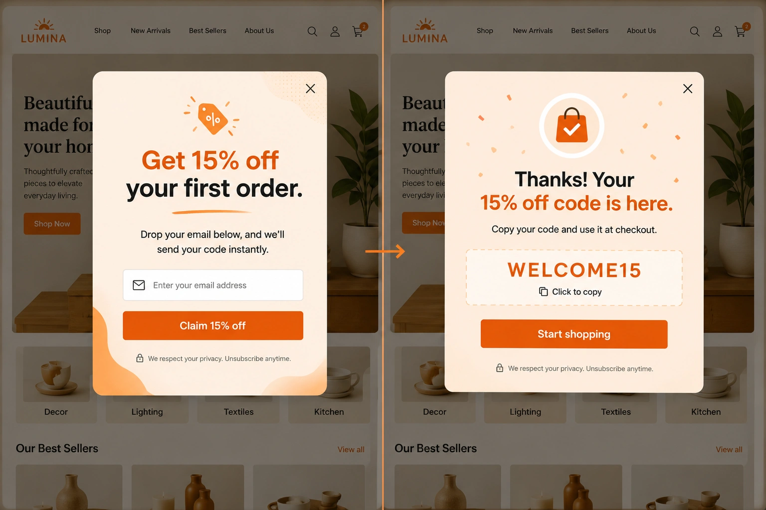
For an e-commerce site, a discount popup is one of the fastest ways to turn a first-time visitor into a customer. The offer gives them immediate value in exchange for their email, which not only potentially converts a sale quickly but also provides an opportunity to share future deals and promotions with them.
- Trigger: Time delay (15 to 30 seconds) or exit intent.
- Headline: “Get 15% off your first order.”
- Subheadline: “Drop your email below, and we’ll send your code instantly.”
- Fields: Email only.
- CTA: “Claim 15% off.”
- Design tip: Show the discount code on the thank-you screen right away to reduce friction in their purchase.
Why it works: This discount popup example works because the visitor knows exactly what they’re getting (15 percent off) and when they’re getting it (instantly), so there’s no leap of faith involved. Offering immediate value in exchange for an email means both parties leave the exchange happy: The visitor saved on their first purchase, and the company received a sale as well as an opportunity to turn that first-time buyer into a repeat customer.
3. Exit-intent lead magnet popup
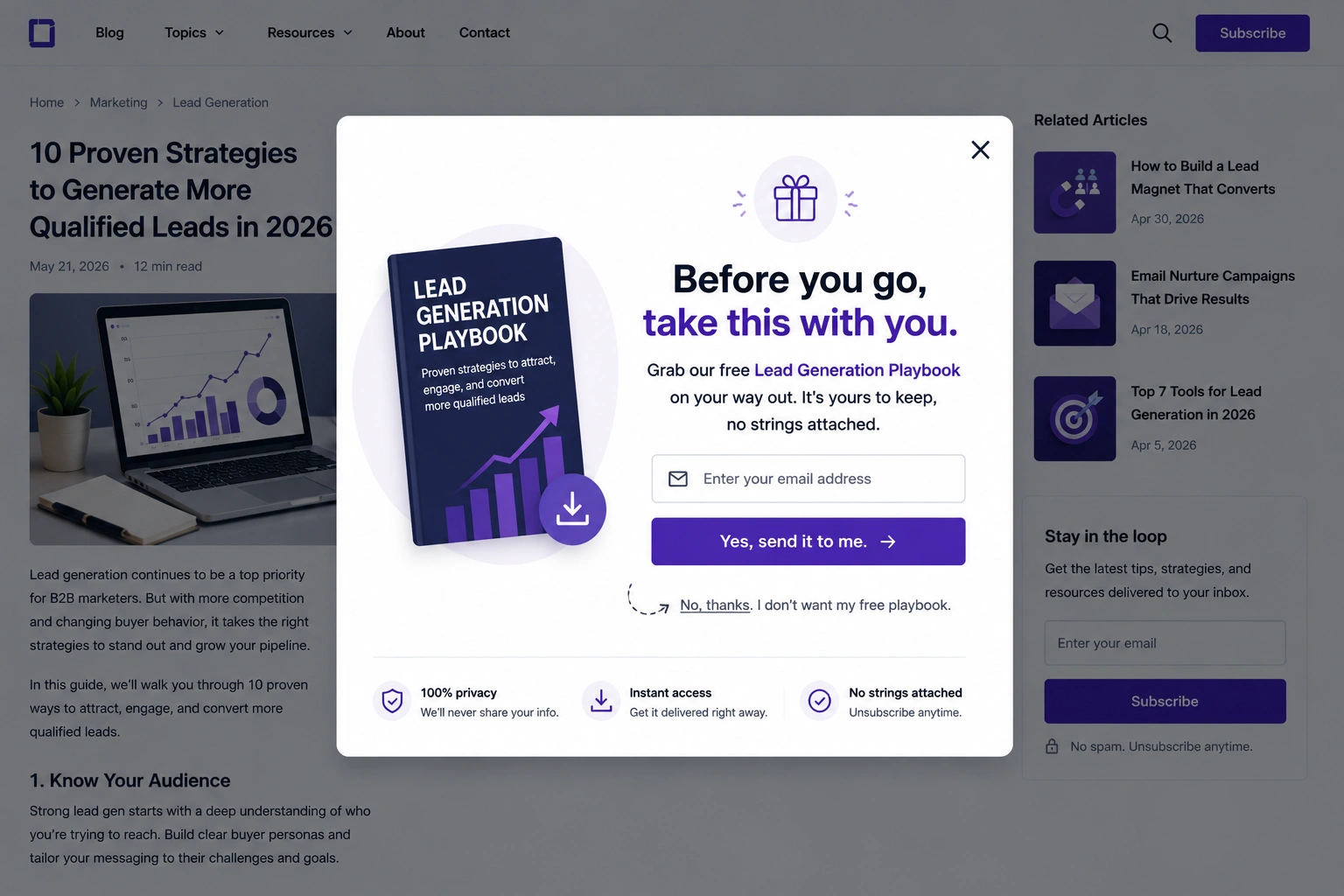
An exit-intent lead magnet popup is for the moment a visitor is about to leave your site. They’ve read enough of your content to be interested, but they haven’t subscribed yet. A free resource gives them one more reason to share their email on the way out.
- Trigger: Exit intent (when the visitor’s cursor moves toward the browser close button).
- Headline: “Before you go, take this with you.”
- Subheadline: “Grab our free [resource] on your way out. It’s yours to keep, no strings attached.”
- Fields: Email only.
- CTA: “Yes, send it to me.”
- Design tip: Make the dismissal button playful and slightly difficult to click: “No, thanks. I don’t want my free [resource]” makes opting out feel like a small loss, which can push undecided visitors to take the offer.
Why it works: Exit-intent popup examples include presenting a well-timed offer when a visitor is about to go, prompting them to pause and reflect before leaving. The opt-out language is a psychological tactic that forces them to click a button they might not agree with to opt out, increasing the odds of them adding their information.
4. Two-step/micro-conversion popup
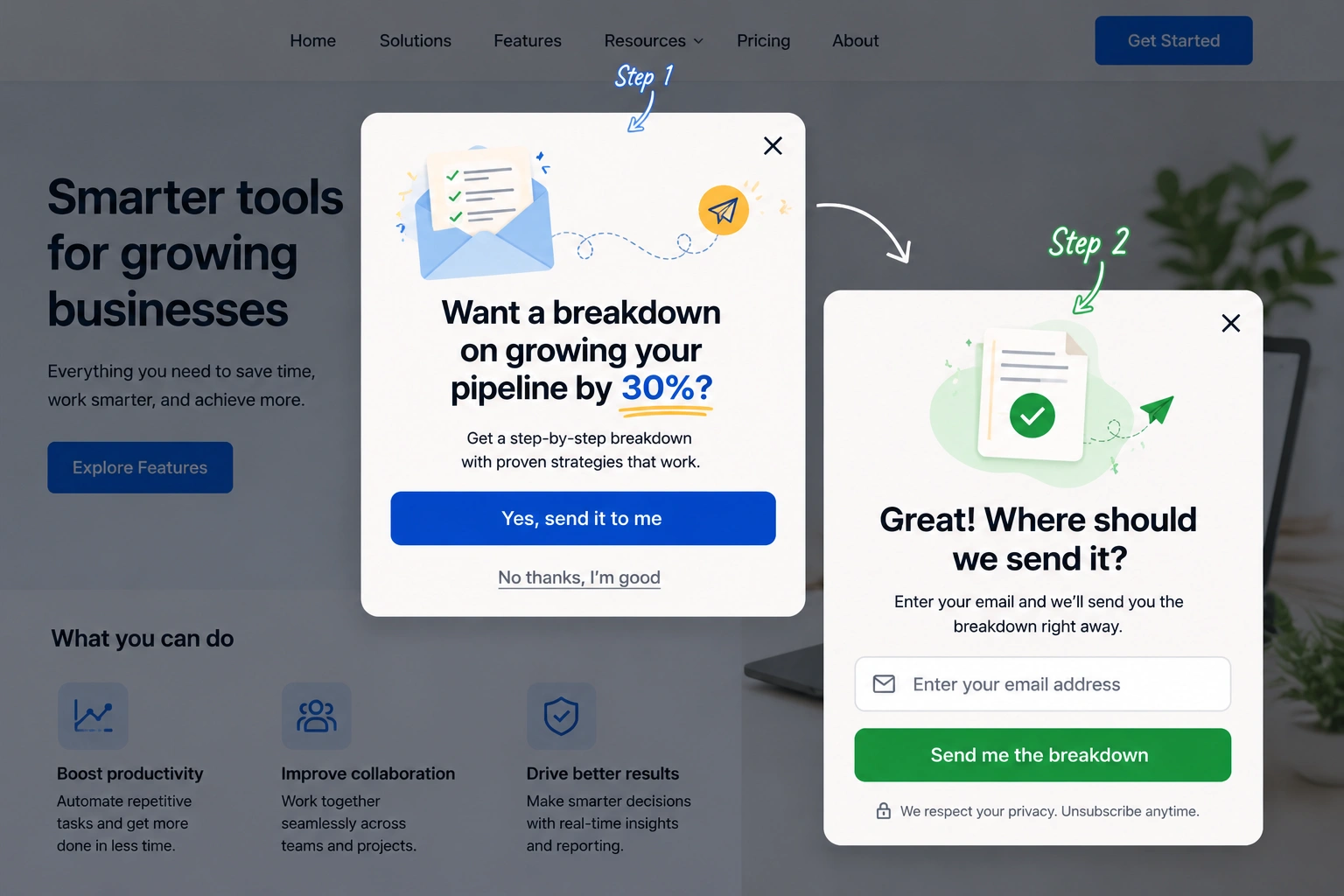
A two-step popup splits the conversion into a small request first and the actual signup second. It’s the right approach when a regular popup would feel too pushy, such as on a landing page where the visitor is still figuring out what you offer. By the time they reach the email field, they’ve already said yes once.
- Trigger: On click (when a visitor clicks an in-page button or text link).
- Step 1 button: “Want a breakdown on [specific outcome]?” (e.g., how to grow your pipeline by 30 percent).
- Step 2 headline: “Great. Where should we send it?”
- Fields: Email only.
- CTA: “Send me the breakdown.”
- Design tip: Embed the Step 1 button inside the copy on the landing page. Done right, it should feel like a natural part of the reader’s experience.
Why it works: This works because of the Zeigarnik effect: Once a visitor takes the initial step of clicking “yes,” they feel committed to finishing what they started, making them more likely to complete the form. Splitting the request into two smaller steps also makes each one feel lower stakes than a single form.
5. Cart abandonment popup (e-commerce)
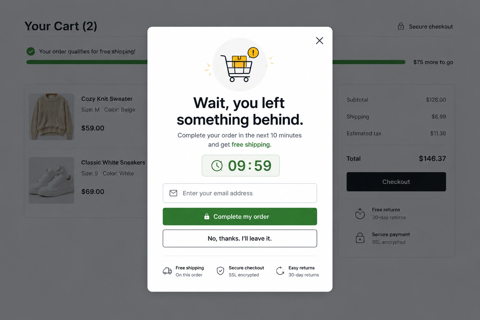
E-commerce sites often lose buyers after they add items to their cart and before they’ve clicked checkout. A cart abandonment popup is a chance to recover them before they leave, but only if timed right.
- Trigger: Exit intent on cart or checkout pages only.
- Headline: “Wait, you left something behind.”
- Subheadline: “Complete your order in the next 10 minutes and get free shipping.”
- Fields: Email only, or skip fields entirely if the customer is already logged in.
- CTA: “Complete my order.”/”No, thanks. I’ll leave it.”
- Design tip: If the customer is logged in, skip the email field and go straight to the CTA buttons. Anything that adds friction at this point makes them more likely to give up and leave for good.
Why it works: The popup addresses the two most common reasons for cart abandonment: The 10-minute window creates real urgency that pushes hesitant buyers to act, and the free shipping offer removes the unexpected-cost objection, which can be the biggest cause of abandoned carts.
6. Customer feedback popup
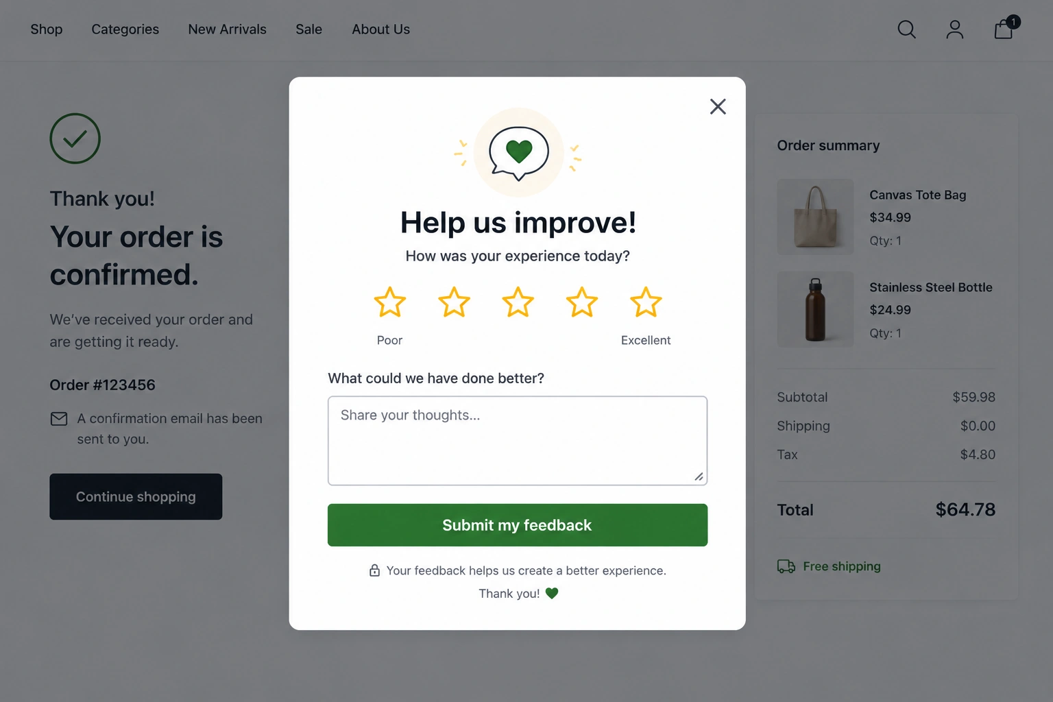
A customer feedback popup form appears right after your visitor completes an action on your site, such as placing an order or finishing a chat with support. It’s the moment when the experience is still fresh, which is also when they’re most likely to share the truth about how they feel.
- Trigger: Time delay or on a specific page or action, such as an order confirmation.
- Headline: “Help us improve!”
- Subheadline: “How was your experience today?”
- Fields: Star rating, plus one open-ended question (e.g., “What could we have done better?”).
- CTA: “Submit my feedback.”
- Design tip: Limit it to one rating field and one open-ended question. Any more than that and completion rates can drop sharply. If you need to ask more questions, add a progress indicator so that respondents see how close they are to finishing.
Why it works: The immediacy and efficiency make customers likely to complete it. Asking right after a completed action means the experience is still top of mind, so the customer feels more inclined to share. Because rating and sharing their thoughts are a low lift, this removes the assumption that filling out the form is a time commitment.
7. Webinar/event registration popup
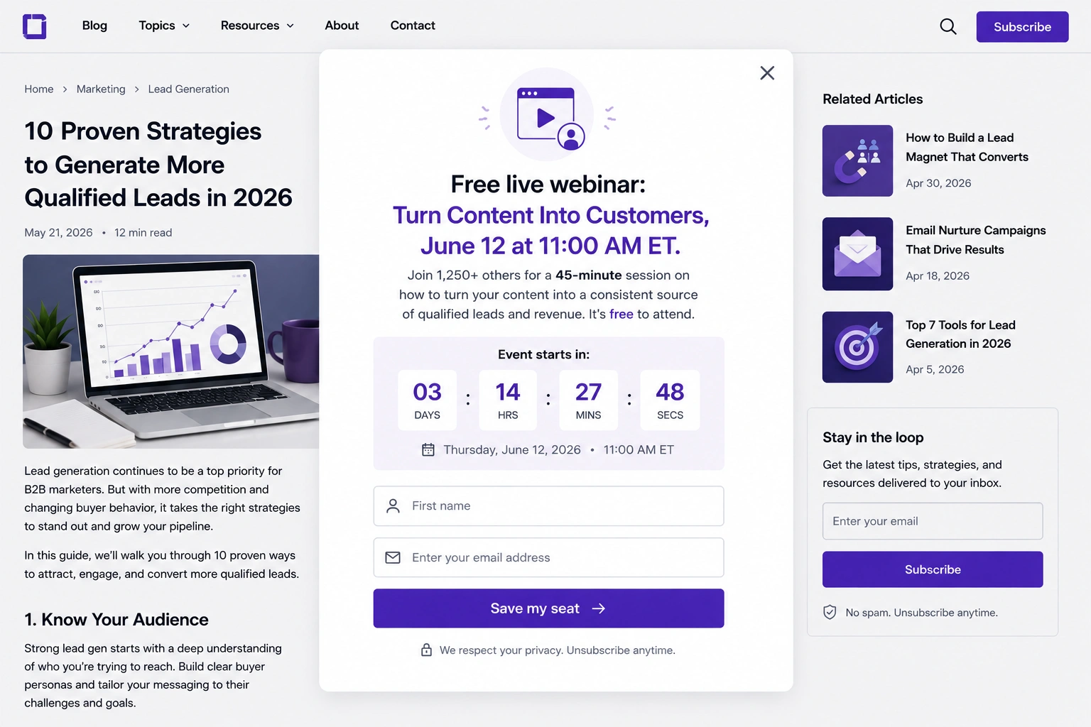
A webinar registration popup works best when it shows up to readers already deep in a relevant blog post or resource. Getting that far into the content is a good sign they care enough about the subject to spend even more time diving deeper.
- Trigger: Scroll point (shown after the visitor reaches 60 percent to 70 percent of a relevant blog post or resource page).
- Headline: “Free live webinar: [Topic], [Date].”
- Subheadline: “Join [X] others for a [X]-minute session on [specific outcome]. It’s free to attend.”
- Fields: First name, email.
- CTA: “Save my seat.”
- Design tip: Add a countdown timer to the event date when it’s within a week. The urgency of a real, ticking deadline can lift registration rates.
Why it works: The popup shows up only to readers who’ve already shown interest by scrolling deep into a relevant page. The fixed date adds a natural sense of urgency that drives registration, and the “Save my seat” framing makes the action feel like claiming something personal.
8. Multistep lead qualification popup (B2B)
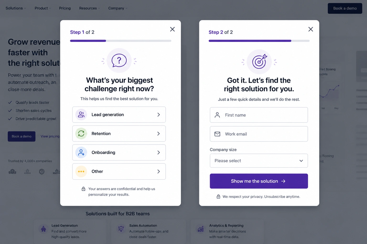
A multistep qualification flow is one of the most effective lead-capture popup examples because it collects information gradually rather than presenting visitors with a lengthy form up front. Start with a single, easy-to-answer question, then collect contact info on the back of that momentum. By the time the visitor reaches the email field, they’ve already engaged enough to want to complete it.
- Trigger: Exit intent or time delay on a product, pricing, or solutions page.
- Step 1 headline: “What’s your biggest challenge right now?”
- Step 1 options: Multiple choice (e.g., “Lead generation, Retention, Onboarding, or Other”).
- Step 2 headline: “Got it. Let’s find the right solution for you.”
- Step 2 fields: First name, work email, company size.
- CTA: “Show me the solution.”
- Design tip: Show a progress bar across the steps. Something like “Step 1 of 2” sets clear expectations so visitors don’t feel trapped or bail mid-form.
Why it works: Starting with a multiple-choice question is the lowest-friction entry point because there’s no typing involved. The visitor commits to a small action early, and by the time they reach the email field, they’ve already invested enough effort that walking away feels like a waste of their time.
What makes a high-converting popup form?
A few principles tend to show up in every popup that converts:
- Nail the timing: Don’t trigger the moment someone lands. Wait until they’ve engaged or shown signs of leaving.
- Focus on one goal: Each popup needs a single goal. Mixing requests or showing two CTAs sharply reduces conversion.
- Match the popup to the page: Relevance is everything. A cart popup belongs at checkout, while a lead magnet belongs on a blog post.
- Write for skimmers: Visitors are unlikely to read a popup, so if it can’t be understood in three seconds, rewrite it.
- Always include an easy exit: If visitors feel trapped, they won’t come back. Keep the close button visible and easy to locate, especially on mobile forms, where small screens can make tiny dismissal buttons hard to spot.
Build your popup forms with Jotform
Every popup type covered here can be built with Jotform popup form templates or Jotform lead generation form templates, including multistep logic, CRM integrations, conditional branching, and custom thank-you pages. The builder is no-code, so you can launch a popup without involving a dev team.
Jotform’s AI Form Generator for popups can do so much more than collect email signups. You can collect any data type, connect to over 150 form integrations, and feed responses straight into HubSpot, ActiveCampaign, Google Sheets, or whatever other tool sits in your tech stack. That means the moment someone fills out your popup, their information goes into your CRM, ready for whatever follow-up flow you’ve set up.
Browse Jotform’s 20,000-plus form templates to find a starting point that fits your use case, or sign up for Jotform for free and have your first popup live on your website in the next few minutes.
This article is for marketers, ecommerce managers, and growth teams who want to capture more leads, reduce abandonment, and increase conversions using popup forms — and are looking for real-world examples with copy frameworks they can adapt immediately.































Send Comment: