“70% of all shopping carts are abandoned. And 28% of those carts are abandoned because of a lengthy checkout process.“
source
Businesses want people to spend money.
That means paying for something should be the easiest part of the whole experience but poor payment systems continue to result in a loss of billions of dollars for businesses.
A successful payment experience requires a clear path that users can navigate through smoothly. After all, payment forms are the digital equivalent of a physical sale terminal in a shop or restaurant. So, it’s vital that they are slick, quick and efficient: no queueing, no obstacles, no errors.
Creating a payment form used to be a tedious headache of a task, especially for startups and small businesses.
But today’s tools empower users to set up a powerful, beautiful payment form integration in minutes — without a single line of code. Plus, you don’t have to pay additional fees for transactions.


Pro Tip
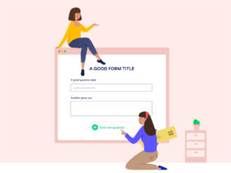
Create an online payment form that works for your business and start collecting payments online.
Wait — what is a payment form?
It’s the digital version of a cash desk. It authorizes online payment, validates the user’s details, ensures the funds are available and pays you.
What can you do with payment integrations?
The options are (almost) endless. First and foremost, you can sell products or services. You can also apply complex calculations to these sales, such as adding taxes and shipping costs or subtracting coupons, with Jotform online payments features.
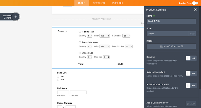
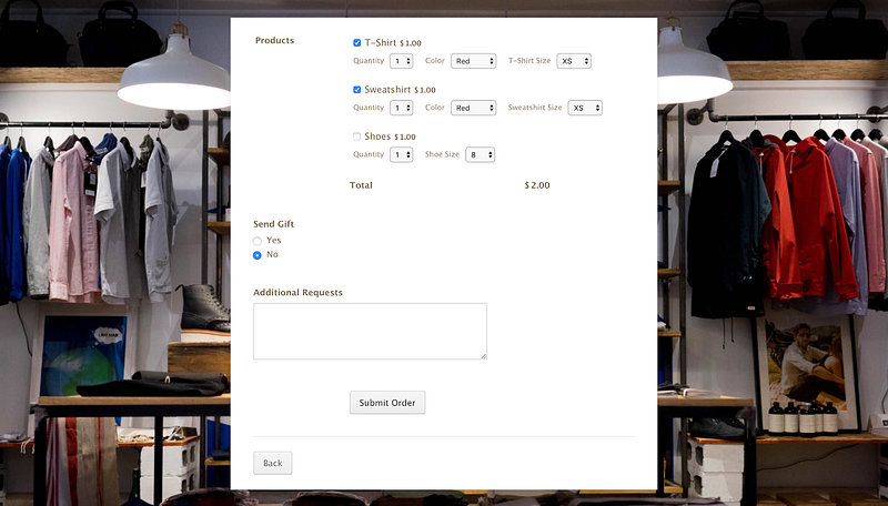
You can give your products helpful descriptions like images, quantity, color and size options.
And when it comes to payment form types, the options vary.
You can create order forms for a single or multiple products as well as for collecting payments of a fixed amount. You can also make these payments recurrent with a subscription service.
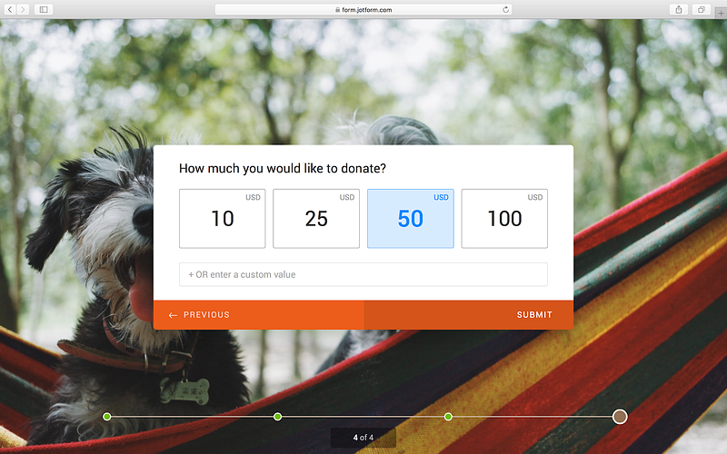
Payment forms can be used to collect donations as well.
How do you design smarter payment forms?
Here are 5 payment practices we’ve found helpful for our 4.2 million users at Jotform, the online form builder company I work at.
1. Keep it simple
Numerous studies have concluded that visually complex form design is seen as generally unappealing.
And psychologically, we feel inclined to interact with a page that’s emptier.
The length of your form also matters. For instance, Jotform’s Classic Forms display all the questions, plus the payment section, on one page. This set-up works perfectly for some of our users, especially in the case of shorter forms.
But when a larger amount of detail is required, lots of information on one page can feel overwhelming.
This is one of the reasons we built Jotform Cards as an alternative to Classic Forms. It has a one-question-per-page layout: nothing is displayed on the page apart from the question and the commands.
As soon as the user has completed the form, they move smoothly onto the payment.
Both types of forms shine under different circumstances. Whatever form option you choose, there should be plenty of white space and no unnecessary fields.
2. Offer multiple methods of payment
Have you ever finished a meal only to be informed the restaurant only accepts cash? Instead of digesting your food, you have to walk to the nearest ATM or ask your friend for a loan. Annoying.
We humans are always looking for ease and convenience, especially when deciding whether or not to buy something.
And choice — whether or not we need it — matters to us subconsciously. Humans value the ability to make decisions for themselves, which is why flexibility is something to prioritize.
The same logic applies when it comes to offering your customers multiple payment options on your order forms.
Most of the online form builder software offer multiple integrations. At Jotform, we offer 30+ payment gateway integrations, across multiple companies and payment methods.
Anyone who wants to pay should be able to do so. It’s simple, really.
3. Reduce delays
Payment forms are a bit like obstacle courses. Every (metaphorical) hoop to jump through and wall to climb slows the user down, making them less likely to finish.
Some obstacles are avoidable: like arbitrary formatting rules or password requirements. Some of them — like typos — aren’t so easily avoided.
With Jotform Cards, we try to reduce these accidental setbacks. For instance, it will recover the email address of a user who has entered the domain name wrong e.g., john@gnail.com should be john@gmail.com.
And when a general error has been made — like a missed field or incorrect input — it warns users with a shaking micro-animation.
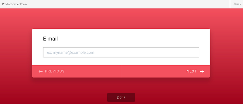
Another avoidable cause of delay? Users having to decipher meaning. Make sure language is crystal clear and questions are phrased in a way that makes sense.
The quicker a user progresses to the finish line, the more likely they are to cross it by completing the payment.
Fewer delays = quicker forms.
Quicker forms = more conversions.
It’s a win-win.
4. Ask for less information
Optional fields are the enemy of conversions.
Baymard Institute analyzed checkout forms and found that a too long checkout process is one of the most significant reasons users abandon a purchase, with the average checkout containing 15 form fields.
And a massive 50% of sites ask for the same information twice, which guarantees dwindling attention spans and irritation.
Asking for information with all content displayed in easily-digestible chunks can be helpful.
5. Prioritize security
We want to feel safe and secure in the places we pull out our wallets. So, smart businesses go to great lengths to make their customers feel comfortable from the moment they walk through the doors.
Payment forms are no different. When users are expected to enter sensitive information like credit card details, they’re hyper-sensitive to anything that seems suspicious:
A recent study revealed 17% of shoppers left a page without paying due to security concerns.
Clear, efficient and professional payment forms put users at ease. Anything that looks DIY will have the opposite effect.
That’s why you should be careful when building a payment form from scratch — tiny errors or inconsistencies will make users extra-cautious and put them off. Put users off extra-cautious.
It also helps to enable SSL on your forms to help protect data. Visitors get peace of mind knowing all interactions are encrypted.
Creating a payment form
In case you are interested in building a payment form using Jotform, you can choose one of our templates or create a new payment form from scratch here.
We offer two form layouts:
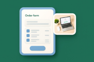
1. Classic Form:
Classic Form offers a more conventional layout with all questions on the same page.
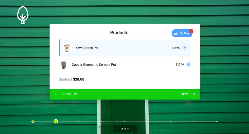
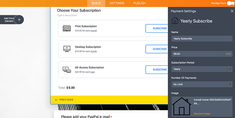
2. Card Form:
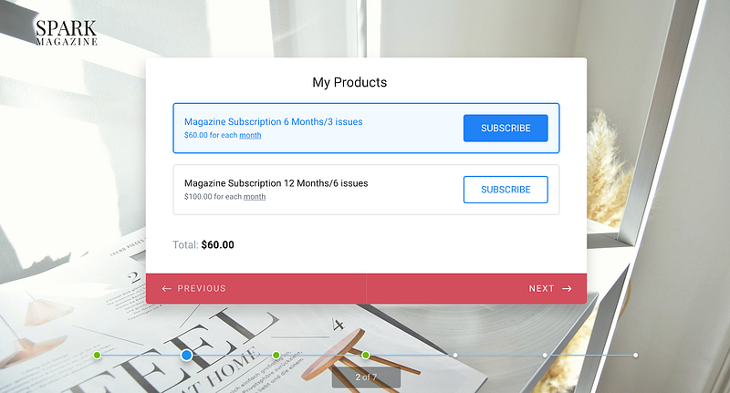
Card Form offers a website-like shopping experience, letting users proceed to purchase swiftly with a one-question-per-page format.
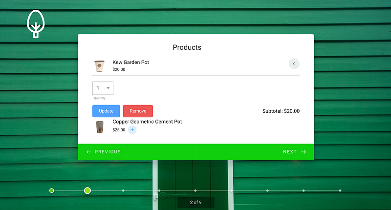
Steps like add to card, address, card info, and products are shown in separate cards. Shoppers can see, and edit, their shopping bag intuitively.
Here’s how it looks:
1. Shoppers select their products.
2. Shoppers remove or add products if necessary, then continue.
You can easily customize your forms to match your brand by adding your logo and selecting a background color or image.
How to add a payment integration
Step 1: Add your fields and select your payment gateway.
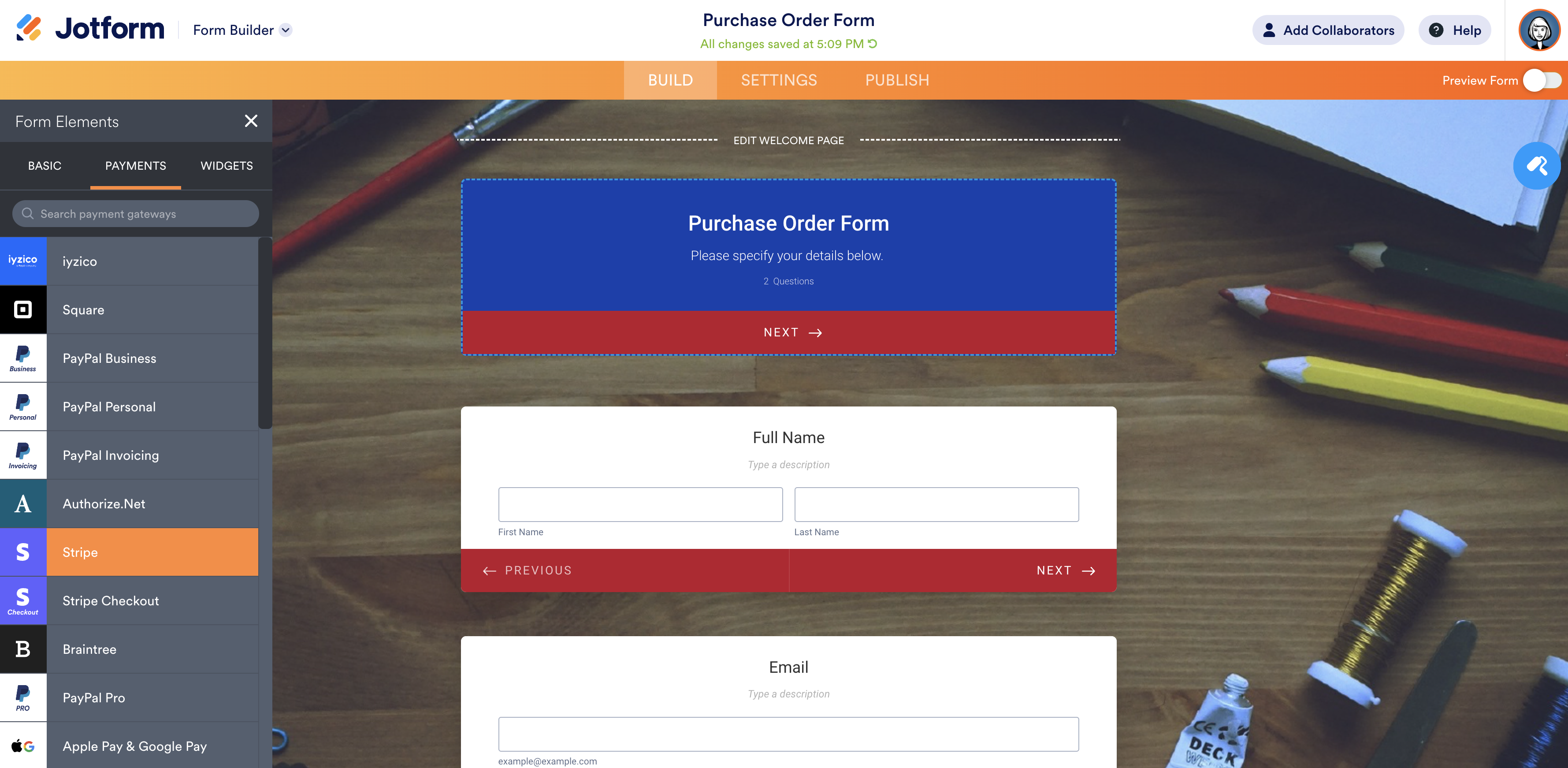
Step 2: Enter integration credentials using a connect button, or enter them directly.
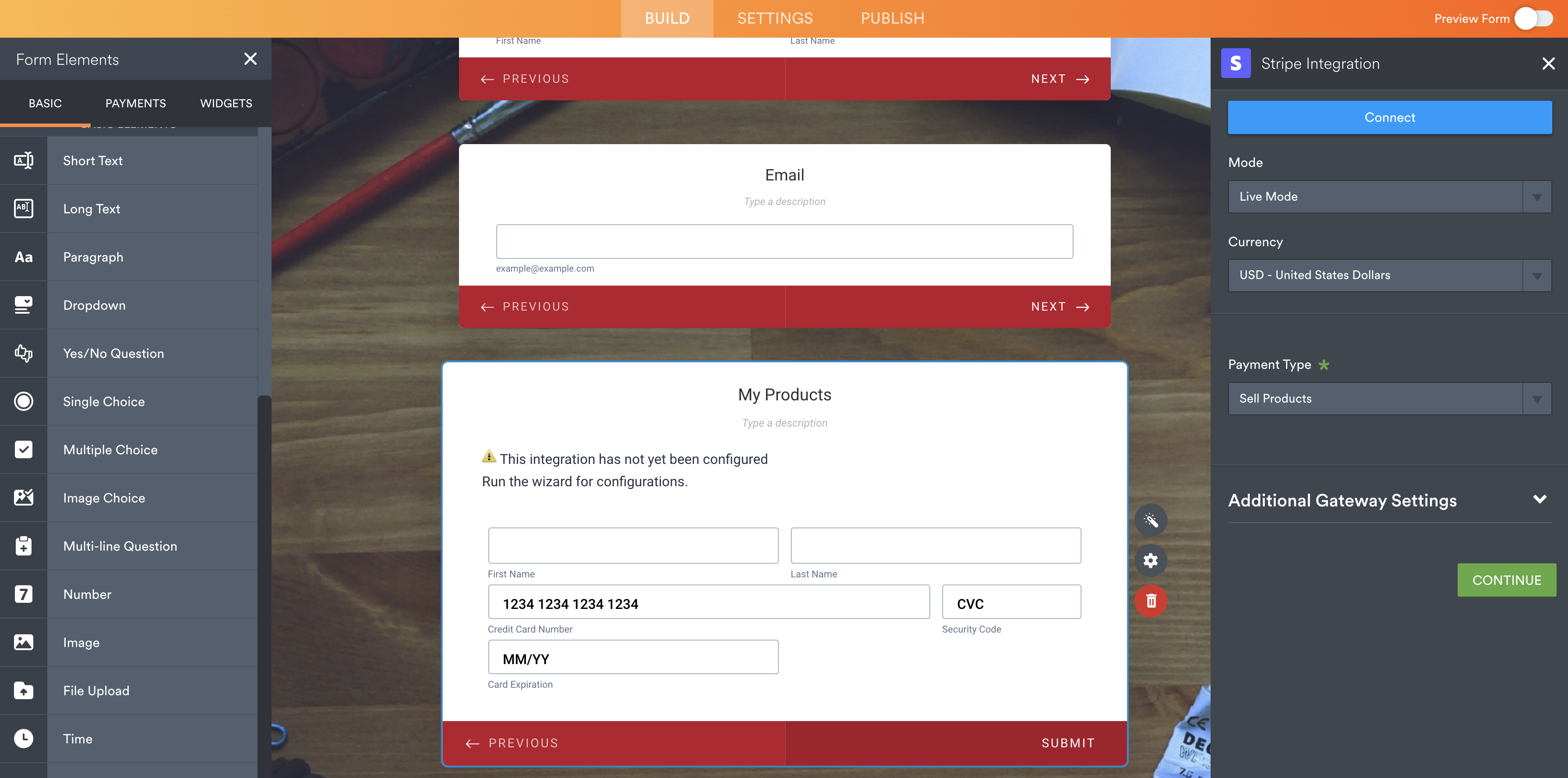
Step 3: Add product image, product details like quantity, color, size.
Step 4: Calculate coupons, taxes, and shipping.
You can use purchase order integration to check for the details and options for a generic payment field creation (it doesn’t require any credentials because it doesn’t create a real transaction).
Step 5: Write personal thank you message-autoresponder emails.
All set. Now you can easily sell your products on websites, blogs or social media with our smart embed feature.


Send Comment:
1 Comment:
November 8, 2018
Great Form Builder. Easy drag and drop menu options to build form. Payment integration is a great option.