Someone once famously said, “Good, better, best. Never let it rest. ’Til your good is better and your better is best.”
At Jotform, we’re constantly researching performance and speaking with our users to understand how we can make a good product experience even better. Well, we’ve gotten your feedback, and we’re excited to announce a fresh, new look for our default form theme!
Why is the look and feel of a form important?
User experience impacts everyone. All of us have used some kind of form or survey in our lives. Whether you’re the one collecting information or the one giving it, the user experience should be enjoyable so that the respondent provides complete information and actually submits it.
The form we fill out makes or breaks that experience. From the design to the colors to the copy and practical functionality, these principles, along with other factors (such as the number of fields), collectively determine the rate of form completion. In 2019, Databox surveyed approximately 30 marketers; more than 40 percent felt that form design has a big impact on form conversion.
It’s important for a form to have a polished look so it captures the user’s attention and helps reinforce the trust needed to get the user to the “submit” button or call to action (CTA). Form design also has an indirect impact on your client’s trust; put another way, your design should be consistent with your brand. Our new default design theme now provides an improved foundation that you can customize to your brand guidelines.
How did we get here?
Here’s a fun (maybe unsurprising) fact: Our default form theme is our most used design. As a result, we didn’t take making a change to it lightly. Our UX team performed an enormous amount of research, analyzing almost 600,000 active forms and conducting feedback sessions with several Jotform users. We then surfaced the most popular form theme edits and enhancements, which helped inform the new design. Our goal? To make sure we created a sound default form theme whose quality and value would apply to all of our users and suit everyone’s needs.
What did we learn?
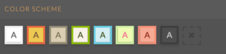
The insights we gained from our research helped us create design principles that guided design of the new form theme, including the shape and color, font characteristics, page orientation, and many more attributes.
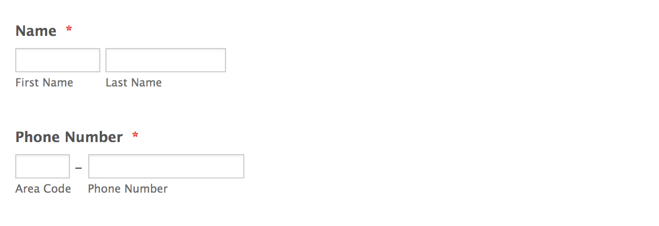
Form usability emerged as a theme from our research and became a huge focus for our UX team — for example, applying consistency across all basic form fields and field alignment. We also expanded our theme’s accessibility by adding subtle explanatory touches to fields and informative, “feedback forward” nudges along the way. On a related note, Jotform will continue to learn from our users so we can design our forms to be as accessible as possible for people with disabilities.
In a nutshell, we learned what our default form theme was getting right and where we had the opportunity to enhance the user experience.
What was our default form theme getting right?
- Easy to use and navigate
- Clear and straightforward
- Organized
How could we enhance our default form theme?
- Modern look and feel
- Sophisticated design and aesthetics
- Advanced styling
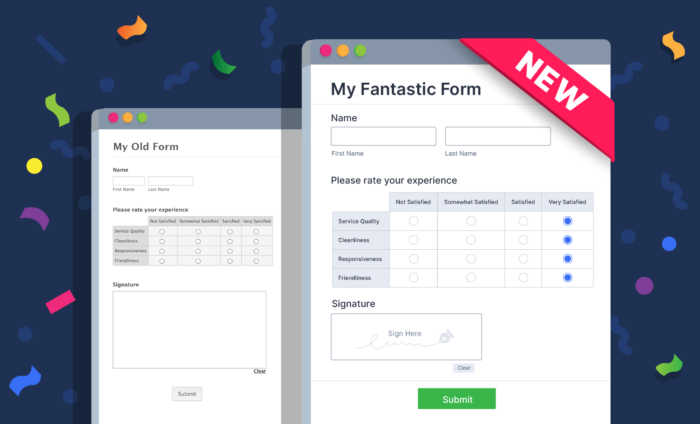
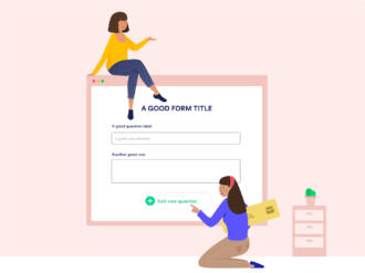
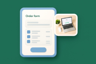
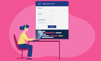
Introducing Jotform’s new default form theme
Perhaps we’re “nerding out” a little, but we’re so excited about our new form theme’s debut! Our new default form theme features many subtle but distinct improvements. Together, they represent a big difference in the overall aesthetic users experience and the confidence they have in submitting your default forms.
We conceived a new design principle to help guide the enhancements we made to our default form theme. We adopted a six-point approach that ensured the design would be adaptive, aesthetically pleasing, functional, trustworthy, user-friendly, and take on a “less is more” feeling.
You can see this principle at work in many new touches:
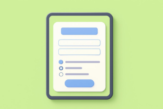
- Discreet shadow borders on the form page itself provide depth and better presentation.
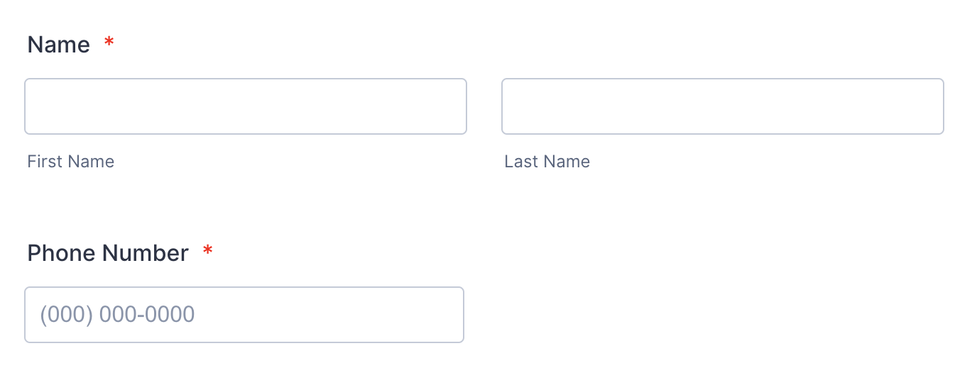
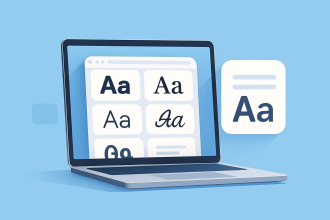
- Font and spacing. A slightly enlarged and softer font feels more elegant. Also, line spacing, adjusted field length, and alignment contribute to a more professional appearance.
- Highlights. A sky blue background highlight accents the field a user is filling, replacing the previous tan outline.
- Checkboxes. Larger checkboxes with off-gray borders convey a clean and minimalist style.
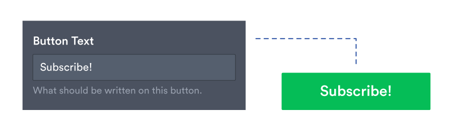
- CTA button. A larger CTA button that’s centered is familiar and easy to access. Also, the default green echoes the green of a traffic light and psychologically reinforces advancement.
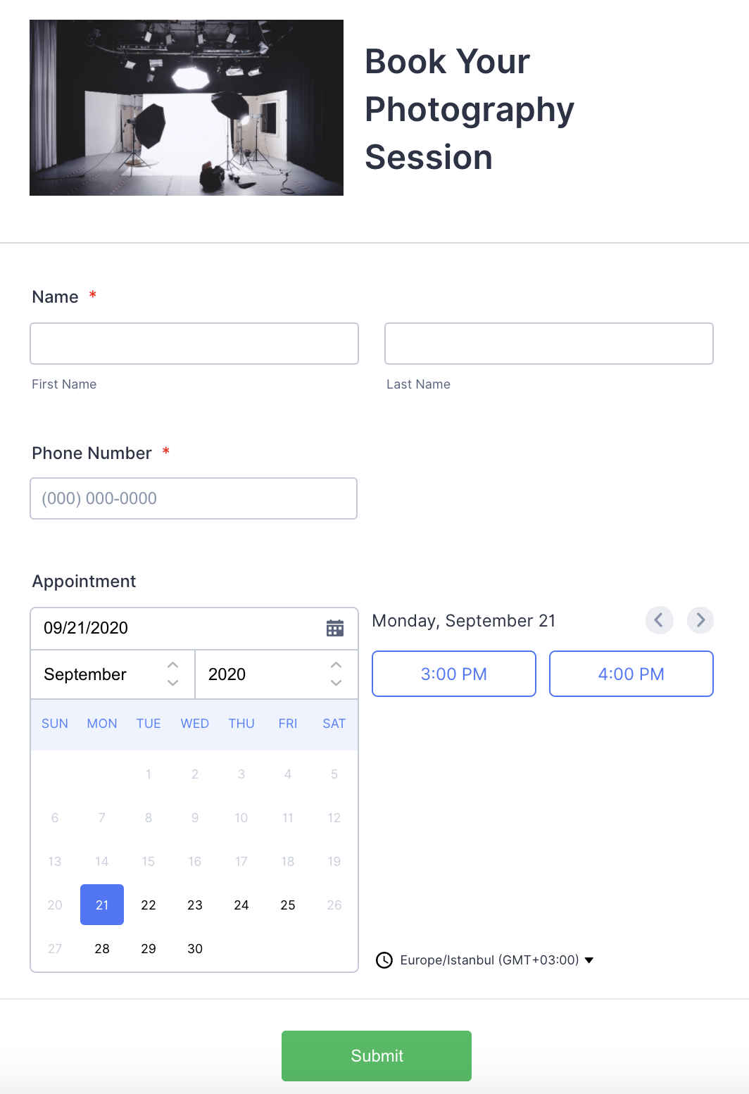
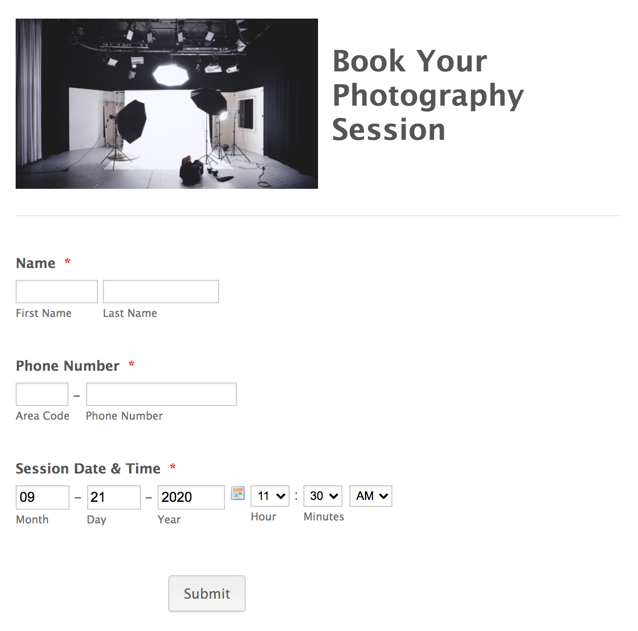
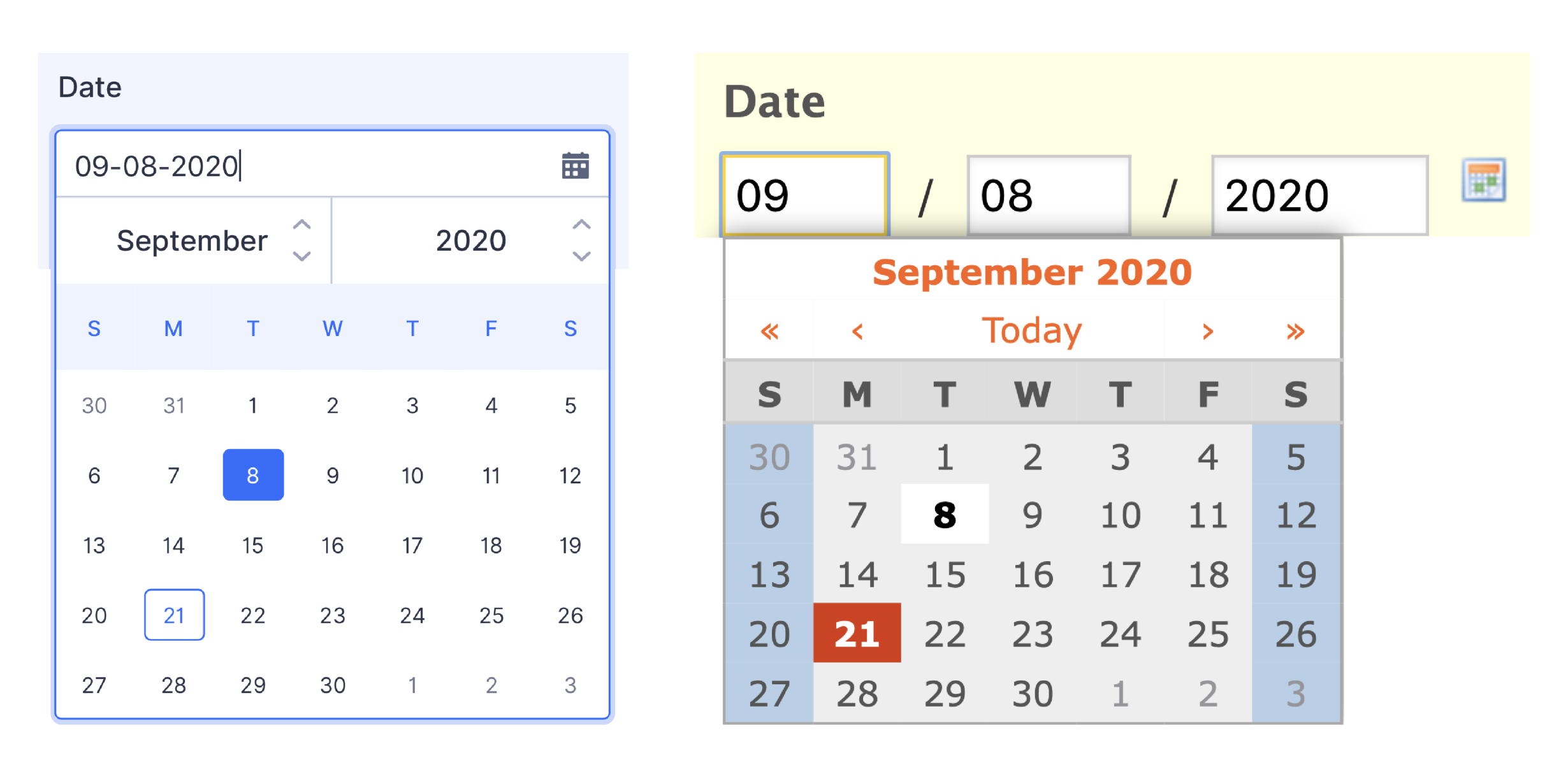
Note: Like many Jotform design elements, you can customize the button style; just make sure your color scheme is consistent. Here’s a tip: Customize the text to something actionable that fits the goal of your form. - Greater consistency and field functionality. Consistency in overall look and field functionality inspires reliability. As an example, you can see improved field responsiveness in a modernized and more intuitive date selector.
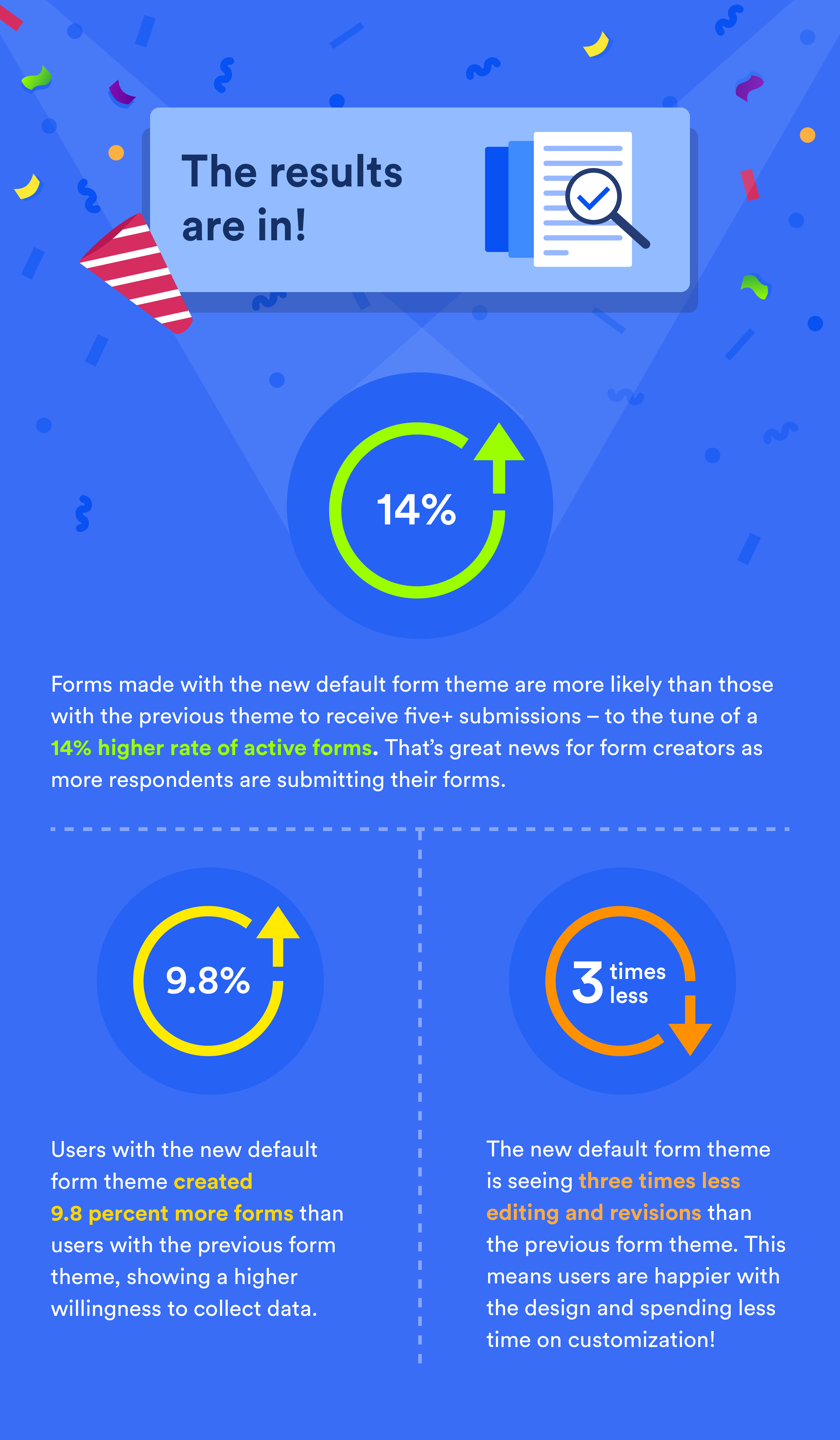
The early results are in!
In the lead-up to our launch, we gave a handful of users early access to Jotform’s new default form theme, and the results are encouraging. In our test, approximately 50,000 users received the new default form theme, and the same number of users received the previous form theme.
- Users who got the new default form theme created 9.8 percent more forms than users who got the previous form theme, indicating a higher willingness to collect data.
- Forms made with the new default form theme are more likely than those with the previous theme to receive five+ submissions – to the tune of a 14% higher rate of active forms. That’s great news for form creators as more respondents are submitting their forms.
- Perhaps most important, the new default form theme is seeing three times less editing and revision than the previous form theme, meaning users are finding higher quality in the new default!
Try the new form theme on for size
The new default theme is available today and will be applied to all newly created forms. For those who would like to update existing forms, rest assured that all you need to do is select the New Default Theme from the form designer’s Themes tab.
Thanks for being loyal Jotform customers!

Try our new default form theme now!


Send Comment:
14 Comments:
June 29, 2022
How use it with API? What should I add to styles property instead of 'Default' of generated by API form?
February 22, 2021
wow! a enjoy it daily guys big
up
October 3, 2020
I have a new taxi business and need to have customers book online
September 26, 2020
great, thanks.
September 25, 2020
Has there been an update to the default PDF?
I'm happy with my form template but not with the default PDF.
thanks,
Jacinta
September 24, 2020
Awesome! I've been waiting for this for a long time! Thanks!
September 24, 2020
Great!
Question: does your calendar function integrate with Outlook 365?
Joe
September 24, 2020
awesome!
September 24, 2020
Well done ... it looks more modern and Apple like ..it’s a real improvement
September 24, 2020
I have been using jotform since September 20, 2008 (12 years) and I have seen the evolution of the company and the team.
I'm still using the service because they have a differentiator vs. to the competition and that is innovation.
Thanks for such great tools, integrations. And they are always in fashion in parallel with web design. My clients and I are delighted with your solutions.
They have done an incredible job. Greetings from Tijuana, Mexico.
September 23, 2020
How can I upgrade an old form to a new one? I ask because my old form is linked to Google sheet and I rather not start a fresh form.
September 23, 2020
Thank you!
It's about time, though :-)
Welcome to 2020. How was your trip from 2005?
Seriously though. Cheers for this!
September 23, 2020
Nice! I love it more than old one. Good move.
September 21, 2020
I came across with this. May I ask if Jot Form is some sort of software to collect form? How does it work actually?