
You could not remove a single grain of sand from its place without thereby … changing something throughout all parts of the immeasurable whole.
Fichte, The Vocation of Man (1800)
Butterflies are fascinating.
They even have a phenomenon named after them: the butterfly effect. It describes the fact that small, barely perceptible changes can have a big, non-linear impact on a complex system.
In theory, the flutter of a butterfly wing could set something in motion that eventually leads to a typhoon.
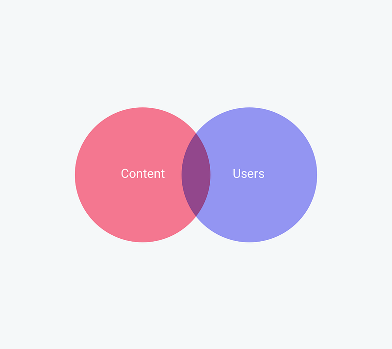
That got me thinking about forms. Because for product designers like me (and my collaborators at Jotform), online forms are pretty complex systems.
And these systems exhibit something akin to the butterfly effect, in that small decisions, or slight alterations can have an impact that is bigger than we might imagine.
As in many other areas of life, every choice we make, however minor it seems, is a moving cog in a larger system.
In my job at Jotform, I sieve through forms built by our users almost every day, and I see first-hand what a difference a small decision can make.
I’m often struck, for instance, by how tiny oversights can lead to significantly lowered conversion rates.
There’s a lot to pay attention to when it comes to building a form. That’s why I’ve put together this guide: to draw attention to small decisions and changes that can have a big impact. Hope you’ll find it useful.
Organization for high-converting forms: a mini guide
Let’s begin with the big picture.
1) Purpose and context
Your form needs to have a purpose. This is the first thing you need to be clear about because it will affect how you build the form. So make that purpose explicit. Write it down.
Forms are a vehicle for communication, which means there are two parties involved in every form that’s filled out.
Yes, what you want to find out through the form matters; but you also want to keep in mind what the purpose of your respondents would be. Why would they go through the trouble of filling out the form?

The purpose is embedded in context, and the more specific you can make this context (in your mind’s eye), the more meaningful it will become. Try to imagine where your respondent is filling out the form.
Are they in the office or at home?
Are they doing it on the weekend or on a bus ride to work?
Are they using a tablet, desktop, laptop, or phone?
Any of these things could have an effect on how you build a form.
Context is not just about the environment. It’s also about giving participants the full picture on why you’re asking them to fill it out, what changes are likely to result from the information or feedback they are providing, and how that makes a difference, for you and for them.
Your respondents (and their purpose and context) need to be part of the framework for your form, right from the start.
2) Who are you talking to?

Your form needs to engage the attention of the right audience — but who are they?
Thinking of a whole group of people is hardly going to focus your mind. That’s why a ‘buyer persona’ can be such a useful concept. It refers to a fictitious ‘ideal customer’ with traits, a personality, hopes, and dreams.
This is the person you should be targeting when you write your form. One single person. Why? Because that single person is going to tell you much more than a large, blurry mass of people can.
Bring your ideal respondent into sharp focus.
Who are they?
What inspires them?
Whose opinion do they value?
Which obstacles get in their way?
Which problem(s) do they want to solve?
What is their connection with your business?
By figuring out what is meaningful to your customer, you will be able to collect meaningful data.
3) How to ask
Imagine going for dinner with someone who starts bombarding you with convoluted vernacular peppered with jargon and obfuscation — wait, what? You’d probably want to get away pronto.
A form is no different. It’s a conversation. You want to make sure the person who’s filling out the form (your conversation partner) doesn’t start feeling tense, overwhelmed or resentful.
That’s why you need to keep it clear, and consistent.
Speak simply
We all prefer plain language — even the experts agree. And we all know it. So why does so much online chatter sound like it’s been through a thesaurus?
Some people confuse simple with dumb. Not so. To express something simply (and clearly), you have to understand it well. Or as Einstein famously put it:
If you can’t explain it simply, you don’t understand it well enough.
When it comes to language, simple means Plain English. Plain English creates maximum clarity, with minimum effort on behalf of your listener. That’s what you’re aiming for.
So write down the shortest, most straightforward version of what you’re trying to say. No jargon, no unusual words, no complex sentences. Just light, simple, natural language, the way you’d talk to a friend — not a robot.
Think of it as having a relaxed conversation over a cup of coffee.
One good way of checking whether your writing achieves this is by reading your text out loud. Your ear will hear what your eye might not see: the places where your writing becomes stilted or hard to understand.
Complexity is your enemy. Any fool can make something complicated. It is hard to keep things simple.
Richard Branson
Simple also means as short as possible. When it comes to online communication, users don’t read much. People who are online are both busy and easily distracted.
Realistically, you can expect that around 20% of your words will be given full attention. Make sure that these words stand out, and that your form doesn’t distract from them.
If you’re not sure whether a question is relevant, get rid of it. In this conversation, it’s far more important to be a good listener than a good talker. Fewer questions mean better answers because each additional sentence or section will lower your form’s conversion rate.
Last but not least, simplicity also applies to visuals. Yes, as human beings we appreciate beauty. But beautiful design is often simple, and never overdone. Unnecessary images or fancy fonts will distract rather than entice.
Your use of color will probably depend at least to some extent on your company’s visual identity. That aside, simplicity means following some obvious rules. Don’t put purple next to yellow. Don’t write in orange on a white background, or in white on a dark background.
Keep it consistent
Respondents are more likely to stick with a form if it doesn’t trip them up by being unpredictable. Consistency supports a smooth read-through.
One important area for consistency is the tone of voice — the tone that reflects your company’s ‘persona’. What does your company’s persona sound like? This will not just be a matter of style but also of values. What phrases and words represent your company’s ethos? Is it energetic, trendy, futuristic? It’s worth having a brainstorm about this.
At Jotform, we focus on being inclusive, friendly and down to earth — and the language we use reflects this.
Once you’ve nailed the tone, make sure it’s maintained throughout all of your forms. Your customer wants to be speaking to the same, friendly person throughout their journey.
Visual consistency is equally important. Adopt a visual identity and style that you retain it throughout your form (and the rest of the forms you create in the future).
How to stage your questions
Remember there are two partners in your form’s conversation. You want to make sure you get the information you need from the form. And your respondent wants to get to the end of the form as quickly and easily as possible. Keep both these things in mind when you decide on the questions you will include in your form, and where you are going to place them.
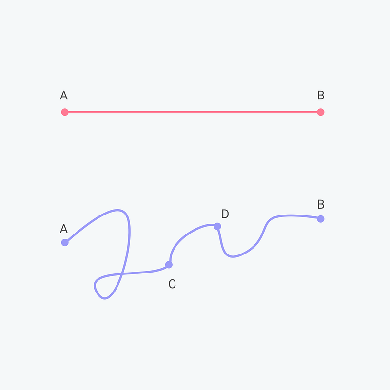
Make it flow
The content of your questions matters, naturally, but so does the way they are ordered. Each question should nudge your respondent on to the next. Big leaps will confuse your respondents, and make them start speeding through the rest of the form or close it altogether.
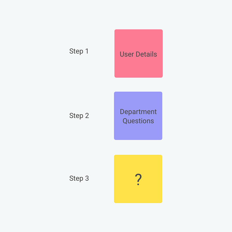
One way to maintain flow is to start with easier questions and move towards harder ones, to ease your respondent along. Unless they’ve been hiding under a rock, most people are conditioned to recognize certain natural flows — for instance, you wouldn’t ask someone for their credit card details before their name.
Ordering questions also mean paying attention to how you cluster them. For instance, group personal information together, introduce payment separately, and so on.
Give a helping hand
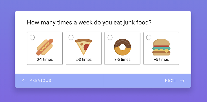
When you send out your form or survey, you want respondents to get involved quickly. So throw them a softball. Start with a simple yes/no, easy, can’t-miss question to help them through starter friction and get them going.
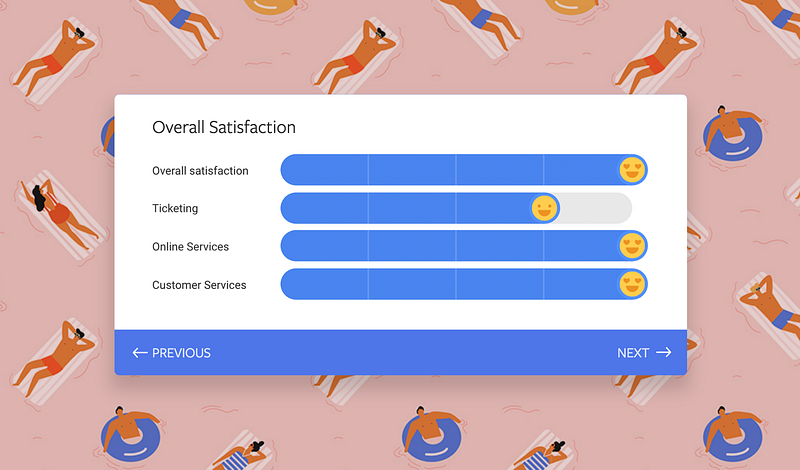
Using predefined choices will allow respondents to select their answer without having to type. Another way to make users’ lives easier is to use placeholder text so that they can quickly glance at the page and understand the answer required without having to read the whole question. Using yes/no questions will also help them move forward without struggle.
Depending on the data you need, there are many different question types. After you’ve jotted yours down, go through them with a fine-toothed comb and remove anything unnecessary.
If questions are necessary but only for a certain subset of your audience, use conditional logic to implement them in a way that doesn’t irritate those who it doesn’t apply to. And if you’re set on ‘nice-to-haves’ such as ‘would you recommend our company to a friend?’, make them optional after a form has been completed. You are likely to get a higher proportion of answers this way than if they were in your original form.
Think of it as a first date. You start with small talk. Light, simple questions that are easy to answer, like:
Are you under 40?
Do you own a business?
Can you ski?
(Discussions about how your marriage ended come later on).
Make your respondents feel comfortable first, and gain their trust. The tough questions can follow on from this.
Final thoughts
When it comes to designing forms that work, it’s the small things that matter. Paying attention to detail will have a far-reaching effect — and not bothering with it will too. A simple question, placed where it belongs, may make the difference between a journey that is completed, over and over, and one that’s not.
And in that respect, it’s not that different from the flutter of a butterfly wing.


Send Comment: