We see hundreds of web forms every day and often encounter forms that are created so carelessly. Some only have a title or just a user name field. Some don’t even have any text at all. These little tips and tweaks, along with strong form design principles, will help you create more professional looking contact forms and also improve your conversion rates.
1. Fool proof your forms:
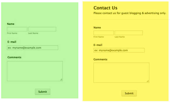
Always give additional information about your contact forms. Even if it is a simple contact form explain what your visitors can do with it. Contact us can mean everything. Contact for what? For a job application, idea, chat, emergency, issues, and so on.
How?
Always start with a heading and sub-heading on your forms.
Example: (Which one looks better?)
2. Aid your visitors with extra info:
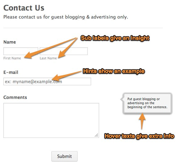
Help your visitors in every way that you can with tiny bits of information. Point out extra information for fields that can be confusing or to make sure the visitor is on the right path.
How?
1. By placing hint boxes
2. With hover texts
3. By using sub labels
3. Test forms before publishing
Preview your form, think like a visitor, and fill in your form to find any flaws.
4. Don’t use captcha
Unless you’re getting many spam responses, it’s a good suggestionnottouse it.
5. Don’t use a form in a pop-up window
It may be tempting to put the form right in the center of the screen to get responses quickly, but it can get annoying. People may fill out “I hate pop-ups” on your form… There goes a wasted submission!
6. Don’t use “required” for every field
Give your visitors some flexibility. They’ll thank you by filling out the form correctly.
7. Keep it simple
Simplicity is the key to success for almost anything. Don’t fill your forms with out of context questions.
8. Have 1 open-ended question
Leave 1 open question for the thoughts, comments, ideas of your visitors. Some may want to give additional and valuable information so don’t miss them out.
9. Be consistent on the grammar
Labels should follow title case. First word of the label should start upper case and the sub-label should follow with the same pattern.
10. Don’t think about phishing
Keep in mind that phishing is bad! Stealing passwords, credit card numbers, etc. is illegal and can cause you a lot of trouble. Use your forms for good.
That’s about it for our best practices. Which methods do you use? Please share them on the comments section below.








Send Comment:
30 Comments:
February 3, 2020
Great suggestions! I see a possible typo on the first "Best Practices..." The sentence, "...explain what can your visitors do..." might be better as, "...explain what your visitors can do..."
May 8, 2018
Do you know/have any recommendation to register people when they don't have an email account?
March 20, 2018
How do you allow users to edit a previously submitted form instead of duplicating?
June 6, 2017
did search on Hover Text - it is mentioned in this article
BUT it does not tell how to add hover text
did search on 'add hover text' and there was nothing
December 12, 2014
Congrats
December 12, 2014
Congrats visually appealing to the max:)
December 12, 2014
Thank you very much for your kind words and feedback, special thanks to the organizers and the jury! I really hope that our form will not stop and that it will fight for the main prize ;)
December 11, 2014
Indeed - Well deserved - :-)
Congratulations!
December 11, 2014
Awesome! Well deserved win!
December 11, 2014
Very nice!!!
December 11, 2014
Yeah! a beautiful contact form.
December 11, 2014
This is one of my favorite contact forms. COngrats!! :D
December 11, 2014
so cool! I am using it.
Congrats!
December 11, 2014
How'd you make that?!?!
Teach me!
December 11, 2014
So glad this one was chosen! My personal favorite!!
AWESOME design and use of the available tools.
Waking Girl
December 11, 2014
Congrats!
December 11, 2014
Congratulations! Well done!
December 11, 2014
Congrats!
March 22, 2014
What are best practices for protecting against spambots getting into your web form? Can you elaborate why Captcha should not be used?
February 1, 2014
This is the "name" I have used - and with that manner of spelling for about as long as I can remember.
The mar is the first letters of my name - the second set in the first letters of my wife's name and I am a professional photographer. Put it all together and it really keeps it "simple" for those that choose to remember my email address as well.
February 7, 2013
"Labels should follow sentence case."
I agree, but the example doesn't follow that. It's "First Name Last Name".
January 29, 2013
Damn it.
reference
duh.
January 29, 2013
#9 should probably be "grammar" in referance to the English language.
Sorry, but a pedant must live by their own rules.
;)
January 29, 2013
dfesgthre rhyrn h
January 25, 2013
#9 should probably be "grammar" in refering to English Language.