
Well-executed landing pages with forms
- Juicy Parenting’s parenting guide
- Relevantly’s social media calendar
- Brian Tracy’s 14-step goal setting guide
- National Association of Women Sales Professionals’ (NAWSP) webinar
- Jotform’s COVID testing white paper
- Paychex free trial
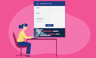
Every website needs landing pages — those all-important web pages that exist for the sole purpose of capturing information from visitors. In the vast majority of instances, businesses use landing pages for lead generation. They’re also useful for collecting event signups, mailing list subscriptions, online quote requests, or some other specific action.
In every case, a landing page needs a form. Forms — preferably ones that are short, simple, and not too pushy — are the easiest way to collect visitor information. A well-constructed landing page paired with the right form can actually increase conversions and promote engagement with site visitors.
But what exactly constitutes a “well-constructed” landing page and the “right” form?
An effective landing page
- Focuses solely on conveying the value of the resource you’re offering
- Has minimal copy that’s compelling and to the point
- Has a clear call to action (i.e., “Start my free trial” or “Get the report”)
A great form
- Asks for a reasonable amount of information that matches the value of the resource you’re offering (The form for a webinar might ask for more information than one associated with an infographic, for example.)
- Has a simple, clear layout
- Looks attractive
The internet is full of landing pages, and some of them do a better job at converting than others. Before you start working on your landing page’s form design, take a look at the following great examples for some inspiration.
6 examples of well-executed landing pages with forms
1. Juicy Parenting’s parenting guide
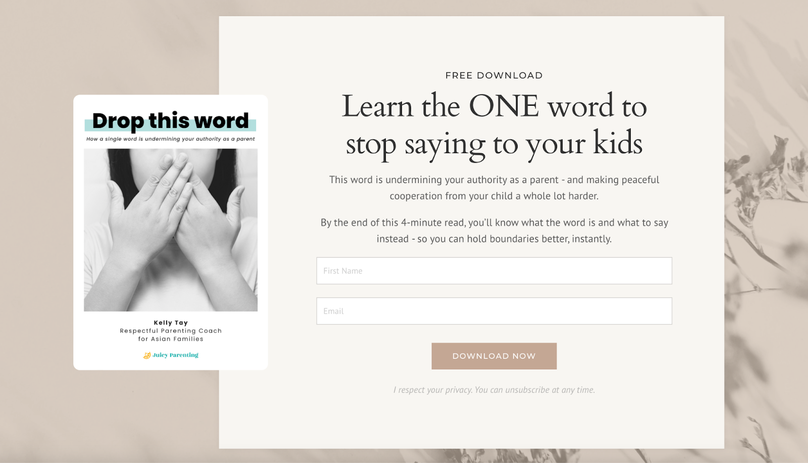
Juicy Parenting has mastered landing page copy — it’s short, sweet, and direct, telling visitors exactly what they can expect when they download the free resource. (But there’s a bit more information farther down the page, along with some social proof.) And the form is perfectly appropriate for a four-minute read, only asking for a first name and email address.
2. Relevantly’s social media calendar
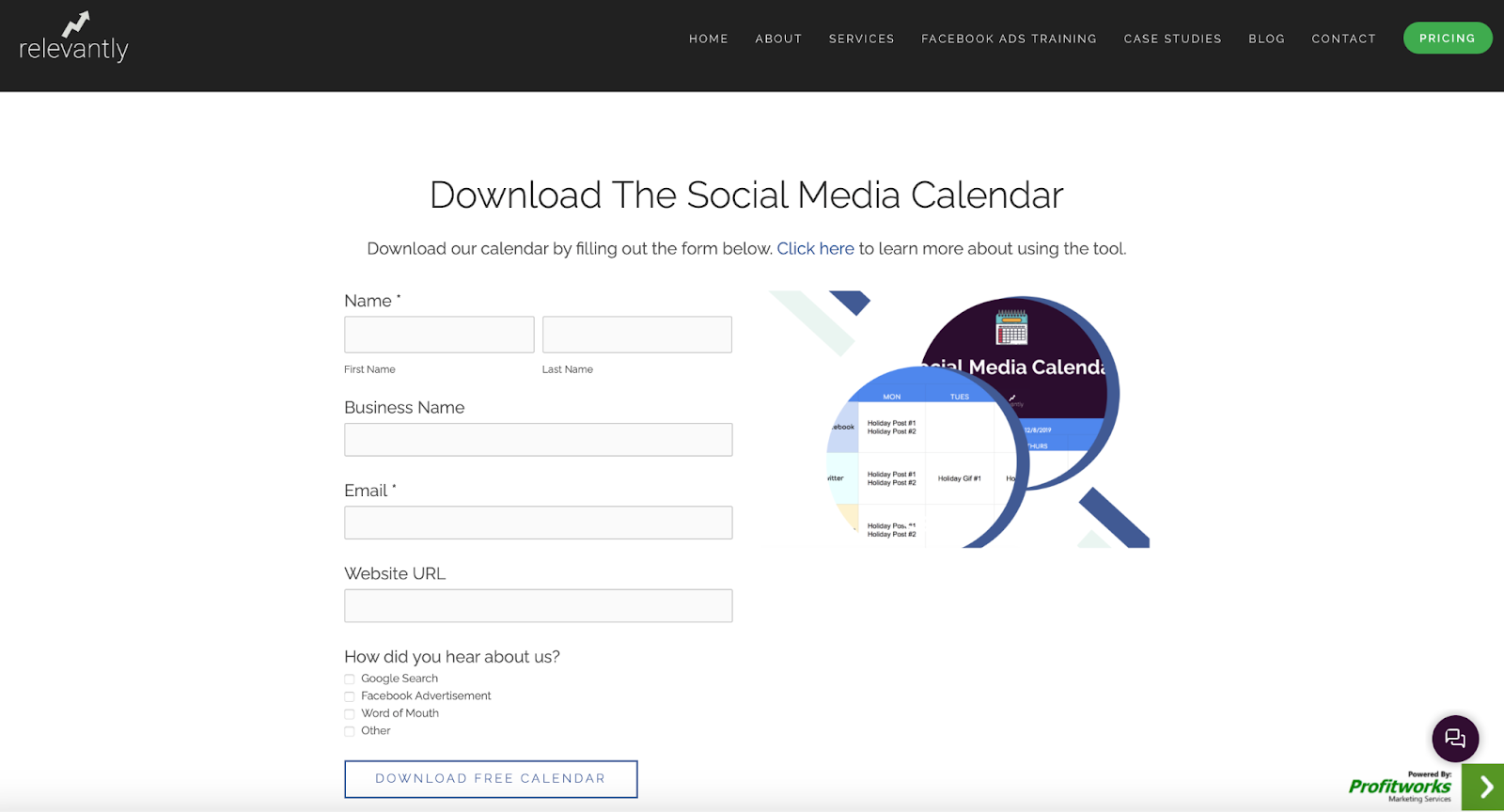
In this case, Relevantly put its landing page copy and form on separate pages. The landing page copy includes a Free Download button that takes visitors to this form.
The copy provides several opportunities for readers to download the resource, and it explains the offering in detail. Also, the form asks for a bit more information than other examples, which indicates the company’s interest in collecting better leads rather than just more leads.
3. Brian Tracy’s 14-step goal setting guide
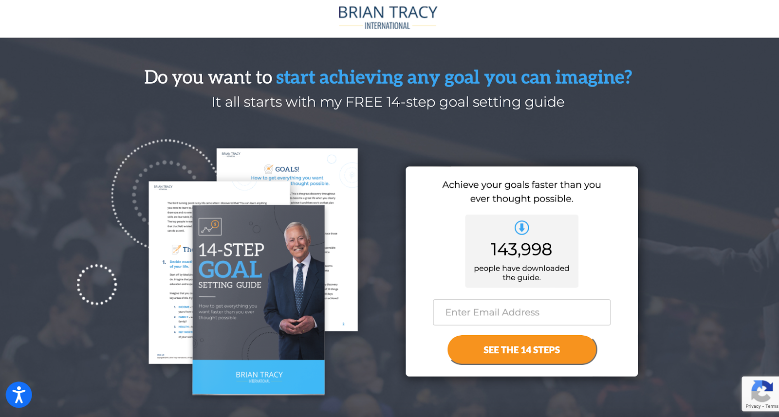
This is an attractive-looking landing page with a form; readers who scroll down will find a few concise descriptors of the goal-setting guide. The call-to-action button is compelling — “See the 14 steps” — and stands out in terms of page design.
The form itself uses the “breadcrumb strategy,” meaning it presents questions one at a time. Once someone fills in their email address, another form field pops up asking for their name. The simplicity of this strategy is what makes it work.
4. National Association of Women Sales Professionals’ (NAWSP) webinar
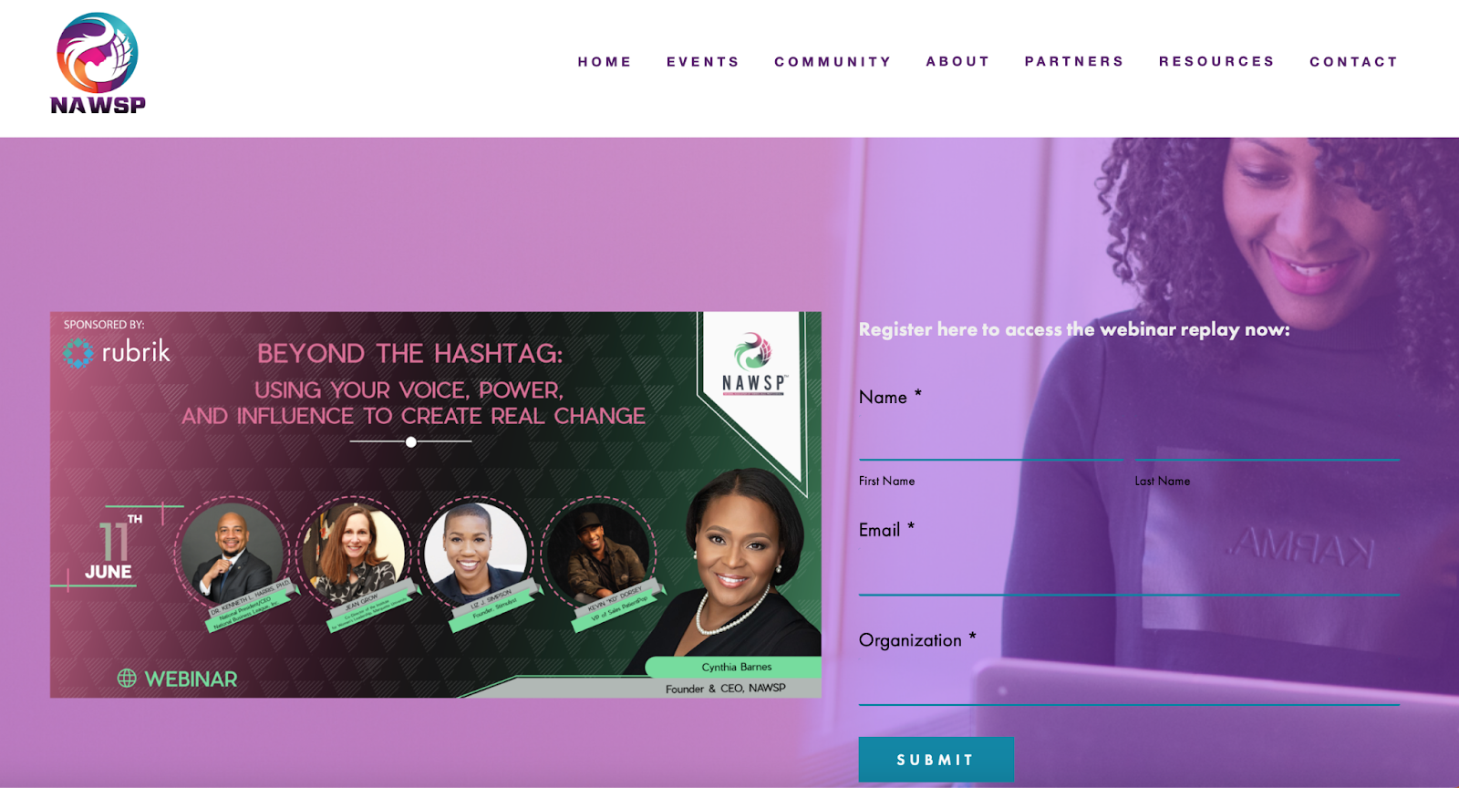
This landing page with form provides visitors with access to an on-demand webinar from NAWSP. Farther down the page, it includes a brief description of the topic and a bio for each member of the panel.
This is an excellent example of an effective, attractive landing page that asks for appropriate information in exchange for a valuable resource.
5. Jotform’s COVID testing white paper
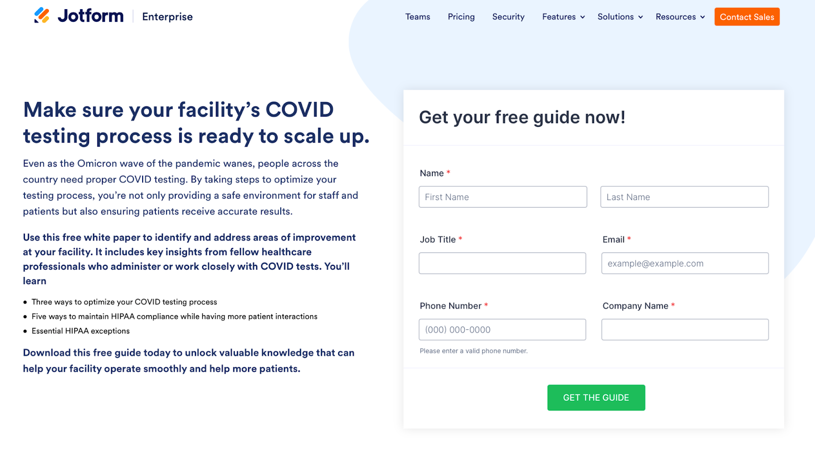
This clean and simply structured Jotform white paper landing page makes a great first impression. It has plenty of white space, and the green call-to-action button stands out. It also has a compelling headline that speaks to readers and draws them in.
The form attracts attention with its layered appearance. Note that the form fields all have red asterisks — the standard indicator for required fields.
6. Paychex free trial
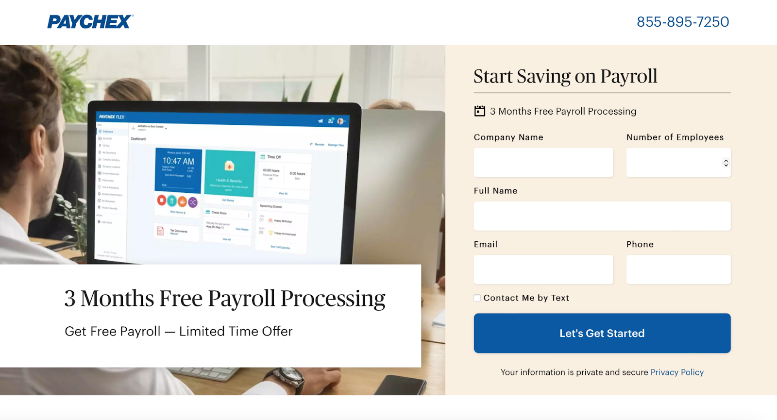
Paychex’s landing page for a free trial is attractive and includes all the important information “above the fold” (no scrolling required).
If you do scroll, however, you’ll see some compelling information about what your business could gain by signing up, and you’ll find a summary of exactly what you can expect to get by saying yes to this deal.
The form asks for only the necessities, and it includes a privacy statement that links to the company’s privacy policy.
A landing page with form + function, thanks to Jotform
Need forms to include on your site’s landing pages? Create them quickly and easily with Jotform, a popular, easy-to-use online form builder.
Creating a landing page form in Jotform is simple: Use the drag-and-drop builder to arrange form fields as you want them to appear — no coding required. Then copy and paste your form’s embed code into your site builder to place it on your landing page.
You can also measure the success of your page by tracking form submissions in Jotform Tables. Organize the submissions, filter them, and share them with colleagues, all as part of a simple, streamlined process. Browse our 20,000-plus form templates to get going quickly and start engaging with your site’s visitors today!
Photo by Ochir-Erdene Oyunmedeg on Unsplash


Send Comment: