
Your “contact us” page is your business’s first line of communication with a potential lead or concerned customer. Learning how to create a “contact us” page starts with understanding the purpose of your page and what best practices make it most effective.
Once you understand the purpose of creating a contact page on your website, you can learn how to create a “contact us” page with tools that reduce stress and improve results. Let’s take a look at why a “contact us” page is essential to your business and what you can do to get the most out of yours.
The purpose of a ‘‘contact us’’ page
Your website’s contact page is one of the most important pages for your visitors to access. A contact page acts as the gateway for customers to reach out to your brand directly, often conveying your brand’s commitment to transparency and communication.
Although many businesses think of their contact pages as a lower priority, the way you design and structure yours could determine how visitors perceive your brand. A well-designed page can help you acquire leads, field potential concerns, and keep an open line of communication with your customer base.
Agency Partner ProgramTurn Referrals Into Revenue!
Become an Agency Partner
How to create a “contact us” page (Contact page best practices)
Since a “contact us” page is so essential to your business, you don’t want to risk falling short with yours. That means the structure of your contact page is really important. Beyond including the main elements of a contact page (which we’ll cover in a bit), there are a few best practices you should consider when thinking about how to create a “contact us” page:
- Make it easy to find. Your website’s navigation bar should clearly list your “contact us” page. Including “contact us” calls to action (CTAs) and buttons on other pages increases this visibility even further.
- Offer multiple contact methods. Let your customers contact you in the way they feel most comfortable — whether that’s through a form, email, phone call, chat, or some other method.
- Include key business information. Your “contact us” page should be a hub of essential business information so clients can easily access what they’re looking for. This includes your address, contact information, and hours of operation.
- Connect your social media. Be sure to include links to your social media profiles on your contact page. This offers a direct pathway for users to connect with you on social and boost your engagement.
- Keep your form simple. Users may be nervous about giving out their personal contact information for fear of unleashing unwanted emails, phone calls, and spam, so limit the number of fields you require people to fill out.
By following these best practices, you can optimize your users’ experience, potentially increase your leads, and make it easy for visitors to contact your team.
“Contact us” page examples
Here are 25 of the best “Contact Us” page examples you can draw inspiration from before you create your own.
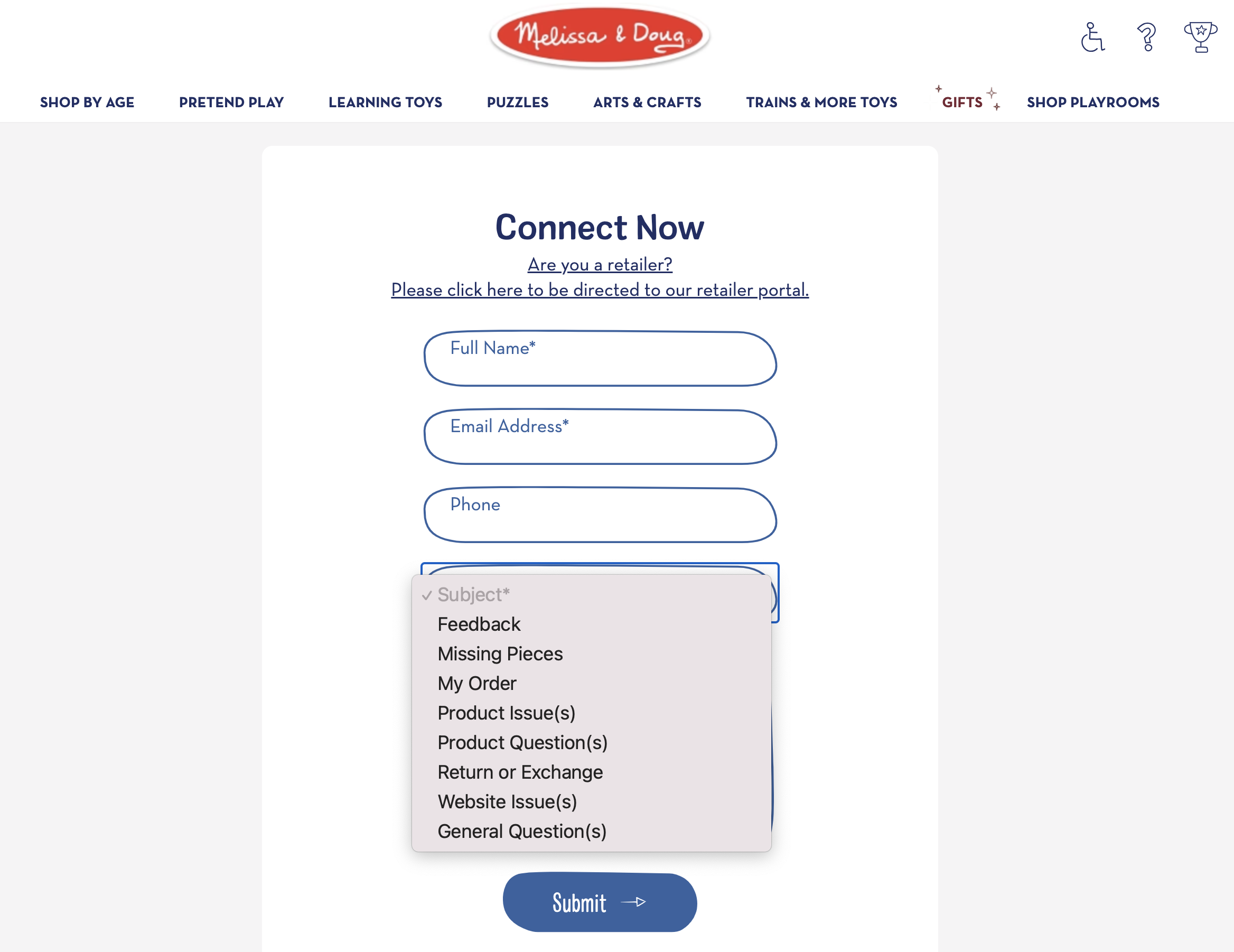
1. Melissa & Doug
This popular children’s puzzle maker offers a focused form that matches its whimsical branding. A dropdown box allows visitors to select the kind of help they need, from checking order status to replacing missing puzzle pieces.
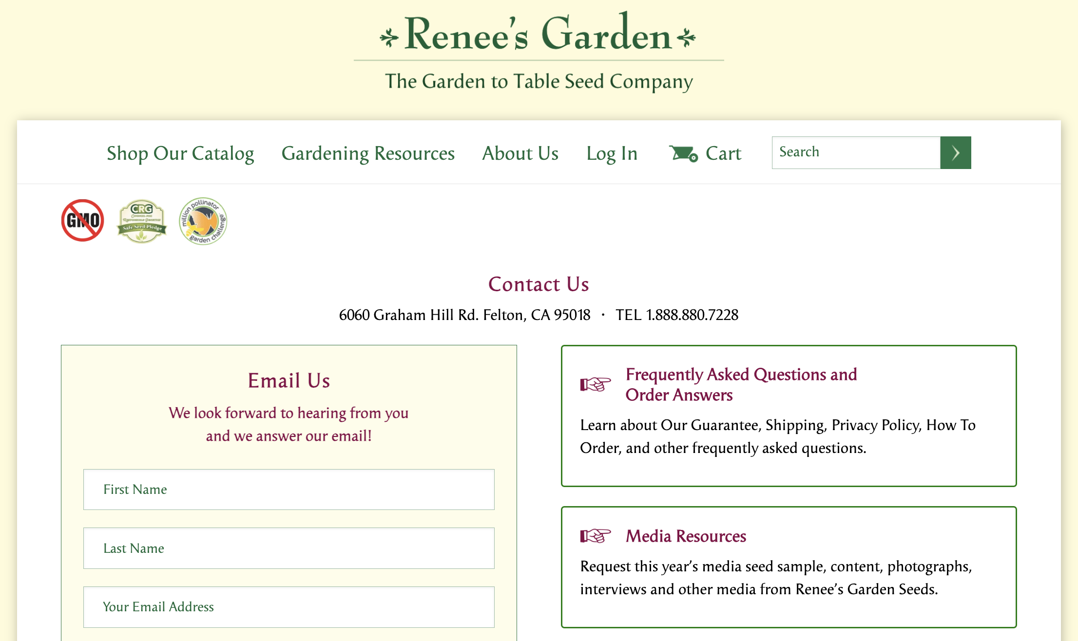
2. Renee’s Garden
This garden supply company boasts an on-brand, comprehensive contact page for almost every kind of customer inquiry. It includes additional instructions for timely responses and a newsletter signup call to action.
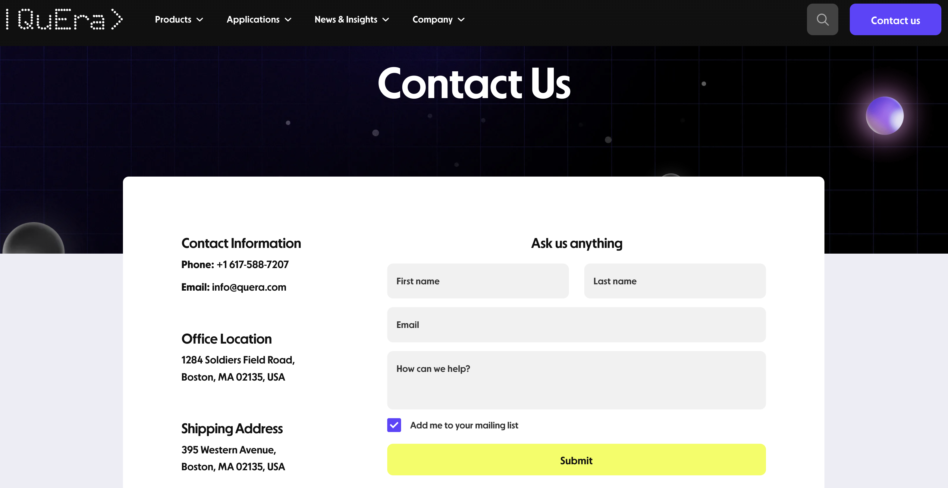
3. QuEra
This tech company’s contact page is clutter-free and boldly designed, with all relevant information placed above the fold.
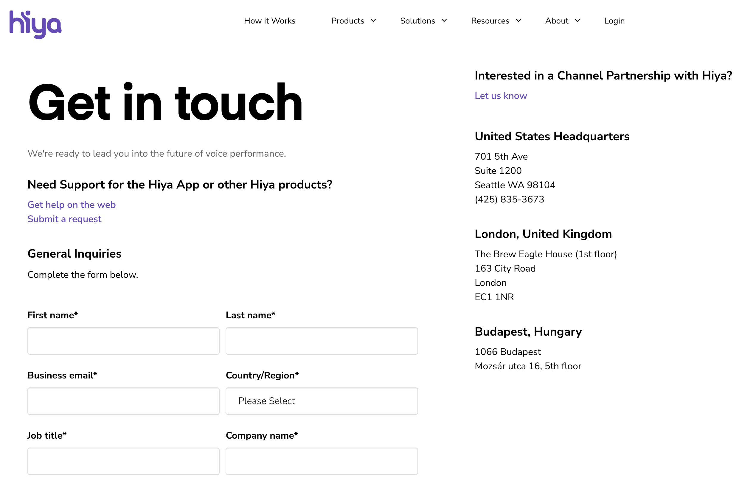
4. Hiya
This startup uses a combination of customer support links at the top of the page and a minimalist contact form at the bottom. Cues in the form fields help users input the correct data.
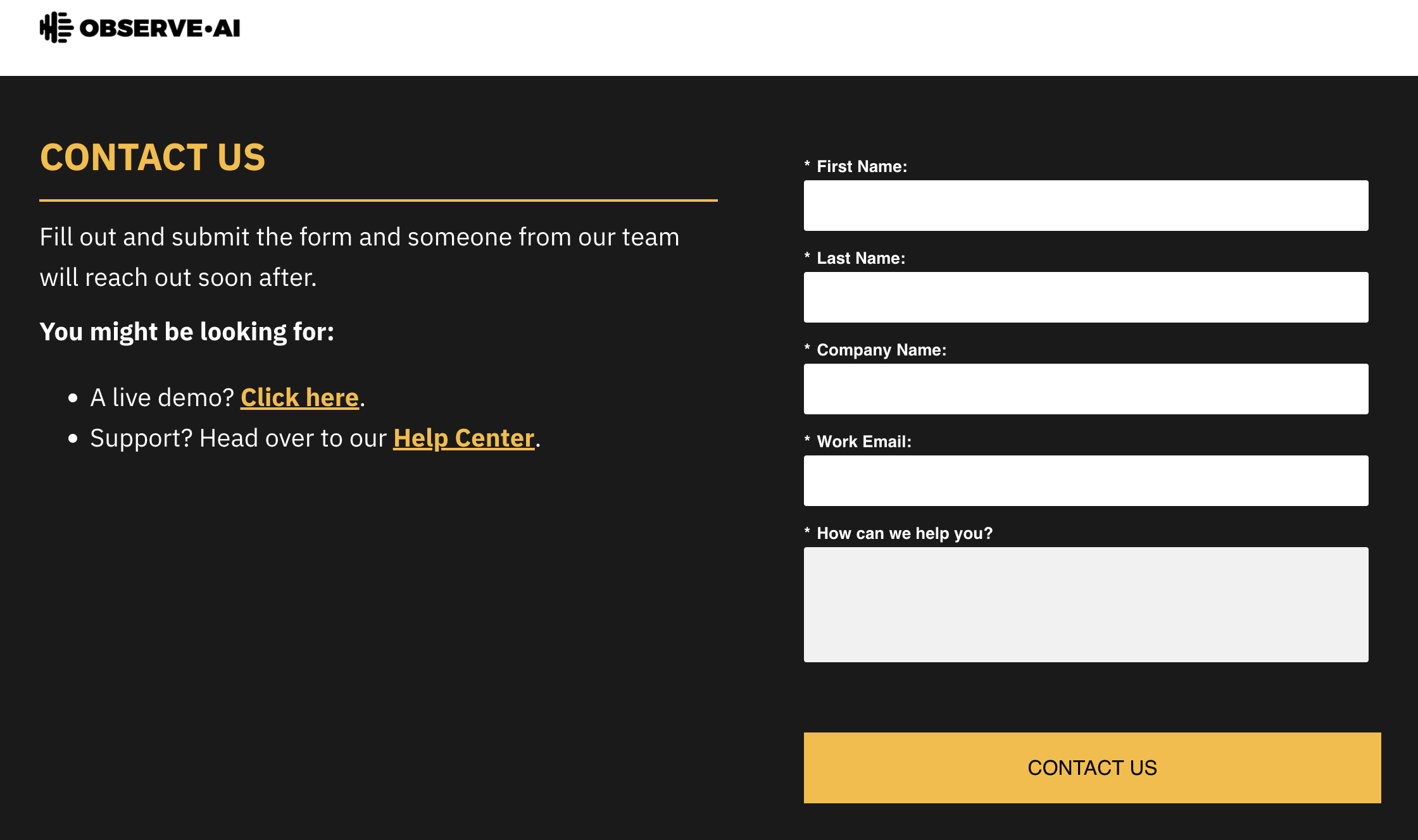
5. Observe.AI
The background and text color for this no-nonsense “Contact Us” page example are on brand for this AI company. The page is easy to read, while the contact form itself is short and sweet. Visitors can easily input their information and questions or access a live demo in seconds. The result is an aesthetically pleasing format that gets the job done.
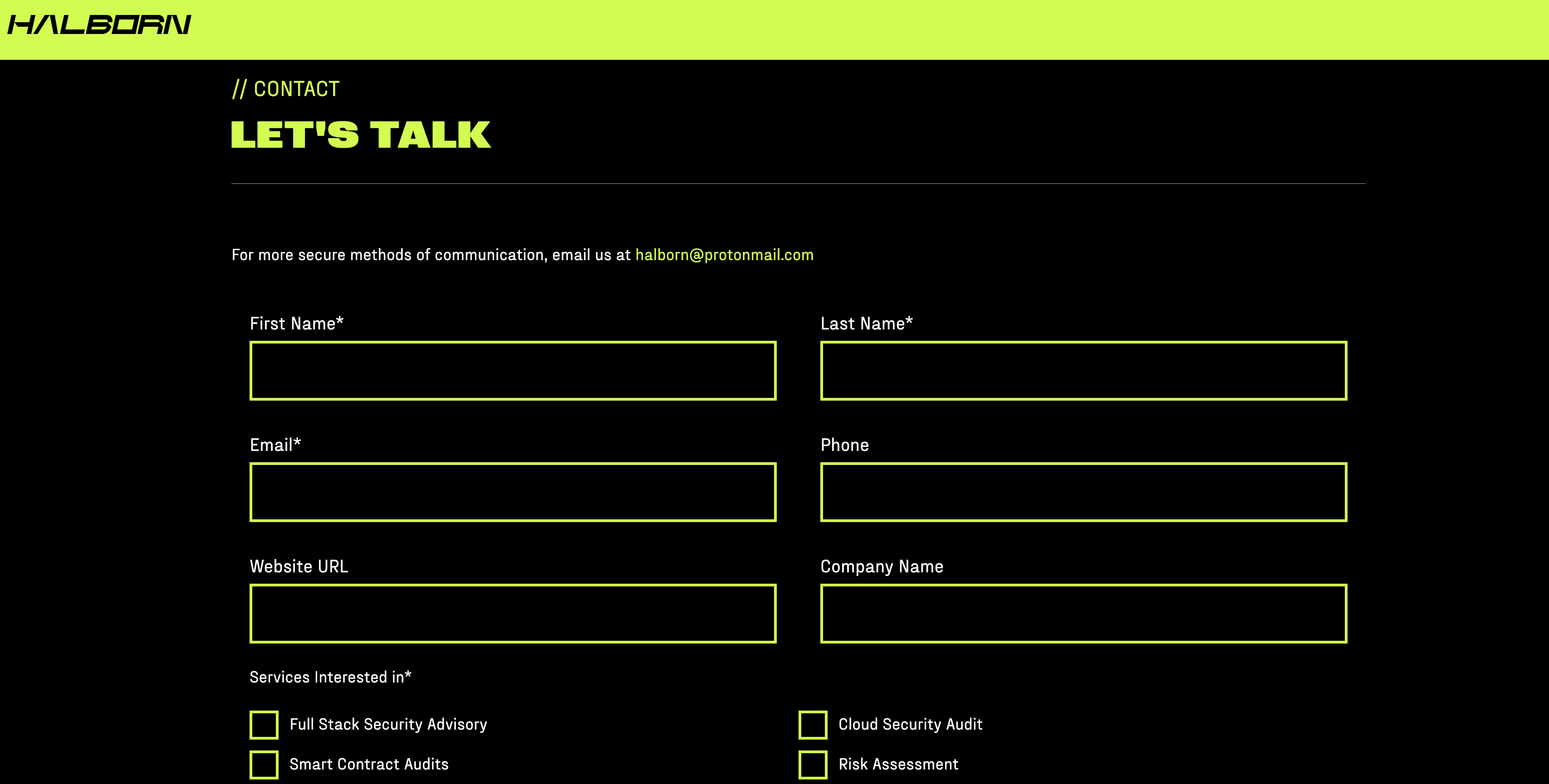
6. Halborn
This ethical blockchain hacker consultancy uses stunning retro computer graphics and sleek animation in line with the company’s branding to grab visitors’ attention. CAPTCHA verification deters spammers, while a ProtonMail email contact option offers inquirers added security.
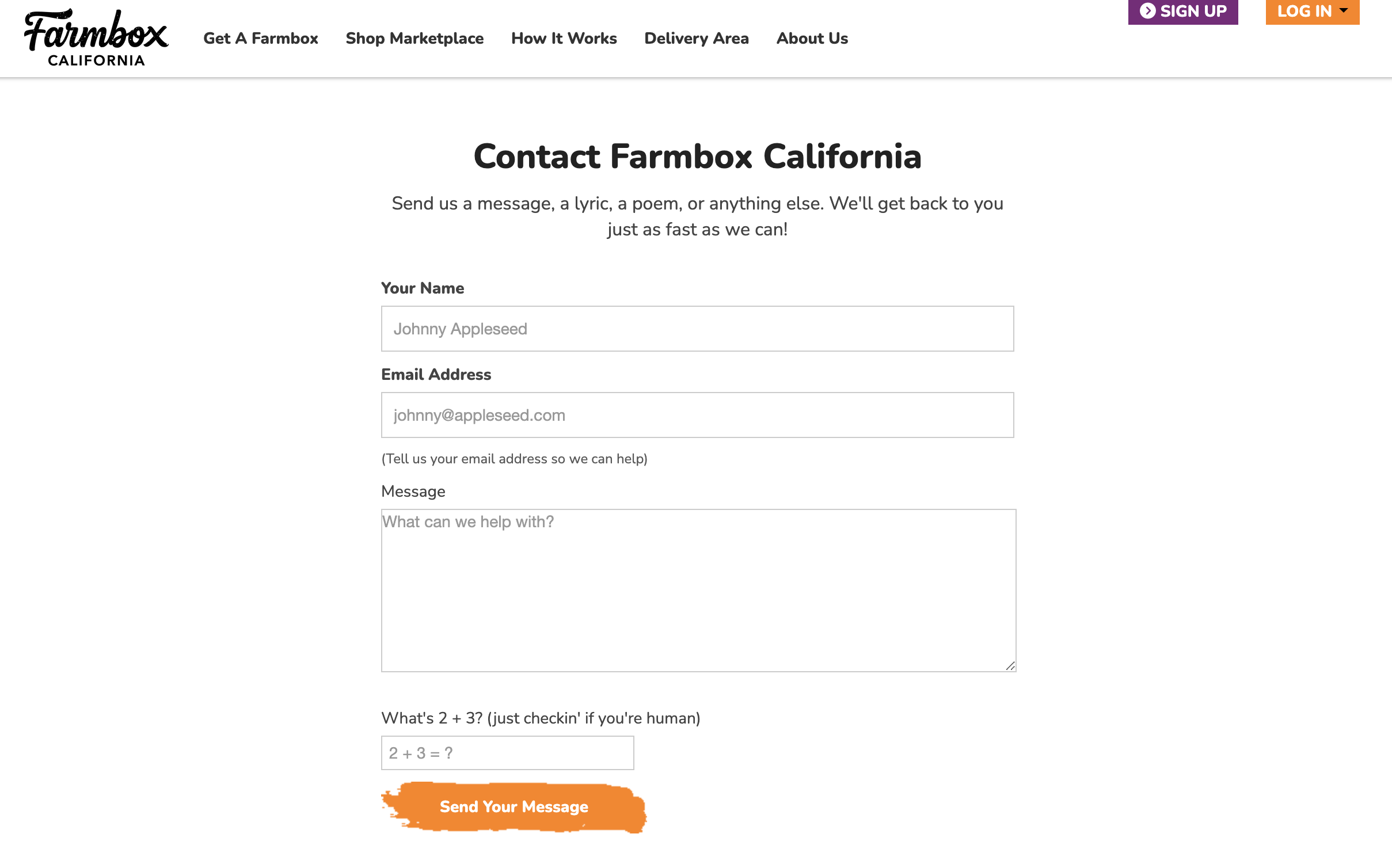
7. Farmbox California
With this contact page’s warm opening line, “Send us a message, a lyric, a poem, or anything else,” visitors instantly feel the brand’s personality. The short form leaves room for social media icons, an email contact address, and the brand’s mailing information, so visitors have multiple ways to reach out.
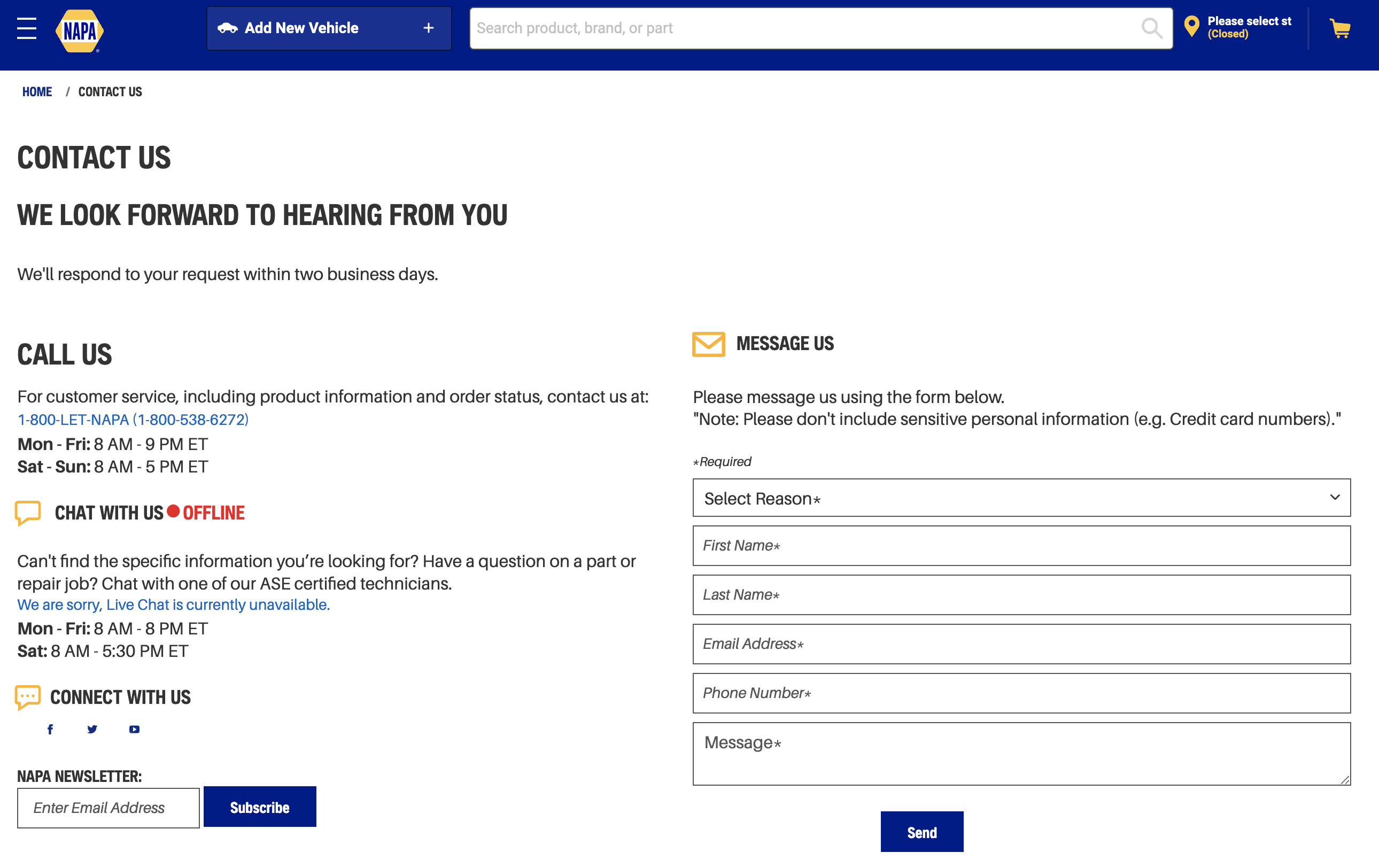
8. NAPA
This “Contact Us” page example from automotive parts corporation NAPA includes a little of everything, from the online status of chat reps and social media accounts to a newsletter subscription offer. The contact form itself includes handy dropdown functionality to direct inquiries to the correct department.
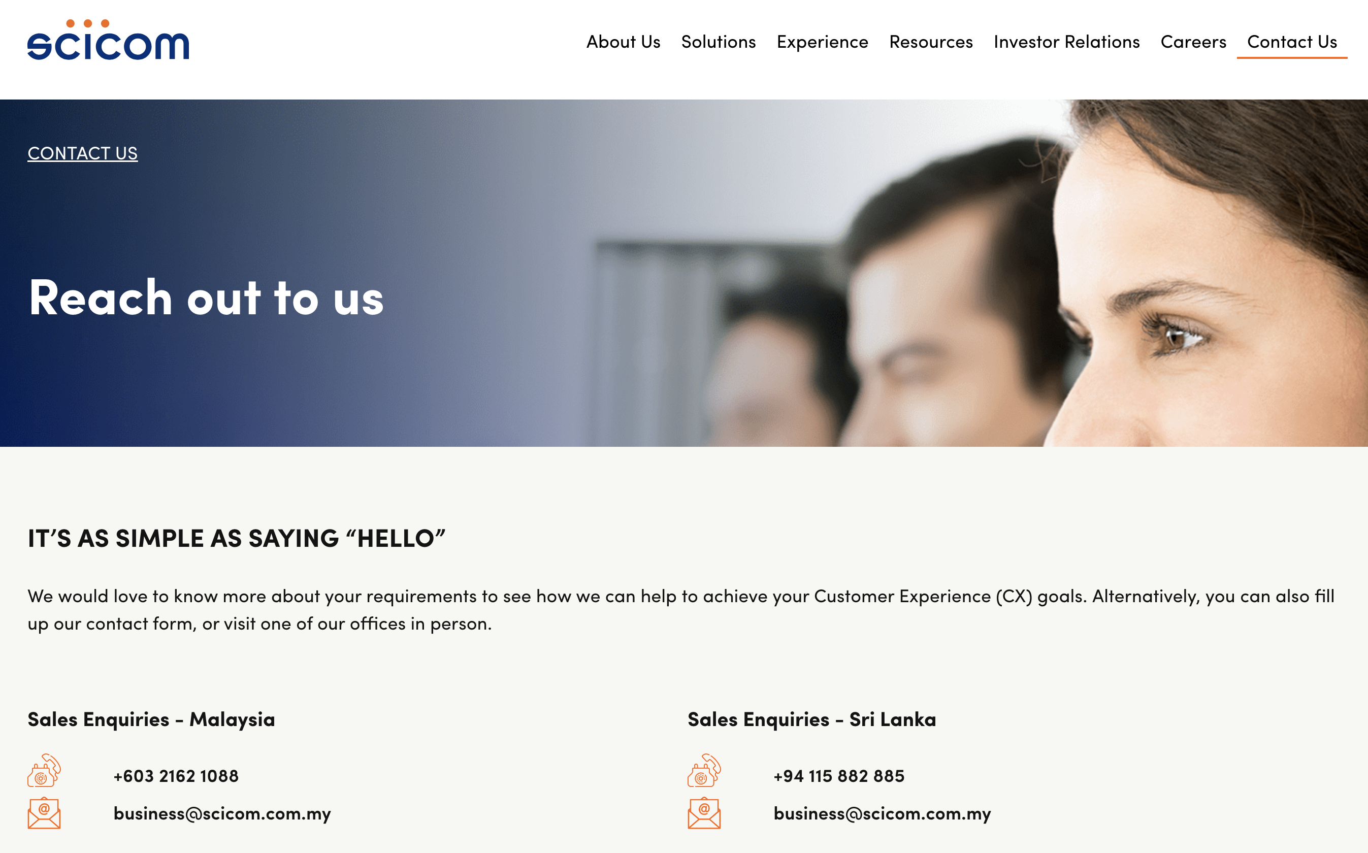
9. Scicom
This contact page includes the company’s mailing address, complete with a navigational map and a simple form for inquiries. It also includes a phone number and email address for more direct communication.
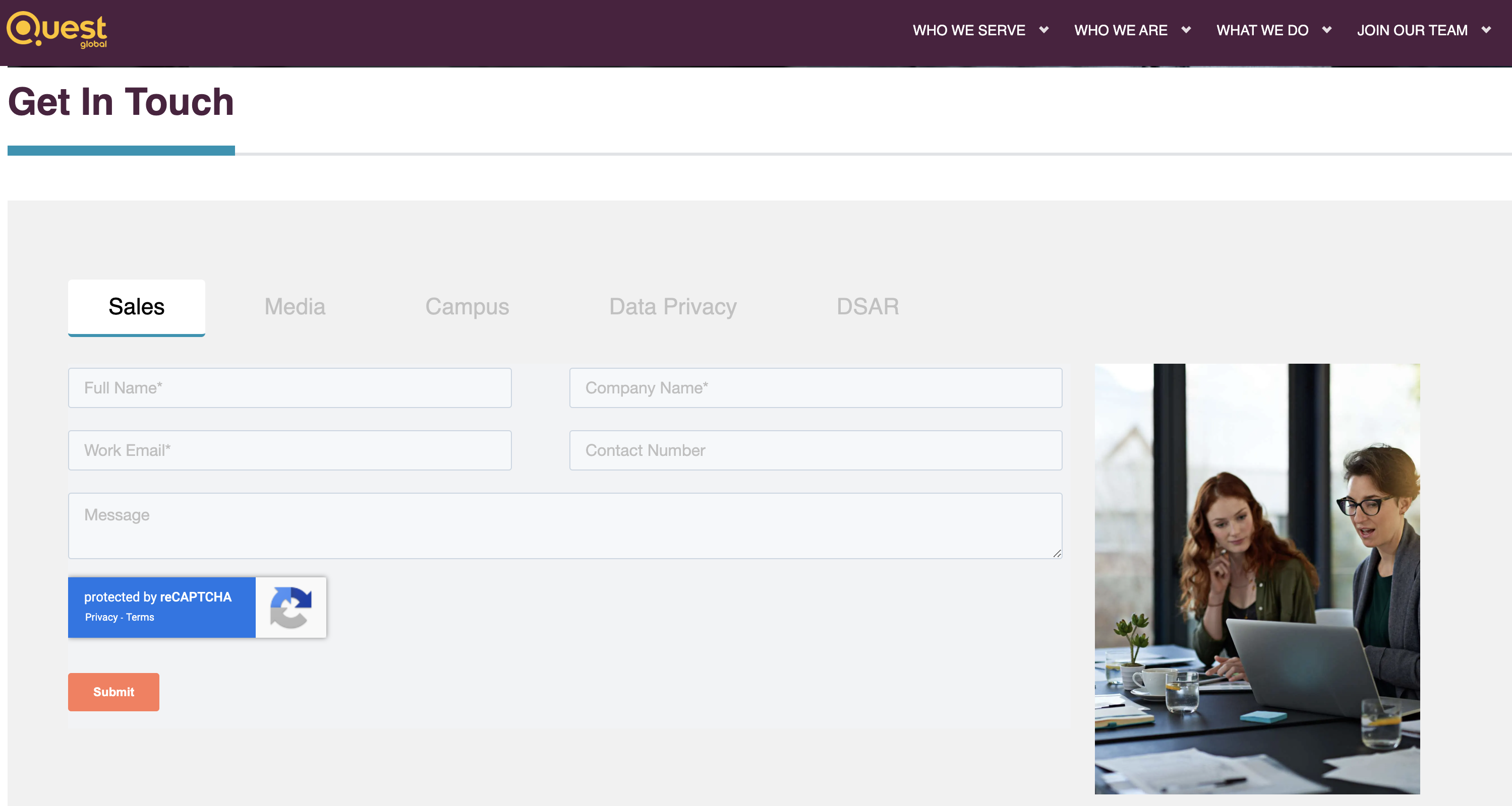
10. Quest Global
This international company makes clever use of tabs, which users can toggle through to get the best contact form for their needs. The Campus, Data Privacy, and DSAR forms also include email ID fields to ensure users enter a valid email address.
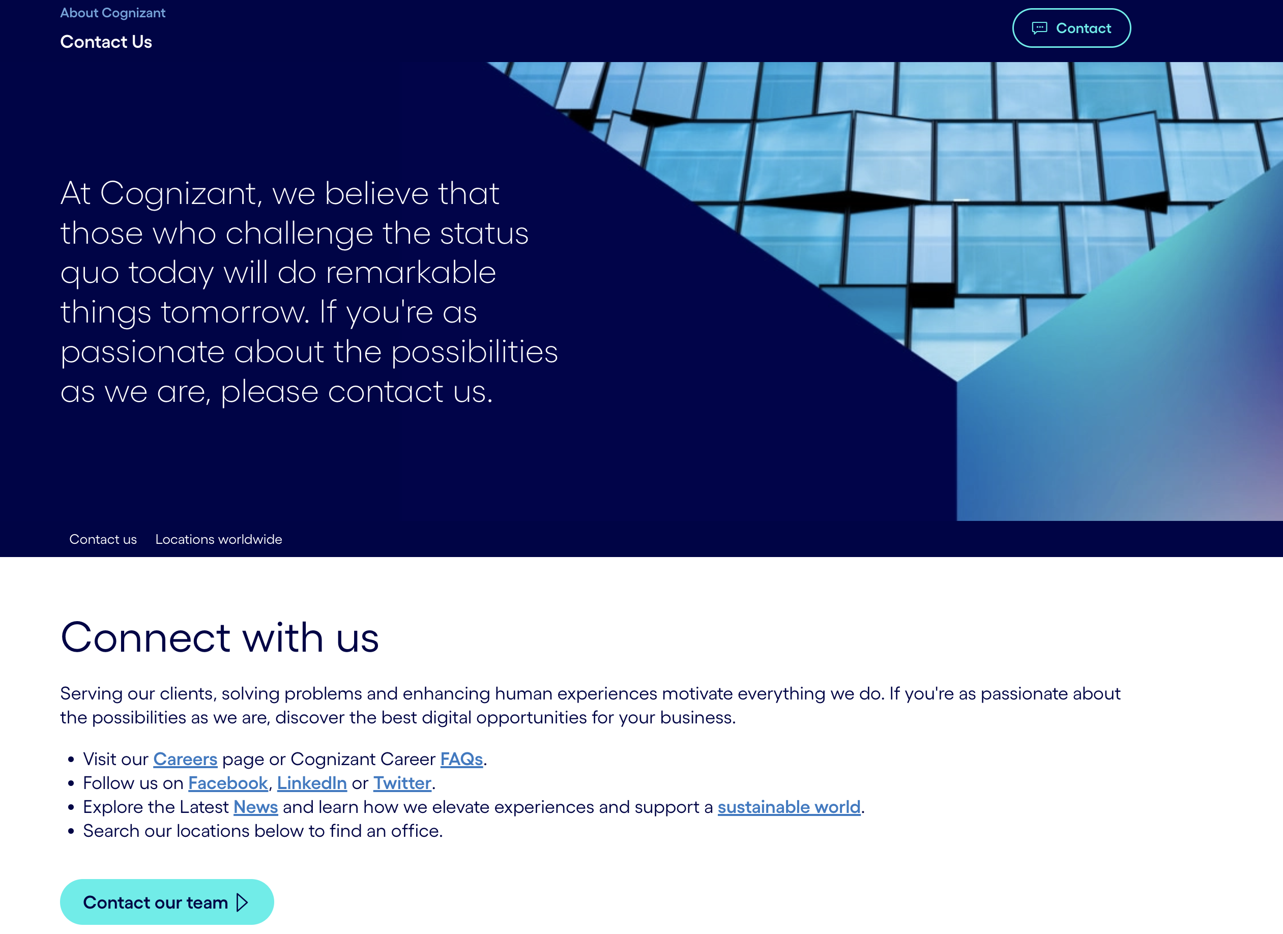
11. Cognizant
Cognizant’s “Contact Us” page is massive and loaded with links to pages for FAQs, career opportunities, the latest company news, and more. The company’s contact form includes a region field (North America, Europe, etc.), which makes sense for larger companies operating in different parts of the world.
12. Zendesk

This contact page is effective mainly because it provides all the contact options and information visitors need to get in touch. This contact page features two prominently displayed contact CTAs and includes a long list of their locations and ways to contact them.
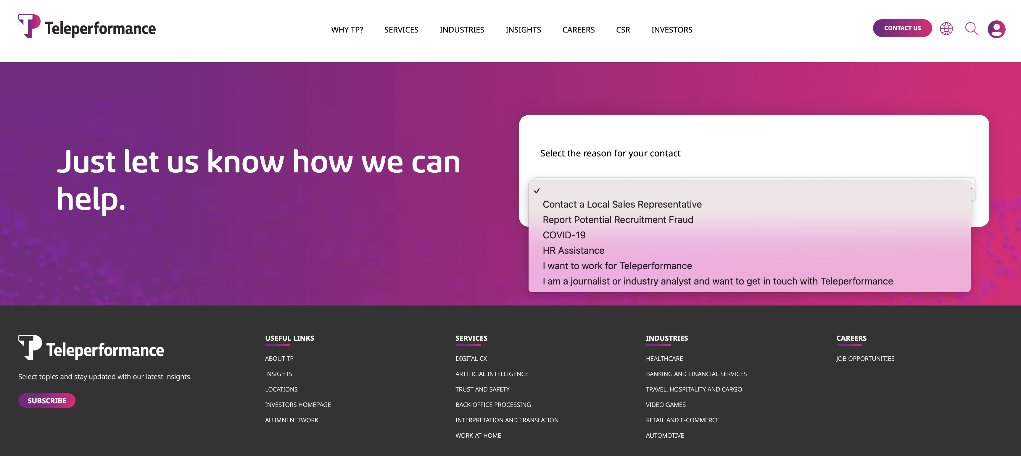
13. Teleperformance
This brightly colored contact page opens with a dropdown menu. Visitors must first select why they’re reaching out before accessing contact forms with more dropdowns, depending on their situation, language, and country of origin.
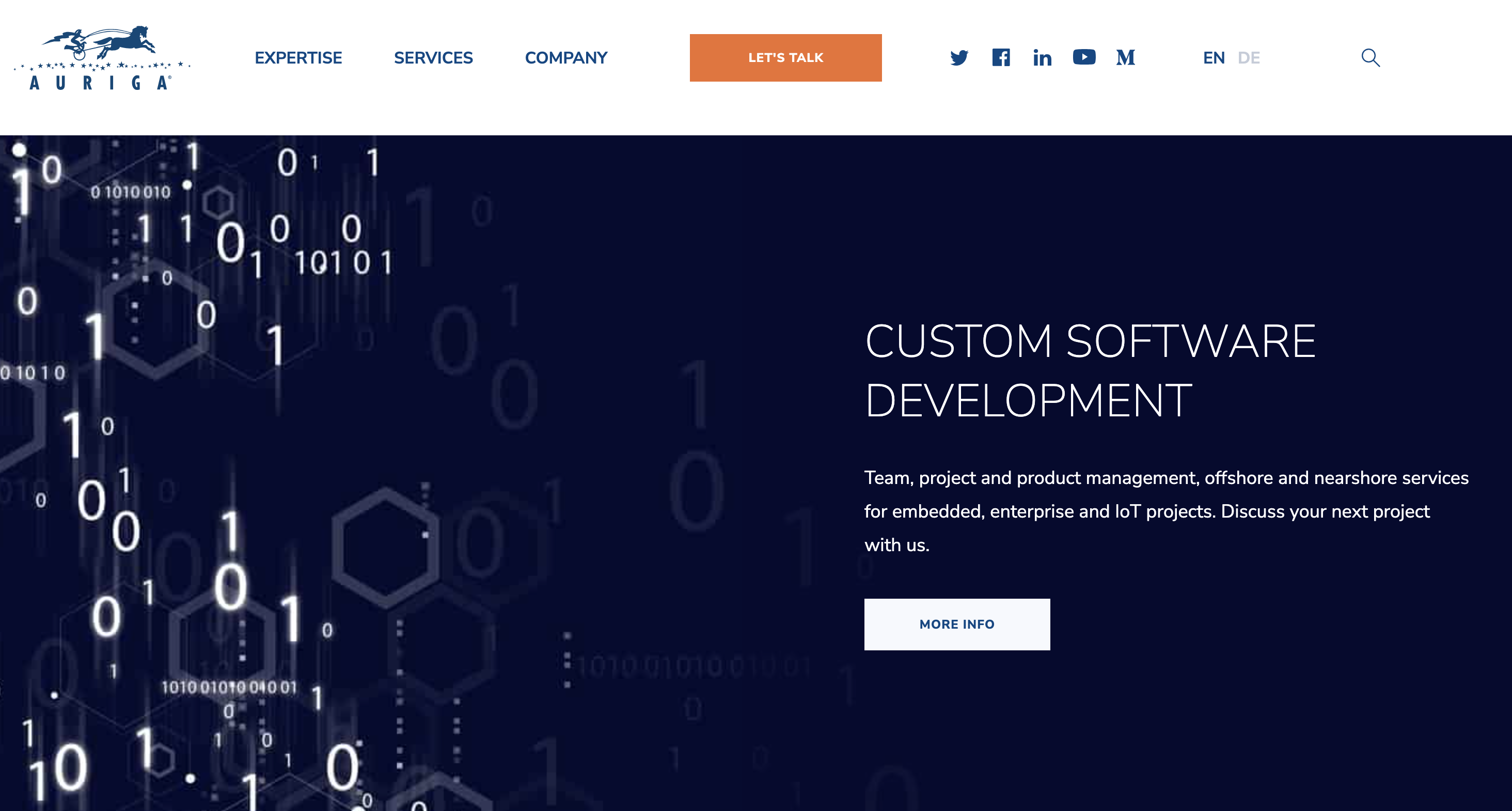
14. Auriga
Instead of a “Contact Us” page, Auriga uses a “Let’s talk” button in the top menu to open a short contact form in a popup. The form itself is straightforward, allowing visitors to submit their information and inquiry in seconds.
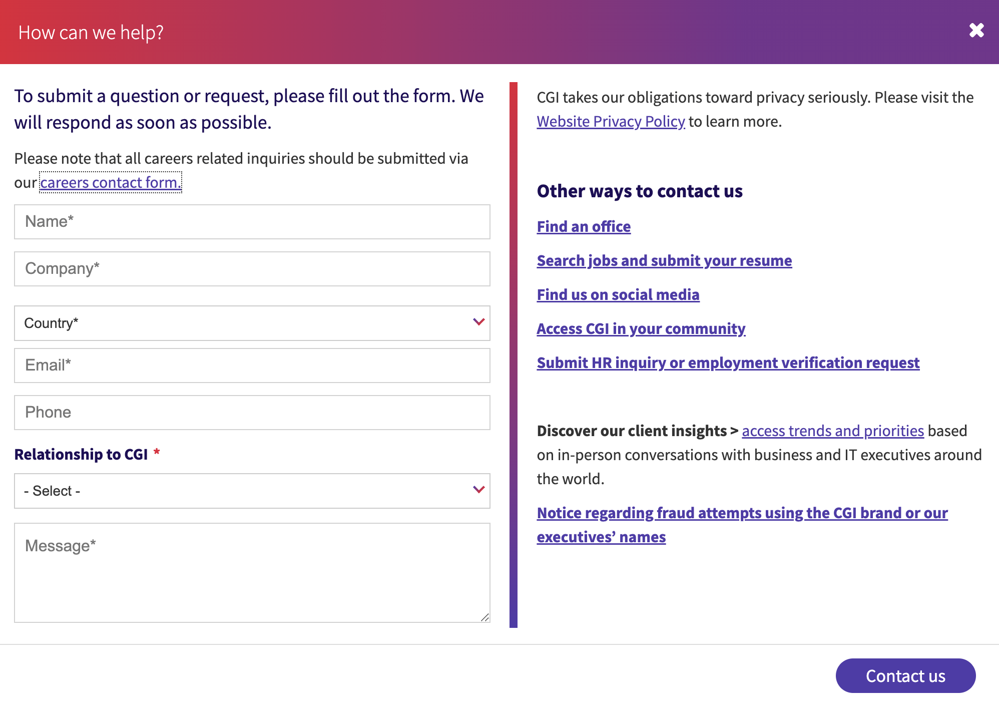
15. CGI
This is a well-designed popup form that includes a dropdown “Relationship to CGI” field (e.g. job seeker potential client, etc.) to help visitors specify what they’re looking for.
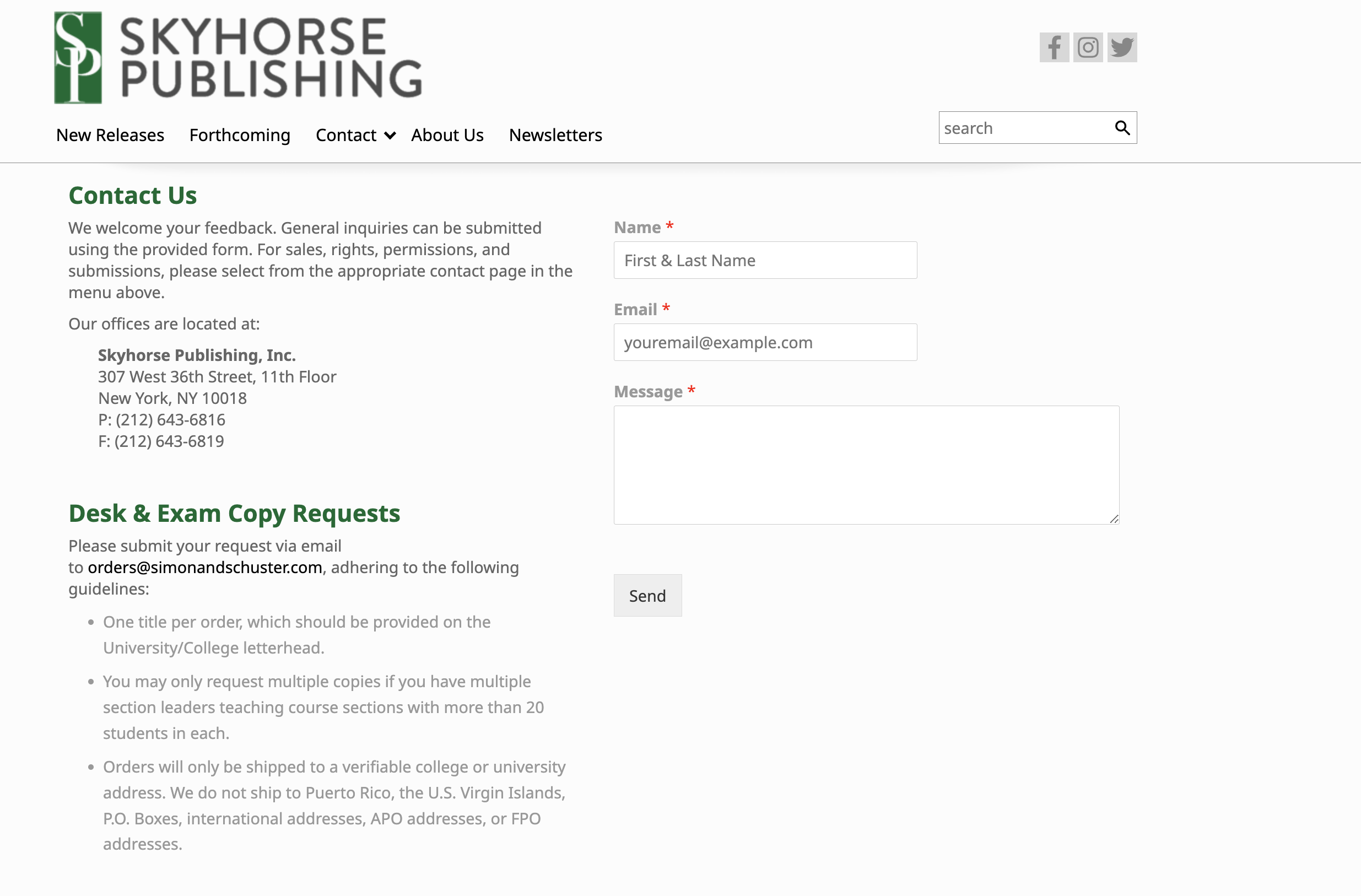
16. Skyhorse Publishing
The book publisher offers three contact forms on one page so PR professionals, readers, and academics can reach out to the right department from the get-go.
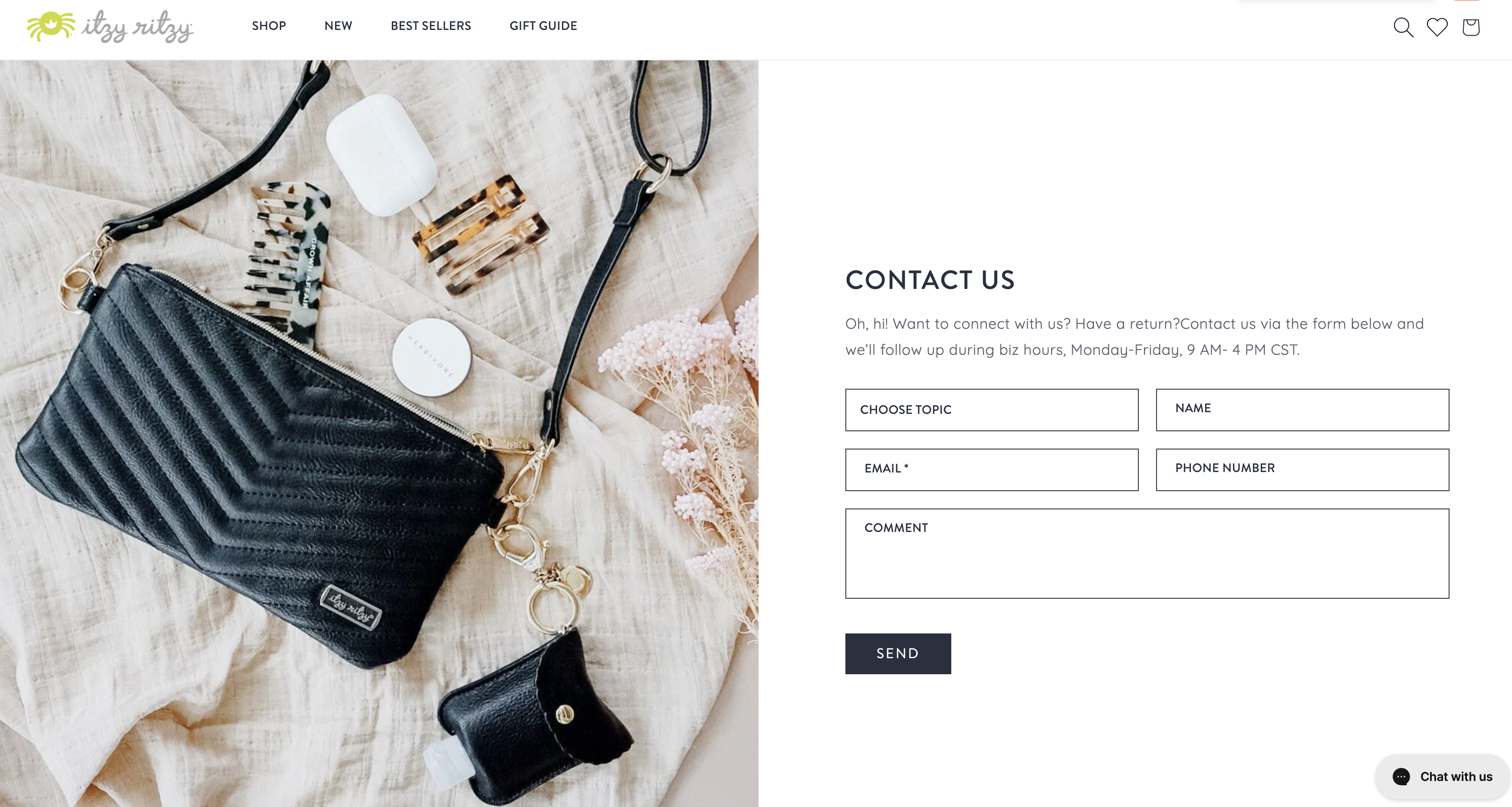
17. Itzy Ritzy
The witty copy and stunning page design help make this contact form stand out. Plus, a new- subscriber discount drives sales from this “Contact Us” page example in addition to allowing visitors to reach out.
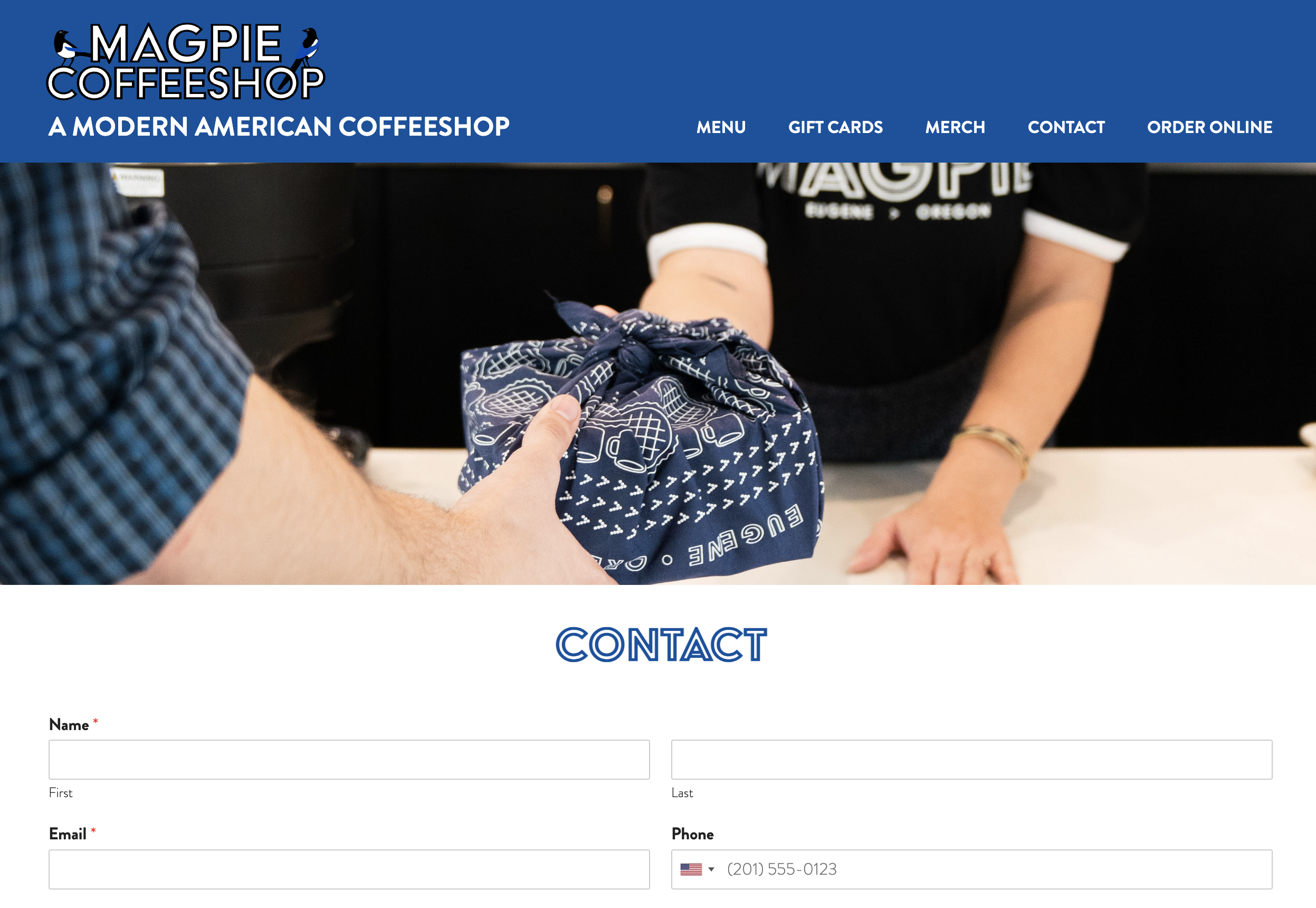
18. Magpie Coffeeshop
Bright blue accents and illustrated birds bring attention to this simple yet elegant contact form. It’s a good example of how branding can carry over across a website to help visitors feel comfortable when reaching out with a question or concern.
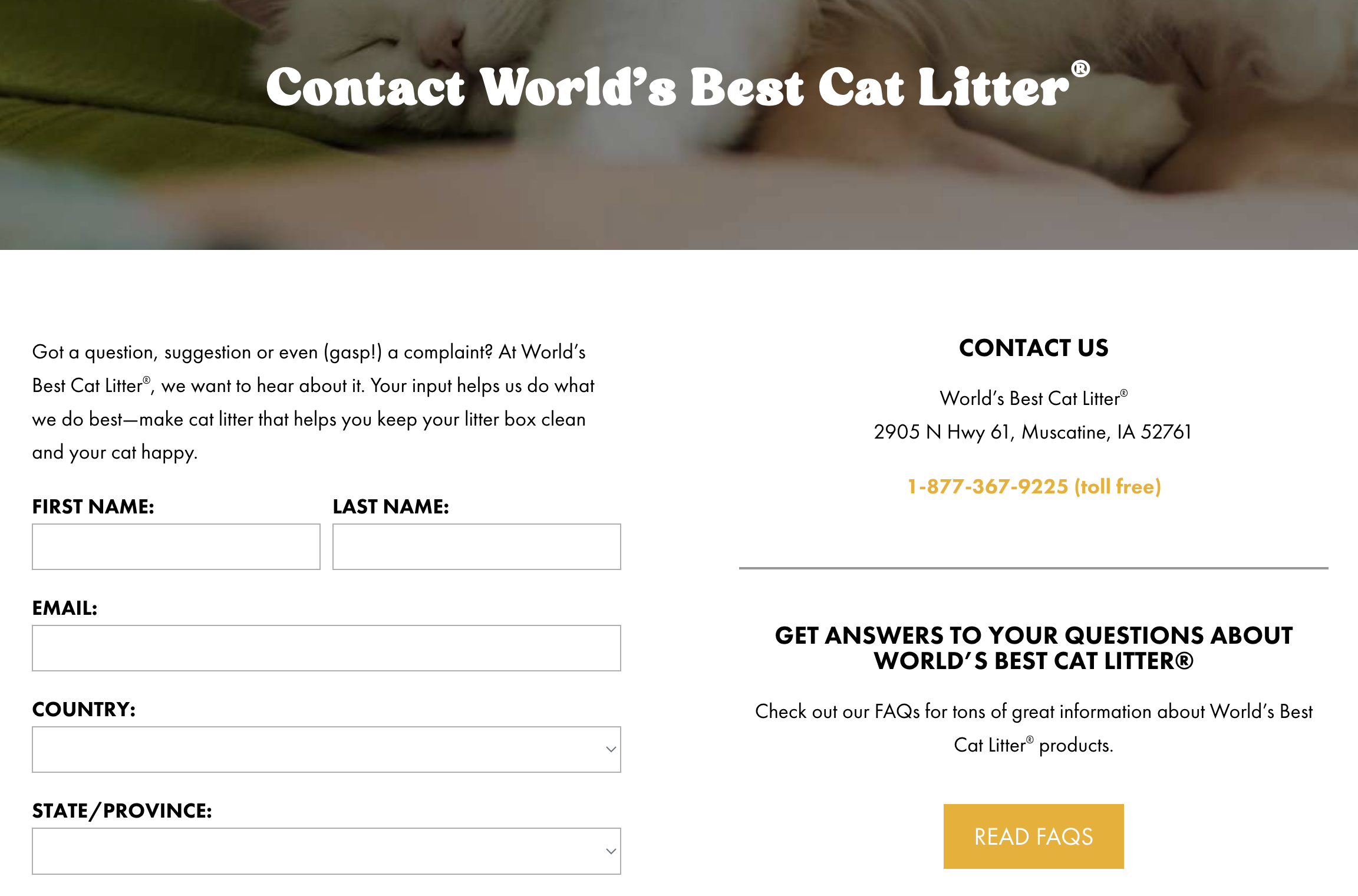
19. World’s Best Cat Litter
Bold messaging and font bring this “Contact Us” page example’s design together. Providing a FAQs button on the same page allows customers to potentially find the information they need without submitting an inquiry.
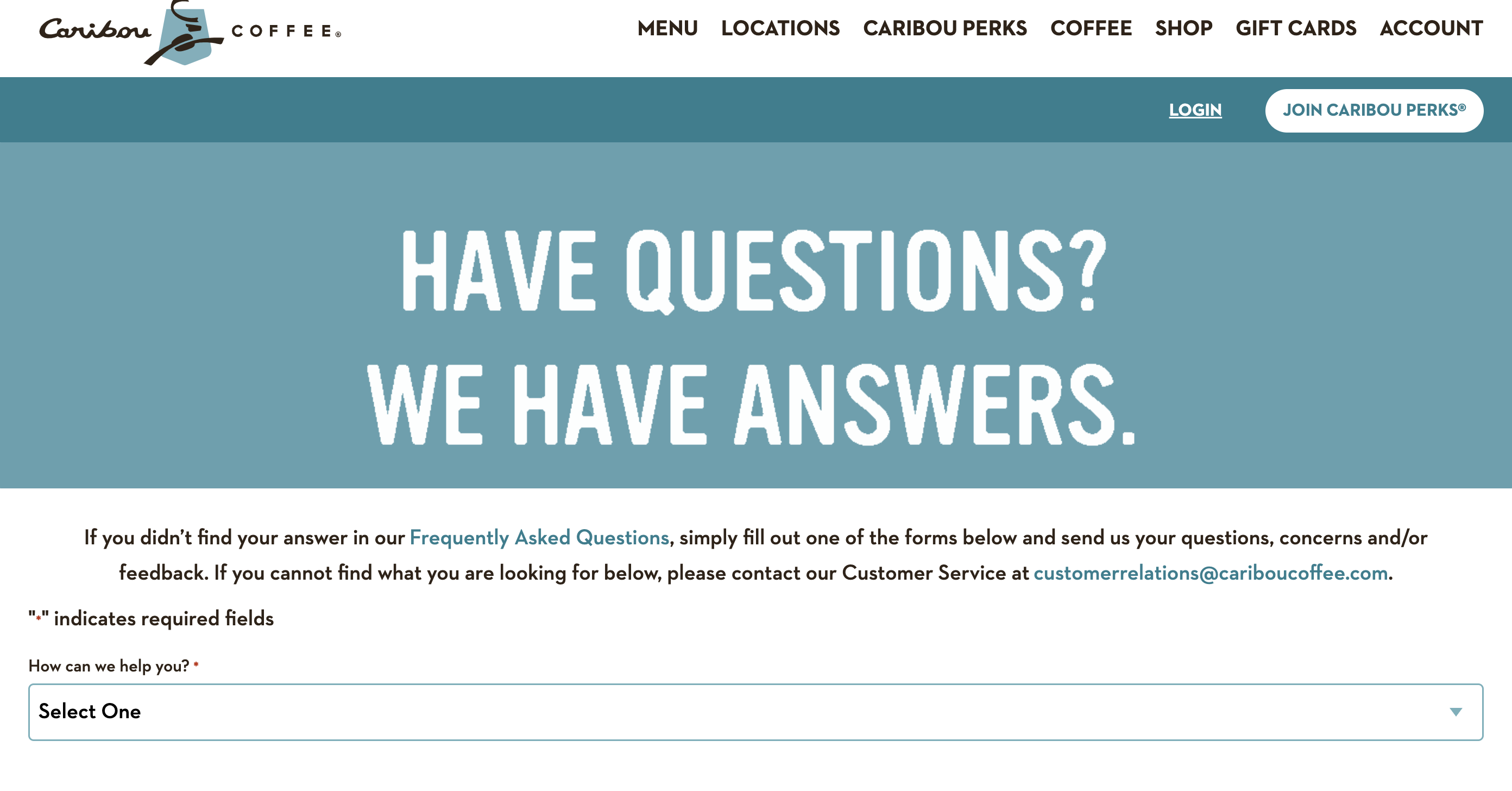
20. Caribou Coffee
A large header and simple dropdown menu get visitors the form they need quickly so they can send a message and be on their way.
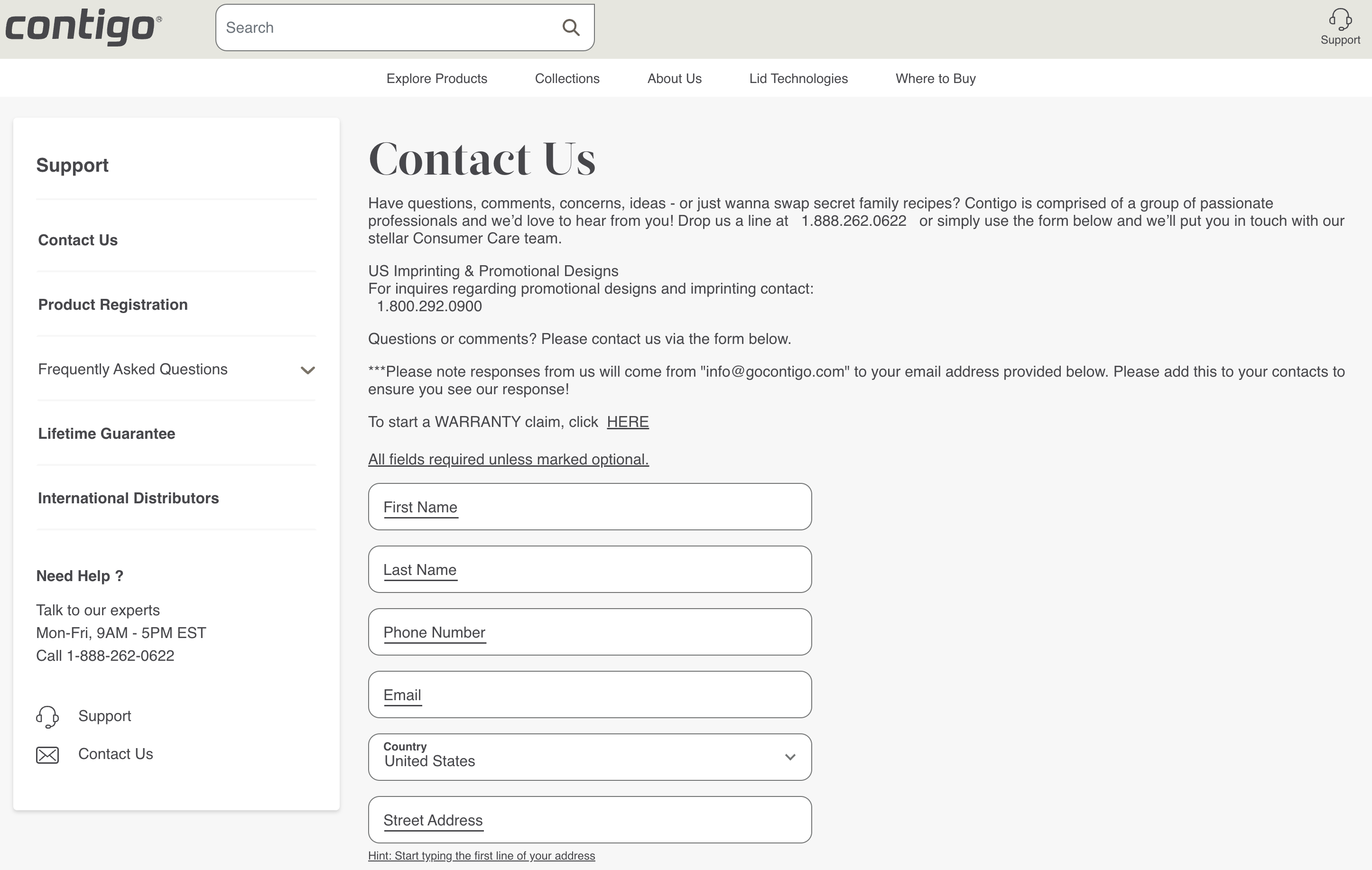
21. Contigo
This travel mug company encourages customers to share concerns or “swap secret family recipes” with their well-designed form.
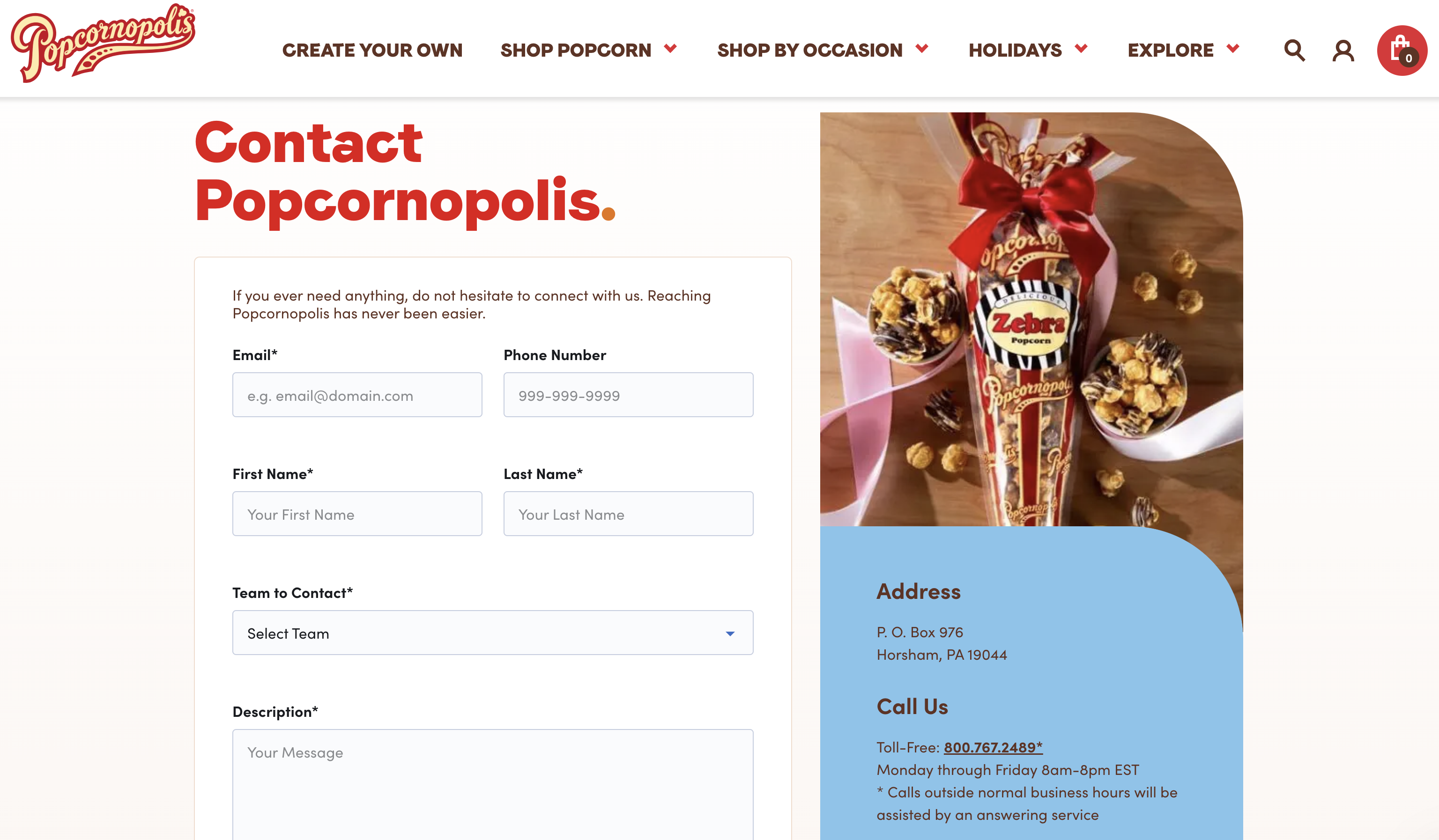
22. Popcornopolis
This contact page matches the delightfully fun design found across the website, while the thorough form fields allow customers to input their contact information, descriptions of their requests, and upload an image.
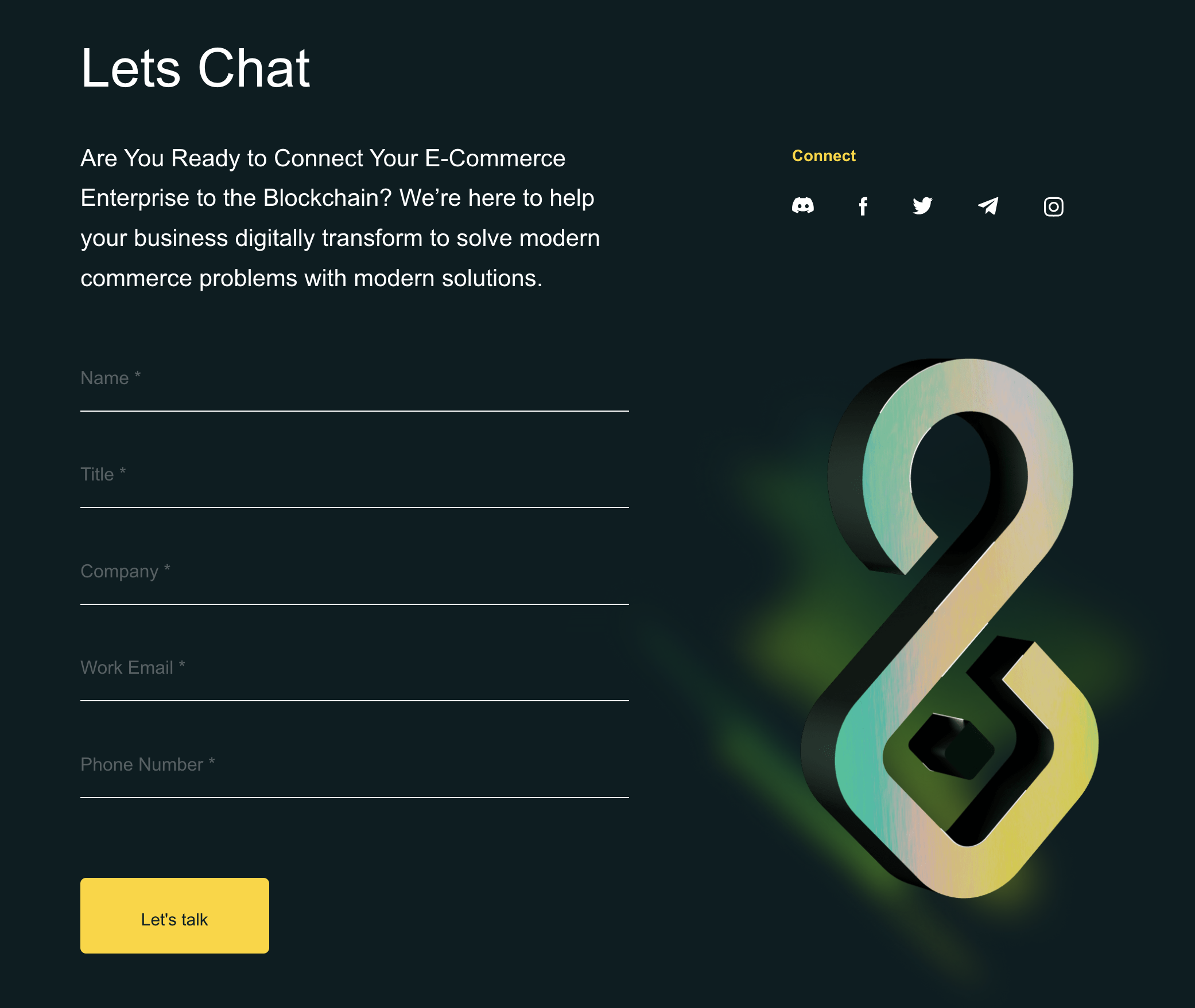
23. SHOPX
This blockchain-focused company has a super-sleek contact page with animation, stylized text, and modern, minimalist social media icons.
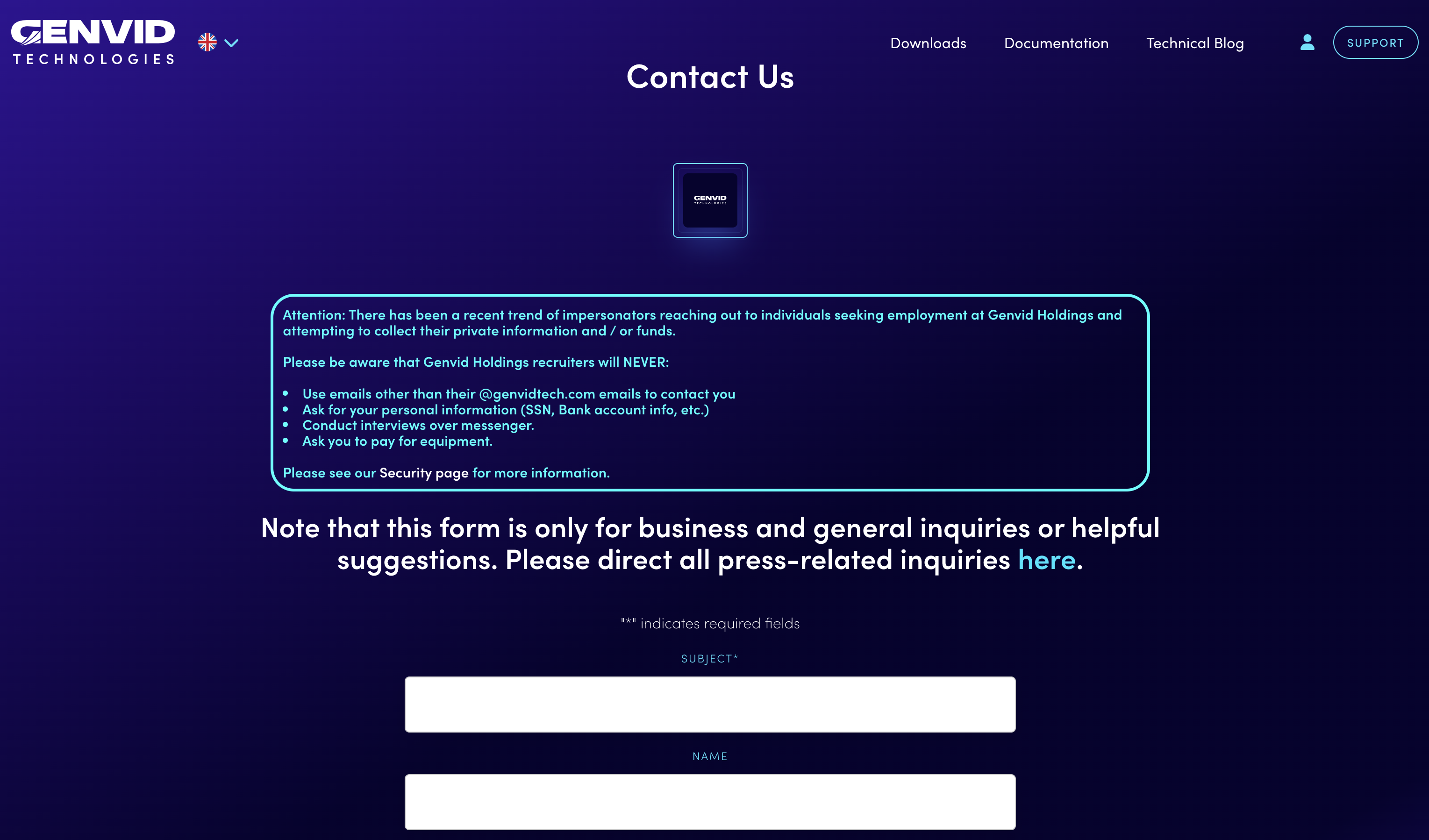
24. Genvid Technologies
Going the extra mile to protect customers, Genvid lists a lengthy disclosure at the top of their contact form to help whitelist the company’s replies and block spammers.
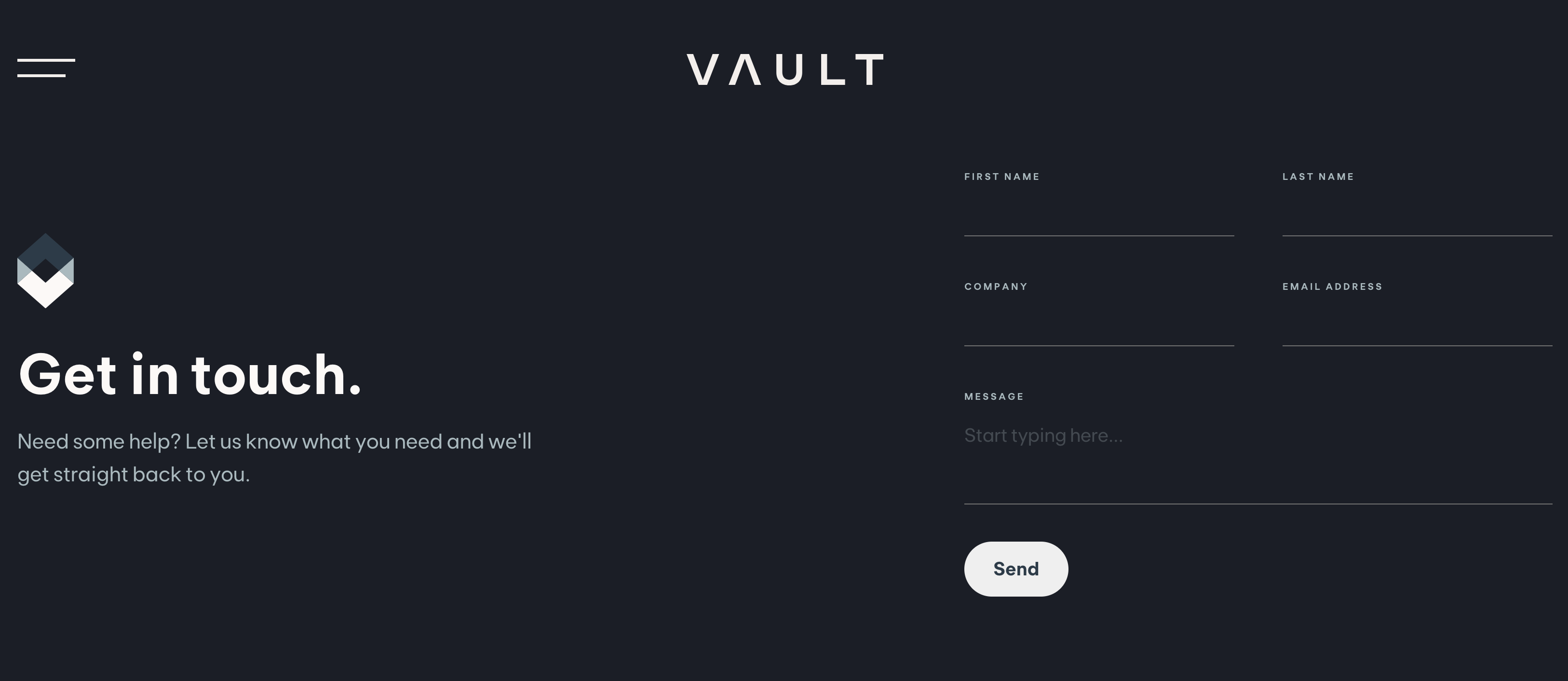
25. Vault
A dark, minimalist design and just a few form fields give this tech company’s contact page a sophisticated look.
What to include on a “contact us” page
There are a few key elements you should consider including on your contact page to ensure its effectiveness. Without these, you may risk losing out on potential leads or the opportunity to address serious issues.
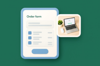
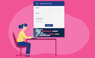
- Contact form: A contact form is the most essential part of your “contact us” page. Be sure to include a form that’s clear, concise, and user friendly.
- Alternate contact options: These options could include a chatbot, an email address, or even a phone number for your call center.
- Social links: Providing links to your social media can help boost interactions and offer another method of communication for users.
- Business hours and address: This information can help users determine when to visit your business and how to get there.
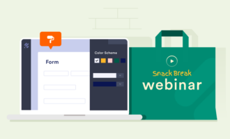
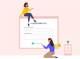
While all of these elements will help boost your contact page’s effectiveness, none is more important than the contact form. That’s why you need a tool that can build effective forms with ease.
The easy, effective way to create a “contact us” page form
Contact forms are important, but they shouldn’t be too time-consuming to create. That’s what makes Jotform’s Contact Form Builder so beneficial to your business. With Jotform, you can generate the ideal contact form for your website in minutes with our easy-to-use, drag-and-drop form builder.
Jotform also offers users a number of other benefits, such as
- More than 400 contact form templates to choose from
- Automatic data storage with Jotform Tables
- No-code app building with Jotform Apps
- Offline forms through the Jotform Mobile Forms App
Learning how to set up a contact form in Jotform is simple, which means you can build your “contact us” page the way you want in no time at all. Once you design a “contact us” page that fits your needs and optimize it for your users, you’ll quickly discover how much your business can benefit from better communication online.
Photo by Michael Burrows


Send Comment: