
Do you know anyone who loves filling out online forms?
Thought so. Me neither.
Can you remember an occasion when filling out a form left you feeling like kicking something? A time you became so exasperated that you just gave up?
Let’s face it: even at the best of times, filling out online forms can be a little bit dull. At the worst of times, it can be complex, time-consuming and confusing. Thoughtful form design can make the experience faster, clearer, and easier to complete.
We need online forms, so the answer isn’t to do away with them. But can we change the experience of filling them out? Here at Jotform, we think so. In fact, our mission is to create forms that make the user experience as seamless and stress-free as possible.
I would like to share how we managed to double payment form conversion rates with our new design.
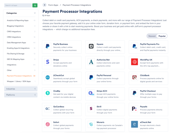
Payment forms
One of the most popular forms on Jotform is payment processing, for obvious reasons. With the help of our forms, users collected more than $300 million in 2017 alone, using PayPal, Square, Stripe, Authorize.net and many other payment gateways.
For a payment to be processed successfully, the user needs to be able to navigate through the form obstacle-free.
Distractions, errors or anything that irritates the user can result in an abandoned form — and a lost sale.
The tricky thing is that forms can grow long pretty quickly. And we know that, that when faced with a long form, many people simply give up. That’s why we decided to reinvent form-filling by creating Jotform Cards: simple, friendly and intuitive.
When we measured the time it takes Jotform Card users to fill out a form, we discovered a huge decrease compared to traditional forms. Quick and easy forms lead to higher conversions.
Here’s how:
1. One-question-per-page layout
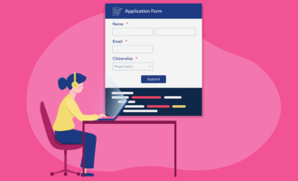
Our classic forms — although still useful — display all the questions, plus the payment section, on one page. This can quickly overwhelm the user.
Jotform classic with all questions on a single screen. So, we decided to split this complex process into multiple smaller pieces. Card Forms have a one-question-per-page layout.
Jotform Cards where every question is displayed on a single card. Apart from the question, there is nothing displayed on the page (except Next and Previous commands). That’s all the user has to focus on. After the form has been filled out, the focus shifts smoothly onto the payment form. No faffing about.
2. Fewer mistakes
Every obstacle that stands in a user’s way will make them less likely to complete their form. That includes setbacks caused by typos or accidental actions. So we’ve made it a priority to reduce these. As you can see on the animation below, Card Forms work to recognizes users’ mistakes.
It will automatically recover the email address of a user who’s entered the domain name wrong e.g. john@gnail.com should be john@gmail.com. Plus, the design warns users with a shaking micro-animation when an error has been made. No more delays.
3. Less information required
Required information is, well, required. But, after taking a long hard look at our old forms, we realized that they made it hard for the respondent to complete the form — let alone make a successful payment.
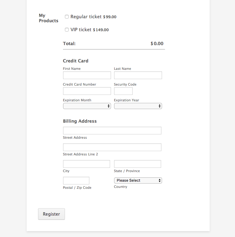
Our old forms with too many details. They simply asked for too much detail. We took that on board. Jotform Cards only asks for the bare minimum of information, with all content displayed in easily digestible chunks.
Jotform Cards only asks for what is required. By eliminating unnecessary distractions, we allow users to focus completely on the task at hand.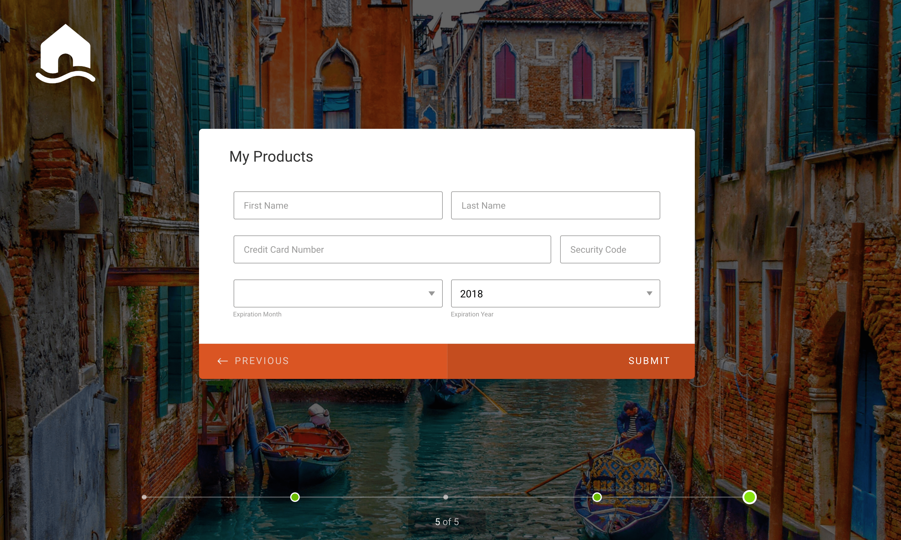
Over to you
We created Cards to make filling out forms more fun, quick and easy. This increases the likelihood of successful submissions, which results in more revenue — and more happy users. Everyone wins. Just the way we like it. But don’t take my word for it. The proof is in the pudding.


Send Comment: