Selecting the best font for forms that you create, publish, and distribute matters more than many people may realize. In fact, your choice of typeface can literally determine how quickly and comfortably another person fills out your form.
Form completion rate and overall user experience (UX) are both directly impacted by form design, particularly font selection. Studies show that typography (i.e., font family, spacing, and letter shape) affects reading speed, ability to parse information, and even level of comfort. A form that uses a poorly chosen font can introduce friction, lead to misreading information, and even increase form abandonment.
There’s no single font that outperforms all others in every possible situation. But you can find safe, versatile choices that perform reliably across many industries and use cases. In this article, we’ll explore 12 “safer bet” fonts with clean, simple visual forms and readable spacing, as well as the key to choosing a font that works for you, no matter what kind of form you’re creating.
What makes a good font for forms?
Choosing the best font for forms really boils down to how quickly and accurately your users can read, understand, and complete each field. Whether you’re building medical intake forms, legal PDFs, or Google Forms-based surveys, the same core criteria apply.
1. Legibility at small sizes: Most forms rely on text that’s 10–12 point (pt) in size. An ideal font maintains clarity at that size with a balanced stroke width, steady spacing, and open counters – that is, the partially enclosed interior spaces in letters such as a, c, e, and s, among others.
2. Simple, functional letterforms: Decorative, handwritten, and overly stylized typefaces slow down your reader and may increase the risk of errors. Simple sans serif and clean serif font choices usually work better than script and novelty fonts for the task-based reading that forms require.
3. Wide availability: Forms must render consistently across multiple kinds of devices, browsers, and PDF software. Prioritize system fonts to prevent unfortunate layout changes, clipped characters, or inconsistencies in font substitutions.
4. Accessibility and contrast: The font you choose for your form should be readable under Web Content Accessibility Guidelines (WCAG) as well as the Americans with Disabilities Act (ADA) accessibility requirements. Fonts with generous x-heights and clear shapes hold up better in both high-contrast and low-contrast environments.
5. Tone that fits the context: Clean serif fonts like Georgia and Merriweather often convey more authority, while neutral sans-serif fonts like Roboto and Open Sans communicate friendliness and efficiency. A font that aligns with the tone of the form’s content improves its perceived credibility.
6. Clear, distinct characters: For too many form fonts, the characters I/l/1 all look nearly identical. This can cause transcription errors — a serious risk, especially for medical, legal, and financial forms. Many fonts intentionally differentiate these shapes, making them better choices for forms.
7. Professional, trust-building appearance: Generally, it’s better to select a polished, neutral typeface for your forms. These kinds of fonts help increase a sense of reliability and can reduce user hesitation. By contrast, fonts with a playful appearance can come across as “gimmicky” on a form, undermining user confidence.
8. Neurodiversity- and dyslexia-friendly: Finally, wherever possible, it’s smart to choose fonts with a steady rhythm, generous spacing between characters, and unambiguous character forms. These fonts help neurodiverse users maintain focus on your form and its fields.
How context changes font readability
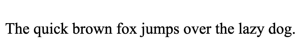
Keep in mind that what makes a font a good choice in one use case may make it inappropriate or a weak choice in another. For example, consider the ubiquitous Roboto font. When used as a larger, bolder heading on a form, it presents legibly with uniform strokes and relatively tall x-height of characters:

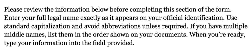
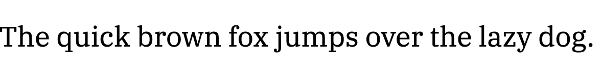
But when it’s used for longer instructional sections, it can look a bit mechanical and impersonal:

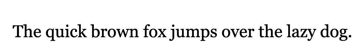
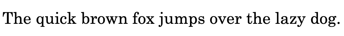
Conversely, Georgia performs quite well in extended text sections:
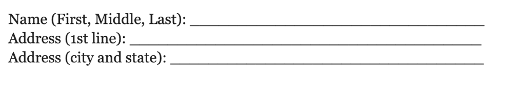
But when used in smaller sizes for field labels, it can be tough to read:
It all depends on context.
Best fonts for common use cases
The right font for your form must perform across different platforms. A font that looks crisp on macOS (which uses subpixel anti-aliasing and tends to render type more softly) may appear heavier or sharper on Windows’ ClearType rendering. Likewise, even the best Google Fonts can behave differently from system fonts packaged with Windows, macOS, or common productivity tools.
Remember that many users will complete your forms inside browsers that substitute missing fonts or in PDF readers that rely on embedded or fallback fonts. That’s why it’s important to select typefaces that are widely distributed, universally stable, and reliable in font stacks (e.g., font family: Roboto, Helvetica, Arial, sans-serif).
Certain fonts, however, do tend to perform better with different types of forms. Here are 12 of our favorites, broken down by use case and type of form.
Best fonts for general & business forms
The best fonts for general and business forms should provide a high degree of readability along with a neutral tone. These choices give you a range of options with different looks while remaining business-neutral and highly readable.
1. Roboto

Best for:
- Web forms
- Google Forms
- SaaS (Software as a service) signup and account-management forms
Why it works:
- Neutral, geometric-humanist sans-serif
- Tall x-height and consistent stroke widths
- Highly legible on screens
Where to use it:
- Online forms
- Embedded form widgets
- Company intranet applications
How it performs at small sizes:
- Remains legible at 10–12 pt onscreen
- Prints reasonably well in PDFs
Character clarity:
- Good differentiation between I/l/1 as well as 0 and O
- Slightly mechanical feel in long paragraphs, but excellent for labels and fields
2. Open Sans

Best for:
- Broad business use where wide availability and a friendly tone are priorities
Why it works:
- Humanist sans-serif has open counters and roomy letter spacing
- Improves quick scanning and sustained reading
Where to use it:
- Contact forms
- Application forms
- Customer-facing PDFs
How it performs at small sizes:
- Appears very good both onscreen and in print at 10–12 pt
- Slightly lighter strokes may require higher contrast on low-quality printers
Character clarity:
- Clear I/l/1 separation
- Reliable 0/O distinction
3. Inter

Best for:
- Modern product teams and designers prioritizing user interface (UI) consistency across platforms
Why it works:
- Built for UI
- Excellent hinting (i.e., a set of instructions embedded in a font that guide how its shapes should be rendered at small sizes or low resolutions)
- Large x-height
Where to use it:
- Web apps
- PDFs exported from design tools
How it performs at small sizes:
- Excellent, especially onscreen
- Sharp at 10 pt and below thanks to UI-focused hinting
Character clarity:
- Excellent clarity
- Pronounced differences among I/l/1 and clear 0/O shapes
Best fonts for legal & formal
Legal, financial, and compliance-driven forms require fonts that help reinforce credibility, perform well with heavy blocks of text, and print cleanly without losing clarity. The best choices balance formality with readability.
4. Georgia
Best for:
- Legal and financial forms
- Printed documents where a more formal tone is needed
Why it works:
- A screen-optimized serif with generous counters and sturdy serifs that hold up onscreen and in print
- Pair with a sans font for labels
Where to use it:
- Printed application forms
- Legal disclaimers in PDFs
- Long instructional copy embedded in forms
How it performs at small sizes:
- Very good for body and long text at 10–12 pt
- Serifs can look busy in tiny labels
Character clarity:
- Strong 0/O distinction
- I/l/1 generally clear (consider using small caps or increased letter spacing for critical numeric fields)
5. Times New Roman
Best for:
- Legacy legal workflows
- Government submissions
Why it works:
- Universally recognized as formal, conservative, and highly dense, making it ideal for long legal text where space economy matters
Where to use it:
- Court forms
- Archival documents
- Compliance forms
How it performs at small sizes:
- Overall, strong performance
- Small labels may look cramped
- Ideal for long paragraphs at 10–12 pt
Character clarity:
- Good, if imperfect
- Tall, narrow forms can make I/l/1 similar
- 0/O is clear
6. IBM Plex Serif
Best for:
- Modern legal documents requiring a formal but contemporary tone
- Court filings, contracts, executive summaries, and PDF-based legal packets
Why it works:
- Designed for clarity, neutrality, and professional polish
- Excellent PDF embedding and rendering consistency across platforms
Where to use it:
- Legal agreements, disclosures, compliance forms, and cross-platform PDFs
- Attorney-client intake forms, HR policy documentation, or any form that must look authoritative and current
How it performs at small sizes:
- Very strong
- Crisp down to 10–11 pt in PDF exports; prints cleanly on common office laser printers
- Well-engineered hinting ensures it doesn’t lose detail in small field labels or footnotes
Character clarity:
- Excellent
- Distinct I/l/1 forms and a clearly slashed zero option (0̸)
- Italics retain legibility
Best fonts for medical forms
Medical forms demand absolute clarity as well as fast, error-free reading of names, dates, doses, codes, and numeric fields by diverse users (including those with older eyes). Look for fonts that print crisply, render reliably in electronic medical records (EMR) and PDF-based workflows, and minimize character confusion in clinical data entry.
7. Verdana

Best for:
- EMR field labels
- Patient intake kiosks
- Onscreen clinic forms
Why it works:
- Wide letterforms, large x-height, and roomy spacing
- Reduces misreads in busy clinical UIs
Where to use it:
- Digital intake screens
- Prescription labels in low-res displays
- PDF forms when embedding system fonts is possible
How it performs at small sizes:
- Excellent readability at 10–12 pt onscreen
- Holds up well in printed outputs, though its wide metrics consume space
Character clarity:
- Very good, with clear I/l/1 and distinct 0/O, which reduces numeric transcription errors
8. Century Schoolbook
Best for:
- Printed legal packets and educational or compliance materials
- Law firms or government agencies that rely heavily on printed forms (although this font may not meet specific jurisdictional requirements for court filings — check local rules)
Why it works:
- Excellent readability for long passages
- Wide letterforms and generous spacing to reduce visual fatigue
Where to use it:
- Printed legal forms, intake packets, and documents handed to clients for in-person completion
- PDFs intended primarily for print use
How it performs at small sizes:
- Wide shapes remain readable down to ~11 pt
- At 10 pt in digital PDFs, spacing can feel a bit loose, but still legible
Character clarity:
- Good
- Serifed I and l are easily distinguishable, and the rounded zero helps avoid confusion with O
9. Roboto Mono

Best for:
- Forms, affidavits, or contracts that include numeric fields, case numbers, dates, IDs, or evidence logs
- Appendices, exhibits, or technical attachments in legal filings
Why it works:
- Extremely clear character shapes reduce misreading and transcription errors (critical in legal documentation)
- Contemporary, neutral tone complements modern legal workflows and digital-first filing systems
Where to use it:
- Form fields for case numbers, barcodes, citations, time stamps, invoice tables, or itemized evidence lists
- PDF fields where consistent character width prevents line-shifting or formatting issues
How it performs at small sizes:
- Excellent
- Stays sharp at 10–11 pt in PDFs and onscreen due to excellent hinting
Character clarity:
- Exceptional
- Distinct I/l/1
- Clearly slashed or dotted zero (depending on variant)
Best fonts for accessibility & neurodiverse users
The selections below prioritize letter distinctiveness, steady rhythm, generous spacing, and cross-platform availability. These attributes improve focus, reduce cognitive load, and raise completion rates for neurodiverse users.
10. Atkinson Hyperlegible

Best for:
- Critical accessibility forms
- Low-vision readers
Why it works:
- Designed by the Braille Institute to remove common letter confusions (b/d,p/q,I/l/1) and increase interior space, with resulting high legibility under stress or fatigue
Where to use it:
- Accessible PDFs
- Consent forms
- Specific form fields where character mistakes are high risk
How it performs at small sizes:
- Excellent
- Optimized for clarity even at 9–10 pt onscreen and in print
Character clarity:
- Outstanding, with intentionally differentiated shapes for commonly confused characters
11. Lexend

Best for:
- Readers with attention or processing differences (ADHD-friendly use cases)
- Long-form instructions where reading speed matters
Why it works:
- Lexend was developed by educational researcher Bonnie Shaver-Troup, Ed.D. It uses research-backed adjustments to letter spacing and width that reduce eye movement and increase reading speed for many users.
Where to use it:
- Instructional text in forms
- Downloadable patient/customer PDFs
- Long copy tied to form fields
How it performs at small sizes:
- Very good at 10–12 pt
- Benefits most noticeable in body text and longer passages
Character clarity:
- Very good
- Clear numerals and distinct letter shapes
12. Courier New
Best for:
- Users who benefit from highly predictable text spacing
- Accessibility workflows where reducing visual clutter is a priority
Why it works:
- Every character occupies the same width, reducing visual “jumping” for some ADHD readers
- Extremely distinct character shapes, with clear differences between I/l/1
Where to use it:
- Numeric fields, ID blocks, medication codes, or any area requiring precision
- Assistive environments where predictable text rhythm supports focus
How it performs at small sizes:
- Good
- Readable at 10–11 pt, though its light stroke weight can appear thin on low-resolution screens
Character clarity:
- Excellent
- One of the clearest fonts for distinguishing I/l/1 as well as 0 and O
Which fonts are…
Most pleasing to the eye? Both Open Sans and Inter are widely perceived as neutral and visually pleasing across diverse audiences.
Most ADHD-friendly? Lexend (for long passages) and Atkinson Hyperlegible (for focus on distinct characters) are solid starting points.
Best for neurodiverse forms? Choose fonts with open counters, generous spacing, and strong character differentiation, such as Atkinson Hyperlegible, Lexend, and Inter.
How to apply these fonts in Jotform Form Builder
Using any of the previously recommended fonts inside Jotform is simple. The platform supports both built-in font options and custom CSS, so you can control readability, branding, and presentation without extra tools.

Here’s how to apply form-friendly fonts quickly:
- Use Jotform’s built-in font library
Go to Form Designer → Styles to switch to readable, accessible, or professional fonts with a single click. These native options cover most business, medical, registration, application, and intake needs. - Enjoy clear rendering on every device
Because Jotform is fully web-based, fonts are optimized for mobile, tablet, and desktop, reducing layout issues and ensuring consistent readability for all users. - Start with pre-styled templates
Jotform offers hundreds of templates, each designed with clean, accessible typography. For long, complex, or multipage forms, starting from a template gives you solid readability defaults from the beginning. - Use Inject Custom CSS for full control
If you want to use specific Google Fonts, brand fonts, or any typeface not included by default, you can add them using Inject Custom CSS. This allows consistent font styling across your entire form, from headers to sublabels to input fields. - Consult Jotform’s help guides for more assistance
These guides help you work with Jotform’s built-in fonts, or if you prefer, integrate Google Fonts and custom fonts into your forms.
Build more readable forms today
The best fonts for any form are the ones that make reading effortless and support the form’s purpose, regardless of context. Simple, clean typefaces like Arial, Roboto, Open Sans, Verdana, and Georgia consistently deliver strong readability across devices, browsers, and print formats while also supporting accessibility needs.
Jotform Form Builder makes it easy to learn how to mix fonts in your forms, thanks to built-in font options and industry-specific templates that start you off with polished, user-friendly typography. And when you need complete control, Jotform’s custom CSS support lets you apply any Google Font or brand typeface you prefer, ensuring every form stays aligned with your visual identity.
FAQs
The 10-3 rule is a readability guideline that suggests text blocks should be no more than 10 words per line and 3 lines per section to reduce cognitive load. Shorter lines, generous spacing, and clear hierarchy help keep users focused.
High-contrast combinations like dark gray or black text on a white or very light background are the most readable. Avoid low-contrast pastels, thin text, or light-on-dark combinations unless the form design specifically supports it.
Yes, Jotform supports custom fonts through the Form Designer and Inject Custom CSS, so you can apply Google Fonts, brand fonts, or any typeface your organization requires.
This article is for web designers, UX professionals, form builders, and anyone who wants to choose the best font for improving the readability, accessibility, and professional appearance of digital or printed forms across business, medical, legal, and general use cases.


Send Comment: