Conversational forms inspire action. They’re engaging, they offer a solid user experience (UX), and they use a conversational form design (one question at a time) that mimics a real conversation.
In the past, I’ve created forms that asked for too much admin, meaning no one wanted to fill them out. They were a wall of fields asking for the mundane, such as name, job title, and phone number, followed by 12 listed questions.
Back then, I didn’t know that what I needed was a conversational form. I learned about form design the hard way, but thanks to this guide, you don’t have to.
I cover everything you need to know about conversational forms, including what they are, why they work psychologically, and how this design outperforms traditional approaches. I also share actionable best practices to help you reduce form abandonment and improve completion rates.
Whether you’re building lead gen forms, surveys, or onboarding flows, this guide will help you design online forms that people actually want to complete.
What is conversational form design?
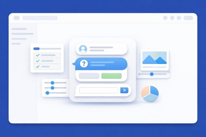
Conversational form design is a UX approach in which, instead of presenting all fields at once on a single page, you show questions one at a time. Conversational forms often include design features such as progress trackers and “next” or “previous” buttons for navigation.
Typeform popularized conversational form design, but it has since become a widely adopted UX standard across the industry. Today, it’s a core feature of the best online form builders and a recognized best practice for improving form engagement and completion.
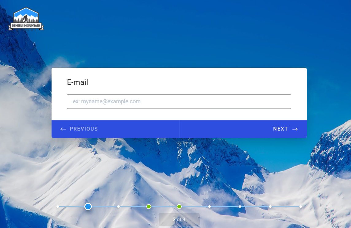
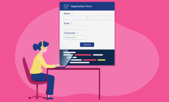
Here’s what a conversational form design looks like using Jotform:
In conversational forms, responses trigger dynamic follow-ups, friendly acknowledgments, and conditional logic (also known as branching logic) that skips irrelevant questions based on what the respondent has already answered. It’s a meaningful improvement to the UX because respondents see questions that apply only to them. Consequently, the form feels less overwhelming, and because recipients can’t see the total number of questions up front, they’re less likely to abandon it before finishing.
Contrast this with traditional form design: a static page where every field is visible up front. The respondent immediately sees the full length of the form, which may feel overwhelming and lead to abandonment or prevent them from starting at all. Potentially, a user would need only a fraction of these questions. Traditional forms also offer little to no personalization or dynamic behavior.
Why conversational forms work: The psychology behind it
The performance gap between conversational and traditional forms isn’t a coincidence. It’s rooted in how people process information, make decisions, and respond to digital experiences.
For example, conversational forms
- Reduce cognitive load: When all fields are visible at once, the brain tries to process the entire task immediately. We’re all busy, and the perceived effort is often enough to trigger abandonment. A one-question-at-a-time format eliminates that overwhelm by focusing attention on what’s in front of the user.
- Feel lower-effort: Even if a conversational form has the same number of questions as a traditional one, it doesn’t feel that way. Because respondents never see the full length up front, the task feels more manageable, which directly affects whether they start and finish it.
- Feel more personal: Dynamic copy that responds to previous answers, such as “Thanks, Sarah! One more question…,” creates a genuine sense of dialogue. Even a simple phrase such as “One more question” can feel encouraging.
- Include progress indicators to keep users motivated: Showing respondents how far they’ve come (and how little is left) taps into human psychology. People are more likely to finish something once they feel invested. A visible progress bar makes that progress tangible.
- Have higher completion rates: Data shows conversational forms achieve significantly higher (30 percent more) completion rates, particularly for longer surveys and lead generation flows.
Conversational forms vs traditional forms
Traditional forms | Conversational forms | |
|---|---|---|
| Layout | All fields at once | One question at a time |
| Completion rate | Lower | Higher |
| Personalization | None | Dynamic, name-aware |
| Best for | Short, simple forms | Surveys, lead gen, onboarding |
| Mobile experience | Often poor | Optimized |
| Cognitive load | High | Low |
Although conversational forms are a best practice, they’re not the right fit for every situation.
Traditional forms still make sense for short, low-stakes scenarios such as a two-field newsletter signup, a quick login form, or a single-step checkout field.
Conversational forms work best in longer, higher-stakes interactions, such as multistep surveys, lead generation flows, onboarding questionnaires, feedback collection, and complaint forms.
The more you’re asking of a respondent, the more the conversational approach pays off.
How to design conversational forms for improved completion
Here are conversational form design tips that will help you create forms that drive higher engagement.
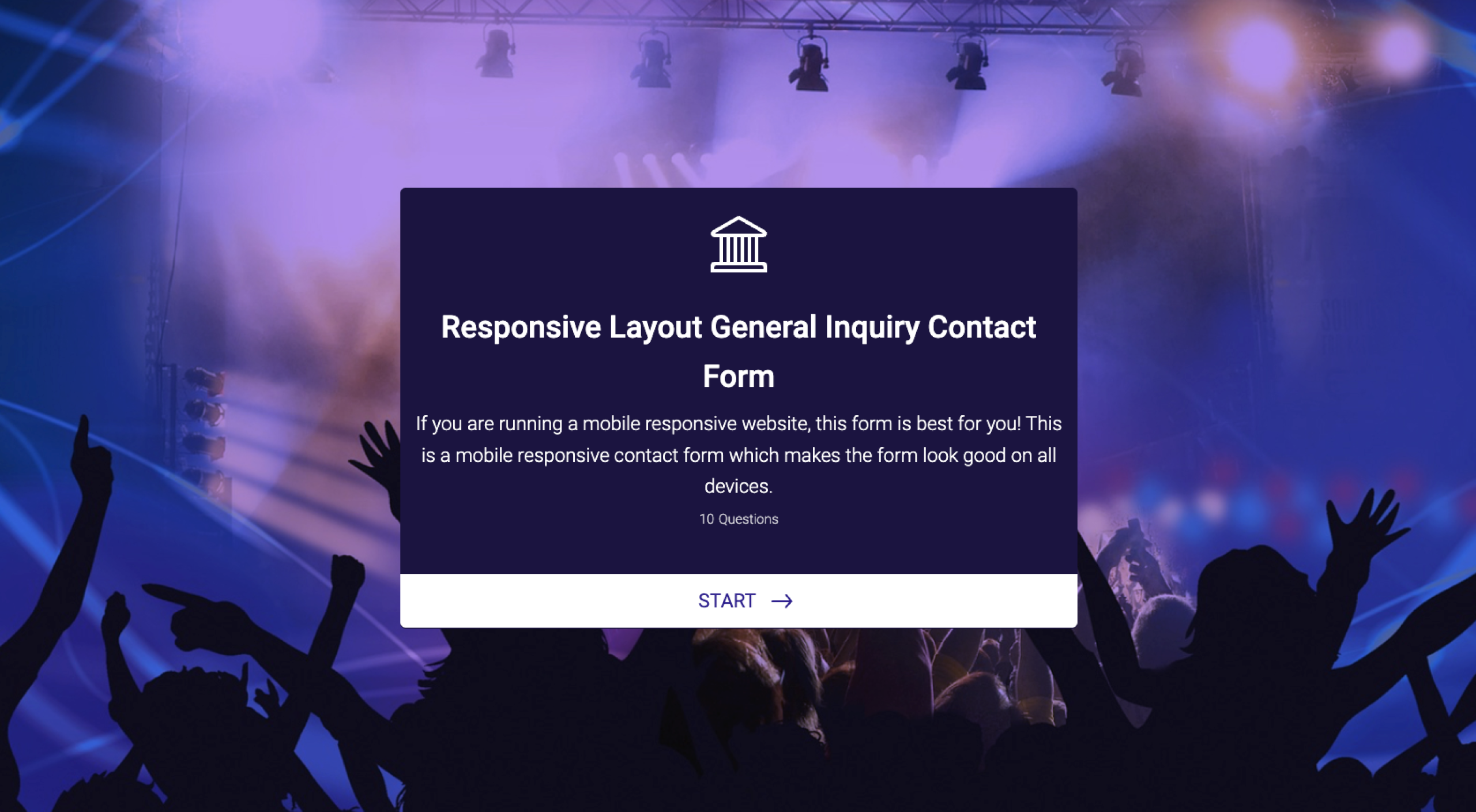
Add a warm intro screen and a human-sounding CTA
Your introduction page is your first chance to make the form feel engaging. It should be brief, friendly, and clear about what’s coming next.
In the following example, the intro section includes
- A form title (Responsive Layout General Inquiry Contact Form)
- Expectations of the recipient (fill out your contact information, job skills, etc.)
- The number of questions (10 questions)
- A CTA (Start)
Write in second-person, natural language
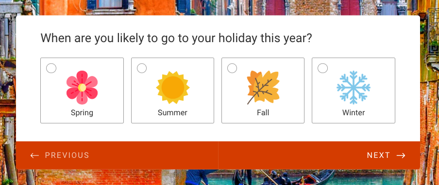
Write your form in a way that mimics real conversation. Instead of “Please provide your occupation,” try “What do you do for work?”
The goal is to keep your conversational form, well, conversational.
The key to conversational language is
- Natural phrasing: Write the way a person would actually speak. Read each question aloud. If it sounds like something you’d actually say in person, you’ve done it right.
- Second-person copy: Use “you” and “your” throughout.
- Direct but personal tone: Be direct about what you want people to do, but keep it friendly.
Here’s an example using natural, personal, second-person language to construct a question:
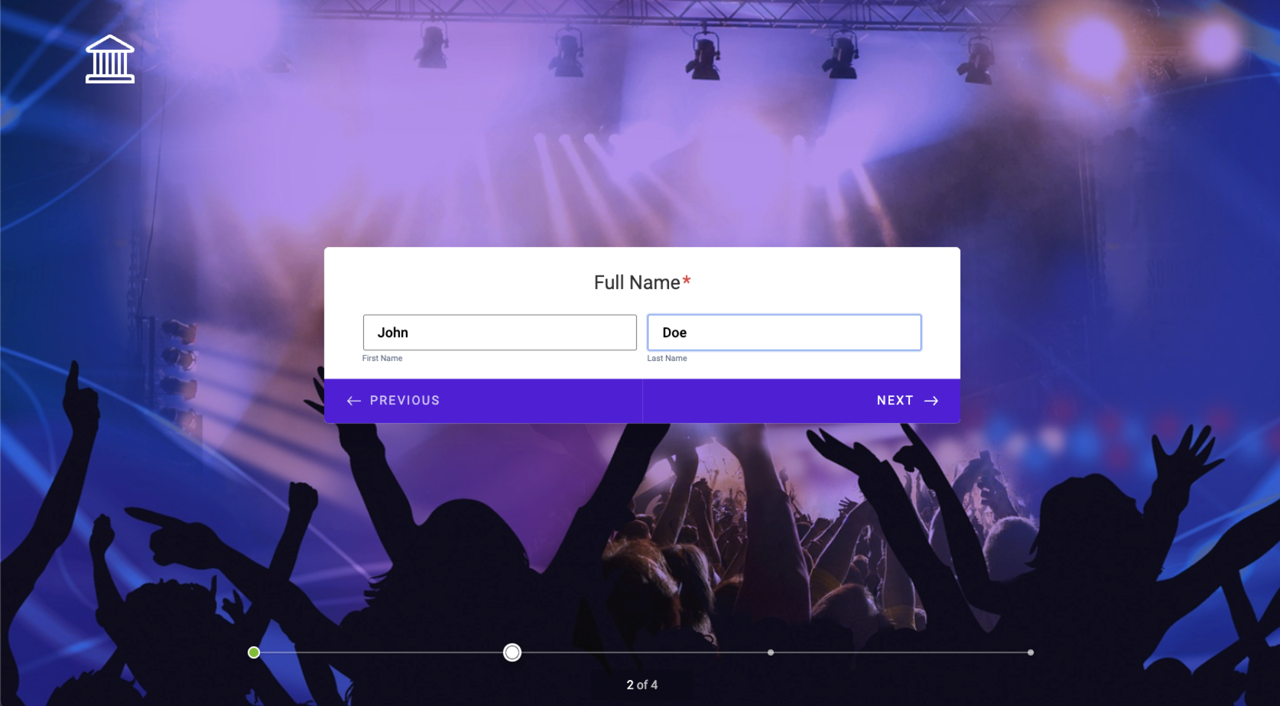
Ask one question at a time
Asking one question at a time is the core of conversational design.
Each screen should have one job: Ask one question and receive one answer.
This conversational form example is highly simplified, but it shows exactly how the one-question-at-a-time form works:
Use conditional logic to skip irrelevant questions
Conditional logic lets you show or hide questions based on previous answers, so respondents see only what applies to them.
For example, if you ask “How did you hear about us?” and someone selects “Social media,” you might follow up with “Which platform?”
Conditional logic shortens the perceived length of the form and improves the quality of the data you collect. These days, it’s a pretty standard expectation in conversational user interface (UI) forms.
This video shows you exactly how to use conditional logic using Jotform:


Use progress indicators
Progress indicators show respondents how far they are through a form. When someone sees they’re 60 percent through, they’re more likely to keep going.
Here’s an example of a progress tracker on a Jotform template:
A progress tracker is especially important in longer conversational forms, such as onboarding flows or detailed surveys.
Acknowledge answers dynamically
If someone shares their name on the first screen of the form, you can use it later to personalize the experience.
For example, a dynamic response might be, “Great choice, Zoe. Now tell us a little about your team.”
This kind of acknowledgment is what separates conversational form design from standard formats. It’s friendly and engaging, and you can use it to highlight progress; for example, “Great choice, Zoe, just one section left.”
Keep required fields to a minimum
Every required field is a potential exit point. The more you ask of your respondent, the more likely they are to abandon the form.
Before making a field mandatory, ask yourself whether you genuinely need that information to move forward.
You can always collect more details later. The immediate goal is to get the form submission.
Design for mobile first
Mobile forms are where conversational form design has a clear advantage. A wall of form fields on a small screen is frustrating. It’s easy to tap the wrong thing and a pain to scroll when you need to skip sections.
A single, well-formatted question with a clear answer option is a dream to complete on a phone.
When building conversational UI forms, design for the smallest screen first.
This means thinking about
- Thumb-friendly tap targets
- Minimal typing where possible
- Layouts that don’t require zooming or horizontal scrolling
Online form designers, such as Jotform, take all of the thinking out of this. Every single form you design with Jotform is already mobile friendly, and this video shows you how:
Test and iterate
Even well-designed conversational forms have room for improvement.
A/B testing is the practice of creating two versions of something and showing each to a different portion of your audience to see which one performs better.
For a form, you might test two different ways of phrasing the same question to see which version gets more completions, higher response quality, or fewer drop-offs at that step.
For example
- Version A might ask, “What is your annual budget?”
- Version B might ask, “How much are you looking to spend?”
You can A/B test
- Question wording
- Question order
- Intro screen content
- CTA copy
Pro Tip
A/B test one thing at a time so you can clearly identify what affects completion rates.
Use Jotform to build better conversational forms
Everything covered in this guide is built directly into Jotform’s conversational forms. Jotform makes it easy to build well-designed forms without code. You can choose from over 20,000 form templates and customize them as you like. There’s also an AI form builder that lets you create a form using natural language. If you want to explore a card-style conversational format, Jotform Cards offers a clean, swipeable layout that works particularly well for surveys and lead generation flows. Try it free and see the difference a conversational approach makes to your completion rates.
Once you get comfortable with the form builder, you can take things further with Jotform AI Agents, which elevate conversational forms to the next level.
The main difference between a conversational form and AI Agents is the script.
Conversational forms follow a script, whereas AI Agents understand context, interpret free-text answers, ask intelligent follow-ups, and adapt in real time. They also work across multiple channels, including standalone, chatbot, WhatsApp, and phone, all without requiring code.
Did I mention that you can get started with any of these Jotform tools completely free?My advice? Start with Jotform conversational forms and apply the best practices in this guide. Then explore and upgrade to Jotform AI Agents when you’re ready for conversations that think for themselves.
This article is for UX designers, marketers, and product managers who build forms for lead generation, surveys, or onboarding — and want to understand how conversational design principles can reduce abandonment, increase completion rates, and create a better respondent experience.


Send Comment: