How do you know if what you’re doing is working? In some cases, it’s pretty obvious. A mechanic who consistently fixes customers’ cars is doing a good job. But a mechanic who often fails to fix the cars customers bring in, and maybe even causes new issues, is doing a poor job.
Unfortunately few industries are as straightforward as car repair. And even great mechanics could have areas of improvement. For instance, they might be able to fix anything on wheels, but if a customer arrives before their car is ready, do they have to wait in a dusty room full of gas fumes?
Measurement is often complicated and multilayered. Marketers track key performance indicators. Companies that provide services conduct customer or client satisfaction surveys. Those that sell products refer to sales numbers. But sales numbers are also relevant to service providers and marketers, just as customer satisfaction ratings are to marketers and companies that sell products.
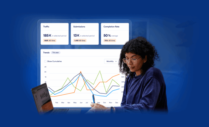
Looking for some clarity? You’ve come to the right place. Jotform Enterprise customers have a new and better way to measure the effectiveness of their efforts — Insights.
Introducing Insights
Insights is one of the helpful new items in Jotform Enterprise 2.0. Others include
- Form Draft and Publish
- Server-wide templates
- AI Assistant
- Updated Admin Console
- Revamped My Workspace
- Brand Kit generation
- Organizational form theme
Insights gives you access to more data points in more detail and for a wider variety of digital assets. Unlike the previous analytics functionality, Insights includes metrics for Jotform Apps, Sign documents, Workflows, and AI Agents as well as forms. Plus, you can use filters to adjust the displayed data and even build custom dashboards.
Last but not least, all users, not just admins, can see information about their own assets and those of their team in Insights.
Let’s take a look at how Insights can help in a range of potential use cases and industries.
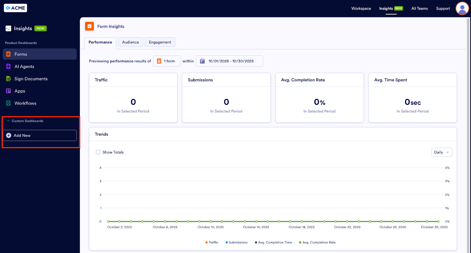
Forms
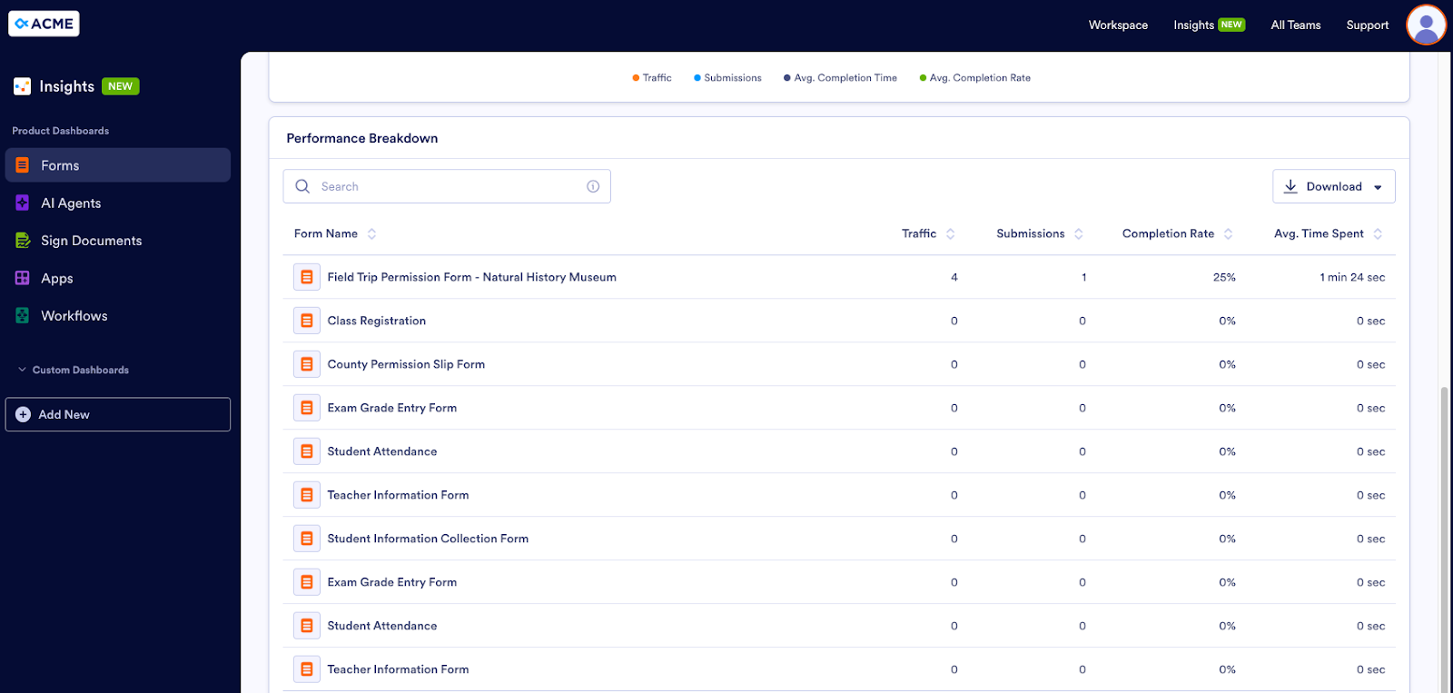
Our first user persona is Eric, the administrator for an elementary school. Every year, the third grade students take a field trip to the local natural history museum. Teachers use a form to collect permission slips from students’ parents or guardians. Eric wants to find out how the form is performing, so he goes to the Performance tab in the Forms Dashboard.
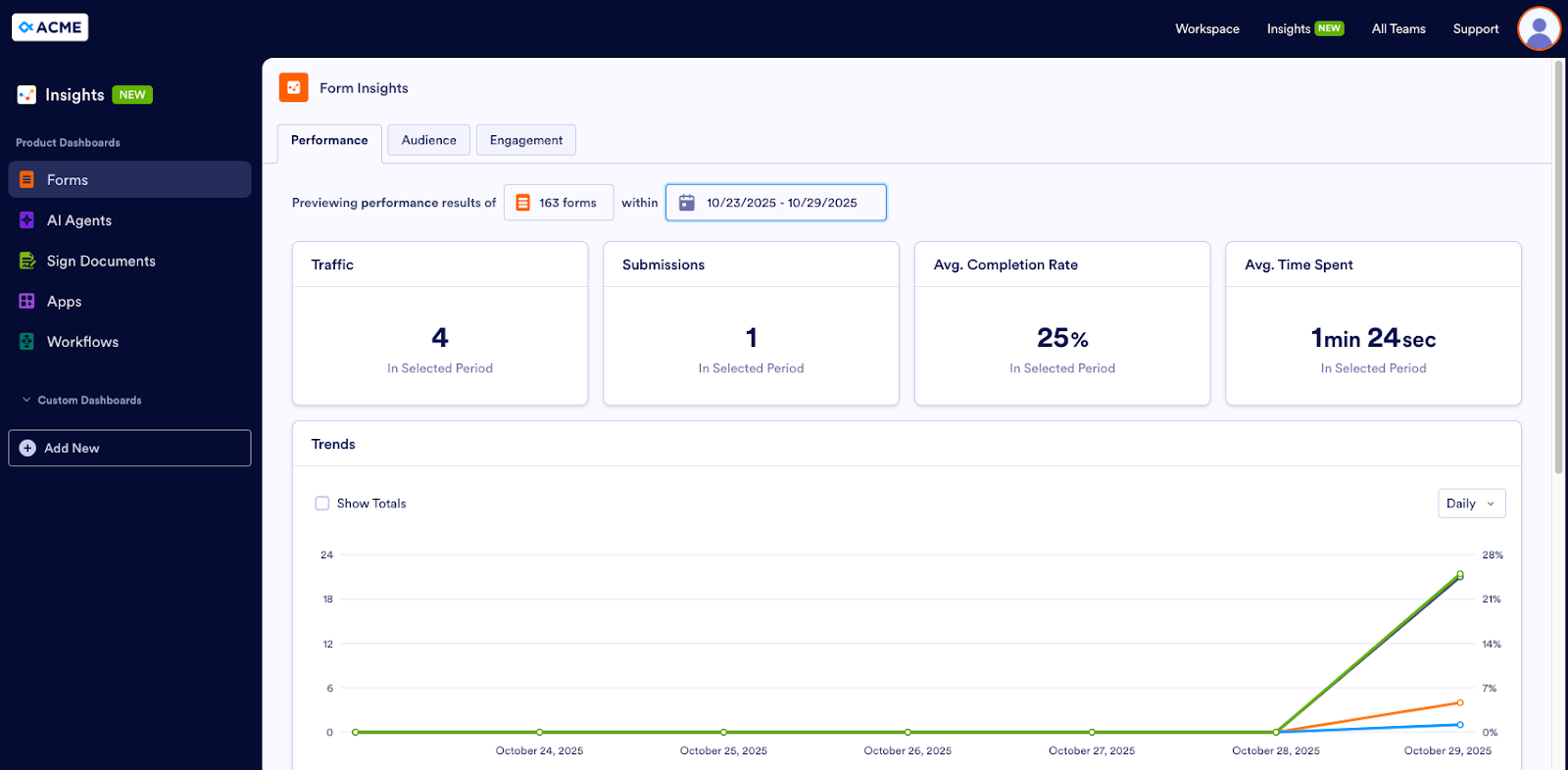
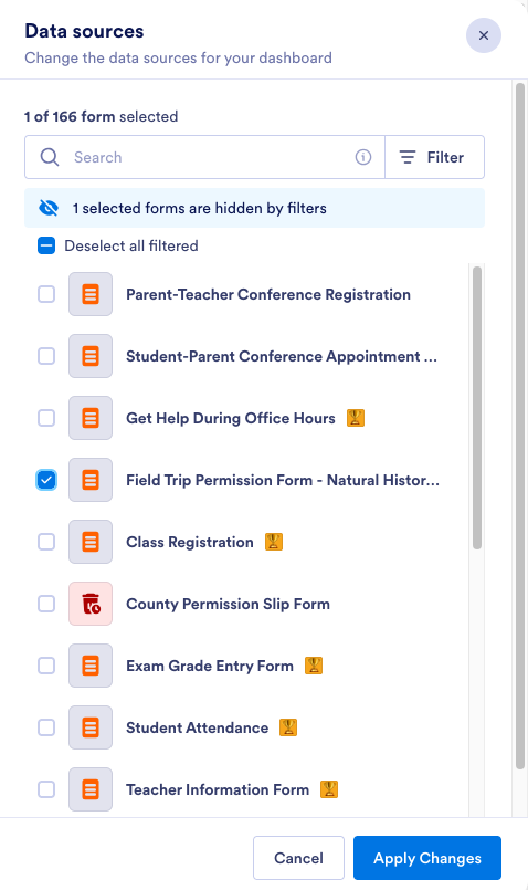
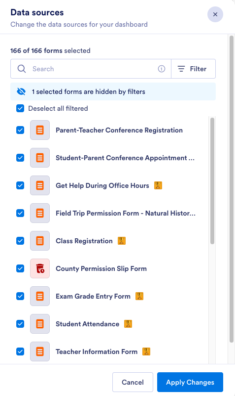
Here, he can see information on traffic and submissions to forms as well as the average completion rate for and average time spent on forms. If he wants to focus on the permission slip form’s performance, he clicks on the box next to Previewing performance results of and selects the form from the list in the Data Sources panel. (He can also specify a date range for his data.)
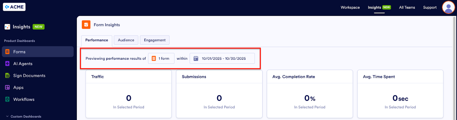
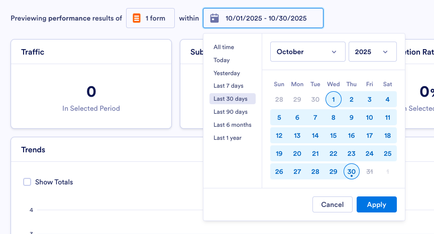
If the form isn’t getting a lot of traffic, maybe parents/guardians are having trouble accessing it. Perhaps teachers sent it in an email that’s now buried in parents’ inboxes. Or if the form is getting good traffic but has few submissions and a low completion rate, there could be an issue with the form itself. Perhaps there’s a question that’s hard to understand or an element that isn’t functioning the way it should or as form fillers expect it to. Eric now has an idea about how to improve the form’s performance and the permission slip process as a whole.
Pro Tip
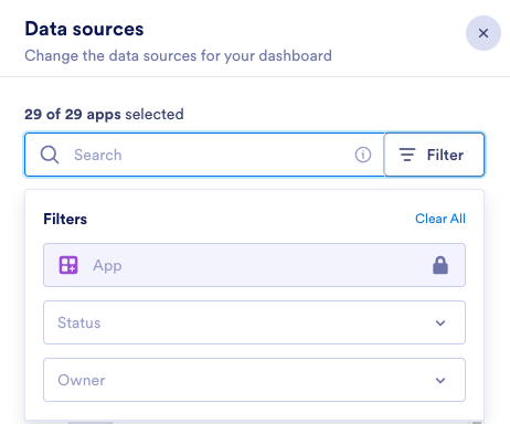
Want to see which team a particular form (or AI Agent, Sign Document, App, or Workflow) belongs to? When you open the Data Sources panel, click Select all filtered, if it isn’t already selected, to show all of the available assets. If an icon appears next to the name of the asset, hover over the asset name. The name of the team that owns that asset will appear.
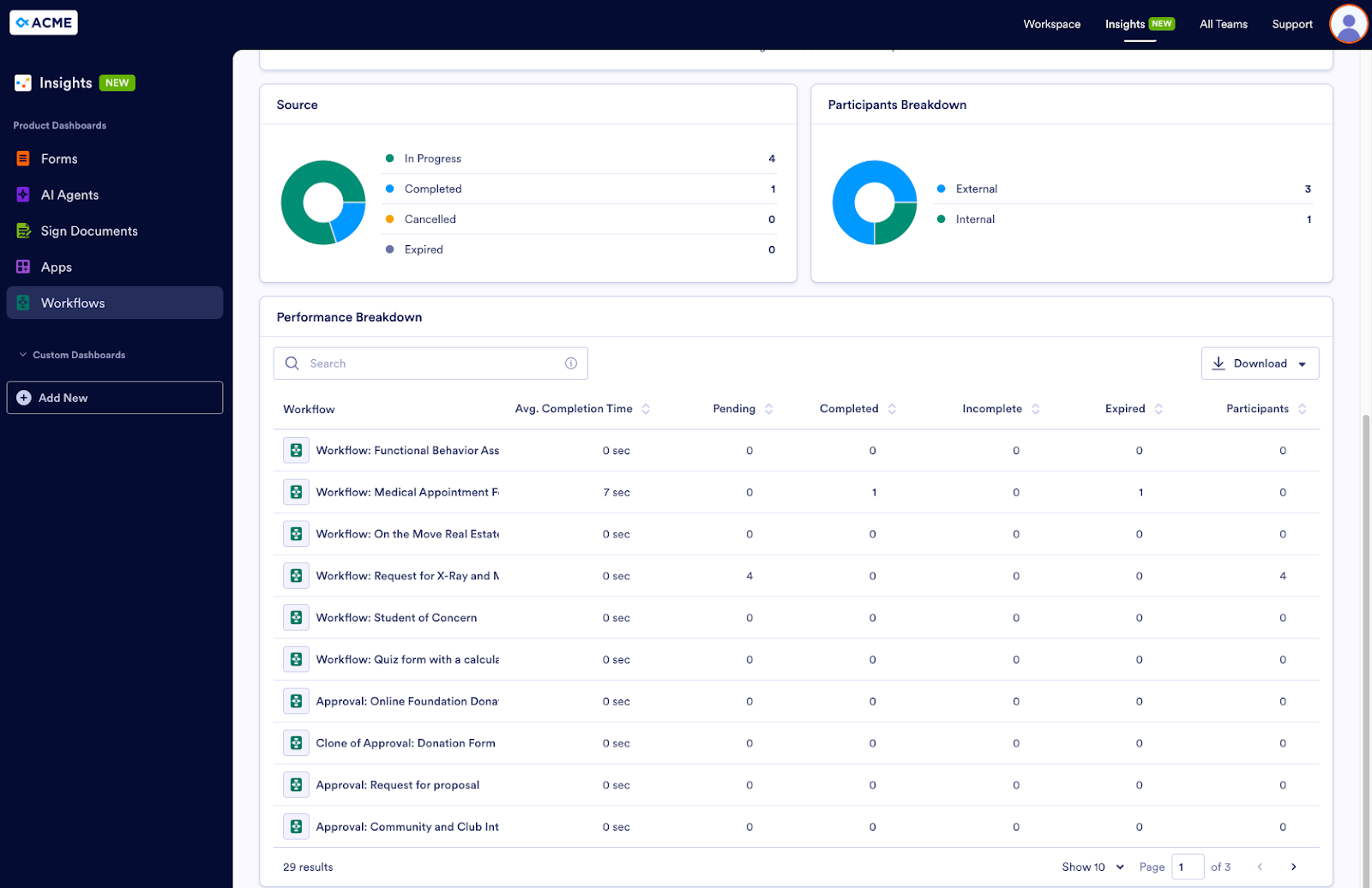
Eric can also see a visual representation of form stats in the Trends graph. The Performance Breakdown at the bottom of the page lists the form or forms he’s selected, along with related metrics. He can download the list as a CSV or an Excel file.
To see more information on his audience, Eric goes to the Audience tab. By default, the Trends graph shows all form views (whether they resulted in a submission or not). If Eric wants to see only the form views that have an accompanying submission, he clicks the button labeled All Form Views to switch to Views with Submissions. He can also adjust the time frame (daily, weekly, monthly, yearly).
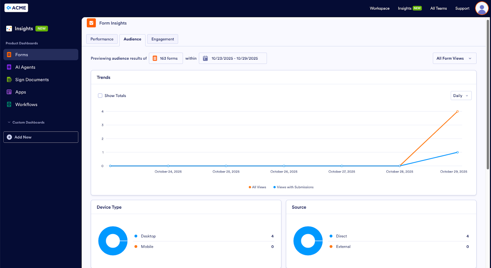
Device Type shows how much of the audience accesses forms via desktop vs mobile. Source shows the percentage of form users who access forms from a direct link vs an external source. Eric can also see which browsers and operating systems the audience uses as well as where form users are located.
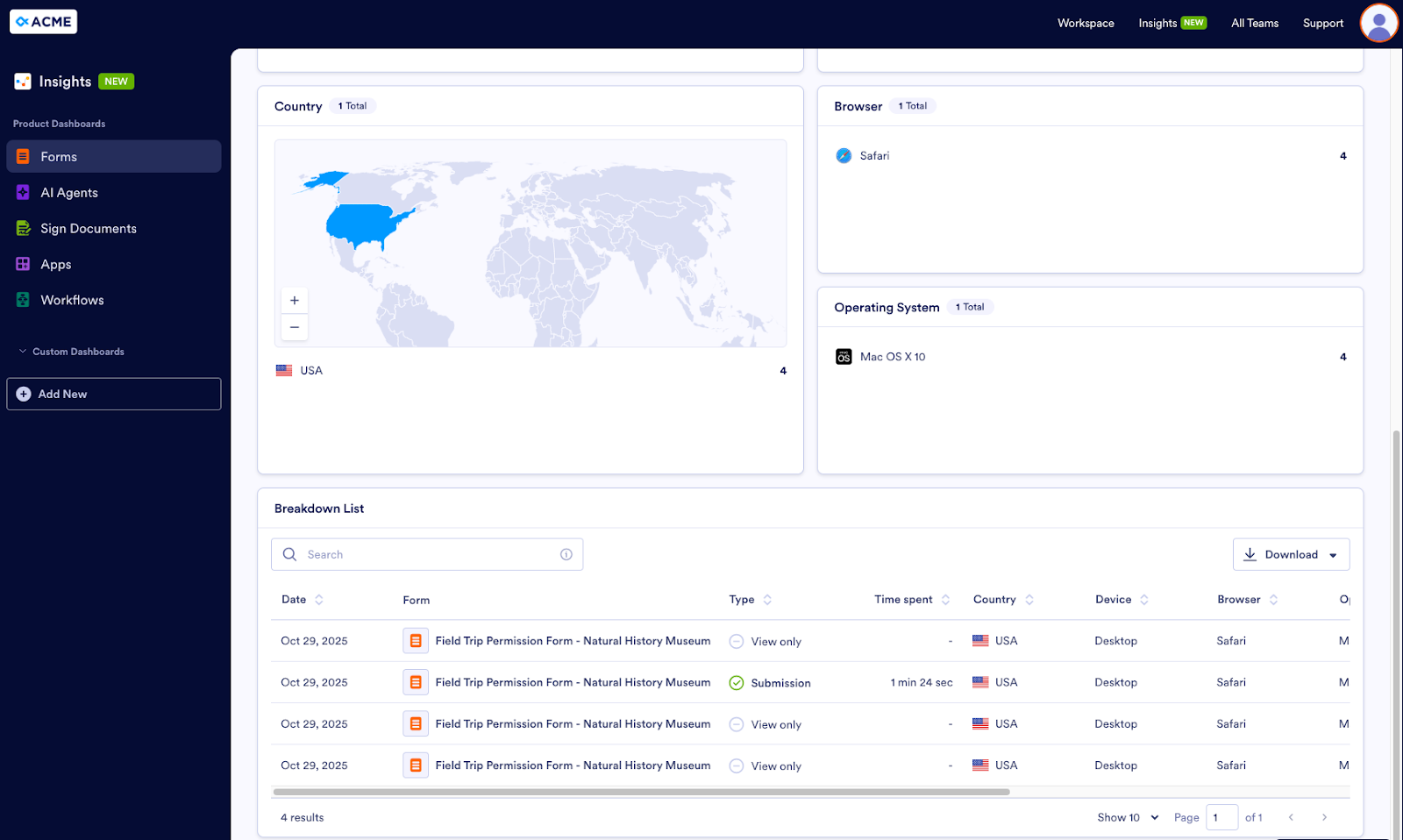
As in the Performance tab, a detailed list of this data appears in the Breakdown List and can be downloaded as a CSV or Excel file.
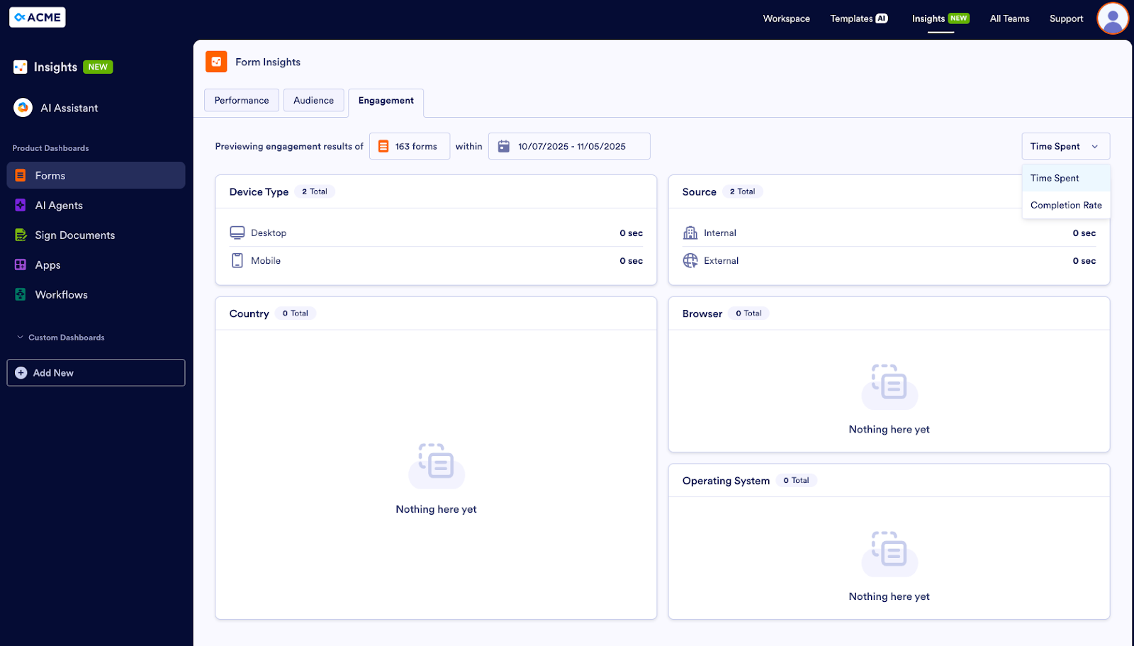
If Eric wants to know more, he can drill down into completion rate metrics and time spent on forms in the Engagement tab. This information is broken out by device type, source, browser, operating system, and country.
AI Agents
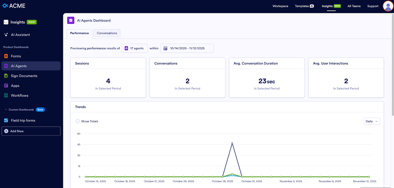
Dawn, our second user persona, manages a customer service department. Her company has recently started using AI Agents to field customer questions. In the Performance tab of the AI Agents Dashboard, she can view the number of conversations that occurred during a particular time period as well as the average conversation duration and the average number of interactions per conversation.
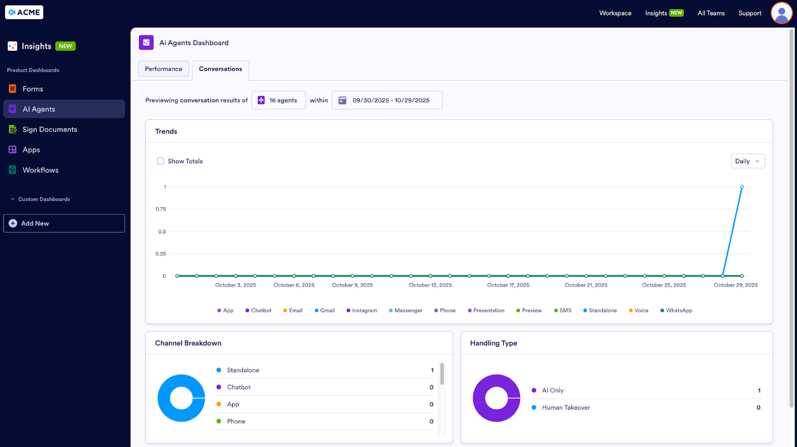
For particulars on conversations, Dawn visits the Conversations tab, which shows the Channel Breakdown — is the chatbot agent having more conversations than the phone agent? Dawn can also see how many conversations required human intervention. If an agent needs a person to step in more often than not, this could mean the agent needs more training.
Sign Documents
Our next user persona, Oscar, works in the contracts department at a consulting company. The department uses Jotform Sign to collect e-signatures.
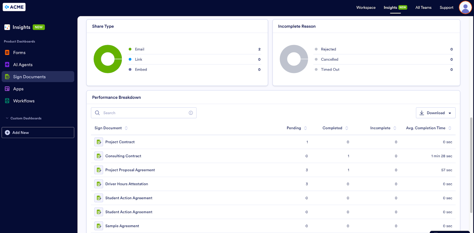
To view how many documents are pending, complete, and incomplete, Oscar views the Documents tab in the Sign dashboard. This tab also displays the average completion time for documents.
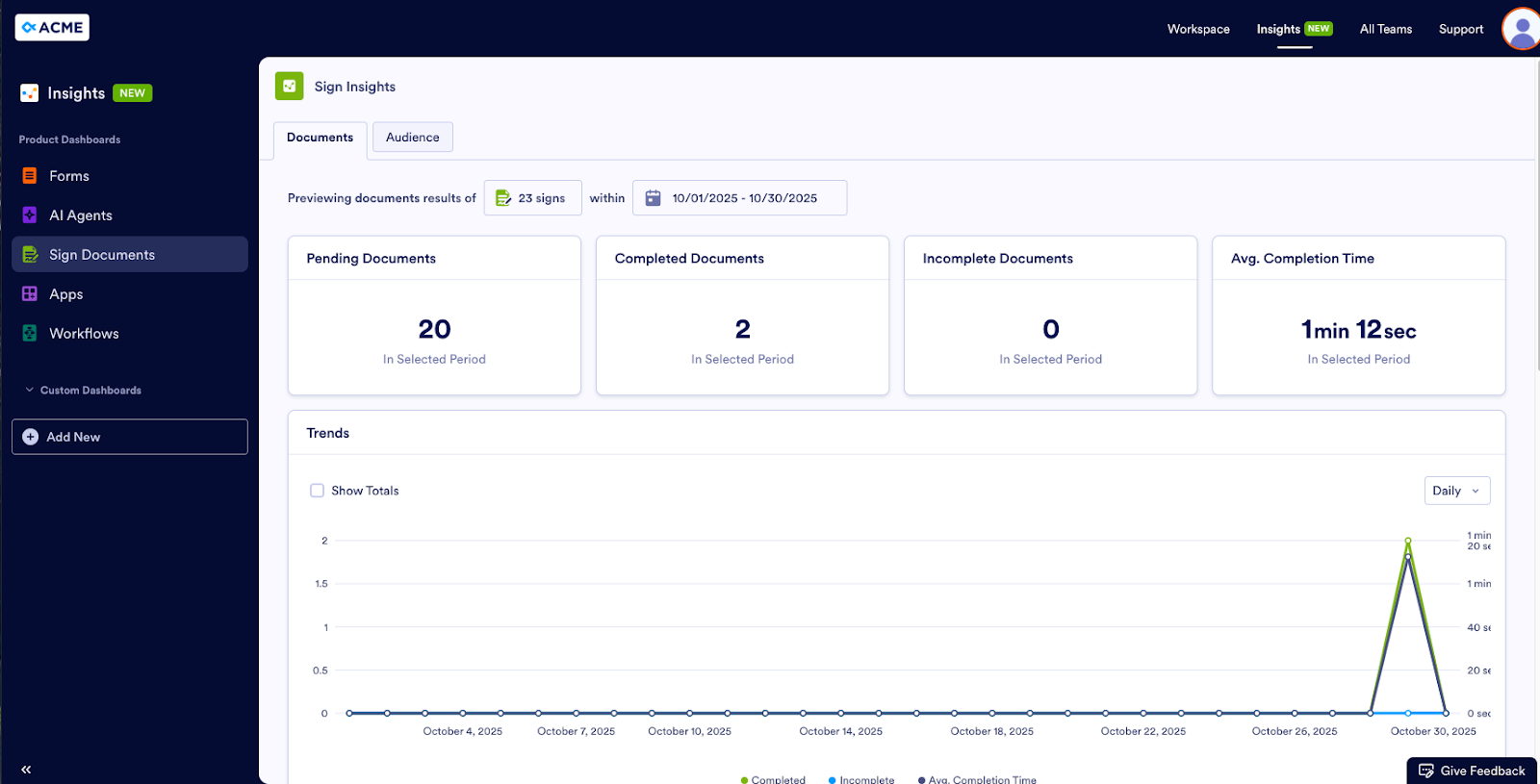
He can also see how the document was shared with signers (email, link, embed) and the reason why the document is incomplete. Did the signer decline to sign? Was the contract canceled? Did the document time out?
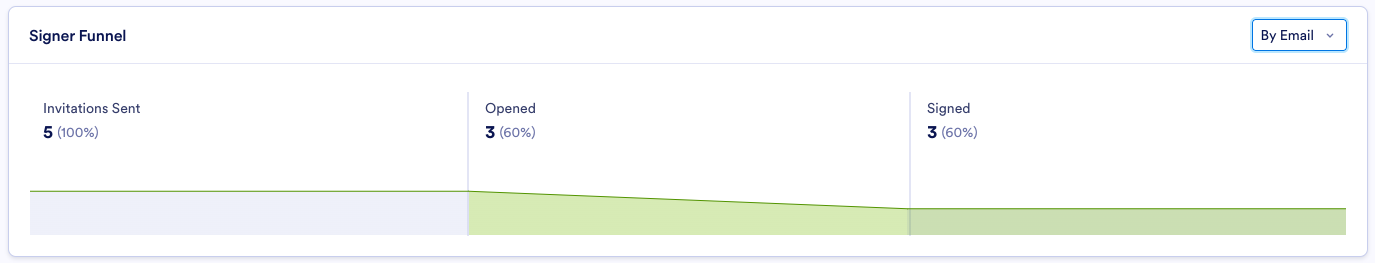
If Oscar needs more information about his audience, the Audience tab delivers. It shows details like the frequency signers view documents and the device type and operating system they use.
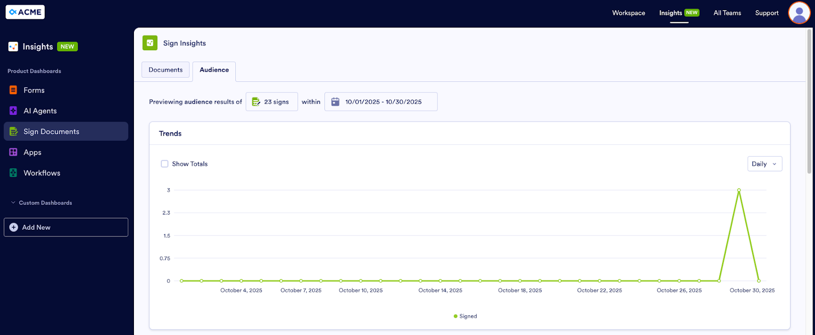
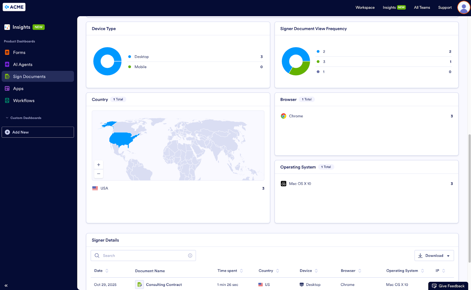
The Audience tab gives Eric full visibility into the signer funnel.
Apps
User persona George works in the corporate office of a fast food restaurant chain. The corporate office uses an app to provide franchisees with company news, policies and procedures, timesheet submissions, and time-off requests, among other things.
Unfortunately, corporate has gotten reports that several franchisees aren’t following the updated cleaning procedures. It’s George’s job to find out why. The Performance tab in the Apps Dashboard can help.
Pro Tip
Want to further filter your assets? In the Data Sources panel, click on the Filter button. You’ll see two more filtering options: status and owner. Under Status, you can select Enabled, Disabled, or Deleted. Owner allows you to select a team or yourself, for the assets you’ve created in your individual Workspace.
This tab displays the amount of traffic, downloads, and active visitors to the company’s apps, as well as the average engagement rate. If these metrics are low for the franchisee app, that could mean employees aren’t using the app and therefore aren’t aware of the new procedures.
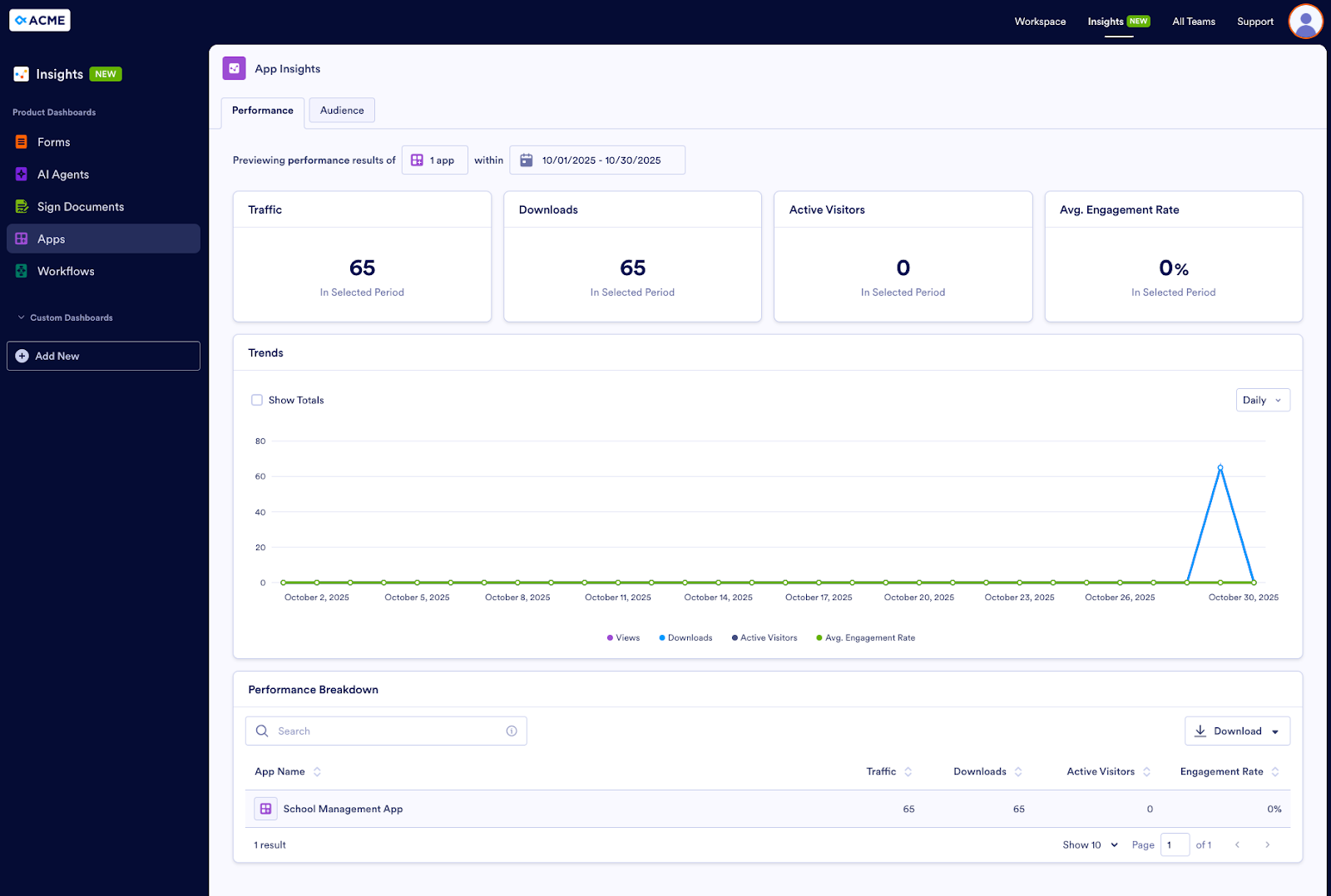
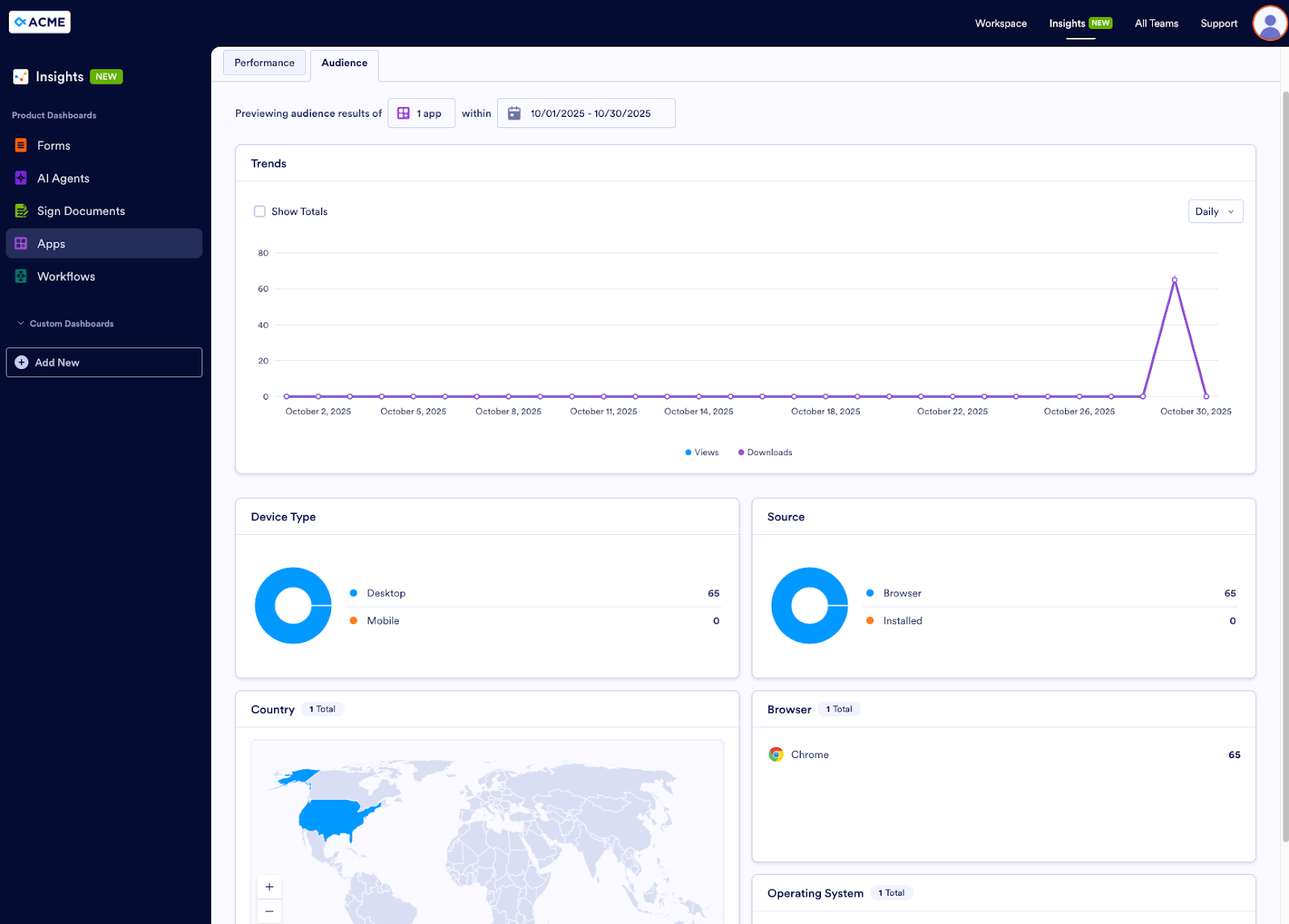
For a closer look at the audience, George can check out the Audience tab, which shows views and downloads of the app, as well as device type, source, browser, operating system, and location.
Workflows
Alyssa, our last user persona, leads HR at her company. Under her guidance, her department has set up multiple workflows — for job applications, onboarding, time-off requests, offboarding, performance reviews, and more. These processes have been in place for several months, and she wants to take a look at how they’re going.
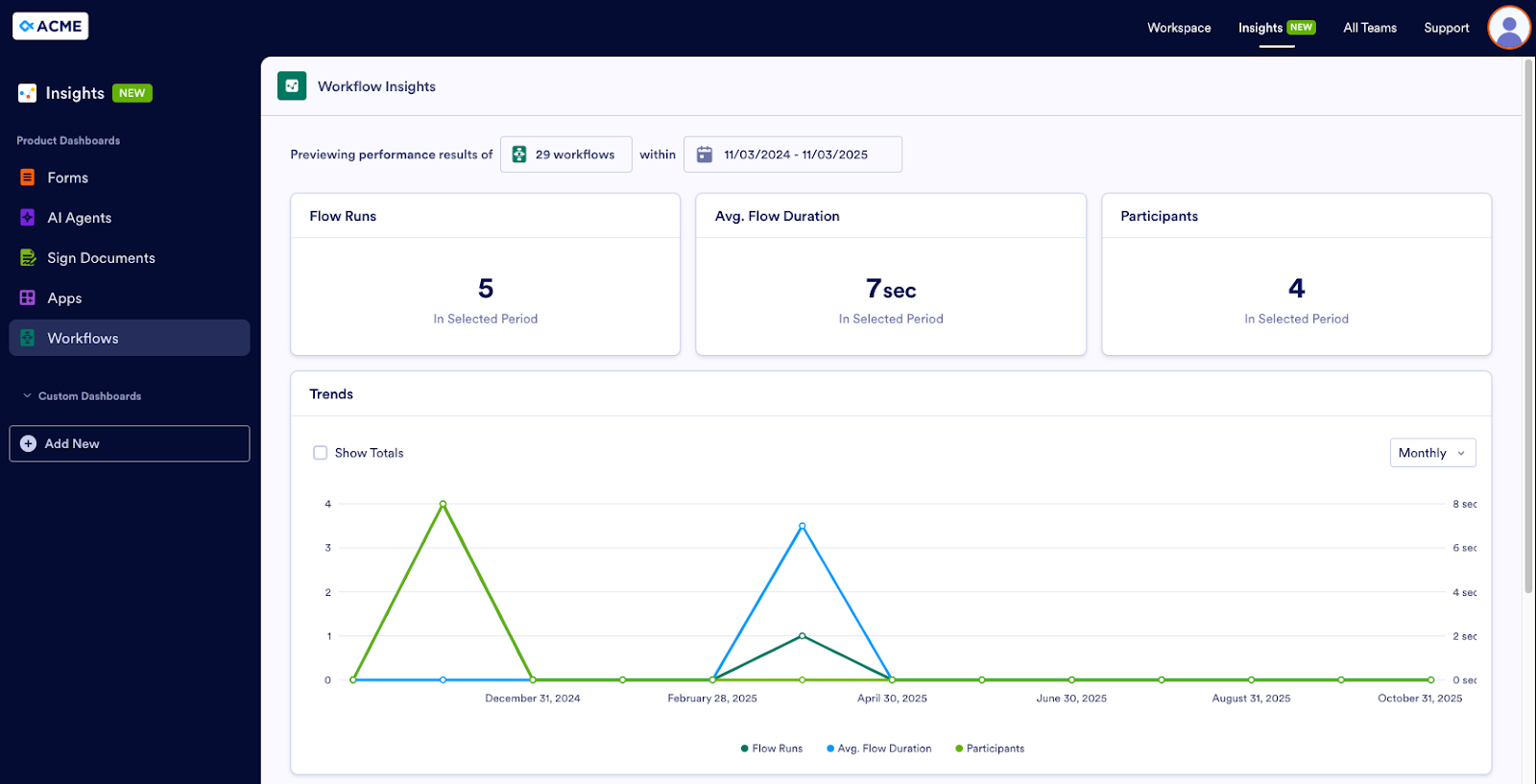
In the Workflows dashboard, Alyssa can quickly see how many workflows are in progress, how many have been completed, how many have been canceled, and how many have been canceled. She can filter to show a single workflow or a group of related workflows.
Alyssa chooses which workflows to view together. For example, it might not make sense to compare the average flow duration of a performance review to a time-off request. But it does make sense to compare various job application workflows. The dashboard gives her this flexibility.
Custom Dashboards
Insights also provides a way to create custom dashboards so you can see the metrics you need in just the way you want. At the moment, custom dashboards are available for forms only. This functionality will be rolled out to the rest of Jotform Enterprise’s digital assets in the near future.
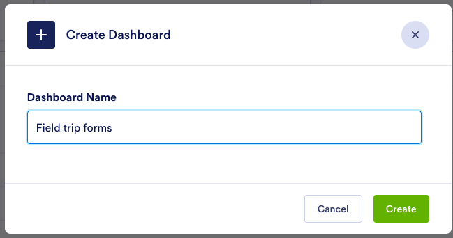
Say Eric wants to see more specific information about his permission slip forms only. First, he clicks on the Add New button under Custom Dashboards.
He names the dashboard.
Then he makes selections for a range of items, like Chart Type, Data Source, and assets. He selects his field trip forms and indicates that he wants to see the number of form views per year, with a breakdown by device type.
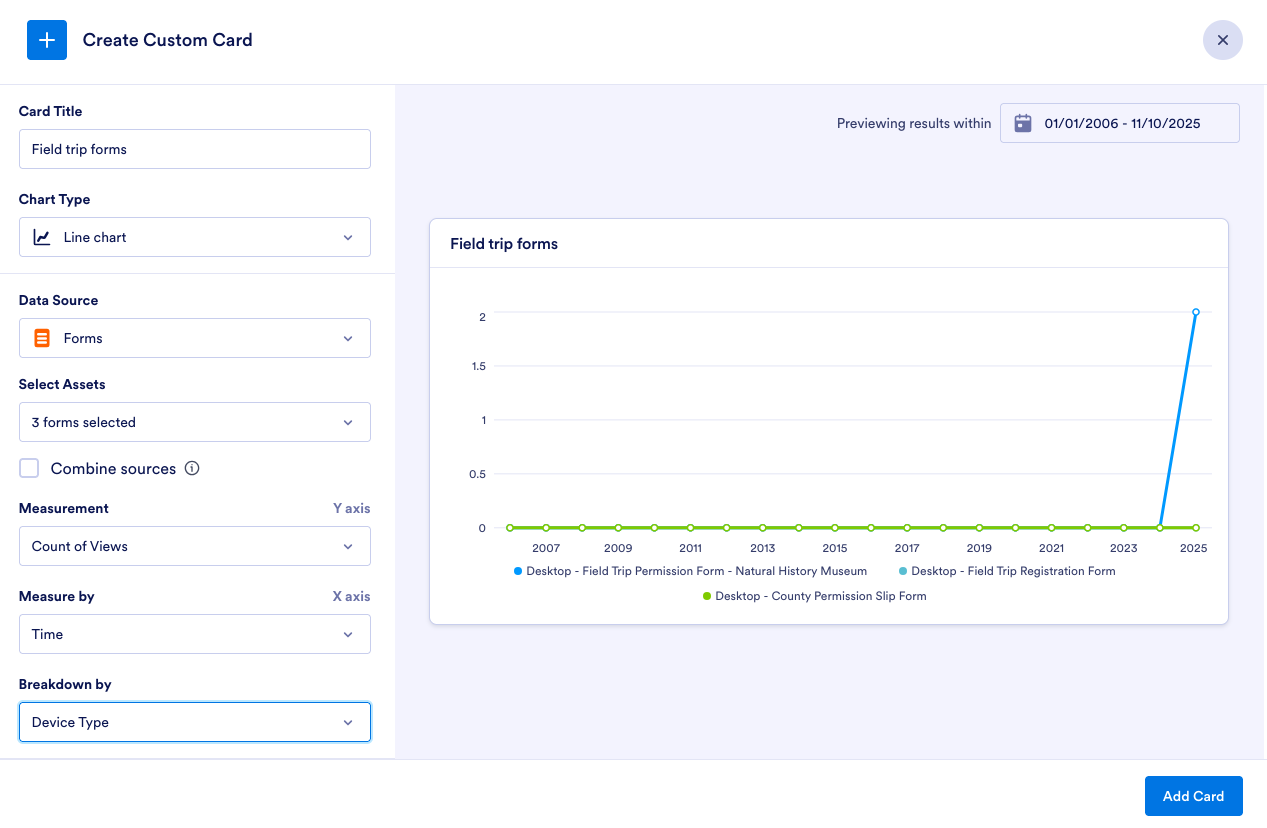
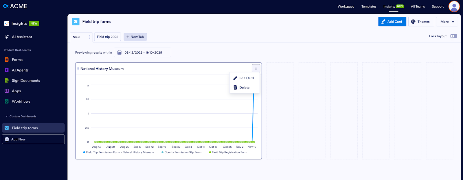
In the resulting Dashboard, he can select a new timeframe for his graph, edit or delete the card, clone or add the Dashboard to his favorites, and create a new card.

What Insights can do for you
As Alyssa, Eric, Dawn, and the rest of our personas have shown, Insights provides helpful features that can benefit your organization in many ways.
- Holistic visibility across all touchpoints
Insights gives your organization a single source of truth. There’s no longer any need to juggle multiple tools. This reduction in context switching will save your staff time, and maybe even their sanity. Plus, if your organization doesn’t have to buy as many tools, it will save money. Win-win!
- Comprehensive performance and engagement metrics
All of the metrics in Insights equip you with the information you need to identify what’s working and what’s not, so you can optimize your digital assets.
- Audience insights
Breakdowns by device, browser, operating system, country, and source allow you to develop a deep understanding of who is engaging with your assets and how. As a result, you can tailor these experiences to boost completion rates.
- AI Agent and workflow tracking
With Insights, you have the ability to monitor AI agent conversations and workflows to assess their efficiency. This helps organizations reduce manual work and automate more tasks, while maintaining quality.
- Custom filters and exportable reports
Insights allows you to apply flexible date ranges (daily, weekly, monthly, custom) to your data and export it in Excel or CSV format. It’s easy to share insights with stakeholders and track progress over time, ensuring accountability and better reporting.
- Aggregate comparison
You can compare metrics for multiple assets at once. For instance, in the Workflows example above, Alyssa viewed metrics for several workflows. You’re able to benchmark performance, identify top and underperforming items, and make decisions based on data.
- Interactive visualizations
Dynamic line charts, pie graphs, and performance tables display real-time metrics for user engagement, traffic sources, device types, and completion rates. It’s easy to spot trends, understand behavior patterns, and translate raw data into actionable information.
Insights takes the guesswork out of measurement. Instead of guessing, you can
- Spot underperforming forms, documents, AI Agents, apps, or workflows and optimize them
- See if AI agents actually reduce the workload for your support team
- Identify which workflows are slowing down your teams
- Better understand your audience according to a range of information like device, operating system, country, channel, etc.
Insights has transformed Jotform Enterprise from a tool that enables you to build assets and collect information to a business intelligence platform that helps teams analyze and optimize their efforts. Jotform Enterprise is now a vital element that could ultimately help ensure your organization’s success.
Discover Jotform Enterprise 2.0 today!


 integrations for Jotform Enterprise")


Send Comment: