
So, you’ve closed your survey, and you now have 874 responses sitting in your database. The next step is to present your findings in a way that’s impossible for leadership to ignore.
A well-crafted survey results presentation turns raw data into actionable intelligence. It clarifies complex findings, secures stakeholder buy-in, and drives informed decision-making. In this guide, we’ll cover the essential steps for creating a survey results presentation, including the tools that make your presentation clear, visual, and compelling.


Why presenting survey results matters
Whether your research involved customer satisfaction, market analysis, or employee engagement, raw data doesn’t speak for itself. Without a presentation, it’ll be difficult for your stakeholders to extract the insights they need to understand the information. The presentation step is where you transform data into something capable of moving your organization forward, using visuals — such as charts, graphs, and heat maps — and storytelling.
Here are a few other reasons why presentations are critical:
- Survey results presentations build clarity and understanding. They break down survey results into clear, digestible information by explaining what each data point means and highlighting key findings in a logical, easy-to-understand way.
- A well-structured survey presentation drives action and supports decision-making by showing stakeholders exactly what needs to change and why.
- Presenting survey findings reveals trends and patterns that are invisible in raw data.
- Publicly demonstrating your methodology and findings enhances your credibility, establishes you as a reliable data interpreter, and makes it easier to get buy-in for future research initiatives.
- Survey presentations engage stakeholders and ensure alignment when it comes to priorities and next steps.
How to present survey results effectively
The most effective survey results presentations balance clarity with depth and guide stakeholders through informed decision-making. Below are some best practices for structuring your survey results presentation for maximum impact.
- Curate your data to highlight what matters: Showcasing every question and response from the survey data collection isn’t necessary. What matters is identifying the insights that directly address your research objectives and stakeholder priorities. So, lead with your most important findings, then support them with relevant context. This approach respects your audience’s time while ensuring critical insights don’t get buried.
- Choose the right visuals to simplify complex data: Using the right survey results visualization can make a complex finding instantly clear. From bar charts to line graphs and heat maps, your choice of visuals should match both your data type and narrative.
- Build a narrative around your survey findings: Rather than presenting disconnected statistics, craft a cohesive narrative to engage your audience and guide them through a story they can follow and remember. Your presentation should have a beginning (what we wanted to learn), middle (what we discovered), and end (what this means for us).
You can start by establishing context: Why did you conduct this survey? What questions were you trying to answer? These details ground your audience in the purpose before diving into results.
Then, introduce your key findings in a logical sequence. As you present each finding, connect it to the larger story and show how insights relate to one another. For instance, does low product satisfaction correlate with poor customer service experiences? Do regional differences suggest varying market needs? These connections help stakeholders see patterns they might otherwise miss.
Close your narrative with implications and recommendations based on the data you’ve shared.
- Design your slides for maximum readability: Slide design can enhance or undermine your presentation. To ensure readability, use clear headlines on each slide so your audience can quickly grasp the main point, even without reading the entire deck. Add sufficient spacing between elements, too, and use large, legible fonts with sufficient contrast between text and background.
Avoid cluttering your slides with excessive text. Instead, let your visuals tell the story, supplemented with your spoken narration. It’s good practice to adopt the “one idea per slide” principle and split complex information across multiple slides.
- Provide full reports for deeper data dives: Even though your presentation delivers the highlights, some stakeholders may want to examine the methodology, review the survey demographic questions, or explore complete response distributions. A full report serves this need without cluttering your core presentation.
By following these practices, you can deliver an effective survey results presentation that reflects your data, engages your audience, and shapes how stakeholders perceive both the findings and your expertise.
How to present survey results in PowerPoint
When it comes to tools for presenting survey results, PowerPoint remains a popular option. It allows you to organize data however you need, create custom charts, and deliver presentations that feel polished and professional. Here are some guidelines for structuring your survey results in PPT.
- Start with a cover slide that establishes context. Include your survey title, its purpose, the time period in which data was collected, and the sample size. This immediately orients your audience and sets professional expectations.
- Lead with a key insight or executive summary slide that highlights your 3–5 most critical findings. That way, even if stakeholders only see one slide, they can still grasp what matters most.
- Structure the rest of your presentation with one major finding per slide. Each slide should have a clear headline that states the insight, a single supporting visual, and minimal text. This prevents cognitive overload and makes your slide easy to reference. For surveys covering multiple themes — for instance, customer satisfaction and product feedback — use section divider slides to help your audience mentally transition between topics.
- Choose appropriate visuals for each data set. For example, vertical bar charts are effective for comparing a small number of groups, while heat maps are better suited for dense, structured data that compares values across dimensions.
- Close your presentation with a recommendation or next steps slide that connects your findings to action.
The key is maintaining clarity, focusing on insights, and designing slides that support your verbal explanation.
How to share survey results with your audience
Now that you’ve prepared your presentation, the next step is to get it in front of stakeholders. You can do this via a live presentation or by sharing the slides as a PDF.
The sharing method you choose affects how engaged your audience will be. Different formats work better in different scenarios, and tailoring your approach to your audience helps your presentation land more effectively.
Choose between a live presentation or a PDF handout
Live presentations work best when you need real-time discussion and immediate buy-in. When you present in person or via video conferencing, you can guide stakeholders or clients through findings, answer questions as they arise, and gauge reactions to adjust your emphasis on the fly. This format is ideal for controversial findings or complex data that require explanation to build consensus among decision makers. Live presentations are also interactive, allowing you to address concerns before they become roadblocks.
On the other hand, PDF reports or slide decks work well when stakeholders need to review findings on their own schedule or reference them later. This format suits distributed teams across time zones, busy executives, or situations where you’re documenting findings for the record. PDFs also make it easy for stakeholders to forward relevant sections to their own teams without requiring your presence.
Tailor your presentation to your audience’s needs
Not everyone needs the same level of detail. Executives typically want a top-level summary that provides a concise overview of key findings, business implications, and recommended actions. So, a one-page synopsis or a 10-minute presentation highlighting your top 3–5 insights will serve them well.
Mid-level managers and departmental heads often need more context. Since they’re responsible for implementing changes based on your findings, they’ll benefit from understanding the why behind insights and seeing relevant demographic breakdowns. For this audience, you can share the full presentation deck with supporting charts and detailed findings to help them translate what you’ve discovered into operational decisions.
It’s important to frame your findings differently depending on who’s receiving them. If you’re sharing customer satisfaction results, your marketing team cares more about brand perception and messaging implications, while product teams focus more on feature-specific feedback and usability concerns. Try to customize your emphasis or frame separate summary slides that highlight what each department needs to know.
Share your survey results at the right time
When you share results matters just as much as how you share them. It’s important to present findings when stakeholders have the capacity to act on them. For instance, sharing survey results right before budget planning gives leadership time to allocate resources based on your insights.
Combine multiple sharing channels
From in-person presentations to PDF handouts via emails, website embeds, and social media, combining multiple sharing approaches ensures your findings reach everyone who needs them. For key decision-makers, you can give a live presentation, then follow up with a PDF recap via email for reference. If you’re sharing survey results publicly, you can create short visual highlights for social media or publish a survey summary in a blog post.
While these sharing methods work well for most survey results presentations, they often have limitations when you need to present findings repeatedly, field ongoing questions, or reach distributed audiences on their own schedule. In these scenarios, AI-powered presentation tools like Jotform Presentation Agents offer a better solution.
How to present survey results with Jotform Presentation Agents
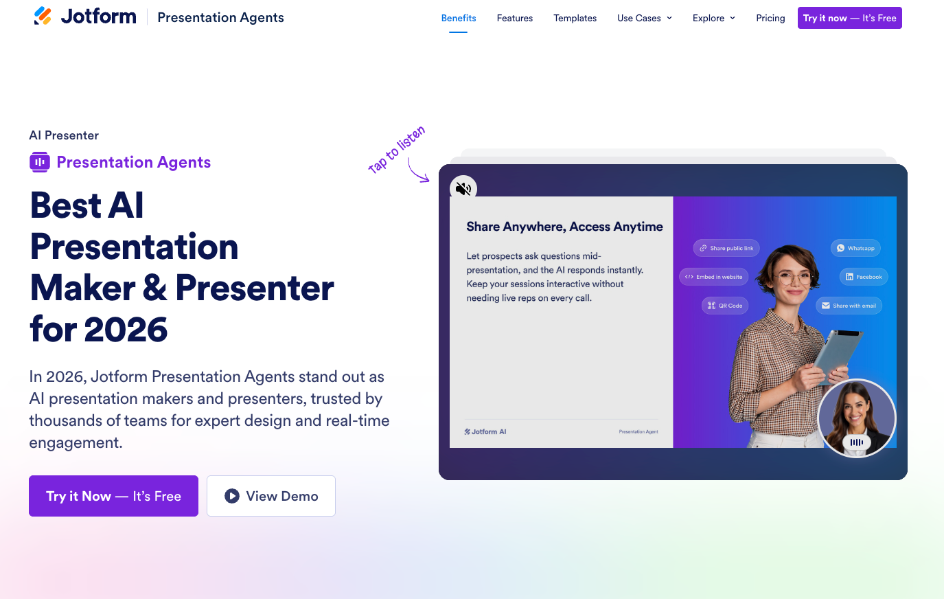
Jotform Presentation Agents transform how you share survey results by turning your data into interactive, voice-guided presentations that engage stakeholders without requiring you to be present. Whether you’re an HR manager sharing employee feedback with leadership or an educator introducing topics to students, a presentation agent allows you to deliver fun, immersive sessions that can run at any time without a live presenter.
Turn your data into slides
The AI agents work in two ways. First, you can generate presentation slides from a detailed prompt containing your survey findings. If you’ve collected survey responses but haven’t created slides yet, Jotform Presentation Agents can generate slides and add cohesive narrative scripts tailored to your data. Instead of spending hours in PowerPoint deciding whether to use a bar chart or pie chart, give Jotform Presentation Agents the narrative your data tells and let it build a professional presentation for you. In seconds, the AI can create a complete slide deck with professional formatting, charts, color scheme, and visual hierarchy. This frees you up from design work and allows you to concentrate on data analysis and recommendations.
Alternatively, you can upload existing PowerPoint or PDF slides, and the AI will turn them into an interactive presentation with spoken narrative and real-time Q&A.
Customize your presentation’s look, voice, and language
Jotform Presentation Agents give you full control over how your presentation is delivered. You can refine the AI-generated script and tailor the agent’s voice, tone, avatar, and accent to match your brand. The agent can also narrate slides in any language and answer user questions in their native language.
Engage audience with an interactive Q&A
Unlike a static PDF or slide deck, Jotform Presentation Agents can prompt questions at the end of each slide and respond to questions instantly — at any time, and without you needing to be present. You can also add forms, quizzes, and appointment schedulers at the end of your presentation for easy follow-up.
Track engagement and integrate with your existing workflow
As the agent delivers your sessions, you can track which slides are viewed, what questions are asked, and how users engage with your presentation.
For teams already using Jotform Survey & Quiz Tools, the workflow is even smoother: the presentation agent integrates directly with Jotform Forms and Jotform Report Builder. Once you’ve gathered feedback or survey responses with Forms, the presentation agent turns those responses into interactive slides — while Report Builder generates professional reports that automatically update with each new submission.
Share your presentation anywhere
Beyond survey results, you can use the presentation agent to showcase nonprofit initiatives to donors, pitch product features to clients, deliver onboarding sessions, and turn school lessons into immersive experiences. No matter your use case, Jotform Presentation Agents do the heavy lifting of preparing your presentation while you focus on interpreting the data.
With Jotform Presentation Agents, you can make survey findings accessible to stakeholders anytime, anywhere. Create your first presentation today for free, then share it via a public link, embed it on your website, or email it to stakeholders. Recipients can view it on any device, ask questions at any point, and explore findings at their own pace.
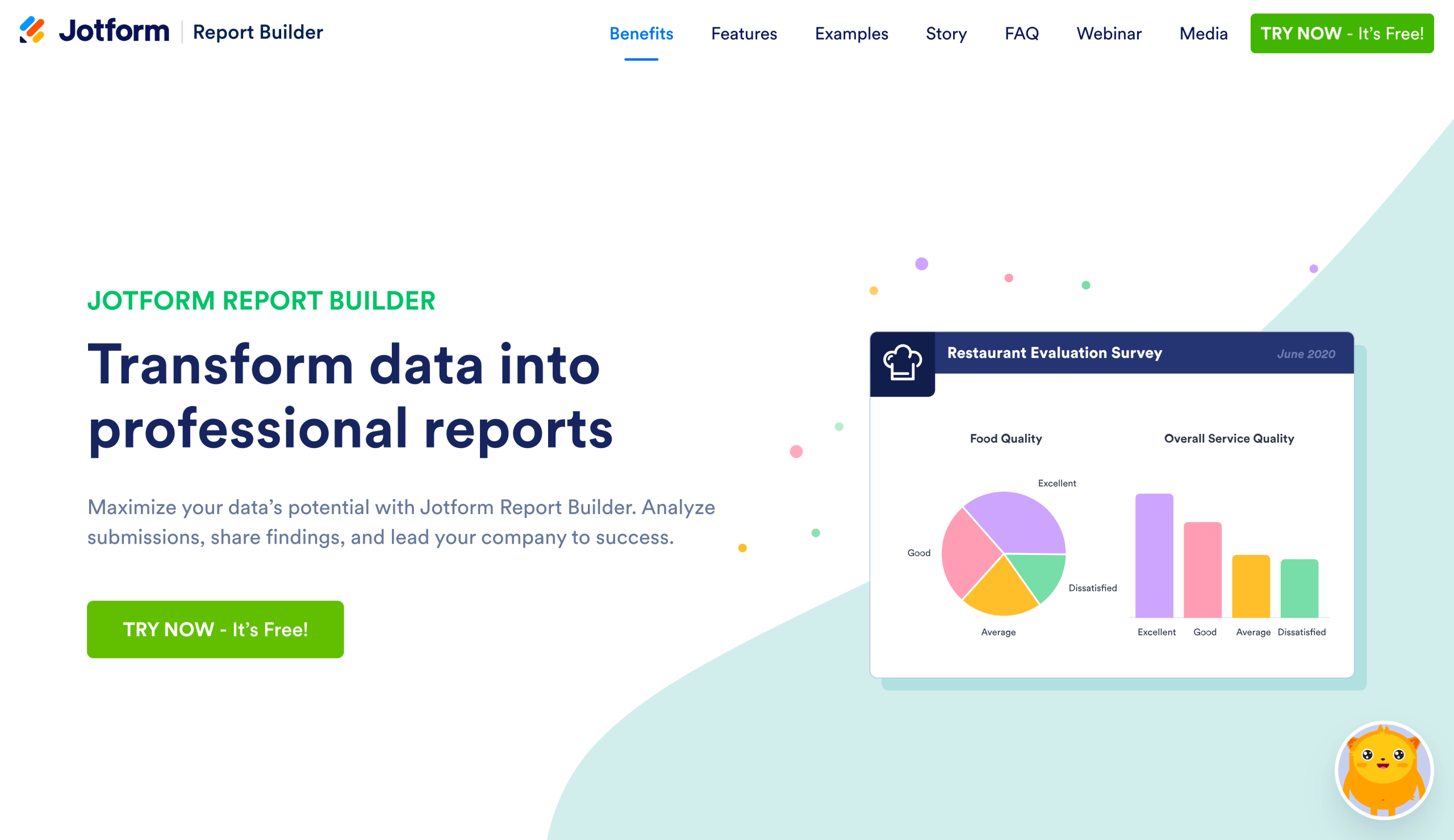
Build and analyze surveys better with Jotform
Your survey presentation is only as strong as the data behind it. Jotform’s tools streamline your entire data collection process from survey creation to response collection, data analysis, and professional presentation. Start by choosing from over 10,000 free survey templates covering everything from customer satisfaction to employee engagement, market research, and academic studies. Each template is customizable, so you can tailor questions and designs to match your branding and needs without starting from scratch.
What’s more, you can make your surveys smarter with conditional logic that adapts questions based on previous responses. This way, respondents can see follow-up questions only when applicable and skip irrelevant sections to ensure higher completion rates and better quality data.
With Jotform’s Free Online Survey Maker, you can worry less about privacy or data security, too. Jotform can help you maintain compliance with GDPR, CCPA, and other data protection regulations. All survey data is protected with 256-bit SSL encryption, giving you and your respondents confidence that their data stays secure throughout the collection and analysis process. Give it a try today.
This article is for the professionals across marketing, HR, education, research, and consulting who need to transform raw survey data into compelling presentations for internal stakeholders, clients, or leadership teams.


 survey questions")


?")

 alternatives in 2026")


")

")


")


Send Comment: