
5 survey examples
Surveys are a great method for collecting information. You can use them to gather insights about how current customers feel about your products and services or how potential customers view your company. Employee surveys are great for getting internal feedback on your corporate culture and company events.
The use cases for surveys are as vast as you can imagine.
But once you’ve gone through the trouble of collecting data from your audience, what’s your next step? Creating a survey dashboard allows you to collect information in one place, so you can easily glean insights from the results.
Why a survey dashboard is important
With a survey dashboard, you can take lots of data that would otherwise be difficult to grasp in its raw state and present your survey findings in brief, easy-to-understand visuals. This way, you quickly highlight key takeaways for, say, your company’s executive team. From bar charts to pie graphs, you can take thousands of data points and summarize them for easy consumption.
“Survey dashboards make it so you can easily see all your data in one place,” says Laura Fuentes, operator at Infinity Dish. “They give you the ability to share real-time insights with those invested in the project, which helps business leaders make informed decisions.”
Josefin Björklund, CEO of ToppCasinoBonus, adds that survey dashboards allow you to
- Share results in real time. With a survey dashboard, it’s easy to share important, up-to-the-minute survey insights with management, as graphs are typically updated automatically whenever new responses come in.
- Centralize data. You can combine results from multiple surveys in one place, which makes it easy to analyze and form connections between different data sets in a single view.
- Customize the way data is presented. You can easily customize the look of your survey results according to your project requirements. Use a collection of different visuals to tell different stories from your data.
Consider this example that illustrates the importance of a survey dashboard. Say your company recently sent a survey to your customer base. Luckily, nearly every customer responded, which gives you a statistically significant number to work with: 1,000 responses.
Trying to review and grasp this many responses one by one would be unrealistic. But creating a survey dashboard that aggregates and presents responses in visual format makes them much easier to comprehend.
Let’s say one of your survey questions asked whether customers were satisfied with your service turnaround time. By creating a pie chart on your survey dashboard, you immediately see that over 40 percent of your customers responded negatively. While that’s not a majority, it still indicates an issue your executive team would likely want to investigate.
The key takeaway in this example is that you save a lot of time and the headache of wading through data by using a dashboard to visualize your survey responses.
Tips for using survey dashboards effectively
Björklund says it’s important to use the right set of visuals in a survey dashboard, as each type of visualization showcases data differently. Not all visuals are suited for all data sets.
“Using the right visualization at the right time can help you make a better decision,” she says. “For example, a pie graph is useful for showing how different parts make up a whole. Whatever visual you choose, just remember to keep it simple. If your visual is too busy, it will be harder to understand.”
“To use survey dashboards effectively, you need to track metrics your leadership team has deemed important,” says Fuentes. “No need to waste time on less vital information, even if you find it interesting.
“Remember that your audience is looking at your survey dashboard to inform their decision-making,” she says. “So customize it in a way that enables them to get the highlights ASAP. They can then ask for more details.”
5 survey dashboard examples
Dashboards are all about visuals, and now it’s time to see some. Below are a few survey dashboard examples built with Jotform Report Builder, a reporting tool that compiles your data and allows you to produce attractive visual reports. If you embed the reports into a web page, they will automatically update as new responses are submitted.
1. Restaurant evaluation survey
As a restaurant owner, you know how important it is to stay on top of customer perceptions about your food and service. Surveying can help you answer key questions, such as
- How do customers feel about the quality of your food? Additional questions you could ask include
- Was it served hot?
- Was it tasty?
- How would you rate the quality of the ingredients?
- What do customers think about your service? Additional questions you could ask include
- Were the employees friendly and courteous?
- Were you served promptly?
- Was the dining experience a good value for the money?
That leads us to the first survey dashboard example below: a simple restaurant evaluation survey that asks customers about food and service quality.
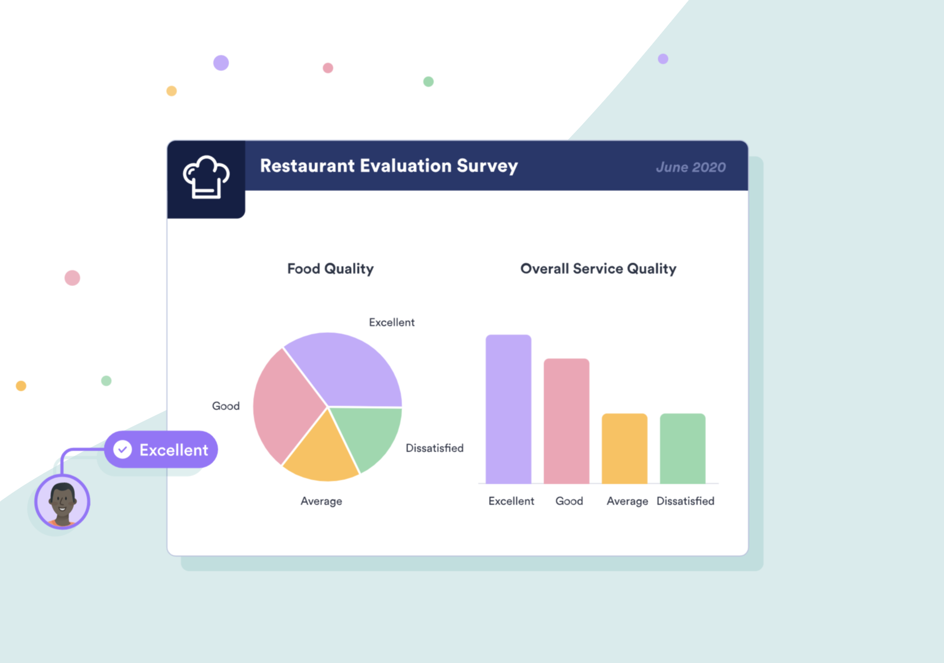
The survey results show that the majority of customers (about 60 percent) rated food quality as either good or excellent; less than a quarter were dissatisfied. So most customers like the food. Service quality has a similar breakdown.
Depending on your business goals, you may decide to take no immediate action and simply monitor survey results over time. But if you want your restaurant to have the best food or service in town, you’ll likely take strides to improve these numbers.
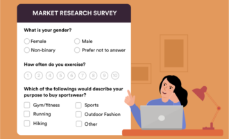
2. Market research survey no. 1
Market research is the process of gathering information about your existing customers and target market. From a business perspective, this information is helpful for communicating with your desired audience, and it helps you better serve them.
In our next survey dashboard example, we look at a market research survey that gauges consumer interest in certain activities.
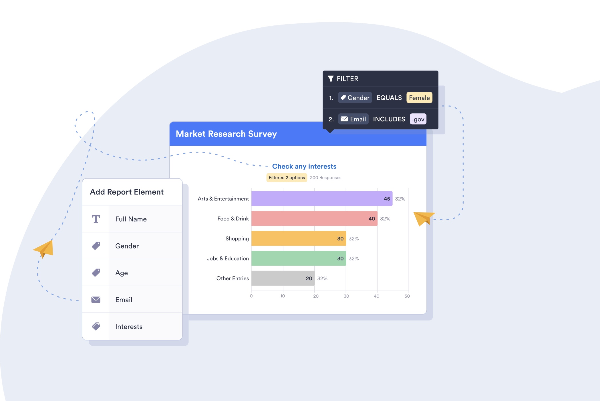
This survey asks consumers about their interests; they can check off any of four pre-identified interests or enter another interest, if applicable. For this particular dashboard visual, we filtered the responses to look at only female respondents who have an email address ending in .gov.
Let’s assume you work for an advertising agency and have several business clients who sell products and services to government agencies. By discovering what female government employees are interested in, you could help your clients craft more relevant content, messaging, and ads relating to this audience.
3. Market research survey no. 2
This example shows more market research, specifically from the vantage point of a photographer.
Photography is an art, and it takes both vision and skill to capture the perfect shot. But it can also be considered a science, given the technical details and equipment decisions that come into play. A photographer can use a multitude of different cameras, lenses, lighting, and software to produce numerous versions of the same image.
You also have to know a few key details to bring these things together in the right way. One key detail is where your customers prefer to have photos taken, which sets the stage for the next survey dashboard example.
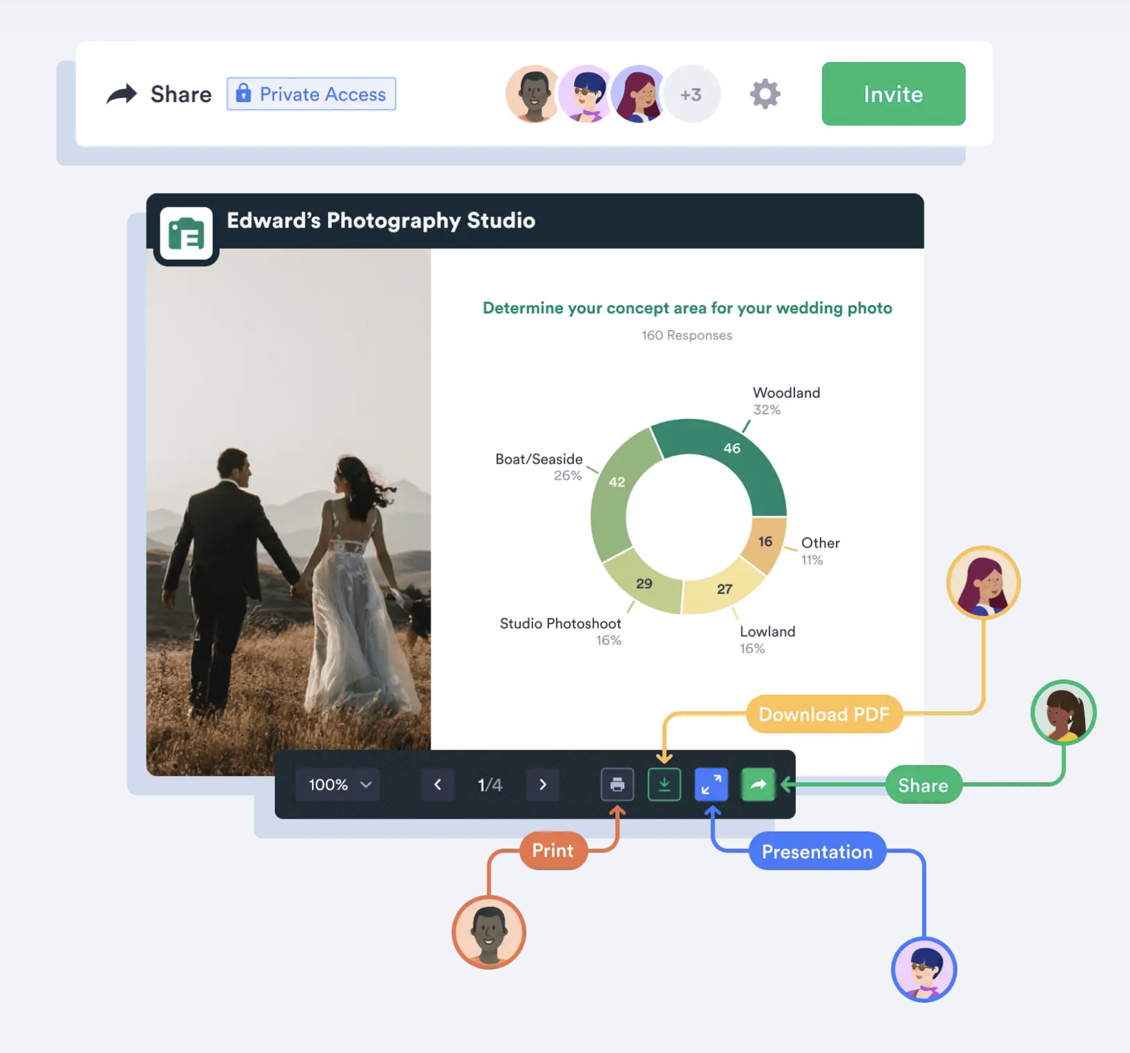
Assume you’re the owner of this studio, which focuses on wedding photography, and you’ve asked your prospects and customers about their ideal venue for wedding photos. Gathering this information can help you make decisions about equipment and other resources you may need for upcoming wedding seasons.
As the example showcases, most respondents (58 percent) want either a woodland or seaside wedding, meaning you need to be prepared for an outside event at the very least.
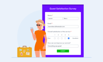
4. Market research survey no. 3
Up next is another profession that’s part art and part science: baking. It also benefits from a little market research. Cakes require not only good timing and close attention to detail but also the right ingredients. Surveying your prospects and customers to find out what kind of cakes they prefer will help inform your purchasing as well as your marketing.
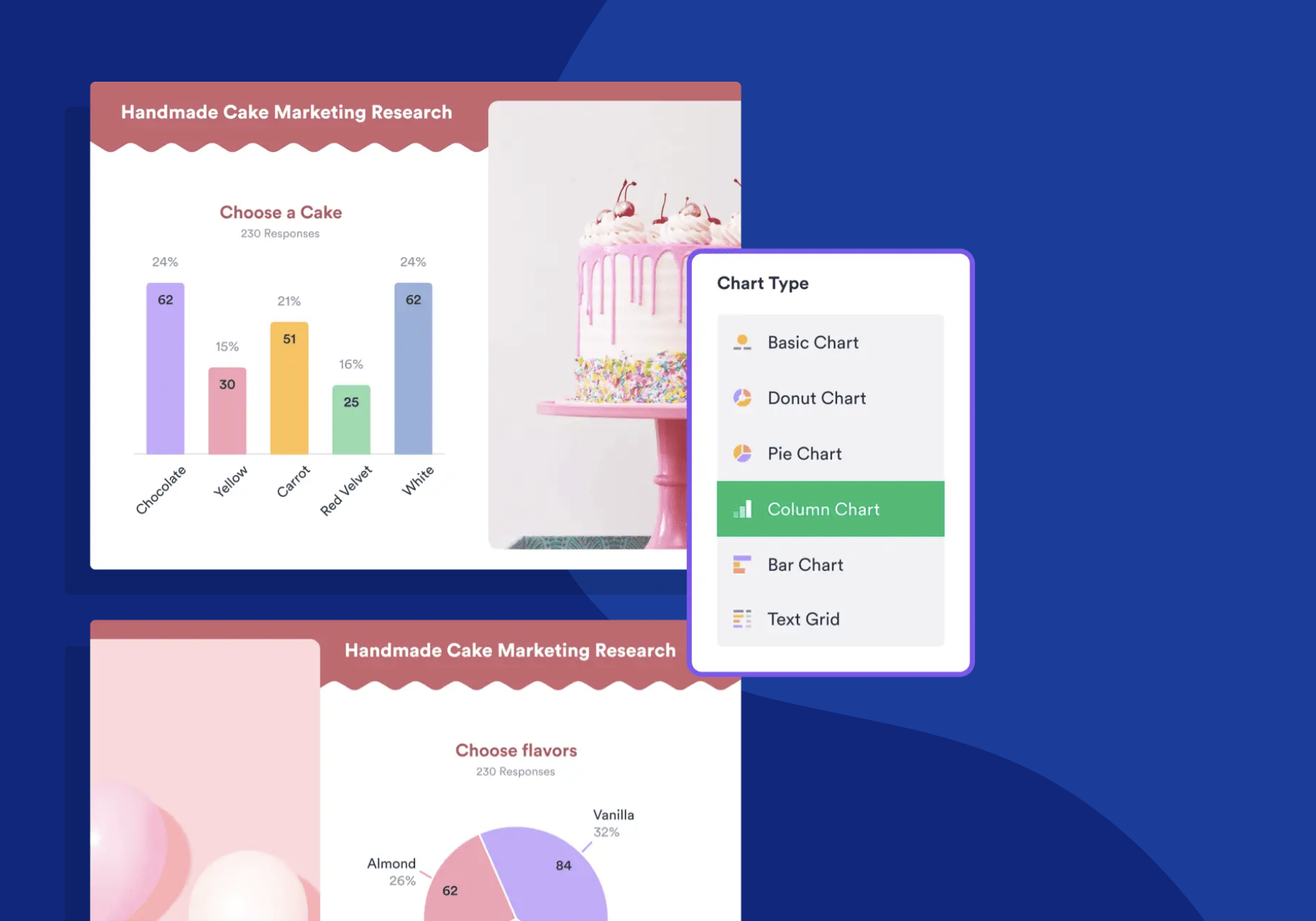
From the report, it’s clear that yellow cake and red velvet cake are the least favorite of the five choices — it’s probably best not to place either of those cakes front and center. Chocolate and white are neck and neck, and carrot isn’t far behind. Knowing that these are the front-runners, you can stock up on the right ingredients and plan future displays.
5. Straw poll
Straw polls are helpful for gauging opinions and are popular for political surveys. However, you can also use them in other contexts — like in a meeting to quickly get consensus on a topic or at a large corporate event to help determine a new initiative.
In the survey dashboard example below, the straw poll gauges voting sentiment.
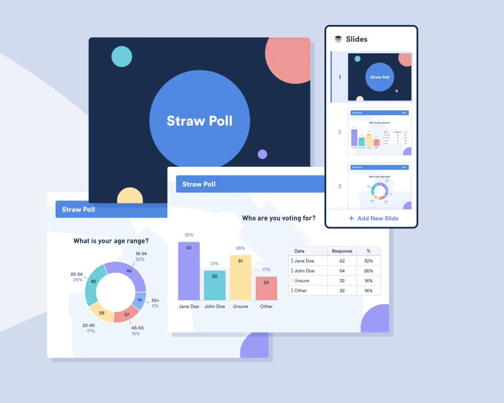
The report shows that most respondents plan to vote for Jane Doe or are currently undecided. It also breaks down the age ranges of respondents. Assuming you’re one of the two candidates, you could use this information to formulate a campaign strategy that targets a certain age group of voters who are unsure — and hopefully sway them to your side.
A survey dashboard is clearly an important tool for gaining insights. If you’re looking for a solution that stores and organizes your data in addition to helping you create customizable surveys and dashboards, check out Jotform. You can filter your form data, automatically generate visual brand reports with your logo and color palette, and share them with the relevant audience. Try Jotform Report Builder today.


Send Comment: