
Survey report examples
- Bar chart
- Pie chart
- Table summary
- Smile indicator
- Donut chart
- Multiple visualizations
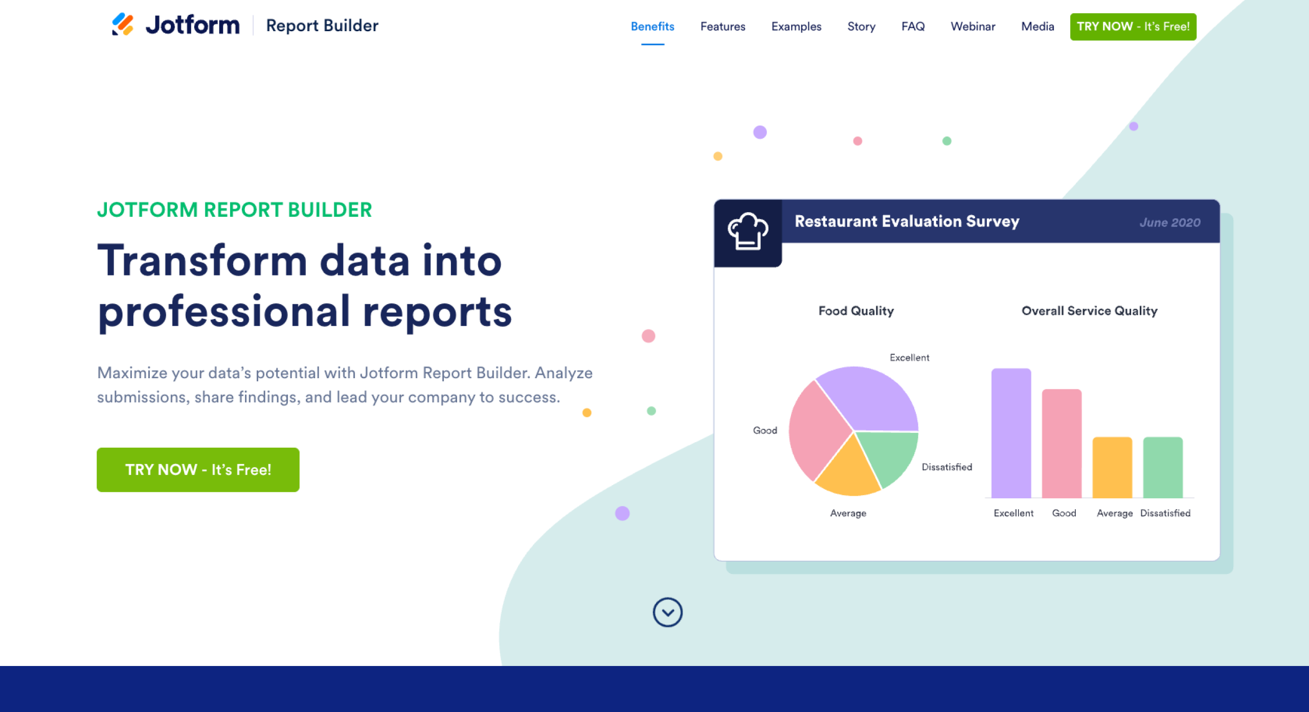
When you’re looking for key insights to help you make business decisions, you can’t go wrong with surveys. If you know how to create a survey, you can send them via email or embed them on your website to customers to gauge how they feel about your products and services, how satisfied they are with your support team, or how likely they’d be to recommend your company to others.
Getting answers to key questions can help you identify what measures you need to take to retain your customers for the long term.
Employees are also a good audience to survey, as you can learn about their needs and determine how engaged they are at work. Insights from employee surveys can give you insight into whether you need to raise morale or make some significant changes within the organization.
Regardless of who your audience is, it’s important that you present survey results in clear, easy-to-understand visuals. This enables you and your team to quickly and accurately draw conclusions that will inform the decisions your organization makes.
To give you an idea of what these visuals can look like, we’ll walk through several visuals from several survey report examples below. The underlying surveys were created and distributed using Jotform, and the survey reports were produced using Jotform Report Builder. We’ll also take a look at why survey reports are important and what you need to include in a survey report.
Why survey reporting is critical for business decisions
Essentially, researchers use survey reports to present data they’ve collected from a survey.
Survey reporting is important because it gives the surveyor and other stakeholders a way to view and understand the data that a survey collected. It can also help them quickly glean insights from the survey data.
It’s important for survey reports to present data in a fully objective manner so the audience can make decisions based on facts. For example, say you’ve conducted a survey about which software your audience prefers, and the results showed that most people preferred software A over software B or C. The report should state that the majority of respondents preferred software A, but it shouldn’t include any subjective comments, such as asserting that people prefer software A because software B and C aren’t good software products.
In addition to text, you can present the data in a survey report visually, such as in a chart or graph, to better showcase the information you’ve collected to the audience. Many people learn visually, and these elements can provide additional context to help them draw conclusions.
5 key elements every survey report needs
Not all survey reports include the same information, but there are certain details that are usually included. Here are some examples:
- Completion rate: This refers to the average number of questions answered divided by the total number of questions in the survey. The completion rate is an indicator of how respondents felt about the questions in the survey.
- Number of responses: This can refer to the number of individual responses or to the number of unique people who responded. This helps you understand how large of a sample size you’re dealing with.
- Survey views: This refers to the number of times people viewed your survey. Unique survey views refers to the number of individuals who viewed your survey. Comparing survey views with the number of responses you received shows how many people viewed your survey but chose not to respond.
- Breakdown of answers per survey respondent: Some surveyors want to know each individual’s response to a survey, as it can highlight trends and anomalies.
- Breakdown of closed-ended questions: Closed-ended questions provide quantitative data because they require respondents to select answers from a predetermined set of options. It’s easier to make visual representations of data gathered from closed-ended questions rather than open-ended questions.
4 survey report & visualization examples
Let’s look at some examples of specific surveys and how their results could be presented visually.
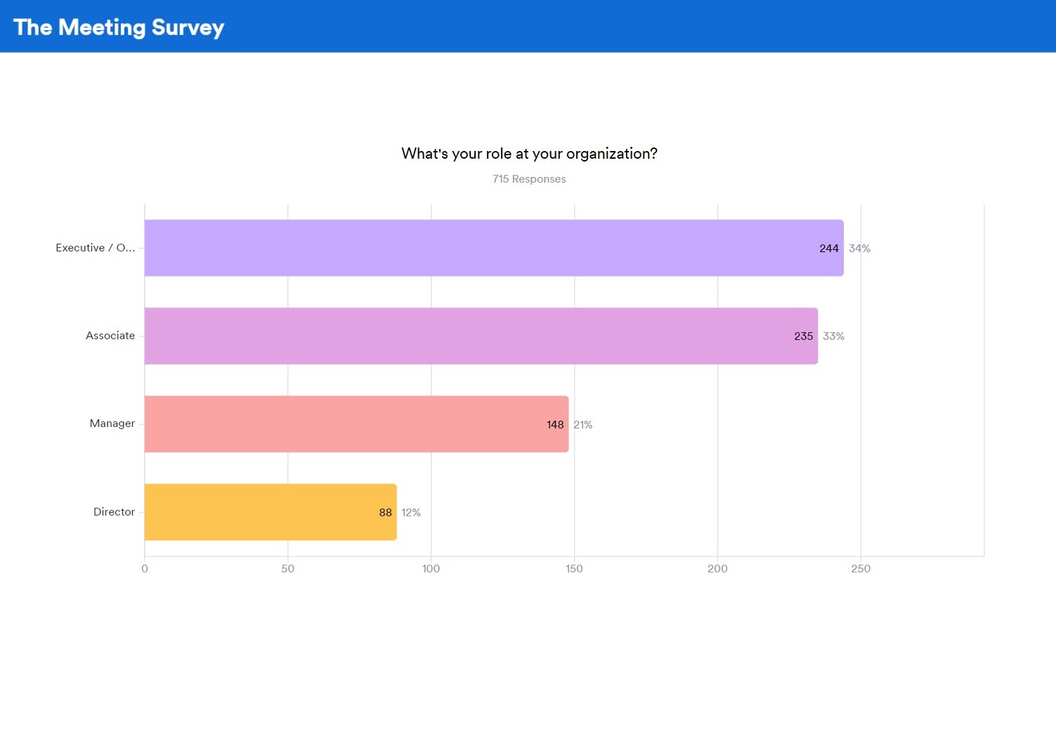
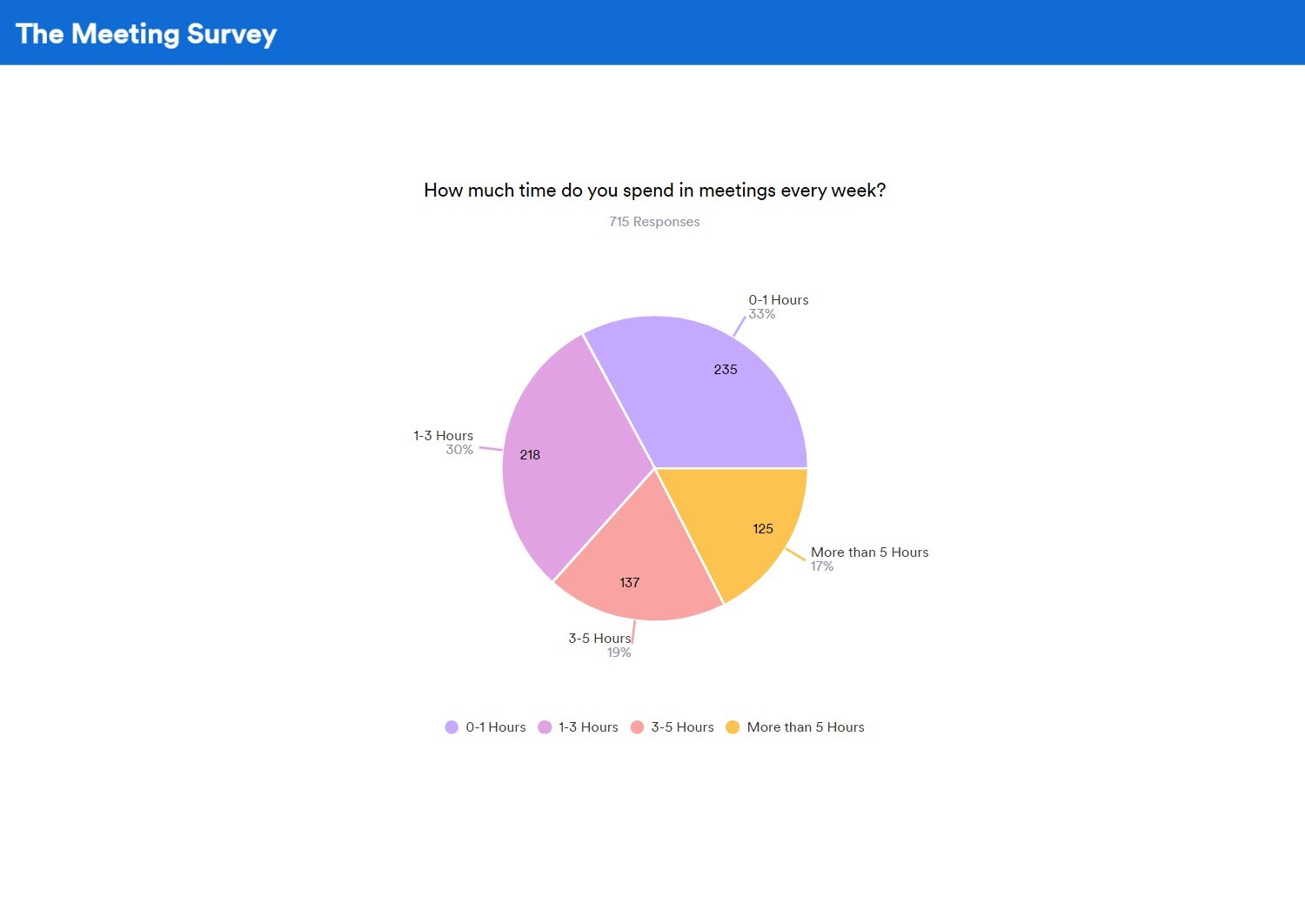
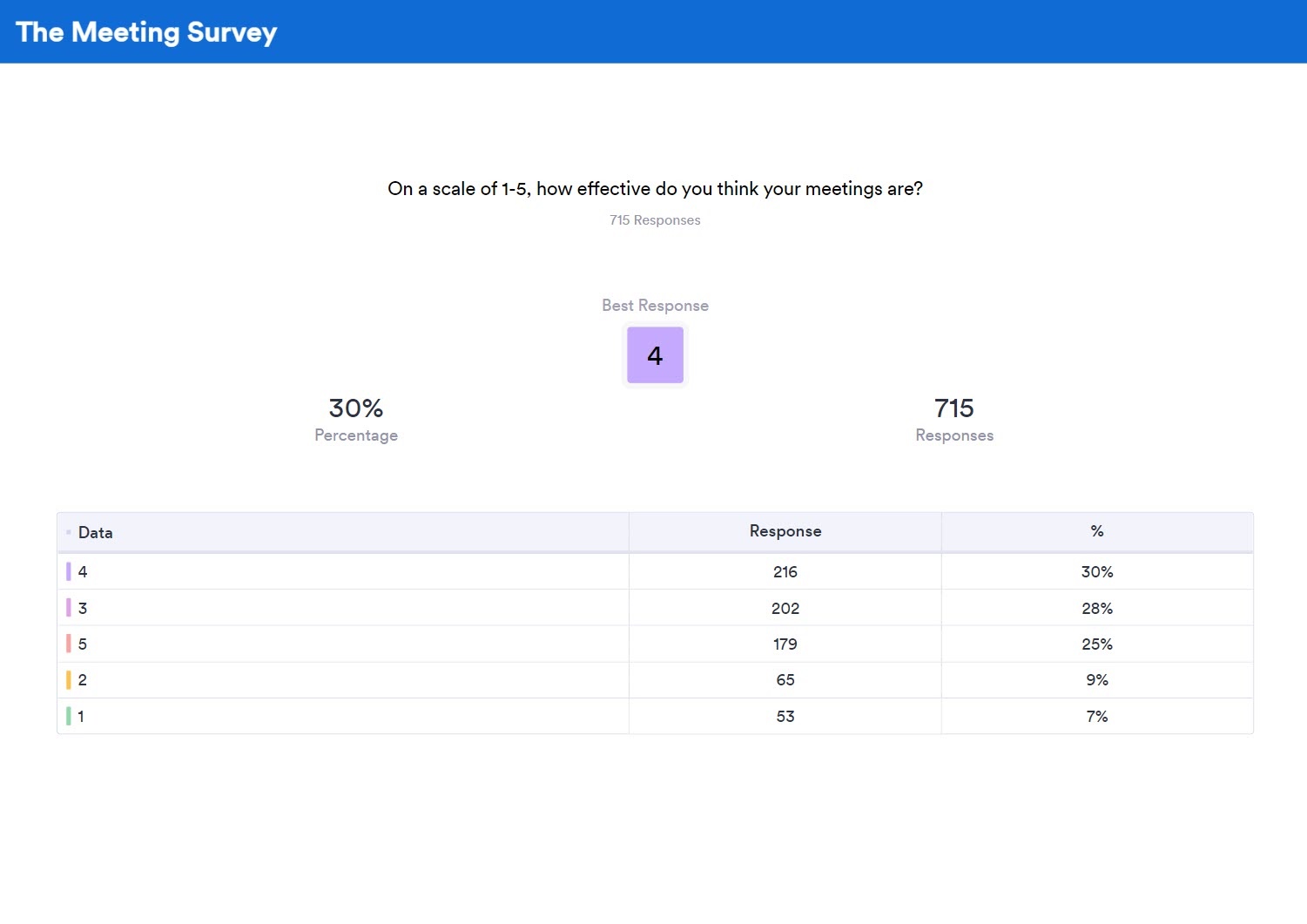
1. Meeting survey report
The purpose of this survey was to get people’s opinions on company meetings. To add context and perspective to the answers, respondents also provided relevant data about themselves, including their role within the organization and their industry. The survey included a total of 715 respondents.
The survey posed five questions:
- What’s your role at your organization?
- What’s your industry?
- How much time do you spend in meetings every week?
- Are most of your meetings in person or through a video chat or call?
- On a scale of 1–5, how effective do you think meetings are?
The survey creators aggregated responses to each question and then displayed them using a visual to make communicating the data easy. We showcase each visual below.
Using bar charts to show clear contrasts
As part of the survey report, the survey creators presented the answers to the role and industry questions in the form of a bar chart. This allowed them to clearly delineate and identify the size of the various roles and industries. The chart shows that most respondents were either at the executive or associate level. The second chart shows a mixed bag of industries.
Using pie charts to show data distribution
For the meeting time and format questions, respondents had just a few options to choose from, and the survey creators were interested in seeing the share of people that selected each option. A pie chart is the perfect visual to showcase how respondents answered.
The first pie chart shows that most meetings were on the shorter end — between zero and three hours long. The second chart shows that meetings were overwhelmingly in person.
Using table summarize to rank frequent responses
The survey creators presented the last question, which asked about meeting effectiveness, in a table summary format. The table summary places the most frequently selected response front and center. It also lists all responses in order of frequency.
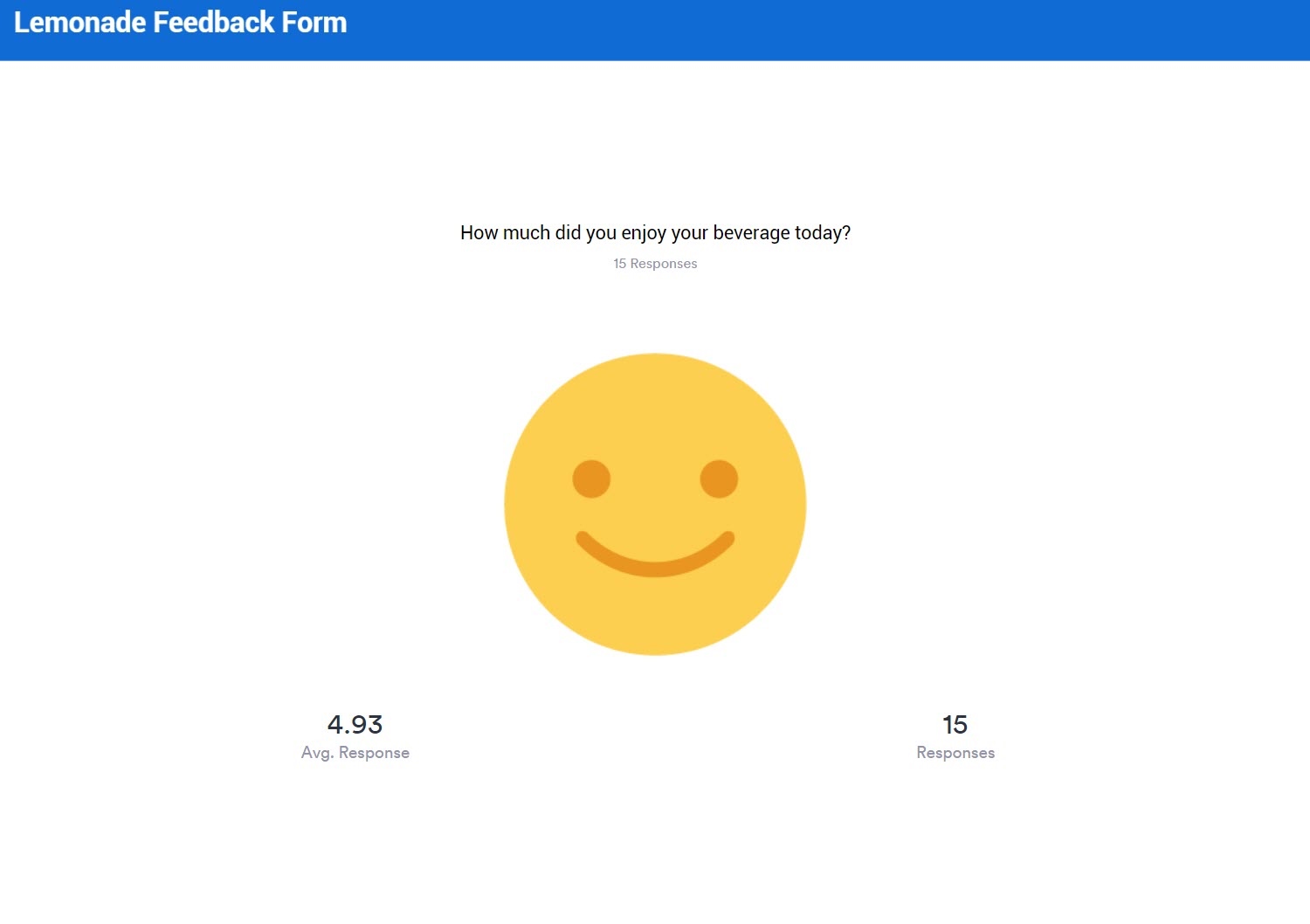
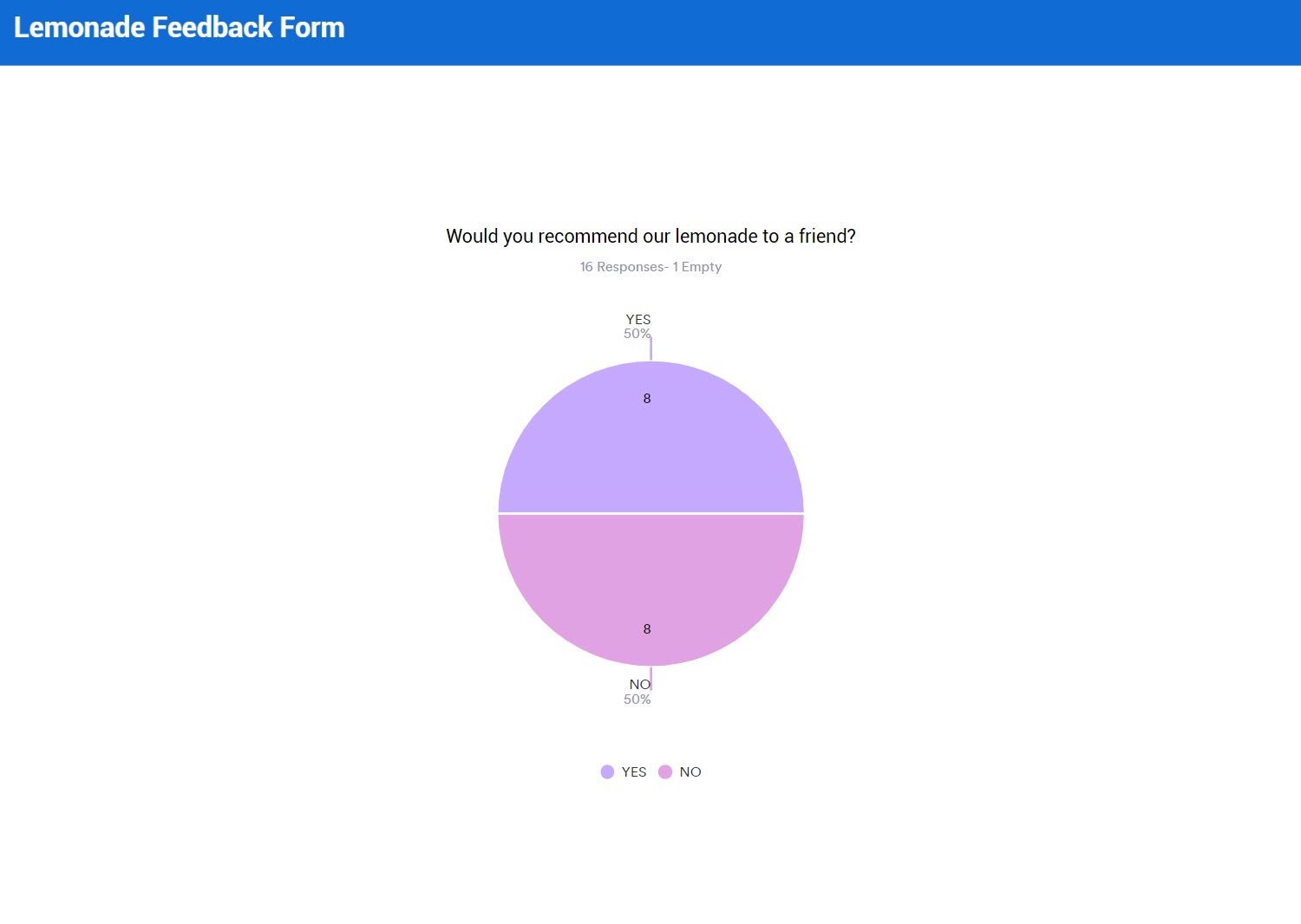
2. Lemonade survey report
This survey report example was more fun than practical, but it offers some additional visuals to consider for your own survey report. In this fictitious example, imagine that the survey creators are owners of a lemonade stand who wanted to find out what customers thought about their product.
The survey asked respondents two questions:
- How much did you enjoy your beverage today?
- Would you recommend our lemonade to a friend?
Check out the visuals used for each question’s responses below.
Using smile indicators for instant visual feedback
This visual differs from traditional charts and graphs by adding a little personality. Instead of lines, bars, or pies, you present results using a collection of emoji-like faces. You get a smiley, neutral, or sad face depending on how positive (or negative) the responses are. Smiles tend to be universal, so it’s immediately evident how respondents rated your business when you view the image. (In this case, most people liked the lemonade!)
Using bar charts to track recommendation rates
Both survey report examples employed pie charts, which isn’t surprising given how effective this simple visual is at displaying certain data sets. This survey report used a pie chart for the last question about recommending the lemonade. Interestingly enough, despite most respondents enjoying the lemonade, only half said they’d recommend it to a friend.
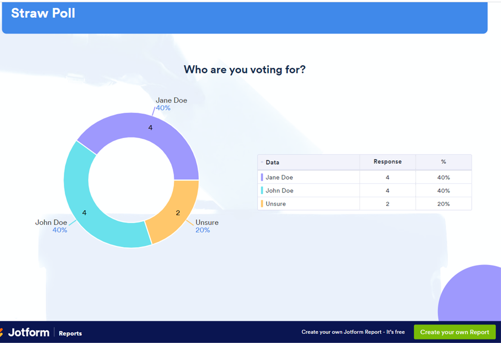
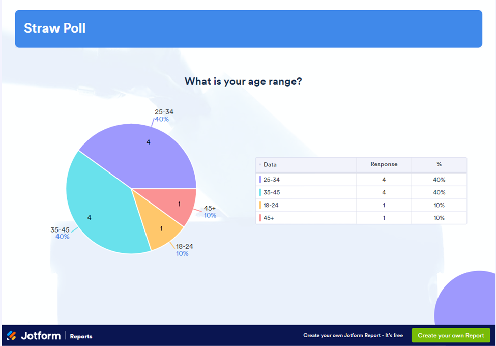
3. Straw poll
Straw polls are important in the political sphere because they help politicians and their teams understand who people will be voting for in an upcoming election. In this hypothetical example, the straw poll included these questions:
- Who are you voting for?
- Which issues are most important to you when you vote?
- What is your age range?
- What is the highest degree or level of school you have completed?
Using donut charts for multi-series percentages
Similar to a pie chart, a donut chart is useful in visualizing percentages of a whole. However, unlike a pie chart — which displays just one series of data — a donut chart is actually useful for visualizing multiple series of data, with each series being a separate ring on the chart.
In this example, we see one series of data of candidate preferences. If we were surveying different geographies, we could add rings and the corresponding results for each geographical location.
Using multiple visuals for data clarity
Sometimes, one visual representation of the same data set isn’t enough. Displaying the same data in two or more ways can help the stakeholders make more sense of the information and gain the insights they need to make better decisions.
In this example below, we can see a pie chart in addition to a table that contains the same data. The pie chart may be more helpful to visual learners, while the table may be more helpful for those who learn better from seeing text and numbers.
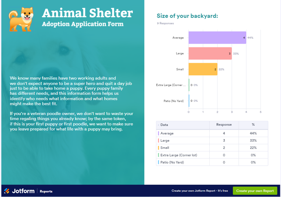
4. Animal shelter adoption application form
This fictitious report from an animal shelter summarizes the information gathered from their adoption application form. It not only shares useful information, but also contains the animal shelter’s branding and uses storytelling elements.
Some of the questions in this report include
- Choose which best describes your level of dog-owning experience.
- Are you concerned with any of the following behaviors?
- Would you consider adopting a pet with existing medical needs that are being treated?
- What is the size of your backyard?
Leveraging storytelling to provide data context
Some types of survey results reports require text in addition to visuals and numbers. In this example, the animal shelter offers context for a particular question and explains why it’s important. It also includes a bar graph and a table.
5 tips for writing a compelling survey results report
A successful survey results report includes vital information that engages the stakeholders and provides them with the information they want to know. Here’s how to do it:
- Offer an executive summary: If your report is longer than two pages, it’s best to provide a short summary up front that highlights the critical findings — and if you’re unsure where to start, learn how to write an executive summary to make it clear and compelling.
- Tell a story: Survey findings often include a lot of numbers, but it’s important to tell a story about those numbers. What was your motivation for conducting the survey? What is the context around the questions you asked? Be sure to answer these questions in the report.
- Present the most important data first: Cover the main questions the survey was trying to answer first and then follow with any ancillary information you collected. For example, if the point of a survey was to collect feedback from students about their teachers, present those findings up front. If you have any additional details, such as feedback from parents, provide that information next.
- Use visualizations to communicate the data findings: While you should also provide the results in text form, most people learn better when they have a visual representation of the data. Choose one or more of the data visualization examples from above and incorporate them in your report.
- Analyze the data: What conclusions can you draw from the data you collected? This is the most important part of your survey results report. You should include it in the executive summary as well as in the body of the report. It’s the action item that readers will take away from the report.
What to consider when presenting a survey report
To ensure you successfully communicate the findings from your survey report in a presentation, it’s best to start with your audience. Who are you presenting the report to? Is it an executive in the C-suite or kids in your class? Is it someone who’s already familiar with the survey or someone who has no background or context for it? Your audience should inform how you deliver your presentation.
For example, the more your audience already knows about the survey and the reason for it, the less background information you have to provide in the report. The less they know, the more context you have to offer.
Similarly, consider how much time your audience has to spend on the report. Are they just looking for a five-minute overview, or do they want a deep dive into the data?
You’ll also want to consider the audience’s role in the survey process. Are they required to help you decide next steps, for example, or are you just showing them your findings to back up the decision you’ve already made? Are you teaching them something from the results, or are they there to help you learn something from the findings? This will also have an affect on the amount of information you provide in the report and how you’ll present it.
When it comes to the presentation itself, it’s important to share it in multiple ways so you can meet the needs of your audience. For example, offer a print or digital copy of the report, talk through it in a meeting or call, and project the report on a screen as you talk through it. This way, you’ll provide the audience with multiple ways to digest the information you’re sharing.
Automate your survey reporting with Jotform Report Builder
Did the visuals from these survey report examples inspire you? You can start building your own survey reports today using Jotform Report Builder. With Report Builder, you can automatically create real-time reports and presentations from submissions to your Jotform survey. Just drag and drop to customize the design to fit your needs.


Send Comment: